Dashboard: Create an overview page for namespaces
As previously discussed in #908 and #1117, it could be helpful for dashboard users to see some aggregated data and general information as an Overview for a given namespace.
Some ideas:
- A "failing" card which shows a highlight of which resources have been failing for a long period of time and/or restarted an excessive number of times etc.
- Some more global data, like "precent of resources that are green", "resources that fail most frequently", or a graph of the total number of pod failures every day for the last day/week/month or so, to help teams easily see if their objects are crashing more frequently and they may need to take deeper action.
Very open to feedback and more ideas, and will have some mockups posted shortly!
 cnwalker
All 32 comments
A "failing" card which shows a highlight of which resources have been failing for a long period of time and/or restarted an excessive number of times etc.
This is great idea. Other ones too. Will you implement initial version in your PR or you would like to review us first and then we can make next step in the another PR?
Just few more ideas (I may add new ones later):
- we could design new type of card which uses bigger font to make values like resource count bigger
- any kind of graph would be nice, we display too much data as a plain text (we should take advantage over CLI here)
You can check this https://github.com/kubernetes/dashboard/issues/1333 for some ideas about overview.
 maciaszczykm
on 21 Jul 2017
maciaszczykm
on 21 Jul 2017
cc @cnwalker @danielromlein
maciaszczykm
on 21 Jul 2017
I think it would be best to get a good version of the overview page (one that doesn't duplicate so much code from search) that shows all the objects in a namespace first and then iterate with more aggregated dashboard features.
cnwalker
on 21 Jul 2017
@cnwalker Sure, no problem. Just ping us when you will be ready for next review. Please remember also about CLA.
maciaszczykm
on 21 Jul 2017
I think #2132 is ready for another review!
cnwalker
on 24 Jul 2017
@cnwalker You need to sign the CLA first, label is still red.
maciaszczykm
on 24 Jul 2017
@maciaszczykm CLA should now be signed!
cnwalker
on 24 Jul 2017
@cnwalker Do you plan to push it forward?
maciaszczykm
on 27 Jul 2017
Yeah! So the next phase of the overview page I was thinking is to add the ability to filter by status in the resource card list (show only pending, show only failing, etc.). Then to have a resource card set to "show failing" and another set to "show pending" by default on the overview. When you filter I was thinking it should also give you the totals. Will upload a drawing soon so it's more clear.
cnwalker
on 27 Jul 2017
Yeah!
Great.
So the next phase of the overview page I was thinking is to add the ability to filter by status in the resource card list (show only pending, show only failing, etc.).
I think this is global resource card functionality. Like sort, pagination or filtering. These are quite tricky, so ask us for any explanations.
Then to have a resource card set to "show failing" and another set to "show pending" by default on the overview.
Could you elaborate a bit? Otherwise, we are waiting for your sketches. Don't spend time or anything fancy, just show us your idea.
When you filter I was thinking it should also give you the totals.
Looking forward to it.
maciaszczykm
on 28 Jul 2017
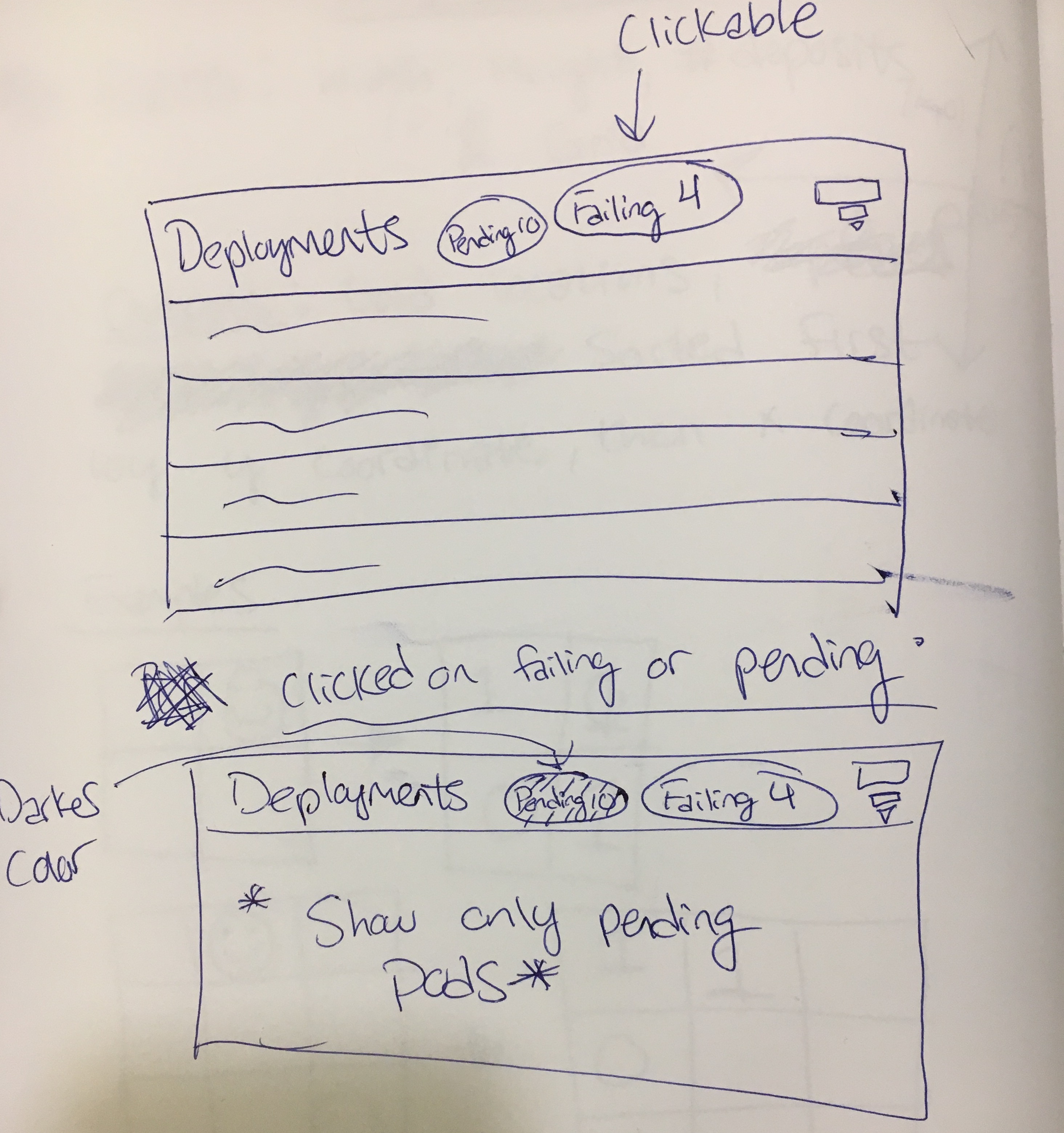
Preliminary sketch, I was thinking of adding functionality to global resource list filter. Clicking on a button should restrict to only resources in the given state. What do you think?
cnwalker
on 28 Jul 2017
These changes are ok but IMO they are not overview specific. Maybe we could show some donut charts like on node details page for allocated resource?
It could nicely show ratio of success/pending/failed pods. It would be good to show 2/3 charts to visualize state of resources in chosen namespace(s).
 floreks
on 28 Jul 2017
floreks
on 28 Jul 2017
@floreks I completely agree, I had another sketch that I forgot to upload (looks the same as node details page).
Any ideas for more charts? It would be great to have some notion of the number of failures for the last week etc. is the capacity to access failure timestamps already in the dashboard or would that have to be added?
cnwalker
on 28 Jul 2017
The chart I'm thinking is probably better to implement before the filter by status functionality.
cnwalker
on 28 Jul 2017
@cnwalker I agree.
maciaszczykm
on 28 Jul 2017
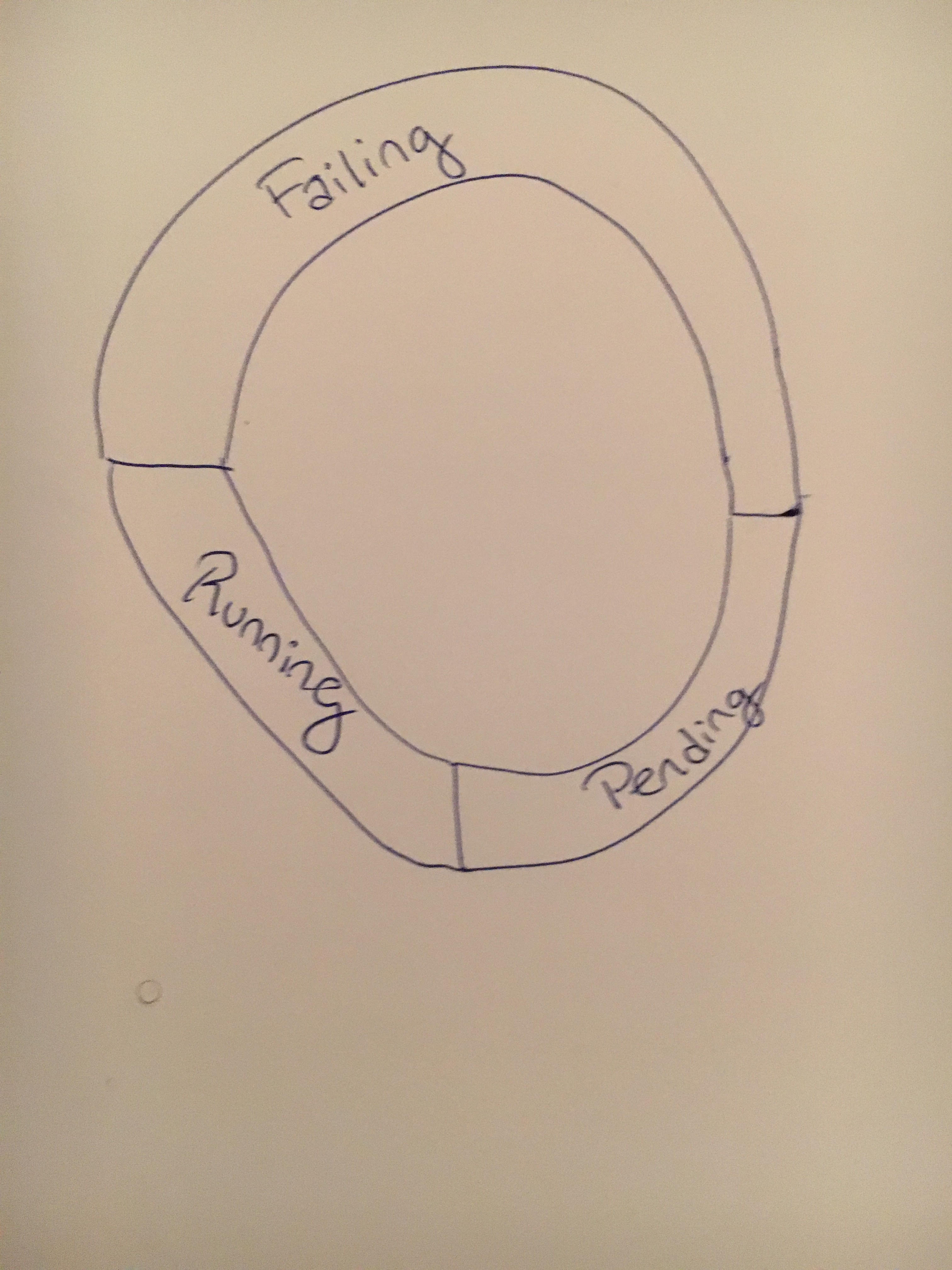
I guess showing 3 rings will be easier as @maciaszczykm already prepared some code to make it work for 1 and 2.
Maybe we could also show pod distribution across nodes, i.e. we are on Overview page in default namespace and we have 100 pods.
- 20 pods are on node-1
- 50 pods are on node-2
- 30 pods are on node-3
Name of the node to which pod belongs is already on the pod list so we could use that data to visualize that. We'd have to think about UX when there are many nodes but it might be a good idea.
floreks
on 28 Jul 2017
Good idea @floreks! I'll come up with some more designs
cnwalker
on 31 Jul 2017
@cnwalker We have pods for now, but I would like to see all resources here. What about putting some graph like https://bl.ocks.org/mbostock/3886208 on this card? We can start with text data:
Replica sets: 19/21
Deployments: 6/6
Stateful sets: 10/13
...
But using graphs would be a lot nicer :)
maciaszczykm
on 7 Aug 2017
Hmm stacked bar chart is interesting but I think may be difficult to interpret. What about some mini-single ring donut charts next to each element, with pods and deployments bigger for easier viewing?
cnwalker
on 7 Aug 2017
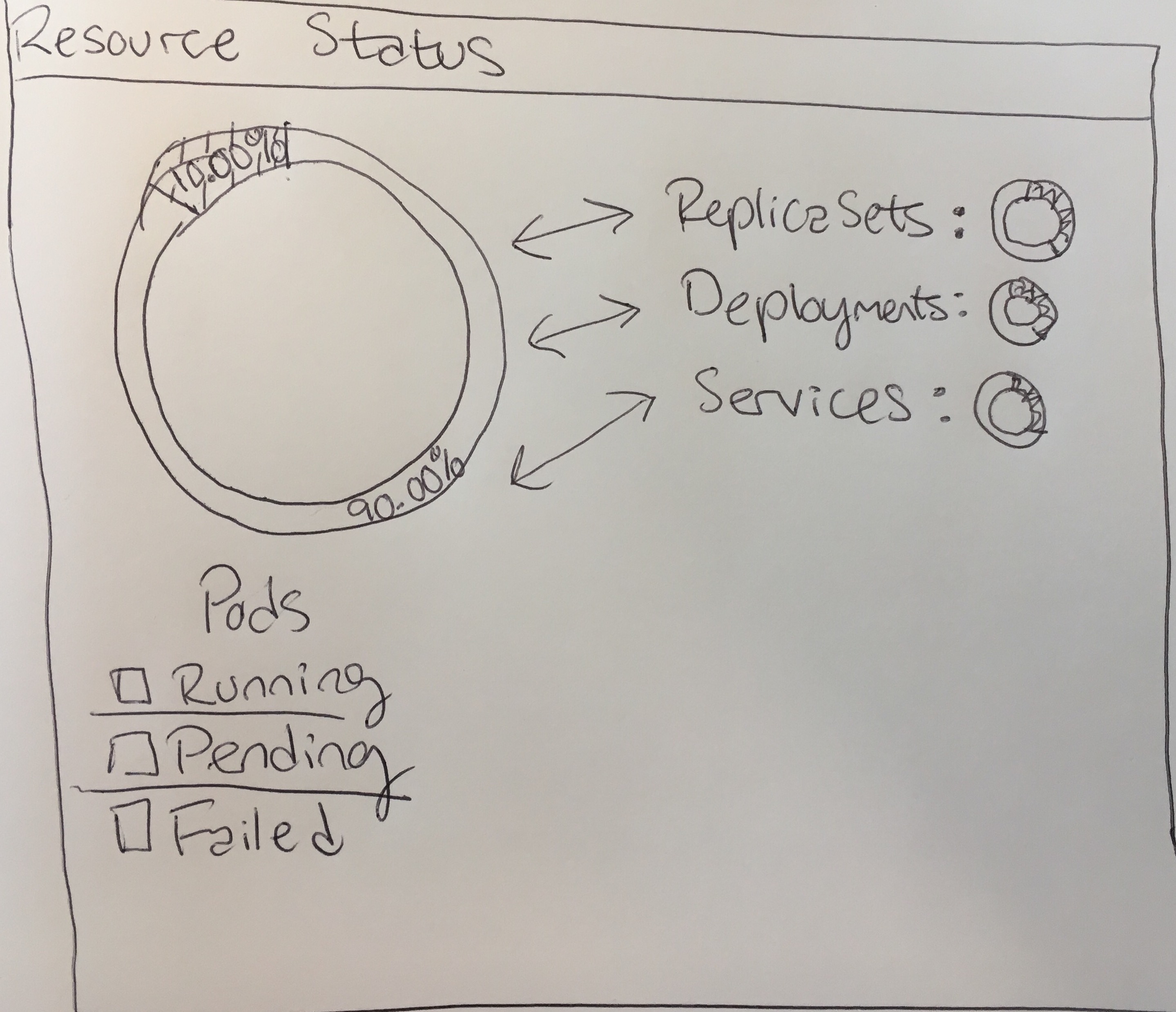
I'm thinking when you click on any of the items on the right, they switch places with pods (big text, larger graph). My thinking is when you go to the overview page, you want to spot check if anything is wrong with a given resource. If you notice red or yellow in the small pie charts, you can click on them to drill down and see exactly how many things are running, pending, or failed.
cnwalker
on 7 Aug 2017
I feel like current Resource Status is leaving too much space unused. It works nicely on a node page but on overview we should use all available space. I'm not sure if donut charts is the way to go here. Showing available data in more condensed way might be a good thing. We have only 7 resources on an overview page so I think it would be still quite clear.
Take a look at this demo.
floreks
on 7 Aug 2017
Interesting, I agree that there is too much empty space right now, but I'm not sure treating all of the resources equally in the visualization is the best way to go.
The workflow I'm thinking of, is that people open the dashboard, they see 1 or 2 relatively large, simple visualizations that tell them the status of the most important resources (I'm thinking pods and deployments), and some smaller info that notifies them if there's anything to worry about in the other resource groups.
If something is concerning, they can click on the other resource groups and see a clear, simple visualization of them. That visualization doesn't necessarily have to be a pie chart, but I think the stacked bar might be too cluttered, to the point where a lot of the most important info is de-emphasized. This is my personal experience though, do you find that when you look at the dashboard you are equally interested in all the resource types?
cnwalker
on 7 Aug 2017
Maybe this is a good compromise? Condensed stacked bar chart on right, but when you click on an element you see a pie-chart on the left?
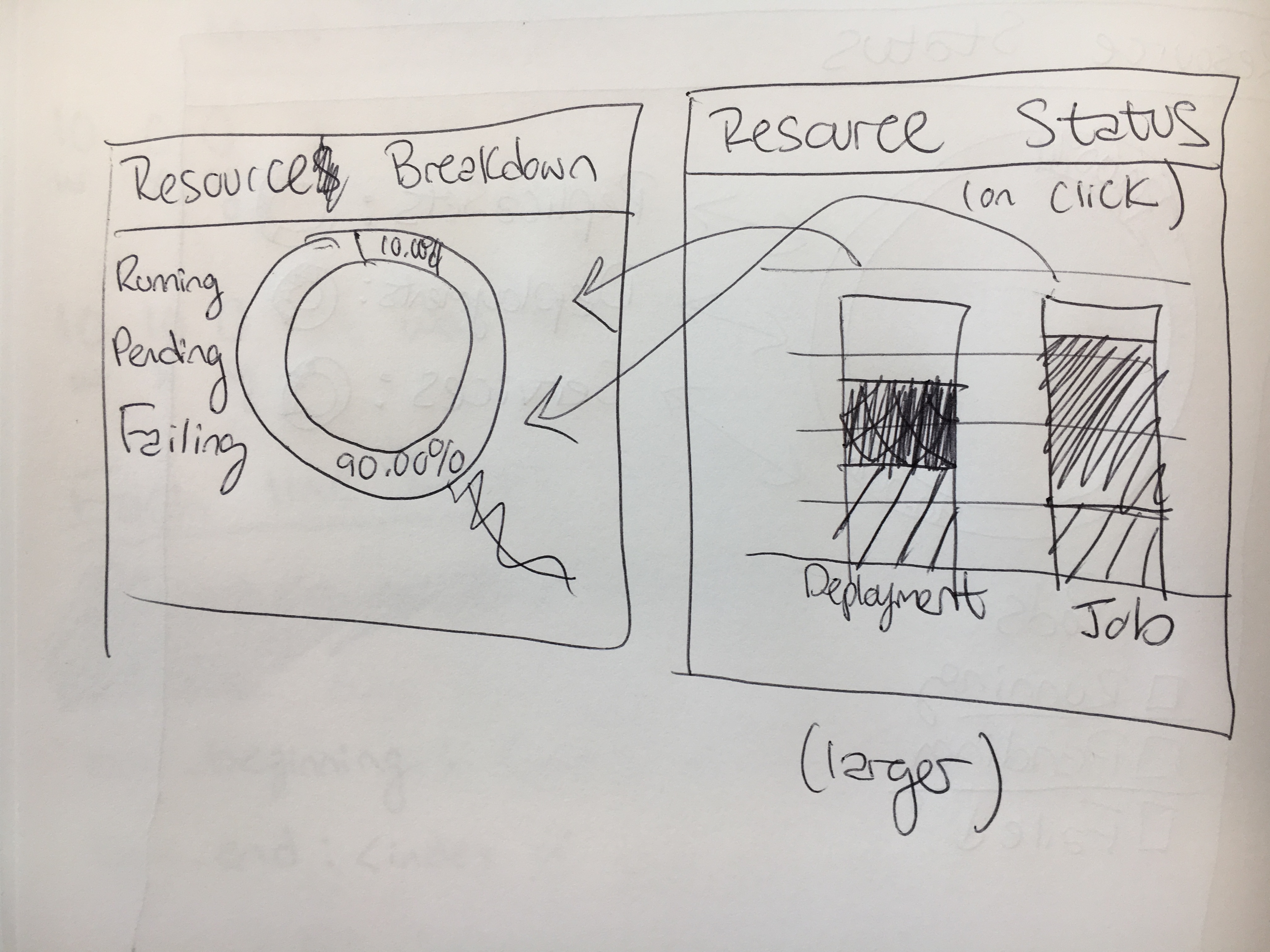
The other question for the stacked bar charts is scaling. What should we should if you have ~3000 replica sets, but only 10 deployments for example?
cnwalker
on 7 Aug 2017
Splitting into different charts is fine as long as we can make it nice and responsive. We have to remember that every high level resource (rs, rc, deployment, etc.) is equal and we can not just show status of most important resource because there are not any. Some people might use exclusively deployments on their cluster and others stateful sets and pure pods. That is fine.
Everything under workloads is equal and we can think how to present data we have. We can make charts more responsive. Provide some actions on click. Add some combobox and provide multiple visualizations.
- Resource statuses - show charts with resource statuses (not only pods)
- Resource ratio - show (maybe using sunburst chart or something similar) how different resource are distributed in a namespace. From looking at this chart you should be able to see what kind of resource is most used.
- Resource usage per resource type - currently cpu/mem graphs are showing combined metrics. We could also provide more detailed data on an overview page.
- Trending resources - based on creation timeline we can prepare chart that shows what kind of resources are most popular over time + maybe combine that data with resources that are failing the most.
There are many more options. These are just from the top of my mind.
floreks
on 8 Aug 2017
Ooh resource ratio and trending resources sounds very interesting. You're right, all resources should be equal and users should be able to prioritize the ones they are most interested in by bringing up their resource status.
For 4, does the dashboard currently pull records of resources that have been deleted?
cnwalker
on 9 Aug 2017
So maybe the next PR should be to support all the resources in the "Resource status" card, and some global visualization to give you a state of the cluster? After asking some people on my team, I think something like your demo is the way to go @floreks.
If everyone agrees, I'd like to implement something like the most recent photo. What do you think @maciaszczykm?
cnwalker
on 9 Aug 2017
For 4, does the dashboard currently pull records of resources that have been deleted?
Nope, it would have to be implemented.
If everyone agrees, I'd like to implement something like the most recent photo.
Sure. We have to start somewhere. We'll discuss more once we see how it looks in dashboard.
floreks
on 9 Aug 2017
I think we should change the current graph to bar graph if it is the only one.
maciaszczykm
on 10 Oct 2017
Hey! I have another graph coming, sorry I am back in school now and have had less time. More visualizations are on the way.
cnwalker
on 10 Oct 2017
How about also add pie charts for Resource quotas, like one for cpu and one for mem, it can tell how many cpus/mems have been assigned to each namespace and the total assignment as well.
 xychu
on 11 Oct 2017
xychu
on 11 Oct 2017
Issues go stale after 90d of inactivity.
Mark the issue as fresh with /remove-lifecycle stale.
Stale issues rot after an additional 30d of inactivity and eventually close.
Prevent issues from auto-closing with an /lifecycle frozen comment.
If this issue is safe to close now please do so with /close.
Send feedback to sig-testing, kubernetes/test-infra and/or @fejta.
/lifecycle stale
 fejta-bot
on 9 Jan 2018
fejta-bot
on 9 Jan 2018
Stale issues rot after 30d of inactivity.
Mark the issue as fresh with /remove-lifecycle rotten.
Rotten issues close after an additional 30d of inactivity.
If this issue is safe to close now please do so with /close.
Send feedback to sig-testing, kubernetes/test-infra and/or fejta.
/lifecycle rotten
/remove-lifecycle stale
fejta-bot
on 10 Feb 2018
Related issues
 ianlewis
·
55Comments
ianlewis
·
55Comments
 saschagrunert
·
30Comments
saschagrunert
·
30Comments
 Smana
·
70Comments
Smana
·
70Comments
 ScubaDrew
·
118Comments
ScubaDrew
·
118Comments
 kking124
·
30Comments
kking124
·
30Comments
Most helpful comment
Hey! I have another graph coming, sorry I am back in school now and have had less time. More visualizations are on the way.