It would be nice to have a logo for DADA2, but my graphical design skills are pretty lacking.
We have an idea that's mostly worked out already, in which a "noisy" DA transitions to a clean "DA" as part of a text DADA2 logo, representing removing the noise from the data.
I'm pretty happy with the text and integrated arrow element
but my attempts to introduce noise to the first DA aren't quite there yet
Gzipped SVG versions also attached:
DADA2_Logo_Baseline.svg.gz
DADA2_Logo_NoiseAttempt.svg.gz
 benjjneb
All 17 comments
Could you do a pixellation gradient from left to right? With the idea of something coming into focus.
 naupaka
on 19 Oct 2017
naupaka
on 19 Oct 2017
Hey @benjjneb,
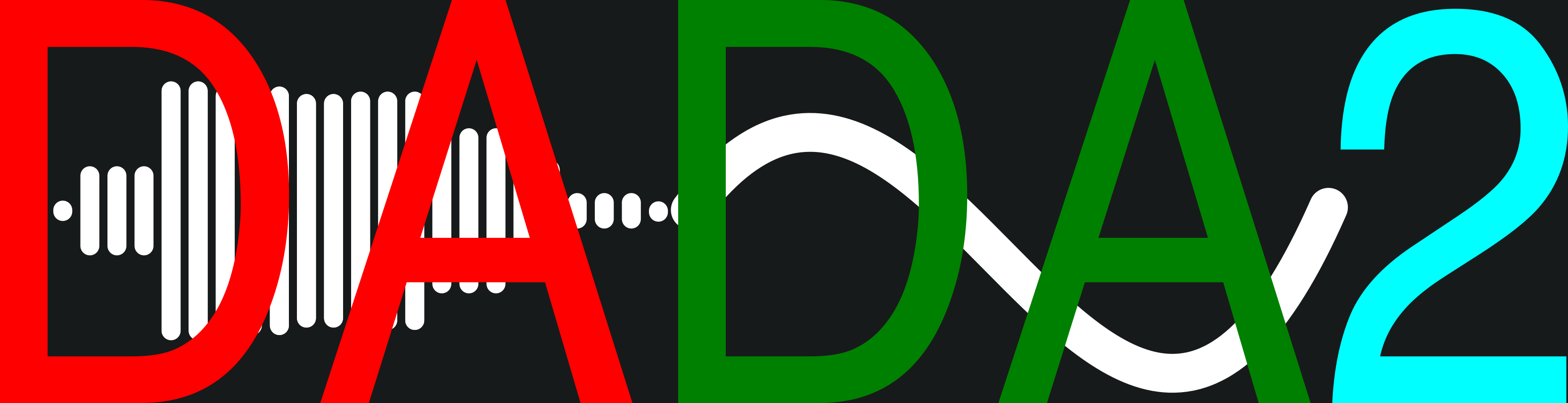
I am also pretty bad at graphic design, but I gave it an attempt. When I thought about "noise" the sound waveforms came to mind and this is what I came up with. It starts with the noise of pronouncing "DA" and ends with a clean signal line. It's pretty rough and very busy but I figured I would throw it in.
 gblanchard4
on 24 Oct 2017
gblanchard4
on 24 Oct 2017
That is cool @gblanchard4
However, because of our previous use of the unfinished baseline logo, we want to keep that basic look, and prefer modifications on top of that (e.g. adding noise to the first DA in that logo) rather than something with all new colors and font shapes.
benjjneb
on 26 Oct 2017
Wrong font, made in Word, low res .png...
but to add to your ideas of what you're looking for? I think it deserves a solid 1/10
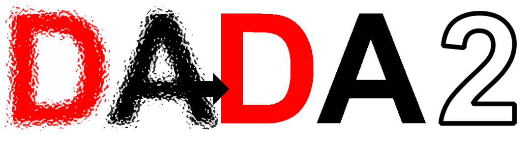
Updates!


 pdobrano
on 27 Oct 2017
pdobrano
on 27 Oct 2017
@pdobrano I love it, that's already better than any of my bad attempts at making the first DA noisy.
benjjneb
on 28 Oct 2017
Ben,
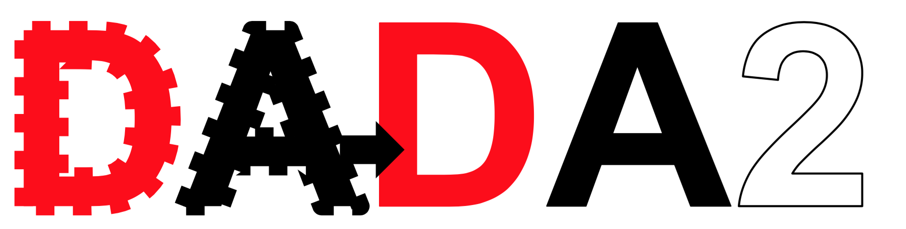
Per your request to keep the same "simple design" you had shared in your original post, I gave it a shot and came up with this. I'd be happy to adjust it further and increase/decrease the _noise_ effects.

 bashirhamidi
on 28 Oct 2017
bashirhamidi
on 28 Oct 2017
It looks like there are some great DADA2 logo ideas! I have a few ideas as well:


 lakarstens
on 30 Oct 2017
lakarstens
on 30 Oct 2017
I think I like the noise effects by @pdobrano and @bashirshir the best. Maybe the top one by @lakarstens too. The bottom two are interesting, but I don't quite get the "noise to clarity" impression that we're hoping for.
benjjneb
on 1 Nov 2017
Hi @benjjneb, here I leave you a handful of versions. If you find some of the ideas interesting I can easily polish them to suit the needs. Best!



 kaze33
on 2 Nov 2017
kaze33
on 2 Nov 2017
I like the @pdobrano one best, I find the red and black harsh....
On Wed, Nov 1, 2017 at 8:57 AM, Benjamin Callahan notifications@github.com
wrote:
I think I like the noise effects by @pdobrano
https://github.com/pdobrano and @bashirshir
https://github.com/bashirshir the best. Maybe the top one by @lakarstens
https://github.com/lakarstens too. The bottom two are interesting, but
I don't quite get the "noise to clarity" impression that we're hoping for.—
You are receiving this because you are subscribed to this thread.
Reply to this email directly, view it on GitHub
https://github.com/benjjneb/dada2/issues/352#issuecomment-341149858, or mute
the thread
https://github.com/notifications/unsubscribe-auth/ABJcvZCIXUMHPOE1jNDyUCqb-FsVu_cWks5syJT2gaJpZM4P90_D
.
--
Susan Holmes
Professor, Statistics and BioX
John Henry Samter Fellow in Undergraduate Education
Sequoia Hall,
390 Serra Mall
Stanford, CA 94305
http://www-stat.stanford.edu/~susan/
 spholmes
on 2 Nov 2017
spholmes
on 2 Nov 2017
For what its worth I really like the second logo from @pdobrano
Would love to have an official logo to include in my M.S. defense in April.
 jrdohert
on 6 Nov 2017
jrdohert
on 6 Nov 2017
awesome.
I wish I had polled this for a phyloseq logo a long time ago, but I'm blatantly copy-catting this for phyloseq:
https://github.com/joey711/phyloseq/issues/838
And for what it's worth, I like @pdobrano number-3, but I think I'd prefer a different color palette than the red/black... and maybe some interesting letter-stacking?
 joey711
on 6 Nov 2017
joey711
on 6 Nov 2017
It seems that the thread has spoken, and the logos by @pdobrano are the clear favorites! After doing a bit more looking myself, I think that the 3rd logo (more "noise") is better than the second one for practical usage, because the noise effect remains evident at smaller sizes.
Questions for @pdobrano:
Can those images be put into a vector format? Or are these rasters? (vector is preferable for size-scaling reasons, but high-res raster is also OK)
Would you be willing to try a couple more iterations on version 3 before we pick one to go with? Perhaps with some additional simple added element, like a small amount of the blog regions being a 3rd color like green in the noisy DA. Or anything else that strikes you.
On the color palette being harsh: I've been using this red/black color palette as a proto-logo for a while already, so my preference is to keep it for consistency.
benjjneb
on 13 Nov 2017
Glad to see some positive reception and great ideas posted by everyone. I agree with your color palette preference, @benjjneb, I think the red makes the logo 'pop'
I can convert them to an .svg file, but quality would be improved if I had your proto-logo's font.
I'll try to come back with some other iterations once I (ahem) brush up on my photoshop skills.
pdobrano
on 14 Nov 2017
Any thoughts on this version appreciated:

This was based on @pdobrano logo, but redone to be simpler and cleanly vector format (i.e. all simple geometric shapes). Also changed how the "2" was integrated.
benjjneb
on 15 Feb 2018
that's pretty sweet...
joey711
on 15 Feb 2018
The now official DADA2 logo:

With text:

Thanks for the help everyone!
benjjneb
on 12 May 2018
Related issues
 rec3141
·
5Comments
rec3141
·
5Comments
 mestaki
·
4Comments
mestaki
·
4Comments
 aliruizrodriguez
·
8Comments
aliruizrodriguez
·
8Comments
 bernt-matthias
·
7Comments
bernt-matthias
·
7Comments
 moleconet
·
3Comments
moleconet
·
3Comments
Most helpful comment
It looks like there are some great DADA2 logo ideas! I have a few ideas as well:
