Cwa-wishlist: Give the logo more room to breathe
Current Implementation
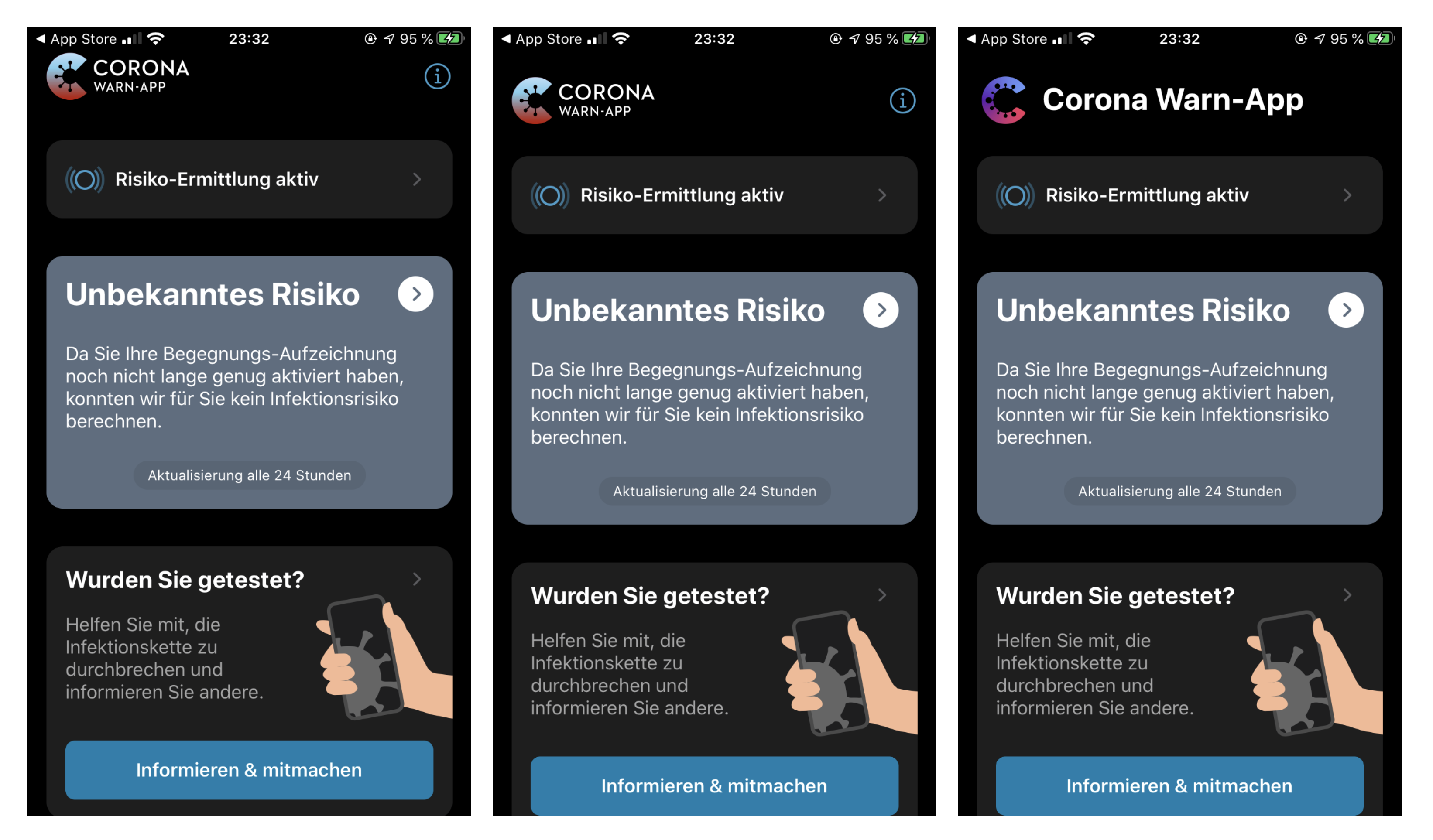
The little CWA logo in the header of the iPhone app
Suggested Enhancement
The logo in the header is so close to the top and when you scroll it has no room in the header. Make it a bit smaller and it looks much cleaner.
Expected Benefits
Internal Tracking ID: EXPOSUREAPP-2117
 dwd0tcom
👍2
All 3 comments
Good idea. Here some examples:
- Screenshot of current app home screen
- How it could look like with a little more spacing.
- Or how about some icon design adjustments?
 moritzebeling
on 29 Jun 2020
moritzebeling
on 29 Jun 2020
👍2
A redesign is not really possible at the moment. They have a OOH–campaign running for the app. But the middle one seems to be cool!
dwd0tcom
on 29 Jun 2020
👍1
NOTE: This UI enhancement is only needed on non-notch devices (iPhone 7, 8, SE2, ...).
 tens0rfl0w
on 8 Jul 2020
tens0rfl0w
on 8 Jul 2020
👍1
Was this page helpful?
0 / 5 - 0 ratings
Related issues
 Mehaara
·
3Comments
Mehaara
·
3Comments
 durator
·
3Comments
durator
·
3Comments
 makr3
·
3Comments
makr3
·
3Comments
 Lurkars
·
3Comments
Lurkars
·
3Comments
 tibor
·
3Comments
tibor
·
3Comments
Most helpful comment
Good idea. Here some examples: