Cwa-documentation: Colors for risk status are hard to see for people with color blindness
Current Implementation
Currently when the user opens the overview page and scrolls to the paragraph that lists the possible risk status every status has a colored cirle beside them. The colors are red, green and gray. This can be hard for color blinded people to differenciate. One member in my family pointed out that he has a hard time to differenciate between the gray and green color.
Suggested Enhancement
I can think about two ways to tackle this issue:
- The circles can be converted to different shapes to present diffrent risk statues.
- They can be a settings that when turned on changes the colors to more friendly colors for color blinded people
Expected Benefits
The app should be usable for a large number of people. Making the app more open for people with a color blindness could help with that. Approximately 9% of mens and 0.8% woman have a kind of red-green color blindness.
 Gregyyy
All 10 comments
This issue is related to both https://github.com/corona-warn-app/cwa-documentation/issues/170 and https://github.com/corona-warn-app/cwa-documentation/issues/191. The latter one's discussion also touched upon icons for different stati.
 ironjan
on 15 Jun 2020
ironjan
on 15 Jun 2020
in my humble professional position: An app that is not well usable by close to 10% of the population is buggy. design for color blind people is not an enhancement, but a bug.
 ilippert
on 15 Jun 2020
ilippert
on 15 Jun 2020
in my humble professional position: An app that is not well usable by close to 10% of the population is buggy. design for color blind people is not an enhancement, but a bug.
Not to mention that this is not just any app but an app that is supposed to be a tool to help contain one of the worst pandemics in recent human history.
 h1-yena
on 16 Jun 2020
h1-yena
on 16 Jun 2020
I'll move this to the documentation repository (as it affects both apps) and we'll discuss again with the UX/UI designers. Contrary to corona-warn-app/cwa-documentation#191 the list of available statuses was not topic of an issue before
 tkowark
on 16 Jun 2020
tkowark
on 16 Jun 2020
For reference, this list is being referenced in the issue 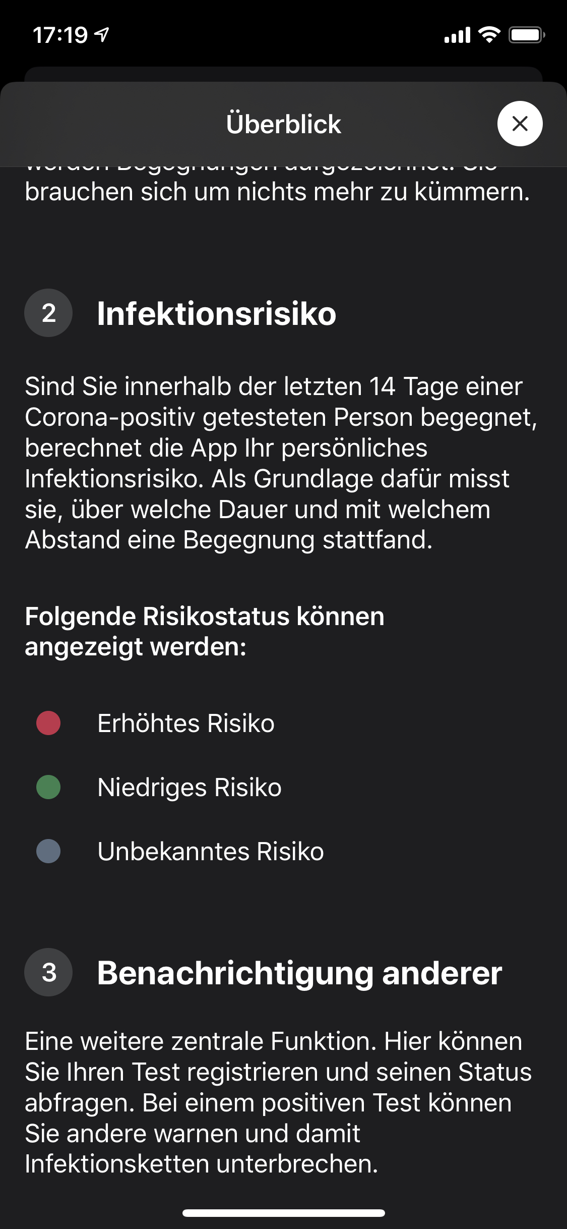
tkowark
on 16 Jun 2020
Dear @tkowark,
this issue was referenced 2-3 weeks ago in my #170.
Marking in your the risk with a semantic color (as documented with your screenshot) is a direct contradiction to the explanation of @SebastianWolf-SAP why the bug was closed. Sorry I don't understand this.
It is also clearly ignoring ISO 9241 (part 8 or 302 and 303).
The Android App is downloaded now 1 mio+ times.
According to the statistics we have about 10% color blind people. So this is now a problem for 100.000 people.
Please face this issue very very soon!
 egandro
on 16 Jun 2020
egandro
on 16 Jun 2020
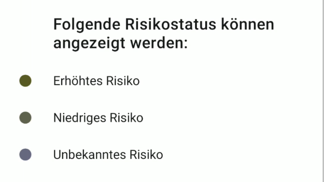
To visualize this, one can emulate these impairments on android:
Colorblindness:
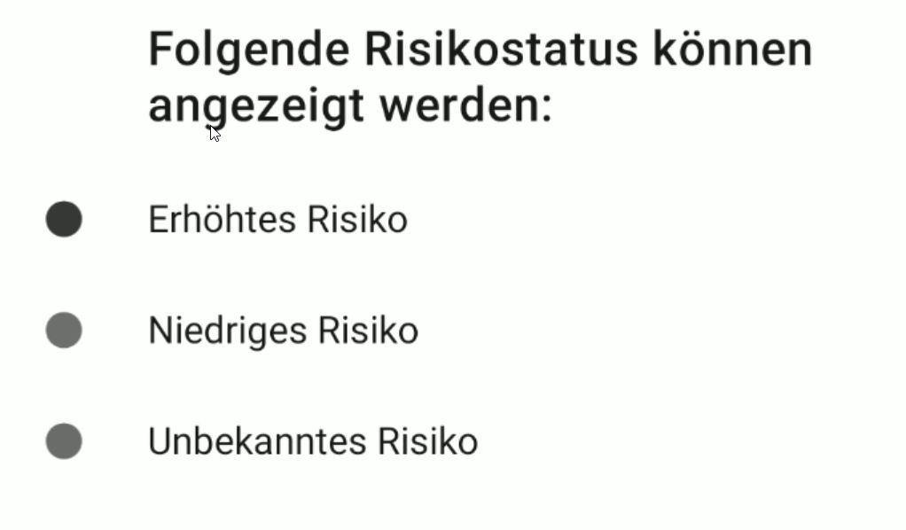
Deuteranomaly (red-green-blindness):
 pheinz95
on 16 Jun 2020
pheinz95
on 16 Jun 2020
To clarify: This issue is just regarding the list in the image where colored bullets and text is standing side by side. For the main screen, we still refer to the answers provided by @SebastianWolf-SAP in the other issue.
tkowark
on 16 Jun 2020
I'm sure you have this covered but:
https://webaim.org/articles/contrast/
- Don't rely on colour alone
- Ensure colour contrast conforms to ratios indicated by the Web Content Accessibility Guidelines
Decent colour contrast analyser:
https://developer.paciellogroup.com/resources/contrastanalyser/
Nice work getting this out btw.
 mnapthine
on 18 Jun 2020
mnapthine
on 18 Jun 2020
Dear @Gregyyy, dear contributors,
we've consulted again with our UX specialists and the answers are still more or less the same as outlined in #170:
- The primary information explained in the glossary is about the possible risk states, the color mapping is of a secondary nature since the text (titles) serve as the primary identification of the risk status
- This is consistent with the paradigm already used on the risk status cards and detail UIs (text serving as the primary status identification, color & icons are secondary)
I'm sorry that we need to close this issue here as well.
Mit freundlichen Grüßen/Best regards,
SW
Corona Warn-App Open Source Team
 SebastianWolf-SAP
on 19 Jun 2020
SebastianWolf-SAP
on 19 Jun 2020
Related issues
 pdehaye
·
3Comments
pdehaye
·
3Comments
 kheinz57
·
3Comments
kheinz57
·
3Comments
 kbobrowski
·
3Comments
kbobrowski
·
3Comments
 marcopashkov
·
3Comments
marcopashkov
·
3Comments
 cougarten
·
3Comments
cougarten
·
3Comments
Most helpful comment
in my humble professional position: An app that is not well usable by close to 10% of the population is buggy. design for color blind people is not an enhancement, but a bug.