Application Version
Platform
Printer
Steps to Reproduce
Actual Results
Expected results
Additional Information
 tlhintoq
All 7 comments
Hey @tlhintoq , what do you mean 'setting floater'?
Can you provide more information please?
 Ellecross
on 27 Dec 2018
Ellecross
on 27 Dec 2018
Hi @Ellecross
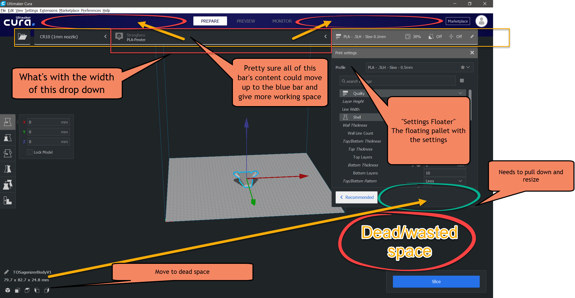
Here is a screen shot with the Settings pallet labeled. The pallet with all the settings is a fixed size. It should be re-sizable so it can show more settings when displayed on a normal/high resolution monitor.
Along with all the other dead/wasted space that could be tightened up to make more room for working space.
tlhintoq
on 27 Dec 2018
Hey! Ahhhh! Now I know what you mean. ;) Thanks for making that clear... and for that image!
Yeah, we get a lot of feedback about the new UI design - which is good because we know what to keep and what to change and how to improve stuff.
We are now working on the resizing of the settings panel. Taadaaahhh https://github.com/Ultimaker/Cura/pull/5058. This should make the bar resizable.
The rest of the feedback during beta (or even after) - such as the dead space around the UI and better placement of some elements - we gather them from around GH, FB and reddit and discuss what we can do to improve them. :> wheee
Ellecross
on 27 Dec 2018
The main issue in this thread is fixed: It's now resizeable, so the dead/wasted space below the settings is now gone. It will also remember your last used size and whether the panel was open or not, after you close Cura.
The width of the configuration drop-down was done to push the settings panel to the side so that it wouldn't get in front of the 3D scene if you have a large screen. In the future, we're hopefully going to make the settings panel draggable so that it wouldn't be necessary any more. We'll see what we can come up with...
I agree with the wasted space in the blue top bar but there's some room now for more stages there in the future, so I suppose that's good. I don't think it would look nice to move some stuff from the main menu bar into the blue bar, but there has to be something we could do with that space. In early designs we had a texture there that would make it feel less empty.
 Ghostkeeper
on 3 Jan 2019
Ghostkeeper
on 3 Jan 2019
That's great news @Ghostkeeper. Resizability and remembering state between sessions is a big improvement and the kind of UI expectations most people have in 2019.
Dragable/dockable panels would be AWESOME especially when so many people have multiple monitors. It would be great to put all the pallets on the second monitor leaving the 3d Model ("build plate") view completely unobstructed and full screen.
tlhintoq
on 3 Jan 2019
Yeah, but we're not going to be able to implement that for 4.0. Maybe in a later release though. It's not going to be trivial, especially if we also want it to be able to detach from the main window.
Ghostkeeper
on 3 Jan 2019
In the mean time, I'm working on a plugin that changes the new GUI in Cura to be more settings-centric by adding back the concept of a sidebar. If you can't get used to the floating panels in the new GUI, there will soon be a plugin for you.

 fieldOfView
on 3 Jan 2019
fieldOfView
on 3 Jan 2019
Related issues
 muhammadelmogy
·
3Comments
muhammadelmogy
·
3Comments
 StanislavJochman
·
3Comments
StanislavJochman
·
3Comments
 tomoinn
·
3Comments
tomoinn
·
3Comments
 DmitryBychkov
·
3Comments
DmitryBychkov
·
3Comments
 probonopd
·
3Comments
probonopd
·
3Comments
Most helpful comment
In the mean time, I'm working on a plugin that changes the new GUI in Cura to be more settings-centric by adding back the concept of a sidebar. If you can't get used to the floating panels in the new GUI, there will soon be a plugin for you.