For the Cura 3.0 UI, it seems to UX team have focused on recommended mode and fairly large screens. Many users use Cura on smaller screens though, and with many more settings visible than the defaults. This means (vertical) screen real-estate is at a premium.
I have started a branch focusing on compactness, with some fairly simple changes:
https://github.com/Ultimaker/Cura/compare/master...fieldOfView:feature_compactness
I'm not yet making this a PR, because (1) I know some of the changes will be controversial and (2) I would like some discussion about all this.
Current feature_compactness vs master:

 fieldOfView
All 12 comments
How would this look for dual extrusion machines?
 nallath
on 25 Oct 2017
nallath
on 25 Oct 2017
I have not touched the (somewhat obese) extruder buttons yet.
fieldOfView
on 25 Oct 2017
As long as we don't get variant or material names that are longer than fit in the dropdown boxes this layout change makes a lot of sense to me. On my 13 inch screen it's really annoying to have to scroll all the time.
 ChrisTerBeke
on 26 Oct 2017
ChrisTerBeke
on 26 Oct 2017
I'm going to have to come up with a better solution for this:
https://github.com/Ultimaker/Cura/issues/2662#issuecomment-339598581
fieldOfView
on 26 Oct 2017
This was the first "issue" I noticed with Cura 3. I use it more often on my laptop, which is not full hd (a big chunk of the laptops are still not full hd), and the sidebar layout does not make any sense to me - I can see only 8-9 settings at a time, and have to scroll a lot. The settings search function is of no use, because it works slow and updates the list slow - even on a fast PC.
The "Check material compatibility" link should not be on the main screen at all. It's not something you will use all the tame (will you EVER use it actually?), and it takes a lot of vertical screen space.
The extruder switching buttons also don't make sense - they should function (and look) more like "tabs", than buttons - because it's what they are - tabs, with each "tab" containing the settings for the selected extruder. Just like in the 2.x version. And of course, use less space.
The view mode dopdown location is also poorly chosen, and looks inconsistent with the other "tool buttons" on the screen. The top-right location makes the color legend get "in the way" in a more annoying way.
I'm not saying this because I am "used to" the old layout. It just made more sense from UI / usability point of view, and definitely looked cleaner & more thought of. You had all the "tools" in the left sidebar, and the "settings" in the right sidebar - a traditional "UI paradigm".
 lokster
on 29 Oct 2017
lokster
on 29 Oct 2017
I'm liking that new design, but would like to hear @mennoberg's opinion as well.
As long as we don't get variant or material names that are longer than fit in the dropdown boxes this layout change makes a lot of sense to me.
We're explicitly shortening the default material names a lot. Not specifically for the Cura layout but also how it's presented on the website and such. We even got PP (tee-hee) instead of Polypropylene eventually. People will make custom material names but I don't think that is a big problem.
The "Check material compatibility" link should not be on the main screen at all. It's not something you will use all the tame (will you EVER use it actually?), and it takes a lot of vertical screen space.
This is a battle that was fought and lost. I think Cura should have a listing of which materials a material is compatible with and simply display warnings when incompatible materials are used, but that didn't make it in.
The extruder switching buttons also don't make sense - they should function (and look) more like "tabs", than buttons - because it's what they are - tabs, with each "tab" containing the settings for the selected extruder. Just like in the 2.x version. And of course, use less space.
They used to be tabs, but this was done for a more... unified look I think? Also because the dark theme was supposed to be leading and the tabs didn't work as well in the dark theme. We want to do away with the tabs entirely at some point, and somehow show all extruders at the same time but we haven't fleshed that out yet.
The view mode dopdown location is also poorly chosen, and looks inconsistent with the other "tool buttons" on the screen. The top-right location makes the color legend get "in the way" in a more annoying way.
This position used to be a bit better when we still had a solid black top bar there (the bar of the printer selection drop-down was extended over the entire top side). It was moved there because the layer view panel blocked a lot of the view on small screens. I think on the left side makes more sense for the work flow. Let's not change that now though.
 Ghostkeeper
on 7 Nov 2017
Ghostkeeper
on 7 Nov 2017
It might also help if one could toggle between a single column (as it is now) and several columns (as many as fit on the screeen). This might even completely eliminate the need to scroll. But the toggling should be a quick action, so a shortkey. Ctrl-Tab would be an obvious choice and doesn't seem to be in use yet.
 DDDirk
on 7 Nov 2017
DDDirk
on 7 Nov 2017
Multi-column setting-view has been considered before, but is fairly tricky to implement in combination with the collapsing sections.
fieldOfView
on 8 Nov 2017
In general, love it!
The short naming convention is a bit limiting, but not a deal breaker.
The compatibility link in Simple mode could be tricky. Novices may get a feeling something is wrong - why would the system tell the to check material compatibility if they are not trying to print anything exotic?
Then again, I was never a fan of the compatibility link. I think giving a warning in case there's an issue should be way enough - as Ghostkeeper mentions. A simple link confuses the UI with a help file.
 filipgoc
on 17 Dec 2017
filipgoc
on 17 Dec 2017
Based on work by @whiteglint on the forum, I have now created a theme that is (fairly) easy to add to your current install, and should survive future installations of Cura (unless you remove your configuration folder). See https://community.ultimaker.com/topic/21502-optimize-cura-for-smaller-screens/?tab=comments#comment-200295
The theme is slightly too compact in places for my liking, but I am sure it will be appreciated by some reaching this issue through a search.
- Go to https://gist.github.com/fieldOfView/6313ca39f5e3a57b35a676fc5fd2ef63 and use the "raw" button to download the theme.json file
- Launch Cura and go to Help -> Show configuration folder
- Navigate to the folder named "themes" and create a new folder inside that folder named "compact-sidebar" (or similar)
- Place the downloaded theme.json file inside that new folder
- Restart Cura and open the preferences; there should now be a theme named "Compact sidebar"
- Select "Compact sidebar" and restart Cura one last time
fieldOfView
on 14 Feb 2018
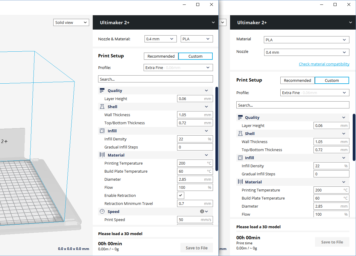
I have created a plugin that replaces the Prepare sidebar with a more compact version:
https://github.com/fieldOfView/PrepareStageCompactor

(master on the left, with plugin on the right)
Until the plugin is made available in the plugin browser, I have made a curaplugin package here:
http://files.fieldofview.com/temp/PrepareStageCompactor.curaplugin
The plugin is an option for people that want/need a more compact sidebar, so this issue can be closed.
fieldOfView
on 16 Feb 2018
The plug-in didn't change anything in my side bar :(
Ghostkeeper
on 8 Mar 2018
Related issues
 mnswamp1
·
3Comments
mnswamp1
·
3Comments
 probonopd
·
3Comments
probonopd
·
3Comments
 tomoinn
·
3Comments
tomoinn
·
3Comments
 Liger0
·
3Comments
Liger0
·
3Comments
 mubarak111nsu
·
3Comments
mubarak111nsu
·
3Comments
Most helpful comment
I have created a plugin that replaces the Prepare sidebar with a more compact version:
https://github.com/fieldOfView/PrepareStageCompactor
(master on the left, with plugin on the right)
Until the plugin is made available in the plugin browser, I have made a curaplugin package here:
http://files.fieldofview.com/temp/PrepareStageCompactor.curaplugin
The plugin is an option for people that want/need a more compact sidebar, so this issue can be closed.