Csswg-drafts: [css-inline-3] Alternative initial-letter-align based on glyph bounds
Kindle has had a version of initial-letter implemented for several years, but the default alignment follows a behavior which doesn't seem possible with the initial-letter spec. Instead of using font-wide metrics for alignment, it measures the specific glyph bounds of the text under initial-letter. It then can align the lowest point of the glyph with the baseline of the body text.
The behavior can be viewed in our KindleCreate app (image below):
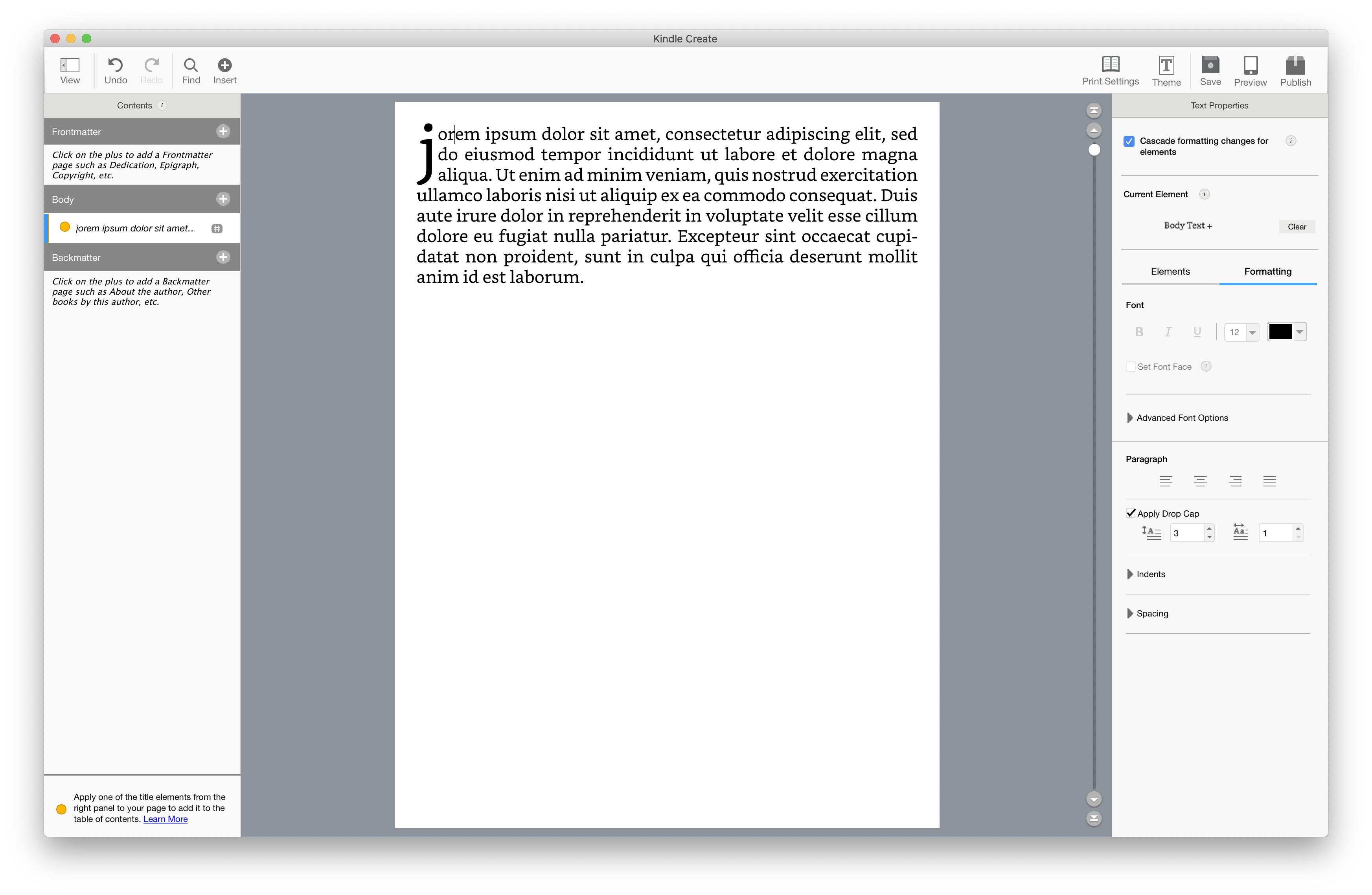
You can see the initial-letter (or drop cap as it's called here) actually takes up the 3 lines that are specified by the author. While a similar implementation in Safari would take up 4 since the descender knocks out an extra line.

I'm working on asking some of publisher contacts what the expected behavior would be when characters with descenders are used with initial-letter, but in the meantime wanted to get a feel for other people's thoughts here.
 stantonma
All 6 comments
If you had another paragraph under that one with the same settings and an 'i' as the initial letter, would the glyph of the 'i' appear larger? The design we arrived at tries to ensure that the size of the initial letter does not change depending on the presence or absence of a descender.
 astearns
on 16 Jun 2020
astearns
on 16 Jun 2020
Yes, the glyphs appear larger/smaller based on the character chosen.
stantonma
on 17 Jun 2020
Yeah, one of our foundational rules in typesetting is visual consistency. The line-height should not change from page to page, even to fix widows or orphans. If I create a dropcap, its point size should not change depending which letter it happens to be. The whole idea of initial letters is aligning to the cap height and baseline, not taking up a certain number of lines of space.
This is also unlikely to be a large problem in implementations using Latin scripts, as initial letters are usually capitals, and capitals seldom have descenders.
 dauwhe
on 18 Jun 2020
dauwhe
on 18 Jun 2020
The whole idea of initial letters is aligning to the cap height and baseline, not taking up a certain number of lines of space.
But couldn't there be a case where the designer wants a consistent numbers of lines? Are we ignoring that use case?
This is also unlikely to be a large problem in implementations using Latin scripts, as initial letters are usually capitals, and capitals seldom have descenders.
Agree, though "Q" seems to be the exception in the many fonts.
stantonma
on 22 Jun 2020
But couldn't there be a case where the designer wants a consistent numbers of lines? Are we ignoring that use case?
I don't believe I've found examples in the wild like that, but I'd be quite interested in seeing them! The examples we've found in books about typography, in tools like InDesign, and in books and magazines around the world all seem to suggest that the cap height/baseline alignment is what is desired.
dauwhe
on 22 Jun 2020
@stantonma Thinking to close this issue no-change based on @dauwhe’s arguments. Do you disagree?
 fantasai
on 13 Aug 2020
fantasai
on 13 Aug 2020
Related issues
 schenney-chromium
·
3Comments
schenney-chromium
·
3Comments
 castastrophe
·
3Comments
castastrophe
·
3Comments
 SelenIT
·
3Comments
SelenIT
·
3Comments
 svgeesus
·
3Comments
svgeesus
·
3Comments
 AmeliaBR
·
3Comments
AmeliaBR
·
3Comments
Most helpful comment
If you had another paragraph under that one with the same settings and an 'i' as the initial letter, would the glyph of the 'i' appear larger? The design we arrived at tries to ensure that the size of the initial letter does not change depending on the presence or absence of a descender.