Csswg-drafts: Allow specifying the "accent color" of a form control element
(not sure which spec this might apply to - css-color-adjust? css-color? css-pseudo?)
Form controls often have a themed highlight color that indicates a "selected" state. For example, in Chromium, we recently changed the look and feel to have a blue highlight color:


(Edge on Mac has similar styling to Chrome but does not use blue). This demo enumerates all of the form controls and can be tested on various browsers.
In addition, some operating systems, such as Mac OS X, allow changing the accent color via a user setting. Safari uses this setting to change the blue color in the screenshots above to a different color.
A number of developers have indicated that they would prefer to be able to change the color. See e.g. this issue. I propose a way to do this via CSS:
- A new css property
accent-colorthat would take on the usual color values. We would specify that a user agent should use this color to change the accent color of a UA-rendered form control, if there is such a well-defined concept for that form control; and otherwise this property has no effect. In the various accessibility and forced color modes, this property is ignored.
In general, form control styling and rendering is not specified, but this particular part of it seems like it can be.
 chrishtr
All 66 comments
Is there a reason this can't be done via color alone? Would that currently break the modern OS appearance of the control?
 AmeliaBR
on 9 Jun 2020
AmeliaBR
on 9 Jun 2020
Is there a reason this can't be done via
coloralone? Would that currently break the modern OS appearance of the control?
Two reasons:
- Possibly breaking existing sites
colordoesn't indicate what is being colored. For example, there are non-background strokes like borders or the fill color of a progress input, doescolorchange those?
chrishtr
on 9 Jun 2020
Accent color isn't indicating what's being colored, either. I'd say if there isn't a compat restriction, @AmeliaBR's suggestion to re-use color here makes a fair amount of sense unless there's a need to indicate two different colors as input.
FWIW, the CSS UI spec used to say
If 'appearance' is not 'normal', the UA must render the element as if it was the specified user interface (UI) control from the platform. The UA should use the computed values of the 'background-', 'border-', 'padding-', 'outline-', and 'text-decoration' properties when they do not have their initial values and the computed values of 'color', 'font', and 'cursor' (whatever their values) to influence the rendering where possible. Any values from those properties that cannot be used to influence the rendering of the UI control must not affect the rendering at all. For example, the UA should not draw a second border around a UI control that already has a border. If 'background-color' or 'background-image' have non-initial values and the UA is using their values for influencing the rendering of the UI control, then the UA must ensure that the 'color' property is also used to influence the rendering.
That seems to have gotten lost along the way... //CC @tantek
 fantasai
on 9 Jun 2020
fantasai
on 9 Jun 2020
Accent color isn't indicating what's being colored, either.
I think it is. It's more specific than color. Also, this is the terminology used in the settings app on Mac OS.
That seems to have gotten lost along the way... //CC @tantek
I see. We need to find out which commit removed it.
chrishtr
on 10 Jun 2020
Is there a reason this can't be done via
coloralone? Would that currently break the modern OS appearance of the control?
I think the biggest downside to re-using color in this way is that it is non-specific. It would not allow you to, for example, change the text color to one thing, and the "accent" features to something else. Take, for example, the date picker:
<input type=date style="color: red">
which has a text display of the date, and (on some platforms) a picker icon or arrow. If we tie everything to color, the above <input> would have both red text and a red icon. In contrast, accent-color would be specific to just the "accents", allowing black text with a red picker icon, for example:
<input type=date style="color: black; accent-color: red;">
This would also be compatible with the existing Mac concept of an "Accent color", which affects control elements but not text colors. It would also be safe for web compat, since accent-color is a new CSS property.
 mfreed7
on 20 Jun 2020
mfreed7
on 20 Jun 2020
I agree that tying this to color doesn't seem right.
A few questions that come to mind that I haven't given much thought to yet:
- On macOS, the system accent color affects how focus rings are rendered. Should
accent-colorbe allowed to influence focus styling? - Is there any relation to
<meta name="theme-color">? - Existing form control designs may be amenable to some accent colors but not others. For example, the Chrome checkbox design wouldn't work with
accent-color: whiteunless the checkmark color changes in response. Is this anything to worry about, or is it sufficient to have some wording that encourages engines to ensure their designs can adapt to all choices ofaccent-color? - Do we need to think about how a future form control styling mechanism would interact with
accent-color? What about Web components that implement form controls, and which want to adapt their styling to the accent color?
 heycam
on 1 Jul 2020
heycam
on 1 Jul 2020
An alternative would be to use pseudo elements to target the classic color property to specific parts of the form control. Naturally, this is not as generic as an accent color, but at the same time allows for detailed control of the color for individual parts.
This is not a mutually exclusive alternative, but interaction between the two would need to be clarified.
 henke37
on 1 Jul 2020
henke37
on 1 Jul 2020
- On macOS, the system accent color affects how focus rings are rendered. Should
accent-colorbe allowed to influence focus styling?
Focus rings can already be styled with CSS like :focus { outline: 5px solid orange }.
- Is there any relation to
<meta name="theme-color">?
For some sites, yes, but I can also see them also wanting to choose a different color.
- Existing form control designs may be amenable to some accent colors but not others. For example, the Chrome checkbox design wouldn't work with
accent-color: whiteunless the checkmark color changes in response. Is this anything to worry about, or is it sufficient to have some wording that encourages engines to ensure their designs can adapt to all choices ofaccent-color?
I think we should add the language you suggested.
- Do we need to think about how a future form control styling mechanism would interact with
accent-color? What about Web components that implement form controls, and which want to adapt their styling to the accent color?
We could perhaps define a pseudo element on custom form controls that accent-color automatically applies to? That's kind of what the accent-color I am proposing conceptually does.
chrishtr
on 1 Jul 2020
"A" pseudo element. As in One. That has one name, suitable for any form control? X to doubt. If form controls get pseudo elements, there should be as many as that form element needs. Not some generic one size fits all one.
One pseudo class that applies to the correct pseudo elements could work tho.
henke37
on 1 Jul 2020
What's the intended scope of accent-color? Is it just color of the checked state of radio buttons and checkboxes? If so, then the name seems inappropriately broad. If it's more things than that, then that may shed light on the name, and whether it should all be one property.
 othermaciej
on 1 Jul 2020
othermaciej
on 1 Jul 2020
Is it just color of the checked state of radio buttons and checkboxes?
Yes, something like that (or similar accents in other form elements).
chrishtr
on 1 Jul 2020
"Something like that" and "or similar accents" are not phrases that belong in a standard. We need a clear definition of what "accent" means here, not vague hand waving.
henke37
on 1 Jul 2020
How does this idea fit into the work of the Open UI project? @gregwhitworth ?
 jensimmons
on 1 Jul 2020
jensimmons
on 1 Jul 2020
Windows also has the concept of an accent color on Windows 10. I'd recommend that this be a system color so that it can be leveraged in numerous places. As @chrishtr noted it's used in focus, but also can be used in the glyphs or other areas for form controls. I haven't looked at other use cases for this but the fact that Windows changes the title bars and other backgrounds to the accent color makes me think that it may be something that is allowed to be broad while allowing UAs to leverage it in our stylesheets for the specific scenario denoted by @chrishtr.
TLDR; I propose accent-color to be added to the CSS System Colors as a keyword
How does this idea fit into the work of the Open UI project? @gregwhitworth ?
While this was discovered due to form controls it doesn't have to do with defining behavior, anatomy, states and interactions between states so I think staying in the CSSWG makes the most sense. Shoutout to @heycam for pinging the Open UI discourse channel though :)
and thanks @jensimmons for thinking of us :)
 gregwhitworth
on 1 Jul 2020
gregwhitworth
on 1 Jul 2020
@gregwhitworth I think the proposal here is to provide a way to _set_ the accent color for a particular form control, not to _use_ the system accent color (that may also separately be useful, but it also creates fingerprinting surface, which this proposal does not).
othermaciej
on 1 Jul 2020
What's the intended scope of
accent-color? Is it just color of the checked state of radio buttons and checkboxes? If so, then the name seems inappropriately broad. If it's more things than that, then that may shed light on the name, and whether it should all be one property.
Ideally, the accent-color property can be specified to apply to all form controls, as appropriate. The appearance and styling of form controls is (deliberately) not well-specified, so it might be tough to avoid somewhat vague language here. However, I think the concept is reasonable. For example, in Safari, the system Accent Color setting affects:
- The "background" color for
<input type=checkbox> - The "background" color for
<input type=radio> - The activation "button" for
<select> - The activation "button" for
<input type=text list=datalist> - The highlighted row of
<select multiple> - The active state of
<button>
All of the above seem to make sense as a usage of the accent-color. In Chrome, I could also see adding to the above list:
- The shaded portion of the
<range>control - The clear ('X') button on several controls such as
<input type=search>
Again, the idea is to control the currently-uncontrollable colors of form elements just a bit better. Our hope is that the more broad Open UI type improvements in stylability will give even better control over all pieces of these controls. But in the meantime, this accent-color proposal will alleviate many very real, very painful developer problems with the existing control styling.
mfreed7
on 1 Jul 2020
The highlighted row of
<select multiple>
On macOS Safari, this is rendered using the Highlight Color rather than the Accent Color. (By default the Highlight Color is a lighter or darker version of the Accent Color, but you can set it to a completely different color.)
heycam
on 2 Jul 2020
"Something like that" and "or similar accents" are not phrases that belong in a standard. We need a clear definition of what "accent" means here, not vague hand waving.
Yes, I'm aware of that. No need to talk down.
However, each user agent has their own default form control styling, so the specification of this property will need to be higher level than specific DOM elements.
chrishtr
on 2 Jul 2020
However, each user agent has their own default form control styling, so the specification of this property will need to be higher level than specific DOM elements.
Going over how this might apply to rendering of a wider range of controls as in this comment might help us understand if all of this coming through one property makes sense. For example, Cameron noticed the highlight color vs accent color issue.
It might help to be even more exhaustive in considering the full range of form controls. For example, one thing to consider is the <input type=number> stepper button.
There are also colored pieces of form controls that do not normally follow the OS accent color. We probably want to avoid including those. Rationale: since accent color is likely to be desirable set across a whole site, that is the common use of similar functionality in apps. So it would be tempting to set it as a rule on *, but we wouldn't want unexpected parts of a form control to recolor.
othermaciej
on 2 Jul 2020
@othermaciej ahhh my bad - completely mis-read the issue :/ I'll avoid the fingerprinting discussion given this is about a different proposal altogether.
There are also colored pieces of form controls that do not normally follow the OS accent color. We probably want to avoid including those. Rationale: since accent color is likely to be desirable set across a whole site, that is the common use of similar functionality in apps. So it would be tempting to set it as a rule on *, but we wouldn't want unexpected parts of a form control to recolor.
LOL, I was just writing something similar. I agree that we should scope this in if it's solely focusing on form controls. Also, regarding the stepper buttons on number I think it's fine to still allow them on any replaced form control as in the future a UA may use the accent-color on the steppers or some other part that isn't currently exposed. Outside of that, if this is a common enough pain point now to add this to the platform then I am fine with this proposal as long as we scope and name it accordingly. How about form-control-accent-color?
gregwhitworth
on 2 Jul 2020
The CSS Working Group just discussed Allow specifying the "accent color" of a form control element.
The full IRC log of that discussion
<dael> TOpic: Allow specifying the "accent color" of a form control element
<dael> github: https://github.com/w3c/csswg-drafts/issues/5187
<dael> chrishtr: Form controls are styled and painted in UA specific way in all browsers
<dael> chrishtr: There tends to be a concept of an accent color used to indiacte checked or marked state of form controls.
<dael> chrishtr: UAs pick a default color for that that's consistent in page. There are also OS settings on some OSs to change accepnt color which is respected by some browsers.
<dael> chrishtr: COlor might conflict with brand of site, like site with orange theme but checkboxes are blue
<dael> chrishtr: Proposal is to ahve css property which says form controls should use this color as basis of accent color when painting form control
<dael> Rossen_: Opinions on this?
<tantek> the other big use-case is for sites that want to make "darker" versions of form controls that match their site styling, similar to scrollbar colors
<hober> q?
<dael> fantasai: Main concern is it's not clear what accent color is used for. B/c that it's nto clear what's expected contrast between that, text, and background.
<tantek> +1 agree with fantasai, needs to be predictably specified so it makes sense across OSs and devices
<dael> fantasai: Concern people will choose colors that are good on some OS but won't contrast with background enough in other rows. For example a select multiple it needs to contrast with text. But on a selected checkmark it's background
<dael> fantasai: Understand what you're trying to do but concerned we won't get something robust across browsers
<tantek> needs to be sufficiently predictable across browsers
<dael> florian: Can we split into foreground and background or does that not generalize well
<dael> myles: We had internal discussion and general feeling is good for web in general. Not sure mech to expose. We have a general idea good to style lots of form control aspects. Good to do in general not just one piece. In general feel this has value for web.
<tantek> +1 myles that's a good summary
<fantasai> tantek, that use case is handled by the 'color-scheme' property fwiw
<fantasai> tantek, https://www.w3.org/TR/css-color-adjust-1/#preferred
<dael> chrishtr: Re: general styling point. Agree that there are other things devs wish to style and hopefully can. This one seems to be simple and common and immediately solves a specific conern. THat's why I think do it as a one-off for the moment and general in future
<Rossen_> q?
<jensimmons> q+
<tantek> fantasai, not talking about not dark mode. hence I said darker deliberately
<hober> q?
<dael> florian: General will take time. Seems most of time accent color is related to backgrou,d but not always. If it's background or foreground matters. Having the pair would be a step which could make sense. There can be many aspects of form control we can do later. Knowing if your'e in foreground or background matters.
<dael> heycam: Ignoring select multiple issue which might nto be accent color all other colros are contrasting separately. For checkbox and radio you'd got icon inside which authors can't control. I think for most cases where accent color can be changed any contrasting color can be painted by UA.
<dael> jensimmons: Has anyone working on open UI on the call? I know a lot of work has gone into form controls and what it means to style them
<dael> myles: On iOS there's no concept of the accent colors. Whatever is in spec needs affordences for OS where it doesn't apply
<Rossen_> q?
<Rossen_> ack jensimmons
<dael> florian: If we look at range of historical OS to get diversity the buttons were a shade of blue. If that was still the fashion accent color wold be there and it's very background-y
<florian> https://66.media.tumblr.com/e0c02215356306ee52298451ac25685e/tumblr_o5a0h4UIDN1v0jfsto2_1280.png
<florian> http://pcdesktops.emuunlim.com/pictures/skins/wb/macosx-aqua-bjb.gif
<dael> chirsh: Answering jensimmons, I'm working with gregwhitworth and others on longer term project for form controls. I don't know if enought o discuss here. In general I think compat. I don't think enough to say about OpenUI to clarify
<dael> Rossen_: Is there a resolution you're looking for?
<dael> chrishtr: I'm hoping to get to agreement on name and set of text what's it's supposed to be for UA and says UA should make sure sufficent contrast and only where it makes sense
<dael> fantasai: Fine to try and draft language. Requires more release to make so it works on a variety of OSs. I'm a little skeptical this will work but understand we want it. I'm concerned about having it work for all OSs.
<dael> fantasai: If we can show that would be the case across current and past OSs and there's a reasonable interpretation for all the OS/browser combos I would feel more comfortable moving forward
<jensimmons> +1 to what fantasai said
<dael> chrishtr: Hearing general support but need mroe research to understand compat as well as foreground/background comments
<dael> fantasai: I think we should do that evaluation in GH. Might be right design, but might be diversity of form controls requires something different.
<tantek> we're also looking preliminarily at a more longer term project for form controls as well, if existing work is happening in the open, please share that in CSSWG! Thanks!
<dael> chrishtr: We'll come back with more concrete proposal
<dael> florian: What I'd liekt os ee in research is wide variety of form control and show form controls is always background or neither. If it's in foreground sometimes we need to split it up.
 css-meeting-bot
on 2 Jul 2020
css-meeting-bot
on 2 Jul 2020
Per the action items from the CSSWG meeting, I have worked through these two action items:
- Study/enumerate the various places where accent-color might apply, across form elements, platforms, and browsers.
- Propose spec text for the ‘accent-color’ property.
Additionally, I gave some thought to the foreground/background color issue brought up by @frivoal.
I've collected the results in this shared doc:
https://docs.google.com/document/d/1yHQUshdC3hKrDRG-xDtUPYVIcc_JNUglK0KMVoqRyCo
I disabled comments on the doc, but I would love to hear feedback, so please add your comments back here in this issue thread.
mfreed7
on 11 Jul 2020
https://docs.google.com/document/d/1yHQUshdC3hKrDRG-xDtUPYVIcc_JNUglK0KMVoqRyCo
a clarification question for @mfreed7: Is there an assumption that there would be granularity options to apply the colors from all UA-chosen form controls to a single element chosen by the developer? Or would the granularity need to be just all UA-chosen controls?
 hwikyounglee
on 16 Jul 2020
hwikyounglee
on 16 Jul 2020
a clarification question for @mfreed7: Is there an assumption that there would be granularity options to apply the colors from all UA-chosen form controls to a single element chosen by the developer? Or would the granularity need to be just all UA-chosen controls?
Thanks for the question. This is a proposed new CSS property, which can be applied with full CSS granularity, down to individual elements. So:
input[type=text].group1 {
  accent-color-foreground: blue;
}
#myelement {
  accent-color-background: red;
}
Agenda+ to discuss a resolution regarding the general shape of the spec approach Mason listed in his doc.
chrishtr
on 21 Jul 2020
Regarding separate accent foreground and background colors, are there existing form control designs where the two colors can be independently chosen? Or is it just that the accent foreground color is chosen automatically based on the background? For example, on macOS you can select the accent background color from a specified set of colors, but the foreground color is chosen automatically (it's white, unless the highlight color is "Graphite" then it's black). I'm not convinced we really need the two separate properties, as opposed to having requirements that, if they do honor accent-color, implementations must do so in a way that does not cause contrast issues.
heycam
on 22 Jul 2020
Thinking about how that would apply to some of the examples listed in the document where current implementations don't use the accent color, but which a future design might like to: in Chrome, the activation widgets in some input elements are shown as a black icon on top of whatever background color the element has. If an updated form control design were to take accent-color into account, then I could imagine the design being
- render a background color behind the icon, in the accent-color, and then automatically choosing black or white for the icon itself
- render a black or white background color behind the icon, and using accent-color for the icon itself
or something like that. Of course there's a whole range of designs you could come up with, but I'm not certain that the accent being composed of two (hopefully contrasting!) author specified colors is necessary.
heycam
on 22 Jul 2020
I went ahead and glanced at component libs across the web as well and here are the results.
Every single one that I can find allows some type of complete theme change. This is somewhat similar to prefers-color-scheme in the platform but it allows you to denote specific ones (primary, secondary, danger, etc). There are a few that allow you to pass in specific params or even select a custom color to override the where that color is used in the component (similar to accent color above) but only Material has the color helpers to ensure color contrast. Based on what I've seen from the component libraries and how the themes work you select a single color and the control adjusts accordingly while ensuring contrast. This aligns with what @heycam proposes with regards to specifying it in a way that the UA will do the color math based on the accent color as that is what the author is going to desire.
Now, designers commonly don't desire true black or white and so I can see them wanting to be able to control the foreground color. If it isn't a lot of additional impact on implementation I would like to see both implemented for that reason but also specify the magic for each foreground and background when the other computes to auto.
If
accent-color-foregroundcomputes toautoandaccent-color-backgroundcomputes to a CSS color then the user agent MUST use a color that meets the WCAG minimum contrast requirements of 4:5:1 foraccent-color-foreground
This will achieve what @heycam denotes above while also allowing designers that want to still adhere to the WCAG but possibly in their own way do so.
gregwhitworth
on 22 Jul 2020
The CSS Working Group just discussed Allow specifying the "accent color" of a form control element.
The full IRC log of that discussion
<dael> Topic: Allow specifying the "accent color" of a form control element
<dael> github: https://github.com/w3c/csswg-drafts/issues/5187#issuecomment-656913918
<dael> Mason: Proposal is add ability to spec accent color for form control elements.
<masonfreed_> https://docs.google.com/document/d/1yHQUshdC3hKrDRG-xDtUPYVIcc_JNUglK0KMVoqRyCo/edit#heading=h.p0f1fs5x6ado
<dael> Mason: These are the ones that can't be styled, particularly color. Looked at most form control elements. Put together a study
<dael> masonfreed_: Conclusion I came to is it seems we would need foreground and background color. Many form controls accent have 2 colors. Absent that we would need magic to ensure contrast
<dael> masonfreed_: In many cases it seemed like magic that would get in the way for devs.
<dael> masonfreed_: Motivation for us is Chrome recently changed from gray to blue and that caused a lot of problems for devs that had a theme on their site.
<dael> masonfreed_: Not full styling but this seems to eliminate a lot of problems
<TabAtkins> q+
<astearns> q+
<dael> masonfreed_: I did propose some spec language. accent-color-background and -foreground. It's nec. vauge because impelmentation varies across browsers. Even if impl is different across browsers there's still value in being able to say here is what I would prefer.
<astearns> ack TabAtkins
<dael> TabAtkins: Overall I like the idea. Similar to explorations a few years ago where we suspected we could boil down color choices
<dael> TabAtkins: On studies, checkmarks you have background as background behind glyph. Screenshot has white checkmark and blue background, but I think usual is dark glyph on light background. Might be fine.
<myles> q+
<dael> TabAtkins: More important is range inputs. Color of progress bar and range input sounds like something to put under control of page. But that's not being colors by either you provide. YOu give reasons, particularly for range inputs, but it does worry me that's a missing thing
<dael> TabAtkins: I think it's really the only missing thing
<dael> masonfreed_: On checkbox and radio. It was modern chrome. Impl differ quite a bit and across platforms on same browser. That was a more motivating case for both.
<emilio> q+
<dael> masonfreed_: On range control, it's a general question. this isn't exhastive list. Can't tackle all. Range control has prefixed pseudo-elements. Though controlling turns off default.
<dael> TabAtkins: My concern is if we add these range inputs won't be sufficently styleable. That's my only concern
<dael> masonfreed_: I don't disagree. Perhaps that future improvement
<dael> TabAtkins: I'm happy with this and works for other control. I support pursuing and see if we can solve range
<dael> astearns: I wanted to voice concern that these are vauge in application where UAs decide how to apply them. Understand form controls are impl differently. May not be initially ways of making this interop apply
<jensimmons> q+
<dael> astearns: Do you think that's set in stone or is making these colors available and seeing differences sparking further interop in form controls?
<astearns> ack astearns
<dael> masonfreed_: This isn't a fix for complete interop. It's a good project which is being persued. I see this as currently form controls are not interop at all. Causes many problems. Adding this mandate (since it's not well spec)....currently colors are out of control of authors. It moves us in direction of interop since there is more dev guidance in the impl.
<dael> astearns: Yeah. Wanted to make sure not painting into a corner. This isn't perm bandaid and allows things to heal underneath
<astearns> ack myles
<dael> masonfreed_: Completely agree.
<dael> myles: A few minutes ago they said chrome switch from gray to blue caused problems. Surprising that a browser made a change which caused problems and fix is adding css properties. Some thought to maybe that change to all websites in browser needs work
<dael> masonfreed_: I think this points to a current interop problem. Most of the complaints were around a color change to blue which existed in other browsers, incl chrome on Mac. To me what that means is they weren't testing on other platforms or browsers since it was already blue. Making this exposed would hopefully eliminate interop problems
<astearns> ack dbaron
<dael> dbaron: I do share some of astearns concerns. What I wanted to raise is when TabAtkins went through list of controls, esp range and progress. My understanding of desc is what is nominally foreground and background would we set to same for range. I think this pic shows they're the same blue.
<gregwhitworth> q+
<dael> dbaron: Risky in that one of the things we try and do in css is push that foreground and background should have contrast. We should avoid situation where we want them not to contrast. I'm worried about defining range in a way that fg and bg used but not contrasting
<florian> q+
<dael> masonfreed_: Two comments. In document I call out thumb being fg and filled in as bg. The screenshot there is chrome current impl which has no contrast. THat is very different across browsers. I think it calls out you want 2 colors so dev can choose different or identical. Spec 1 color and an algo to choose contrast precludes dev not wanting contrast
<dael> dbaron: In this case 3 colors on range. Question is which 2 can devs spec with fg and bg
<dael> masonfreed_: Agree. Ambig. That's the TabAtkins point range may need additional work. I don't think try and spec exactly which piece is fg and which bg. Point of study is what do these typically look like in order to have guidance. I don't thinkw e should spec all pieces now
<dael> dbaron: I think if you don't spec whatever first impl does everyone has to copy. I think better to spec and discuss.
<Rossen_> q?
<astearns> +1 to spec where we can rather than leaving ambiguities
<astearns> ack emilio
<dael> masonfreed_: I see point but I point to current form control which have been different for decades. I see point, it is possible. Long term is expand and spec all parts and allow complete style. I go back to this is a bandaid between now and when that's real
<dael> emilio: Point out dbaron point where this cannot be left out to whatever. We will have to copy 1st impl.
<dael> emilio: If I understand this is for native form controls, like appearance:auto. Right?
<dael> masonfreed_: Yes
<fantasai> Would like to note that locking down the exact UI of every form control on every device forever just because authors want to style them pixel perfectly on the devices they care about is not good for users.
<dael> emilio: Browsers don't always have control over those colors. Ex range on linux and mac for FF the control os drawn by the OS so this is not really impl right now. Want to move to a place where we may not have native styling, but right now couldn't impl
<dael> masonfreed_: Take your point. Until recently on Chrome checkboxes on mac not styled. That's more about why this should be guidance for impl
<dael> emilio: But then not useful to authors. What authors could do is say if browser supports I'll use it if not appearance:none. Not sure to what point authors would bother.
<dael> masonfreed_: Valid point.
<astearns> ack jensimmons
<Rossen_> Trying to align styling of form controls is not a new thing... certainly not new in terms of resolving against it, see https://lists.w3.org/Archives/Public/www-style/2019Jul/0002.html
<dael> jensimmons: I want to say thank you for going and doing more research
<dael> jensimmons: I like seeing you figured out we need 2 properties. That's great,t hat's what we need.
<dael> jensimmons: As a front end dev the idea of these properties existing is super appealing. I can just universally or dark-mode/lightmode I can quickly change accent colors.
<dael> jensimmons: I think we believe there needs to be interop on this. I understand desire to do something quickly and not have to do deeper dive. Given reality of how tricky forms are in browsers it's a rats nest.
<dael> jensimmons: One of the things about how modern css is spec we learned the hard way what happens when underspec. form controls re bad b/c they were underspec a while ago. We can't repeat same mistake if we want to get out from under.
<dael> jensimmons: Feels like if these properties went to world without spec as to what part gets colors we wouldn't get same from all browsers and situation could get worse. THis shouldn't try and fix everything and I appiciate desire to do something quicker than openUI project.
<chrishtr> q+
<dael> jensimmons: I think right depth in technical debt is go through each thing and define exactly what is fg and bg. I don't know how to proceed without that. Doesn't have to be worst thing every, but make it clear that checkmark is fg and behind is bg. If browsers aren't same it's not useful
<dael> jensimmons: Whatever browser ships first defines it is what happened with css1 and 2 and then we end up stuck with things we can't ever change.
<dael> astearns: If we do run into scenario where people have to copy 1st impl it goes into spec, jsut too late.
<astearns> ack gregwhitworth
<dael> gregwhitworth: I wanted to say I feel like people are alluding. We left style out of openUI charter b/c we didn't think anyone would want to talk about interop styling. I think people overe there would be happy to say what gets fg and what's bg. We can take masonfreed_ work as an intial stab.
<dael> gregwhitworth: I went and looked at browsers and saw overlap...someone mentioned contrast...most component libraries do magic.
<dael> gregwhitworth: I'd like to involve openUI in standardizing. In addition we should provide that magic. Css1 we prevented all magic. We went the other way where we have no magic. I propose language where if you provide one browser does math to get contrast min so we get browsers able to do contrast
<TabAtkins> light/dark mode is a lot different from "here's two precise colors i need you to use"
<dael> gregwhitworth: Other argument where I'd like other browsers to weigh in on route we didn't nec do this for all browsers. We didn't go through all controls where if we're in dark this button gets a dark border. I'm getting some conflicts but happy to peel onion. I would love for us to be consistent if possible
<astearns> ack florian
<dael> florian: Conflicted. On one hand I agree with jensimmons and example where range sometimes they contrast and sometimes not and we should be deliberate and design. However, I don't believe we can. OSs not only have different colors but different structures. If you look at scrollbars they have differnet parts from now and 5 years ago. If form control looks completely different between browsers I don't see how we crack this. All while agreeing with jensimmons
<astearns> ack chrishtr
<dael> chrishtr: I don't think this would result in a disaster. Form controls being very different is a big problem. Id on't think this adds to problem but subtracts.
<dael> chrishtr: Addresses main problem that color scheme doesn't match.
<TabAtkins> I think the properties currently hit a good mix of specific and generic that'll be useful and future-safe. dbaron's concern about range fg/bg is the only one I'm really concerned about.
<dael> chrishtr: I think not a good idea to wait on complete solution b/c will take long time. Could be reasonable to try and approach where we write more specific suggestions in spec that state things like on checkbox rec that fg is the glyph.
<TabAtkins> (I think we might be able to address it by instead saying that Chrome just uses the fg color.)
<Rossen_> q-
<dael> chrishtr: Then bring it to the group and see if it's reasonable se of defaults for most browsers. Avoid problem of one browsers chooses and make it more collaborative.
<jensimmons> q?
<dael> astearns: Sounds like a good next step.
<astearns> ack fantasai
<Zakim> fantasai, you wanted to talk about variance of form control styling across OSes, e.g. drop-down boxes
<jensimmons> q+
<masonfreed_> I'm happy to take an action item to recommend the added spec recommendations suggested by chrishtr
<dael> fantasai: Same concerns as florian. I udnerstand problem we want to solve. Concern about idea that goal is make form controls unified for now and in future. Lots of improvements to form controls over time. I think it would be a little bit inappropriate to say now is the best form of UI. I don't want to lock into where we spec exactly what form controls look like and in 5 years someone makes s new select box style that's not compat. That's my concern. No[CUT]
<TabAtkins> That's also my concern, fwiw, and I think this proposal specifically does not run into that.
<astearns> ack jensimmons
<masonfreed_> q+
<dael> jensimmons: I think we have a lot of agreement. We don't want to overcontrol form controls b/c it needs to be possible to invent new display. We know defaults are different for very good reasons. There's a happy medium. What chrishtr said is right taht limit to what we can spec, but we should go down the road. Use lots of may
<dael> jensimmons: As we add accent-color-fg and -bg I can see not spec the defaults. There's threading hte needle. I think everyone is saying thigns that are true. We want to keep this scoped and tight so it doesn't take forever but not create bigger problems.
<fantasai> For the minutes, the proposal gdoc is archived at https://lists.w3.org/Archives/Public/www-archive/2020Jul/att-0000/Accent_Color_for_Form_Controls.pdf
<astearns> ack masonfreed_
<dael> masonfreed_: Echoing. This will be hard to spec crisply, but want to avoid 1st impl wins. I like chrishtr suggestion for more guidance we can agree on before it's implemented. Happy tot ake that action and propose new text.
<dael> astearns: Thank you and thanks for the work.
<dael> astearns: Out of time. Everything we didn't get to goes on the agenda next week
css-meeting-bot
on 22 Jul 2020
What about an _optional_ second value for background-color?
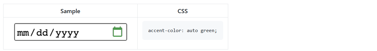
accent-color: blue yellow;
 1jj
on 24 Jul 2020
1jj
on 24 Jul 2020
What about an _optional_ second value for background-color?
accent-color: blue yellow;
That's not a bad suggestion, though that would likely need to just be a shorthand property for:
accent-color-foreground: blue;
accent-color-background: yellow;
(or perhaps the reverse?)
mfreed7
on 24 Jul 2020
It seems somewhat unlikely to me that we'd want these two things to cascade separately, so we might not need the longhands at all.
Also, we don't necessarily need to do this, but we could allow not just <color> <color>? but rather <color>+ (or <color>#), and allow any number of colors. Then, as we specify in greater detail how various types of widgets use the colors, as is being suggested, we clarify which color goes where, and if some widgets (like range?) can use more than 2, then the author can supply that. Anyway, I don't think we should rush into that, but having everything under a single property makes this path easy if we later want to take it, more so that adding an increasing number of properties.
 frivoal
on 25 Jul 2020
frivoal
on 25 Jul 2020
A concern I have about accepting multiple colors is that whether the colors work well together is going to be quite dependent on the platform/browser specific form control design. Two colors may need to be contrasting in one form control design and not in another.
heycam
on 27 Jul 2020
A concern I have about accepting multiple colors is that whether the colors work well together is going to be quite dependent on the platform/browser specific form control design. Two colors may need to be contrasting in one form control design and not in another.
I thought that this was what we said we'd solve by being somewhat specific, control by control, about how the colors get used. I am little skeptical about how well that can work, but it seemed to me to be the direction the group was taking.
Either way, if we are going to take more than 1 color, I think a single multivalued property is better than multiple properties.
frivoal
on 28 Jul 2020
Thanks for the additional comments. After thinking about it, and given the comments, it does seem that this might be the cleanest, and most extensible proposal:
accent-color: <color>+
The first provided color would be the "foreground" color, the second is the "background", and for some controls (<range>?) there might be a use for the 3rd+ color. Having foreground come before background seems logical to me for some reason, but we can also reverse that.
I am in the process of sketching out more-specific text, control by control, and I'll publish that here soon.
Side note: at the CSS weekly call, it was suggested that Google Docs aren't great for publishing documents like this (due to inaccessibility in some parts of the world, and risks of loss if Google goes under), so I've converted the doc I linked above to an MD file here. There is still the risk that GitHub goes under, but then this comment will go with it.
mfreed7
on 29 Jul 2020
Providing n colors seems even less likely to work well across a range of different control designs than providing 2.
othermaciej
on 29 Jul 2020
Ok, as I mentioned, I've been working on putting together a more "elaborate" description of this feature, with more details about each control. In the process, and through some very helpful input from @heycam, I ended up changing from "foreground" and "background" to "contrasting" and "primary", respectively.
Please see the new proposal, here:
https://github.com/mfreed7/accent-color/blob/master/proposal.md
The document contains proposed spec text, along with non-normative descriptions of each control. The idea here is that we can discuss and iterate on these descriptions ahead of time, avoiding the "first mover" problem discussed above. I've attempted to write this up in as complete a way as possible, because the concern before was that there would not be a way to properly specify this feature. Having said that, the above link should be treated very much as a draft, and I would love to hear your comments and feedback. Those can be left as comments in this issue thread, or as issues against my repo, whichever is easiest for you.
Please see the doc above for full details, but just for ease-of-digestion, here is a copy of the proposed spec text:
Proposed Spec Text
Name: ‘accent-color’
Value: <color>+
Initial: 'auto'
Applies to: form control elements
Inherited: yes
Percentages: N/A
Computed value: computed color, see resolving color values
Canonical order: per grammar
Animation type: by computed value type

The ‘accent-color' CSS property sets the color of the “accent” parts or pieces of
form control elements. The first provided <color> value is to be used for
"primary" accent elements. If a second <color> value is provided, that color
should be used for "contrasting" accent elements.  The third and subsequent
colors are only used on some form control elements in some cases, for additional
"accent" parts other than "primary" or "contrasting".

If any color is not provided, or if 'auto' is provided for any color value, then
the UA should attempt to select an appropriate color which offers good contrast
and visibility when paired with remaining provided colors, if any. In selecting
'auto' colors, if the operating system provides an “Accent Color” or similar user
setting, the UA is encouraged to respect that setting as much as possible. The UA
may use a similar, though not identical, color in some cases, for example to
enhance contrast or accessibility.

In limited circumstances, it is permissable for user agents to render the accent
parts of some controls using different colors than those specified by
'accent-color', for example to maintain design guidelines or accessibility
constraints. In those cases, the rendered color should be influenced as much as
possible by the specified 'accent-color'. For example, the UA may wish to only
render the checkbox glyph in either white or black; in this case, the selection
of white or black should depend on the 'accent-color' value, e.g. using the
luminosity of the provided color.

Not all form elements contain “accent” parts, and not all user agents use the same
“accent” parts in exactly the same way for the same form control. However, the
intention is that if the same or similar accent parts exist on a given form
element, it should be associated with the "primary" or "contrasting" colors in the
same way across user agents. This is important to ensure good interop of the
'accent-color' property. For that reason, there is a table of form elements
provided below, which serves as guidance on the various accent parts for each
control. While the table is not normative, it is intended to provide some
alignment and uniformity of implementation across user agents.

The text content of form control elements is explicitly not included in the set
of “accent” parts, as text content is already controlled by the 'color' property.
In addition, the 'background-color' property is often used to control the
rendering for some background parts of form controls - those parts are similarly
not included in the set of "accent" parts that are subject to control via the
`accent-color` property.
mfreed7
on 1 Aug 2020
Without diving into the specific of which color is used where, I feel you're on the right path in term of how this should be specified. One comment though. Earlier, you said:
The first provided color would be the "foreground" color, the second is the "background"
It seems to me you actually took the opposite approach, and that this leads you in many example to use "auto" as the first color, since it wouldn't show up anyway in various controls which don't use a background color. Can you comment on this?
frivoal
on 1 Aug 2020
Without diving into the specific of which color is used where, I feel you're on the right path in term of how this should be specified.
Glad you think so! I'd be really interested to hear specific per-control feedback, as I think this process (haggling over each one) might take some time, but it's important to the spec here.
One comment though. Earlier, you said:
The first provided color would be the "foreground" color, the second is the "background"
It seems to me you actually took the opposite approach, and that this leads you in many example to use "auto" as the first color, since it wouldn't show up anyway in various controls which don't use a background color. Can you comment on this?
Yes. This took some thought (and again, some good feedback from @heycam) to push me toward the current proposal. The basic insight was that the critical "color-matching" accent part should always be the first one. It would be really nice if an author could use accent-color: blue and then the most "visible" or "page-matching" elements would turn blue, while any other elements (e.g. glyphs) would automatically provide contrast. In most cases, the "primary" element turned out to be the element I had previously been calling "background". So I reversed the order, and renamed them to be a bit less specific to where it is (foreground or background) and more specific to whether it is the primary accent or just something that needs contrast.
As for the examples I provided, I just wanted to show a number of different scenarios. I don't think many of these would be typical, and as you can see from the color choices I made, I'm definitely not a designer. However, if you believe I got one (or many!) of the controls backwards, and you think the "primary/contrasting" elements should be swapped, that's great feedback to have.
It would be great to get some developer input on this proposal, in particular the ergonomics of "primary" vs. "contrasting" and the order of the two. It would also be good to get input on whether there is a need to provide the "contrasting" color at all, or if it would be good enough to just control the "primary" color and always leave the contrasting elements to the UA. Personally, I think we should be pushing to open access to all of the colors being used on each control, but there is overhead and complexity to doing that.
mfreed7
on 2 Aug 2020
At this point I think it would be a good idea to have some live demos that use vendor specific code/custom controls to let people test out which parts use which color.
henke37
on 2 Aug 2020
At this point I think it would be a good idea to have some live demos that use vendor specific code/custom controls to let people test out which parts use which color.
That can certainly be a next step, and I'm happy to prototype this in Chromium, but I need some buy-in on the proposal from other implementers first. I do see the point that you'll want to experiment with it before knowing which way is "right" for each control.
mfreed7
on 3 Aug 2020
It would be great to get some developer input on this proposal, in particular the ergonomics of "primary" vs. "contrasting" and the order of the two.
Some feedback from a developer trying to create this design in Chromium:
 (link)
...but with the clock icon also pink.
In my head, the clock icon is a primary color, the same way the text color is primary and the black background is secondary/contrasting the primary. By that logic, i should write accent-color: currentColor.
The current spec draft is the other way around, and calls the clock icon a contrasting color:
 (link)
In my head, that is wrong and clashes with the way i perceive a primary color. Then on the other hand, i completely agree with the classification of blue as the primary color for the progress slider:
 (link)
Looking at the two examples above, the background color is sometimes the primary color and sometimes the contrasting color. In my head, the background should consistently be either primary or contrasting.
In other words, i think the examples from your study generally makes more sense. You just need to rename foreground to primary and background to contrasting. Or not; foreground and background are just as, if not more descriptive to me.
It would also be good to get input on whether there is a need to provide the "contrasting" color at all, or if it would be good enough to just control the "primary" color and always leave the contrasting elements to the UA.
For this specific usecase, i just need primary. But i am certainly looking forward to having full control over checkboxes and radio buttons. Only having a primary color would be limiting to me in that case.
 atjn
on 18 Aug 2020
atjn
on 18 Aug 2020
The new macOS Big Sur has an example we could look to - they allow developers to set an "accent color" in native apps. https://developer.apple.com/design/human-interface-guidelines/macos/overview/whats-new-in-macos/#app-accent-colors
It seems that this accent color is applied across form controls, such as checkboxes, dropdowns, sliders, and textfields, but additionally used as the text selection highlight color and applied to selected elements from lists.
 richiksc
on 18 Aug 2020
richiksc
on 18 Aug 2020
@atjn thanks for the detailed input!
Some feedback from a developer trying to create this design in Chromium:
...but with the clock icon also pink.In my head, the clock icon is a
primarycolor, the same way the text color isprimaryand the black background issecondary/contrasting the primary. By that logic, i should writeaccent-color: currentColor.
I definitely see your point. I had trouble defining which element comes first/second here. And again my goal was to allow accent-color: blue (single color only) to make the most "visible" part of each control blue. With that goal in mind, my concern with the clock input, which (in current implementations) has just a glyph but no background "panel" behind it, is: what happens if new implementations would like to have a background color behind just the glyph? E.g. similar to some implementations of <select>:

In that case, it would seem that the "primary" color, which you would like to match with the rest of the site, would be that background fill, not the glyph, right? I.e. the blue in the <select> above, not the white glyph. The canonical example is the checkbox, where typically you would want accent-color: blue to give you this:
where the background is blue, not the checkmark glyph.
Again, these are all reasons why I think it is important to be able to specify both colors, and to have an agreed upon set of definitions for these controls - so you can always achieve your desired clock colors. As currently defined in the proposal, your example could be perfectly achieved with accent-color: #171717 #ff67bd. Right?
It would also be good to get input on whether there is a need to provide the "contrasting" color at all, or if it would be good enough to just control the "primary" color and always leave the contrasting elements to the UA.
For this specific usecase, i just need primary. But i am certainly looking forward to having full control over checkboxes and radio buttons. Only having a primary color would be limiting to me in that case.
Thanks for the input here.
mfreed7
on 19 Aug 2020
Awesome work on this Mason. Just a few thoughts.
for example to maintain design guidelines
Isn't this a get out of jail free card?
Glad you think so! I'd be really interested to hear specific per-control feedback, as I think this process (haggling over each one) might take some time, but it's important to the spec here.
I think this is a fundamental contract for this feature to be of value. _You_ note as such in your text above it.
This is important to ensure good interop of the
accent-colorproperty.
You then take this a step further in saying:
Not all form elements contain “accent” parts, and not all user agents use the same “accent” parts in exactly the same way for the same form control. However, the intention is that if the same or similar accent parts exist on a given form element, it should be associated with the "primary" or "contrasting" colors in the same way across user agents.
This reads to me that you're saying that UAs, if they have the same parts, should then informally standardize through their
implementation of accent-color for those overlapping parts. Due to the above two statements I don't think that the definitions of these parts and the application of accent color should be non-normative.
I understand that defining and agreeing on every part is not an easy undertaking for form controls. However, I'd prefer for us to begin defining those parts and their associated accent colors. And as each control part definition lands in this spec it allows implementation of that control.
We can have an escape hatch since I know there will be arguments that a UA should be able to implement a part using the accent color provided the user in a way that isn't defined by the spec but that breaks the contract outlined above for interop purposes. We should have the normative definitions that are assigned to standardized parts be required to use the accent color defined IF accent-color does not compute to auto.
This will then allow an author to look at the spec for the control and know that the glyph within the checkbox will get the contrasting color while the background will receive the primary color (using your non-normative definition as an example). Again, the author can opt into the native design by allowing this to compute to auto.
Ultimately, this discussion and the one in Open UI makes me feel like we need an agreed upon base UA stylesheet to solve the real pain points form controls present to authors while ensuring we don't stifle innovation for UAs.
gregwhitworth
on 19 Aug 2020
@mfreed7 no problem, this spec is great work!
I would like to make it clear that i understand your approach to the design system, and if that's the way the final spec lands, i think it would work just fine :)
As currently defined in the proposal, your example could be perfectly achieved with accent-color: #171717 #ff67bd. Right?
That is correct, but in that case i am defining a color that does nothing. It is only there to fill the first space so i can set the second value. That doesn't seem like a robust solution to me. If the order was swtiched, i would be able to define only the necessary color:
accent-color: #ff67bd
i understand that this would mean you would have to define accent-color: auto blue in order to set the background of a checkbox to blue, but the difference is that auto actually refers to something that will be displayed on the page (the checkmark glyph), so it makes more sense to have to define that IMO.
I think most of these problems could also be solved if we just had direct access to the primary and contrasting colors:
accent-color-primary: <color>
accent-color-contrasting: <color>
accent-color-extra: <color>+ (or something like that)
So there is definetely and argument to be made for direct access to the values, but the way i subjectively see it, the system would be most elegant with just the shorthand, but the order flipped. My argument can be summed up into:
| | if primary is background | if primary is glyph | either version, using direct access to values |
| :------------------------------------------------------------------------------------ | ---: | ---: | ---: |
| accepts single value to change background on inputs where it is primary (checkbox, radio) | ✔️ | ❌ | ✔️ |
| accepts single value for inputs that don't have backgrounds (textarea, time) | ❌ | ✔️ | ✔️ |
| does not force the use of filler colors that don't exist | ❌ | ✔️ | ✔️ |
[...] what happens if new implementations would like to have a background color behind just the glyph? [...]
In that case, it would seem that the "primary" color, which you would like to match with the rest of the site, would be that background fill, not the glyph, right?
Yes, that is probably true for many websites, but in the design i posted earlier, the glyph would still be the primary accent color, and i would want the background to be fully transparent.
What ends up being the primary accent color is dependent on the design choices on every page, which is also why i find it more intuitive to call them foreground and background accent-colors, or to base the primary assignment on the fact that glyphs are usually always the primary color in CSS.
Again, these are all reasons why I think it is important to be able to specify both colors, and to have an agreed upon set of definitions for these controls - so you can always achieve your desired clock colors.
I completely agree.
atjn
on 19 Aug 2020
The CSS Working Group just discussed Allow specifying the "accent color" of a form control element.
The full IRC log of that discussion
<dael> Topic: Allow specifying the "accent color" of a form control element
<dael> github: https://github.com/w3c/csswg-drafts/issues/5187
<masonfreed> https://github.com/mfreed7/accent-color/blob/master/proposal.md
<dael> masonfreed: Prop^
<dael> masonfreed: Last time discussed we talked about general prop. Concern we needed to be more specific to avoid ambig or first mover problems
<dael> masonfreed: Sketched out the proposal
<dael> masonfreed: Basics are single prop with multiple values. First spec is primary, second is contrasting.
<dael> masonfreed: Went through each form control and layed out which are primary, which are contrast. Some cases of 3rd color
<dael> masonfreed: General idea is should be able to spec each color of all accent parts. Multiple colors in some cases so proposing bother are controllable.
<dael> masonfreed: Auto value which in any position allows UA to select a color with appropriate contrast
<dael> masonfreed: Biggest debate after that is which are primary and which contrast
<dael> masonfreed: Question for WG is will this be acceptable way to move vforawrd in general
<dael> masonfreed: If yes, work through each control and get agreement on which is primary and which contrast
<hober> q+
<florian> q+
<dael> masonfreed: I think it's important in this spec we list all controls and offer guidance on each control so dev can expect same across UI. If they want glyph of time control to be a color they know which position to use.
<AmeliaBR> q+
<Rossen_> ack hober
<dael> hober: Questions. 1) On some platforms at some points in past accents have been gradients. Wondering how that fits. 2) On which part should get accent it varies wildly between existing browser version and platforms
<tantek> +1 hober, this is 100% true. Just look at iOS versions from 1 to the present. Massive changes in accents / visuals in form controls.
<dael> hober: Example, blink form control refresh some pieces that weren't accented now are. Concerned answer to second question would change over time based on product decisions.
<gregwhitworth> q+ to respond to hober
<fantasai> hober++
<dael> hober: Whatever answer we come to should not depend on contingencies what 2020 browsers look like but instead be forward looking and allow browsers to change view
<dael> masonfreed: Gradient question- excellent question. I'd love specific examples so I can explore
<tantek> gradient, um MacOSX "Aqua" from 2000?
<dael> masonfreed: In terms of parts of controls i think you're right there is a variety of looks and feels and many did just change. The form control refresh drove this. We change checkboxes where it used to be gray, now it's blue, hundreds of people wanted to change it back.
<dael> masonfreed: Specific about which parts my sense is there are a number of ways to define, fg/bg, primary/contrast are all fine. I tried to lay out a way of thinking about accent colors so if browser wants to change they can interpret in the contraxt of the defined elements so it's forward looking.
<Rossen_> q?
<Rossen_> ack florian
<dael> florian: For reasons realted to what hober said I'm not certain accent color thing can work. But I think there's a chance it can and approach being taken will tell us. Single property with a bunch of values and then going through a bunch of controls and saying how it applies is a good idea
<gregwhitworth> ack gregwhitworth
<Zakim> gregwhitworth, you wanted to respond to hober
<gregwhitworth> q+
<dael> florian: Based on current prop I would suggest not just one style for each control but include several. Maybe current, and MacOS aqua and maybe a somewhat out there which gives us diversity and see if it all holds up.
<gregwhitworth> me gregwhitworth oooh - cool
<Rossen_> q?
<dael> fantasai: I think intent is it's abstract and we'll find the answer. Looking at a variety of controls will tell us if it works
<fantasai> s/fantasai/florian/
<dael> AmeliaBR: One clarification for masonfreed. At some point prop allow arbitrary number of colors. Is that still part of proposal?
<Rossen_> ack AmeliaBR
<dael> masonfreed: In current up to 3 colors. First 2 are in almost any control. 3rd is only in range
<dael> AmeliaBR: Okay, that helps. Concern about too many colors is it multiplies ways things can be used and concerns about contrast
<dael> AmeliaBR: Related, question of what is auto? We've got examples about auto meaning use system-wide accent and auto meaning use the local colors and don't accent so use currentColor on transparent bg.
<bradk> For many gradients, you could have a solid, author chosen background color, overlaid with a transparent to semi-opaque white (or black) gradient. That would work for gradients that are just shades of the main color.
<dael> AmeliaBR: As far as web compat and testability for an author not sure if we need additional keywords to distinguish between if you want additional accent colors or keep as simple as possible
<dael> masonfreed: Spec written is vague. auto provided for any color position selects something appropriate for contrast when paired with given colors. So you said blue and left off the glyph so pick something for me
<dael> AmeliaBR: Browser has to make sure contrast is decent not browser has a standard value and do what you normally do. There needs to be smarts
<dael> masonfreed: Correct. I htink need to be smarts to get good contrast
<dael> AmeliaBR: Tying to that and hober comment on gradients we've got examples about native mac where accent modfies to lighter/darker. Same with windows accent colors. Shows as different lightness on different interface parts.
<dael> AmeliaBR: Do we want to explicitly acknowledge that browser may tweak to preserve contrast?
<dael> masonfreed: I did call thatout. If you selected auto and OS provides a color user is encouraged to respoect. UA may us similar colot to enhance a11y and contrast
<Rossen_> ack fantasai
<dholbert> q+
<dael> fantasai: I wanted to agree with hober. Look at specific example. Checkboxes. Some use accent, some done, son use it on border of checkbox, etc.
<dael> fantasai: Don't want to limit going forward and require same. Controls we know about have changed. Need to make sure spec can accomodate that. It sounds like the direction it's trying to take.
<dael> masonfreed: Other questions have been about how, this sounds like question of should we impl accent color
<florian> q+ to respond to fantasai
<dael> masonfreed: Understand concerns but I have done a wide survery. Examples are appriciated but in my tour of browers this scheme will allow you to control all of them. There are checkbox variety, but it has a bg and glyph on top of all impl
<tantek> checkbox are "simple"? like animated toggle switches which completely change color when you flip the switch?
<Rossen_> q?
<fantasai> s/trying to take/trying to take is defining exactly where the colors are used/
<dael> masonfreed: Trying to keep spec open for future but trying to provide guidance. florian said include explicit examples I'm happy to do it if there's appetite and helps discussion.
<Rossen_> ack florian
<Zakim> florian, you wanted to respond to fantasai
<dael> florian: from fantasai point, spec doesn't say you have to put accept in fg or bg. It says you have a list of accent colors and if accent is on bg part you pick from first color. If accent is on glyph you pick from second in list.
<Rossen_> q++ to tell everyone that q++ works
<Rossen_> :))
<dael> florian: If you have no accent color you don't pick it. It doesn't force browsers to pick. Depending on which part you accent you pick from here in list. I think not over constraining.
<dael> florian: I would like to see it explored for a bunch of controls to make sure
<Rossen_> ack +
<Zakim> +, you wanted to tell everyone that q++ works
<Rossen_> ack fantasai
<Zakim> fantasai, you wanted to respond to florian
<dael> fantasai: Accent color for some systems, like macOS aqua, color is lighter and intended to be used with normal text color. Whereas highlight color which is selected item is darker blue and inteded to be used with white.
<dael> fantasai: In that case fg abd bg would be different blues not intended for same time. Maybe you only provide one color and UA modulates. I don't know, either accent is giving 2 meant to work together or 2 variations that could be used with fg or bg
<dael> florian: It's the former. BG and fg supposed to work together
<dael> fantasai: Then you have to pick both together.
<dael> florian: Depends on the control.
<fantasai> s/together/together, you can't just pick one or the other as you said/
<dael> Rossen_: I think these are great examples to be brought for masonfreed if he has to investigate more behaviors.
<Rossen_> ack gregwhitworth
<dael> gregwhitworth: I feel we should based on numerious desicussions I think we should do a meta on control styling. As I tried to outline in it masonfreed hits on in order for this to have value there needs to be interop
<dael> gregwhitworth: Only way to ensure is to normatively define
<AmeliaBR> q?
<dholbert> q-
<dael> gregwhitworth: But I agree with hober we don't want to limit UAs from future or innovations
<Rossen_> q?
<AmeliaBR> q+
<dael> gregwhitworth: I had prop that if values compute to auto author is saying UA do what you will at which point it's irrelevent you adhear to the requirement. But if it's not auto we'll agree these parts exist and it's applied as this color
<dael> gregwhitworth: b/c author opts in it hints to UA they want control. To have interop we need to have agreement. Or this becomes not valuable to impl
<dael> gregwhitworth: Naming is worth looking into.
<dael> gregwhitworth: atgn in github brought up use case to have accent color as a short hand. To point of contrast might be desire to have author include all, but worth considering
<Rossen_> ack AmeliaBR
<dael> AmeliaBR: Follow up from gregwhitworth comments. I think it's still true we need a more complex way of accessing and styling all parts of complicated form controls. Shouldn't stop persuing that.
<dael> AmeliaBR: Still value in simple way of saying use the default form controls but tweak to my colors
<chrishtr> q+
<dael> AmeliaBR: Strong value in this prop while having potential of a more fine grained control in future
<dael> AmeliaBR: Also option of doing appearance:none and recreating
<dael> gregwhitworth: That's not what I meant. Mearly saying only way to ensure interop you have to define the parts and where accent color will be defined.
<dael> AmeliaBR: So introp you expect authors to say this must look some everywhere and if we end up with just this color somewhere...
<dael> gregwhitworth: Opens up prblems like forced colors, how do you get good contrast? And spec is whisy washy and if design principles don't allow you don't have to do. If it doesn't ahear to what brand wants they throw it away.
<dael> gregwhitworth: I like your form control but my brand is green and I just want green. But when they open a browser and it doesn't use it and they'll say it's important and they build their own checkbox
<Rossen_> q?
<dael> gregwhitworth: I personally foresee this being nice to have and due to market share perhaps having to follow a browser. I think this will happen at UA layer if we don't do at spec layer.
<dael> chrishtr: I wanted to respond to points AmeliaBR and gregwhitworth raised about defining parts and how accent color fits in with interop
<hober> q+
<dael> chrishtr: I think we should try and persue the larger project of defining anatomy but htat's a big thing. Value in having easy to use thing to define use cases from authors. I think masonfreed draft is close to enough to spec that if form controls on UA have certain concepts they should use accent color to adjust
<dael> chrishtr: If they don't have the concept of form control has UX that's incompat then UI should ignore accent color. I think that's intent of spec prose
<dael> chrishtr: Allows innovation bc later point. I think it's explicit acknowledgment where we want dev to be able to style form controls we know about but not locking in 2020 style or UX conventions
<Rossen_> ack chrishtr
<Rossen_> ack hober
<bradk> +1 @chrishtr
<dael> hober: I wanted to echo something from earlier. I'm enthusastic about authors supply accent color. What I'd like as an author is to say my accent should be purple. Things that get an accent color should be purpose and that might be different on different platforms.
<Rossen_> q?
<dael> hober: In particular I think 2018 blink and 2020 blink should both be conforming b/c different things are colored. If the colored thing changes I think it meets the use case which allows the control to fit the branding author is trying to achieve while maintaining coherence.
<dael> hober: Websites don't need to look the same in every browser and that's okay. Trying to lock down to point where has to be bg of checkbox would be a mistake.
<Rossen_> Zakim, close queue
<Zakim> ok, Rossen_, the speaker queue is closed
<dael> hober: escape hatch from chrishtr where you have to ignore if you want different is disservice to author. Browsers with different UI aren't supposed to use purple at all? That would be unfortunate
<tantek> +1 hober again
<fantasai> +1 to hober
<dael> masonfreed: To clarify, if there is a peice of the control that does not exist you should ignore htat part. A time control has no glyphs on many platforms. If accent is meant to apply to glyph you can ignore
<dael> masonfreed: If there are new parts no one has imagined it says you should look through and match in spirit what is there so there is forward compat
<dael> Rossen_: Nearly at time. fantasai is on queue. Want to make sure we haev a path forward for masonfreed and those working on proposal.
<dael> Rossen_: fantasai go ahead and then we'll wrap
<dael> fantasai: Reading spec I don't have problem with most. Have general agreement you should be able to spec accent color and UA should do something with it. Contention here is a number of us are saying it shouldn't be dictated what part of the control that is
<dael> fantasai: I think it's important for us to explore various areas accent colors used and make sure spec allows for that variety and then provide guidance. I don't htink we should lock down each form control
<dael> fantasai: Spec text is fine until get to part where we should have interop on where accent color is applied. I think it's clear having ability to spec the accent color is a good idea.
<dael> Rossen_: masonfreed and co I think you've got a good bit of feedback. I prop we bring this as first topic next week and we'll see if there's more to bring closer to resolution.
<masonfreed> Thanks! Very helpful discussion.
<dael> Rossen_: Hopefully what you've heard was valuable and you can address some of the concerns in the meantime
css-meeting-bot
on 19 Aug 2020
@mfreed7 is there a reason that we aren't using primary, secondary, tertiary for names? As we discussed on the call and @fantasai correctly pointed out:
fantasai gave example of radio button, where Chrome 83 and Safari differ in whether the accent color is used for foreground or background, but both are using the accent color reasonably
This would allow the UAs to follow their design systems as they will have defined these colors. Also, I think that accent-color makes OS/UAs map it to their accent color that can be adjusted by the user and may propagate into an aspect of the control replacing the primary/secondary of their own brand for user benefit.
Ultimately, I'm fine with the above general consensus about not needing every part defined and which gets which color. My only other question then however is how can we test this? For this specific feature it seems that the definition of interoperability will be that it is implemented and the "spirit" is followed. Not sure how to make that work outside of render tree tests (since the parts may not be accessible early on) to determine if the accent color is leveraged.
Finally, I'd be curious if the wording is adjusted to ensure that spirit and provide a few concrete examples (as you've already done) if that won't be sufficient. I think that will address @hober concerns and if we can determine an agreed way of testing which will effectively determine spec compliance that will ease my concerns. (basically, I'm trying to avoid @mfreed7 from having to do even more research if it won't move us towards resolution).
gregwhitworth
on 19 Aug 2020
So in the CSSWG meeting today, I heard several things:
- There is a desire to see more examples of current implementations of each form control, across browsers and platforms. This will help people see what the variety looks like today, and gauge how well (or poorly) the proposal will apply to those controls.
- There is a concern that this new property would provide too much "power". They would prefer that the UA should take perhaps only a single accent color, and should decide how (or whether) to use that color. More like "try to use purple if you can", rather than "use purple for the checkbox background, and white for the glyph".
On the first point, I'm happy to do that work. I will likely expand the proposal with a discussion/background section containing a few selected controls' appearance on multiple browsers and platforms. My short list includes: checkbox, radio, select, and date.
On the second point, I do understand where the concern comes from, but I disagree. We've already heard from developers on this thread that they have specific styling needs which would require some level of consistency among browsers. In the example given there, the desire is to specifically control the "clock" glyph on a time control, and to make the rest of the control background one solid color. If this spec were "loose", then some UAs might decide to use accent-color to change the glyph color, and others might change the background behind the glyph. There would be no predictability, and developers would once again be forced to "roll their own" implementation. Or worse, they'll try to browser-sniff so that they can invert the colors to keep the appearance constant. For this to really provide value, I believe there needs to be some level of predictability.
Let me take a crack at expanding the examples, and see if that leads to any different conclusions. This might take me some time, but I'll check back here when it's complete.
mfreed7
on 19 Aug 2020
I had an idea just now. Should there be support for named accent colors? As in, colors for a specific type of accent.
The first use case that comes to mind is an "error" color, to highlight that something went horribly wrong. Progress bars would be an existing example of this use case.
henke37
on 20 Aug 2020
Since it's our performance review time, I'm looking for ways to procrastinate. So I pulled together examples of Checkbox, Radio, Select, Date, and Button, across many different browsers and platforms, and added this as a new section in the proposal.
My impression, after looking through them, is that the accent-color proposal would work in a fairly straightforward way for all of them. But please take a look and post your comments here.
mfreed7
on 20 Aug 2020
Just to acknowledge mfreed7's comment.
If this spec does not give me full control over the form styling, and is reasonably consistent cross-browser, i will cry a lot, and then go back to using a library with custom controls where every aspect is easily styled with normal CSS.
I think that's a relatively common opinion.
atjn
on 20 Aug 2020
I wanted to address two very good points made by @hober in the last CSSWG meeting (paraphrasing):
- What about the radio button? For example, current Chrome uses a larger central blue "dot" while most other browsers use a white "dot" on a blue (or other color) background. Shouldn't those both be
accent-color: blue? - What about controls that use gradients? What happens to those when
accent-coloris used?
For question 1, I would say that in the interest of interop, Chrome would likely remove the blue border, and color the outside (background) with the "primary" accent color, and the larger central "dot" with the "contrasting" accent color. I.e. accent-color: blue would effectively invert the default appearance of Chrome's radio button. And that's ok - the developer's intention there is to get all of the radio buttons to look (at least color-wise) the same. Yes, that's a different appearance than the full auto radio button, but when accent-color computes to something other than auto, the developer is indicating what they'd prefer.
Question 2 is also interesting. In the new section of the proposal, examples with gradients can be seen under the "Aqua" and "Snow Leopard" rows for many controls. (No modern implementations seem to use gradients, that I could find.) There are a number of ways to deal with that, I think. One is to just notice that the gradients go from darker blue to lighter blue, and if accent-color: green is specified, replace the gradient with a dark-green to light-green gradient. The other way, which I think I'd prefer, is that if accent-color computes to something other than auto, replace the gradient with a solid-color fill of the specified color. Again here, the developer is indicating that they'd like a particular color - let's respect it.
mfreed7
on 20 Aug 2020
Thoughts as how to integrate with forced colors/contrast?
 BillGoldstein
on 25 Aug 2020
BillGoldstein
on 25 Aug 2020
@mfreed7 If the developer hasn't specified appearance: none, then I think it makes more sense to be trying to match the OS styling or whatever. We can lock down the exact painting of simple form controls with appearance: none, but we shouldn't disconnect form control styling from platform conventions just because the author wanted to indicate an accent color preference.
fantasai
on 26 Aug 2020
The CSS Working Group just discussed Allow specifying the "accent color" of a form control element, and agreed to the following:
RESOLVED: The group wants to add accent-color and discussion on details will continue
The full IRC log of that discussion
<dael> Topic: Allow specifying the "accent color" of a form control element
<dael> github: https://github.com/w3c/csswg-drafts/issues/5187
<dael> astearns: Discussed last week, bringing it up first this week. I'm guessing to give masonfreed a chance to give an update
<masonfreed> https://github.com/mfreed7/accent-color/blob/master/proposal.md
<dael> masonfreed: I heard a few action items. Main was people wanted examples of existing form controls across browser/platform/time perioeds
<dael> masonfreed: Added to proposal doc ^
<dael> masonfreed: You can see 5 different form controls
<dael> masonfreed: There were several questions discussed on thread
<dael> masonfreed: One was radio button. Question was on Chrome latest there's a large center blue dot on white, rest are white on blue. Q is doesn't that argue for single color and allow platform to decide.
<dael> masonfreed: My view is no if color is spec we should follow
<dael> masonfreed: Similar for gradients, what does accent color do.
<dael> masonfreed: My view that is up to impl but try and respect accent color. Replace graident with flat fill or integrate into gradient into whatever way makes sense.
<dael> masonfreed: Only other open was back to the amount of power to open w/ API. Single color or more specified with multiple colors.
<dael> masonfreed: That's all I heard on the thread. Can open for discussion.
<astearns> ack fantasai
<dael> fantasai: Based on what I've seen starting with one color makes sense since not much evidence of multiple. Figuring out how 2 colors would work together is complicated.
<gregwhitworth> q?
<gregwhitworth> q+
<hober> +1 to fantasai's points
<dael> fantasai: In terms of handling gradients if you set parent none everything is flat. If none is not set try and match platform convention. We can encourage use of accent color but I don't think that should disable platform styling
<dael> masonfreed: single vs 2 color there are a number of controls in proposal. Even the radio button there are at least 2 colors. If you only open one I would say you have to specify which part you control which leaves other uncontroled. Devs want both controls on the thread
<dael> masonfreed: appearance:none is a big hammer. It turns off all styling. Radio becomes an empty div. That is a complaint that brought us to this proposal. radio and checkbox you do appearance:none and have to rebuild everything. This proposal was to give some control without having to rebuild.
<astearns> ack gregwhitworth
<dael> gregwhitworth: I was initially going to +1 to fantasai in regards to spirit but heard masonfreed on complexity. Maybe have multi color but don't play into gradients. Where we leverage primary|contrast proposal we provide one color and allow UA to do what's best to keep spirit of spec
<dael> masonfreed: You mean take current proposal and chop of contrasting color but keep spec as to where first color should apply?
<dael> gregwhitworth: No, this started on handling of gradients, correct?
<dael> masonfreed: And radio.
<dael> gregwhitworth: Was thinking same accent color applied within mac on focus. That's where I was using as use case to have gradients in future. Didn't want to discount that.
<dael> gregwhitworth: Contrasting and primary I would keep. Too many scenarios where need to exist.
<dael> gregwhitworth: Goes into try to follow this and we don't make this normative. So Safari says bg is primary stay true to author expectation is what you recommend.
<dael> gregwhitworth: Radio, I could see Safari say primary is contrast in Chrome. To that end I don't know how you coalesce without lopping them off and hinder feature or get much more prescriptive.
<dael> gregwhitworth: Basically, I don't know
<astearns> ack fantasai
<Zakim> fantasai, you wanted to talk about primary/contrasting
<dael> fantasai: Thing with primary vs contrast the way accent color is used varies a lot. Sometimes fg sometimes bg.
<Rossen_> q
<Rossen_> q+
<dael> fantasai: They are sometimes both. Back to aqua there was a solid color highlight with bg color text b/c it's a dark color. vs gradient and lighter gradient is fg on top
<dael> fantasai: If intention is set accent colors UA should auto generate variations on color and match against fg or bg as appropriate.
<dael> fantasai: If you are creating variations on the color the pair of colors may no longer contrast.
<dael> fantasai: I don't know how you would use the contrasting color in a situation like that
<dael> masonfreed: I see that point.
<dael> masonfreed: I did include some lang that UA doens't have to use exact color. That's one of the cases where you take it as input to the algo but don't have to use exactly that if it doesn't make sense to the gradient.
<astearns> ack Rossen_
<dael> Rossen_: I'm hearing strong dev need that has been sampled over long time. And a good example of document that motivates and explains why we need and how to go about it. I hope all features have this level of detail and consideration when we bring them
<hober> q+
<dael> Rossen_: Question is where do we go from here. Discussed over a few weeks. I do see pushback for various reasons. Continuing forward I'm trying to tease out obsticle here. What's the obsticle or are we pushing back just for sake of pushing back
<astearns> ack hober
<dael> hober: Trying to answer. For me I generally like being able to spec accent color. Very important we preserve browser ability to adopt different designs in future and to deploy on different platforms and meet conventions.
<florian> q+
<dael> hober: Pushing back to preserve impl flexibility to match platform conventions. Platforms have color conventions and want to be able to use those.
<gregwhitworth> q+
<florian> q-
<florian> q+
<dael> Rossen_: How is this different than what we do with appearance today? The cat is out of bag when introduced webkit-appearance:none. Agree in principle to preserve browser innovation but I'm not sure taking away this flexibility is warrented here. Can you expand?
<dael> hober: Don't udnerstand your question
<dael> masonfreed: I understand what you asked hober but what do you think in proposal is constraining the future developments?
<dael> hober: Basic, like what if browser wants to use accent for checkmark, not background of checkbox
<dael> masonfreed: That's why I kept it non-normative. It's guidance but not a constraint. If that makes more sense with a new design there's a good reason so go ahead.
<dael> hober: Okay, gregwhitworth had said earlier if you didn't want to use accent in where it's spec you shouldn't use at all. Maybe previous call. That's different?
<dael> masonfreed: Current lang is accent colors are spec, guidance for what supposed to mean, but tried to thread needle between constrained and open. That's the intention. Open to clarify language
<fantasai> "However, the
<fantasai> intention is that if the same or similar accent parts exist on a given form
<fantasai> element, it should be associated with the "primary" or "contrasting" colors in the
<fantasai> same way across user agents."
<dael> fantasai: We need to clarify if that's intent. Text says should be same across all browsers
<dael> astearns: Acceptable to put intent behind text in spec. Be explicit about attempt and then put normative text so people can interpret.
<dael> fantasai: Disagree accent color should be on same pieces across browsers. Intent is use as appropriate, not find and accent color and try and match web os convention.
<dael> masonfreed: That sounds like a core disagreement we should discuss.
<hober> +1 again to fantasai :)
<myles> yep
<fantasai> s/find and/use/
<dael> masonfreed: What I was going for is if there's a very good reason, like a brand new checkbox with a completely new thing and no way to apply prior history you shouldn't be constrained. But if we're all building a box with a check we should try and be the same so dev can expect similar across browsers
<dael> masonfreed: In document all checkboxes are widely the same so we should hope impl uniformly
<myles> q+
<astearns> ack florian
<dael> florian: I think there's a tension in requirements. Desire if some platform has check blue and another box blue and you say make a thing pink and we can do that. But if you don't know if it goes to fg or bg it's hard to know it would lookr ight against everything else on the page.
<Rossen_> hober, re: "Don't understand your question" - How is webkit-appearance:none different in terms of overriding UA native controls compared to this proposal? (besides the fact that we won't force authors to rebuild the entire kitchen around the sink)
<dael> florian: Current you know if it's fg or bg so you can pick other colors but at the expense of forcing the accent on a specific part. Not sure how to satisfy both parts.
<astearns> ack gregwhitworth
<dael> gregwhitworth: florian hit nail on head
<hober> Rossen_: appearance: none is an escape hatch
<dael> gregwhitworth: To circle back in the proposal to masonfreed i put if it computes to auto it's the webdev saying I want OS.
<Rossen_> hober: yes, and if your position is to keep anyone from escaping this hatch is a much worse optino
<dael> gregwhitworth: No one disagrees with hober about forward innovation. But the second someone finds interop differences it will get replaced. THat's what we see. I get it and I agree but I don't htink it's pragmatic for use.
<hober> Rossen_: sorry, i'm not trying to be dumb, but i don't understand what you're getting at.
<dael> gregwhitworth: If we say this is limited styling and you have outside of broder have accent color the outline becomes blue and my bg is blue and I won't like it. We can go that route but people will find a barrier. The second we hit that people willr eplace it
<dael> gregwhitworth: Worried by making this so loose people will just replace it. We can say you can spec accent color and UA will do best and hope experience is great. We can spec that and say we recommend using these
<astearns> ack myles
<Rossen_> hober: your pushback was about keeping the ability to ship UAs that can continue comply with the native platform right?
<dael> myles: Partially responding I don't htink that nec a bad thing. There are different classes of desire. If web author wants form control same everywhere they have tools for that. Modifying native form controls will be different on every OS. Has to have flexibility
<Rossen_> q
<hober> Rossen_: my pushback is about making sure that browsers can change their form control designs in the future, and use the author-provided accent color(s) in ways appropriate to their new form control designs.
<dael> florian: Design as is has flexibility, but nudges you in a specific direction. If you say accent color blue and you expect a blue check you'd see that and it's fine, but the background is blue on another and you can't see it against your blue bg then you can't see it.
<Rossen_> q
<dael> florian: Having a nudge to say it's this part it gives you more interop to match with the rest of the page. I would be tempted to say spec as proposed probably gets the bias right
<dael> fantasai: I agree with myles and hober. I think if youre appearance:auto goal should be match platform. One thing we can consider is to handle contrast levels instead of spec 2 colors say this if contrast with fb and this if contrast with bg. Most of time not using sep for contrast, you're matching fg or bg.
<dael> florian: You means spec both with expectationbrowser uses one?
<dael> fantasai: Yes
<Rossen_> q+
<dael> fantasai: And if you give 1 you give permission to browser to modify along brightness however it thinks appropriate. If you give 2 you can be more precise, but you don't get to say which part is used.
<dael> fantasai: If you want to do that more manually I think we need to make checkboxes more stylable generally. I don't think accent color is place to do that
<chrishtr> q+
<astearns> zakim, close queue
<Zakim> ok, astearns, the speaker queue is closed
<dael> masonfreed: Can we use example from dev in thread which is the time control with glyph and bg behind the glyph? Author wanted to control the glyph and bg behind to match control. How would they achieve that with your proposal?
<hober> q+
<dael> fantasai: I think that get's into...if there's a time icon on my control there's different ways to impl. glyph could be on tex tinput bg or on a button-looking thing. I don't know approach. They are all reasonable for platform. If author want sto control that specifically we need a model for that form control. I don't htink accent color is way to control b/c browser may not be using accent color for that icon
<dael> masonfreed: I see that but way it is says there might or might not be a glyph. If a glyph may not have backplace. If both use contrast for glyph and accent for backplate. If we impl that author would be happy. Leaves image of glyph to UA but controls colors.
<gregwhitworth> +1 to what fantasai said as it sounds like we need a master switch which appearance is. We should tie the two in some meaningful way and if appearance isn't adjusted we can achieve what hober myles was saying
<hober> I don't think it's helpful to talk about this in isolation; there are other efforts (e.g. Open UI) that will help add form control customization knobs, so the whole "if accent-color is too loose, people will use appearance: none" is a false dichotomy.
<dael> fantasai: But if button-like accent color is buttony part so convention would be bg of icon is accent color. Trying to say something different wouldn't work
<gregwhitworth> +1 to masonfreed point, but there in lies the problem :)
<dael> masonfreed: That's what text says. if buttony the bg should be accent. And that's why you need contrast color to control the stuff on the button. Lacking the contrast color the dev would be lost and have to replace the control.
<astearns> ack Rossen_
<dael> Rossen_: To hober point earlier I agree browsers and UA should be able to differentiate or go to native conventions. Question is given that we have webkit-appearance as an escape which forces devs to complain for years b/c tired of having to use that and re-impl everything. My question is how is this better. Is this best way can do as a presentation platform?
<dael> Rossen_: Best we can do is make it apperance:none? Seems like should be better answer and middle ground to allow and expose these parts.
<dael> hober: I feel like false dicotomy. Talking about this is isolation and not in context of other prop and features. If we think about all together we can see this question is moot. I'm not saying that the only options are appearance:none or accent color.
<fantasai> hober++
<dael> hober: Hoping openUI will increase customizability in a number of ways which willenable people to use more and not use escape hatch
<fantasai> s/willenable/will enable/
<dael> hober: I don't see accent color as alternative but as a complement to those efforts. Platforms with accent color use somewhat similar and somewhat different.
<dael> hober: Accent color on the spectrum of control is advice to the browser. OpenUI exposing specific parts is more at the full toolbox where we do what dev says.
<gregwhitworth> that last point that hober made is what I think we should explore at breakout. florian had noted he thought about this. I'll start whipping up a doc that explores this with concrete examples
<dael> hober: If dev wants it on a specific part of a control I'm saying use what openUI exposes for that control. Accent color is a more general feature that should be more of a hint to the UA to do the right thing. You should have the extra control which is why openUI is exciting
<AmeliaBR> +1 to hober's multi-level model. accent-color as a hint for modifying native styling, other options for more direct piece-by-piece control.
<dael> hober: I think at root question misses the point. If accent color only possible option there's a point. In a world where we'll have other tools like openUI it doens't hold water
<astearns> ack chrishtr
<dael> chrishtr: Summary on what I see where we can maybe make progress today. We all agree UAs shoudl have ability to create new UI types over time
<dael> chrishtr: I think any accent color we agree should be when possible interop in ways it applies so there isn't first mover advantage.
<Rossen_> hober: thank you for elaborating - that was the answer I was hoping and looking for :)
<dael> chrishtr: I think spelling out non-normative text to do so will also help inmaking sure corner cases with contrast and darkmode are taken care of
<dael> chrishtr: accent color is good to add, make sure text does n't prevent future design, we could encourage interop, and have text that can work the corner cases
<dael> chrishtr: Is that a reasonable thing to resolve?
<dael> astearns: I think it's more than we can currently agree on in part because recommend interop isn't agreed on definition
<fantasai> I think that UAs should have ability not just ot create new UI types over time, but to alter the design of existing UI types over time and across devices and platforms
<jensimmons> q+
<dael> astearns: Have consensus this is good to add but details of what's normative and not is good to work out
<hober> fantasai++
<dael> astearns: May be useful to break out current interop goals from future proofing. As we discuss it slides between what people want now and what people imagine in future.
<dael> astearns: Might be good to have explicit note that this could all change due to thing we haven't discovered. For current UA this is level of interop to achieve
<fantasai> Yeah, I don't agree with that either :) See above
<dael> masonfreed: Should I take action to futher update spec text to try and thread needle?
<dael> astearns: I think we should have more text to keep up and more discussion on issue. I think we could resolve this is a thing we want to add, but not other details.
<dael> chrishtr: Could we resolve on other two points?
<dael> astearns: We've already spent 45 minutes on this
<dael> jensimmons: Briefly I think there's a lot of reason for optimism. Desire is to make sure this will be complex enough for future rather than drag into past. I'm personally very interested in and haven't been able to be as involved as I want.
<dael> jensimmons: We can get somewhere great and this is hard b/c it's hard not b/c desire to not do it.
<fantasai> So far no disagreement that we should have accent-color
<dael> astearns: Can we resolve this is something we want to add?
<fantasai> Just disagreement on how prescriptive its definition is
<dael> astearns: Objections to continue to work on this?
<dael> RESOLVED: The group wants to add accent-color and discussion on details will continue
<dael> astearns: Helpful to break items into separate issues. masonfreed as you update text and look at particular items in contention if you can raise separate issue for each so we can have scoped discussion and resolution on pieces as we good may be good way to make progress.
<dael> masonfreed: Will do and thank you all
css-meeting-bot
on 26 Aug 2020
This was discussed at length, and one key thing that was brought up a few times by @hober @fantasai and @frivoal that I wanted to try and have a more meta discussion around leveraging accent-color to see if it can help align the conflicting needs of UAs and authors (all valid issues mind you). It outlines a proposal that @fantasai and @frivoal have discussed in general in the past and shared with me. This tries to get that down on paper (in spirit, not normative tex) and also how this will impact accent-color and enable all of the above use-cases presented by authors but ensure that UAs have the freedom for innovation across form factors/platforms.
Comments welcome: https://docs.google.com/document/d/1LEkDvTrhZuediHfyg6TSAQpPFTX0wMiaLueZhxjC2PQ/edit?usp=sharing
gregwhitworth
on 26 Aug 2020
During yesterday's teleconference, there was a lot of discussion among group members about how important it was to have normative text about which parts of the form element should get the accent or contrasting color. There was a lot of concern (on the call & in this discussion) about whether authors would use the property at all without assurances of consistent appearance.
I threw up a quick Twitter poll to gauge author reactions. Thanks for those of you who retweeted, although caveat that my own followers have a larger than average share of web accessibility devs.
About 1 in 13 respondents said that current native HTML form elements are good enough for them. Of the remainder, half said they need more complete styling than just changing colors. And the rest were evenly divided between whether they would only use this property if it was consistent cross browser vs whether they were OK with variations to match native styling.
The tweet and results were:
If CSS added a property that allows you to tweak native form elements (checkboxes, select, etc.) to use one or more colours you specify, would you use that?
Or would you still need to fully customize?
Would it matter if results looked different between browsers?
- 46.5% no, I need full styling
- 22.9% only if all browsers same
- 22.9% color-tweaked native = 💯
- 7.6% unstyled forms are fine
419 votes · Final results
AmeliaBR
on 27 Aug 2020
TLDR; I support Mason's current proposal for accent-color
One thing I would like to note however, is that while I do think there are some longer term goals that we should continue to pursue with regards to the non-normative text for the assignments of the colors to the parts, that I think by it being non-normative addresses @hober concerns while also enabling a general guide that Mozilla raised as it results to interop concerns by not defining them. I think as further efforts proceed we may be able to circle back on this non-normative text but I think that @mfreed7 has done a good job of finding the correct balance at unblocking a pain point for developers today without limiting innovation of UAs.
gregwhitworth
on 27 Aug 2020
Ok, at the last teleconference, there was significant discussion about encouraging interoperability while not constraining innovation, and the inherent conflict therein. I also heard a suggestion from @astearns that it might help to include more prose explaining the motivation and intent for the spec, because it will aid in interpreting the specification. So I've gone ahead and done that - please see the new section of the proposal. I also copied it inline below.
Separately, I heard a recommendation that separate issues be opened for the sub-questions being debated here:
- Should we go forward with
accent-color? This was resolved yesterday. - Should we constrain browser vendor innovation of form control elements? I have not heard anyone argue that we should, so I'm going to just take it as a given that we shouldn't.
- Should interoperability be a goal for the
accent-colorspec? I filed an issue for this question.
While there are additional issues, I think #3 is a key question. A decision there will guide the rest of the process.
Here is a copy/paste from the new proposal section:
Motivation and Intent
This section is non-normative.
In implementing accent-color, there are two competing/conflicting goals:
- Encourage interoperability among browsers. It is important that developers be able to expect similar, if not the same, behavior across browsers.
- Encourage (and do not constrain) browser vendors' innovation of form control elements.
The goal of interoperability pushes this solution towards a more strict specification of exactly how to use each accent-color value on each form control element. However, the goal of allowing innovation pushes this solution away from strict specifications for how each form control looks or acts. This specification attempts to provide a good middle ground, which maximizes interoperability while minimizing constraints to innovation.
The general methodology for achieving the above compromise is to examine the set of existing form control elements (as of 2020), and agree on the basics of the way accent-color is applied to each of those existing controls. It is explicitly recognized that each browser provides different implementations of each form control, with their own look and feel. This spec does not try to eliminate those differences. However, it does try to provide some level of uniformity and interoperability, where commonalities exist.
This will require judgement when applying the recommendations to new or existing form controls. The goal would be to adhere to the spirit of this spec as much as possible. For example, if the guidance states that an accent-color value should apply to a particular accent part, and the browser implementation of that part uses a gradient fill rather than a single color, then there may be multiple ways to "use" the accent-color value to affect the gradient rendering of that part. The goal would be to match the guidance where it makes sense, and when possible. That might mean replacing the gradient with a solid fill, or it might mean changing the endpoint values of the gradient to match the accent-color value in aggregate. Or it might mean another behavior entirely. The point is that the guidance should be consulted and used as input in determining how to proceed.
Further, this spec is careful to not require exact conformance of each form control with the accent-color spec. It merely encourages browsers to follow the guidance for form controls elements that are "close enough" to the existing set of controls. For brand new paradigms, input surfaces, control types, etc., this spec does not attempt to limit innovation. If there are similar parts of these new-paradigm controls, then as much as possible/reasonable, those parts should be guided by this spec. But this should not be seen as any limitation on innovation.
To assist in characterizing "close enough" as it relates to the accent parts of form control elements, the Existing Control Examples section of this document includes many examples of several control types, pulled from different browsers, operating systems, and time periods. Except where noted, each of the control examples within each group should be considered "close enough" to the group that the guidance for that group should apply.
mfreed7
on 28 Aug 2020
I've just closed the "interoperability" issue that I opened, as it didn't help move the conversation forward as I had hoped. It actually seems to have somewhat derailed it, and that's likely my fault. The big conclusion I took from that discussion was that my proposal bites off too much, and most people seem to agree that accent-color should be less about "full control" of colors, and (as @samuelbradshaw nicely puts it) more about "dusting" the existing controls with a color. In other words, accent-color seems like a good fit for the "I want to change the theme and ensure contrast / readability, but don't necessarily need to control form UX so tightly", and not a good fit for "I want to make sure my form control looks exactly this way". Other technology is better for the latter. And in this context, interoperability can take the form of "achieves the intended purpose reliably across browsers" as opposed to "generates the same pixels across browsers".
As such, I think we should consider other proposals for the accent-color feature. In particular, @fantasai has made several such proposals (e.g. 1 and 2), and we should consider those and any others.
mfreed7
on 15 Oct 2020
Agenda+ to discuss the specific proposals mentioned in Mason's second paragraph, or the version Brad suggested here.
Those approaches sound workable to me, and likely compatible with a wide range of form control UX designs.
chrishtr
on 15 Oct 2020
The CSS Working Group just discussed accent-color, and agreed to the following:
RESOLVED: adopt accent-color as a hint to the UA, with requirements on contrastRESOLVED: Mason Freed added as UI 4 editor
The full IRC log of that discussion
<astearns> topic: accent-color
<TabAtkins> masonfreed: Summary is I closed the "interopability thread" - question I was trying to ask was whether we wanted precise control over where accent colors should go on a control
<TabAtkins> masonfreed: Think I got the answer I needed - we dont' want to do so.
<astearns> github: https://github.com/w3c/csswg-drafts/issues/5187
<TabAtkins> masonfreed: Majority opinion seems to be that we want this to be more of a hint to the UA - "accent-color: purple" means "use purple on this control if you can if it makes sense".
<TabAtkins> masonfreed: Not "put this purple on the checkbox background", more of a hint instead
<Rossen_> q
<TabAtkins> masonfreed: So I'd like to get a reoslution from the grou pon this direction
<TabAtkins> q+
<jensimmons> q+
<fantasai> sgtm
<florian> q+
<Rossen_> ack TabAtkins
<fantasai> TabAtkins: I'm not sure this is exactly the right direction, fine with it as long as we adopt something like what fantasai said, where we require the UA's chosen colors contrast appropriately with the accent-color
<fantasai> TabAtkins: UA can't put black on black ifyou specify accent-color:black
<fantasai> TabAtkins: With that, sounds fine
<fantasai> Rossen_: you can't ignore the accent color?
<fantasai> fantasai: can always ignore it...
<TabAtkins> jensimmons: I think how Mason described it is good and realistic
<Rossen_> ack jensimmons
<fantasai> jensimmons: I think the way Mason described is really good, more realistic to where we are
<fantasai> jensimmons: more time to solve the problem of robus styling
<TabAtkins> jensimmons: Allows us to give authors something useful and gives us time to solve the problems more robustly
<TabAtkins> florian: Roughly in line with all that. As long as the hint involves the requirement that contrast must work.
<TabAtkins> florian: Don't think we have a resolution on one vs many colors, but we can decide that later
<Rossen_> acj florian
<TabAtkins> florian: I think there is an appetite for precise control, but that requires a more robust solution. Should od that too, but shouldn't conflate with this.
<Rossen_> ack florian
<TabAtkins> Rossen_: Taking the lack of queue as meaning we've said everything we need. Objections?
<TabAtkins> proposed resolution: adopt accent-color as a hint to the UA, with requirements on contrast
<tantek> I think we're ok with that too
<TabAtkins> RESOLVED: adopt accent-color as a hint to the UA, with requirements on contrast
<TabAtkins> masonfreed: We probably need to discuss the 1 vs many colors question later
<TabAtkins> Rossen_: yes
<TabAtkins> fantasai: I think we should put this into UI 4, should we let the editors put that in, and discuss 1 vs many colors separately?
<TabAtkins> astearns: Would Mason like to become an editor?
<TabAtkins> masonfreed: "want" is strong, but I'm willing to do it
<TabAtkins> florian: Happy to have help
<TabAtkins> fantasai: There is proposed text already
<TabAtkins> Rossen_: Objections to adding Mason as UI 4 editor?
<TabAtkins> RESOLVED: Mason Freed added as UI 4 editor
css-meeting-bot
on 23 Oct 2020
CSS 'accent-color' Proposed Text
Drafted by Mason Freed, 11 September 2020
Revised by fantasai, 7 October 2020
As discussed on CSSWG Issue 5187, and at the July 1, 2020, July 22, 2020, August 19, 2020, and August 26, 2020 CSSWG meetings,
there is a desire to expand the stylability of form control elements,
in particular by allowing the specification of the “accent color” for various elements.
This proposal is a result of those discussions.
Motivation and Intent
In implementing accent-color, there are two competing/conflicting goals:
- Encourage interoperability among browsers.
It is important that developers be able to expect similar, if not the same,
behavior across browsers,
and most critically, to get usable results on all browsers and platforms
now and in the future. - Encourage (and do not constrain) vendors’ innovation
of form control elements.
The goal of interoperability pushes this solution
towards a more strict specification of exactly how
to use each accent-color value on each form control element.
However, the goal of allowing innovation pushes this solution
away from strict specifications for how each form control looks or acts.
This specification attempts to provide a good middle ground,
maximizing necessary interoperability while minimizing constraints to innovation.
The general methodology for achieving the above compromise
is to examine the set of existing form control elements
(as of 2020),
and agree on where and how an accent color is considered to have been applied
to each of those existing controls,
and define that those uses of color are replaced by the specified accent-color.
It is explicitly recognized that each browser
provides different implementations of each form control,
with their own look and feel.
This spec does not try to eliminate those differences.
This will require judgement when applying the recommendations
to new or existing form controls.
The goal is to adhere to the spirit of the feature as much as possible.
For example, if the specification requires
that an accent-color value should apply to a particular accent part,
and the browser implementation of that part
uses a gradient fill rather than a single color,
then there may be multiple ways to “use” the accent-color value
to affect the rendering of that part.
It might mean replacing the gradient with a solid fill,
or it might mean changing the endpoint values of the gradient
to match the accent-color value in aggregate.
Or it might mean another behavior entirely.
Non-normative examples and guidance are provided
as input to help the UA determine how to interpret accent-color
as appropriate to its own platform and implementation.
Proposed Spec Text
<pre class=propdef>
Name: accent-color
Value: auto | <<color>>
Initial: ''auto''
Applies to: all elements
Inherited: yes
Percentages: N/A
Computed value: computed color
Canonical order: per grammar
Animation type: by computed value type
</pre>

User interface controls on any given platform are typically designed as a cohesive set,
under a single, cohesive visual style.
On many platforms (though not all),
the visual style includes the use of an <dfn>accent color</dfn>,
a typically bright color that contrasts markedly
with the more utilitarian background and foreground colors.
Not every control uses the [=accent color=] in every state,
but it is nonetheless a core part of the controls’ color scheme.

The 'accent-color' CSS property allows the author to specify the [=accent color=]
for user-interface controls represented by the element.
An <dfn for=accent-color value>auto</dfn> value represents a UA-chosen color,
which should match the [=accent color=] of the platform, if any.
A <dfn for=accent-color value><<color>></dfn> value
specifies that color as the desired [=accent color=].

The UA should use the 'accent-color'
to draw whichever parts of the form control
would have otherwise been styled with an [=accent color=].
The UA may adjust the luminance or brightness of the color
or make color substitutions in other parts of the control
(e.g. switching an overlaid glyph from using 'color' to using 'background-color'),
as necessary to maintain contrast for legibility of the control,
and may generate variations of the color for gradients etc.
and to match the control to platform conventions for the use of the accent color.

For example ...
Examples
This section is non-normative.
<input type=checkbox>
A checkbox is typically composed of a square,
potentially overlaid by a “checkmark” glyph representing the checked state.
Certain visual styles use an accent color for the checked state:
some of these use it for the background of the circle,
others for its foreground.
In both cases, 'accent-color' would be used to style
the affected parts of the control.
For visual styles that do not use an [=accent color=],
'accent-color' will have no effect.
The following are all examples of checkboxes rendered with a blue 'accent-color':
| Browser | Platform | Sample | Notes |
|-----------|-----------| :---: |-------|
| Firefox 79| Win | 
 | No use of accent color |
| Chrome 81 | Win | 
 | No use of accent color |
| Chrome 83 | Win/Light | 
 | Accent color as checked item “background” |
| Chrome 86 | Win/Dark | 
 | Accent color as checked item “background” |
| Safari 13 | Mac/Light | 
 | Accent color as checked item “background” |
| Safari 13 | Mac/Dark | 
 | Accent as checked item “background”, and also used to generate highlight and shadow colors around the edges |
| Snow Leopard | Mac | 
 | Accent color used to generate checked “background” gradient |
Depending on the specified 'accent-color',
in order to preserve sufficient contrast
between the square and the checkmark
the UA might need to make some adjustments.
For example,
when applying 'accent-color' as the square’s “background”,
the UA could either adjust the accent color’s luminosity or brightness enough
to contrast with the color used to draw the “checkmark”
or change the color used for the “checkmark” to conrast better with the 'accent-color',
for example by switching from using the scheme’s foreground color to its background color
or vice versa.
If using 'accent-color' for the “checkmark” instead,
a different adjustment might be needed
since the relevant contrast would be between the 'accent-color'
and the square’s fill color.
<input type=radio>
A radio button is typically composed of a circle,
potentially overlaid by a “dot” representing the checked state.
As with checkboxes,
certain visual styles use an accent color for the checked state:
some of these use it for the background of the circle,
others for its foreground.
In both cases, 'accent-color' would be used to style
the affected parts of the control.
For visual styles that do not use an [=accent color=],
'accent-color' will have no effect.
The following are all examples of radio buttons rendered with a blue 'accent-color':
| Browser | Platform | Sample | Notes
|-----------|-----------| :---: |-------|
| Firefox 79| Win | 
 | No use of accent color |
| Chrome 81 | Win | 
 | No use of accent color |
| Chrome 83 | Win/Light | 
 | Accent color as checked “foreground” |
| Chrome 86 | Win/Dark | 
 | Lightness-adjusted accent color as checked “foreground” |
| Safari 13 | Mac/Light | 
 | Accent color as checked “foreground” |
| Safari 13 | Mac/Dark | 
 | Accent color as checked “foreground” |
| Snow Leopard | Mac | 
 | Accent color used to generate checked “background” gradient |
Depending on the specified 'accent-color',
in order to preserve sufficient contrast
between the circle and the dot
the UA might need to make some adjustments.
For example,
when applying 'accent-color' as the “background”,
the UA could either adjust the accent color’s luminosity or brightness enough
to contrast with the color used to draw the “dot”
or change the color used for the “dot” to contrast better with the 'accent-color',
for example by switching from using the scheme’s foreground color to its background color
or vice versa.
If using 'accent-color' for the “dot” instead,
a different adjustment might be needed
since the relevant contrast would be between the 'accent-color'
and the circle’s fill color.
<select> / <input type=text list=datalist>
Drop-down and combo-box controls are typically displayed as
a text area containing the currently-selected value,
and an activation “widget” (such as an arrow button)
which is used to pop up the list of options.
Some visual styles use an accent color for the activation widget.
In these styles, 'accent-color' would be used to style the widget.
The following are all examples of drop-down controls rendered with a blue 'accent-color':
| Browser | Platform | Sample | Notes |
|-----------|-----------| :---: |-------|
| Firefox 79| Win |  | No use of accent color |
| Chrome 81 | Win |  | No use of accent color |
| Chrome 83 | Win/Light |  | No use of accent color |
| Chrome 86 | Win/Dark |  | No use of accent color |
| Safari 13 | Mac/Light |  | Accent color lightened and used to generate drop-down widget “background” gradient |
| Safari 13 | Mac/Dark |  | Accent color used to generate drop-down widget “background” gradient |
| Snow Leopard | Mac |  | Accent color used to generate drop-down widget “background” gradient |
Depending on the specified 'accent-color',
in order to preserve sufficient contrast
within the activation widget
the UA might need to make some adjustments.
For example,
when applying 'accent-color' as a background,
the UA could either adjust the accent color’s luminosity or brightness enough
to contrast with the color used to draw the arrows
or change the color used for the arrows,
for example by switching from using the foreground color to the background color
or vice versa.
If using 'accent-color' for the arrows instead,
a different adjustment might be needed
since the relevant contrast would be between the 'accent-color'
and the widget’s background.
<select multiple>
A multi-select is typically composed of
a rectangular area containing several lines of text,
each corresponding to an option.
Depending on the visual style,
selected options might be identified as highlighted items
or identified by some adjacent icon such as a checkmark.
In visual styles where the highlight is intended to match the [=accent color=],
the UA would use specified 'accent-color'.
<button> / <input type=submit|reset|button>
A button does not typically have any [=accent colored=] pieces.
<input type=range>
A range input many parts, and thus many potential accent parts.
One is the thumb, which is the part of the <range>
that the user can drag along the track.
Another is the track that the thumb slides along,
which is sometimes shaded differently on the “filled” side of the thumb,
the portion of the range, between 0 and range.value.
Whichever portion of the range input is typically colored by the [=accent color=]
would be likewise affected by 'accent-color'.

<progress>
A progress bar is typically composed of a shaded track,
within which a portion of the track is shaded in a different color
to indicate the value of the control.
Whichever portion of the progress bar is typically colored by the [=accent color=]
would be likewise affected by 'accent-color'.

<input type=text|search|password|email|tel|url|...>
Text-input controls are typically rendered as an empty box
containing the value of the input as text,
and do not have any parts highlighted by the [=accent color=].
However, sometimes additional controls are embedded,
such as a “clear value” button,
or a “show/hide password” button.
If the visual style uses its [=accent color=] to render any of these,
then they would be likewise affected by 'accent-color'.

<input type=number|date|time|datetime-local|week|month>
A number of more complex input controls are typically rendered as
a text field that displays the currently-selected value,
and an activation widget/button which is used to bring up a pop-up “picker”.
As with text-input controls,
if the visual style uses its [=accent color=] to render any part of the activation widget,
then they are likewise affected by 'accent-color'.
Additionally, if the visual style uses its [=accent color=] within the pop-up “picker”,
then those affected parts, too, can be affected by 'accent-color'.

fantasai
on 23 Oct 2020
Should accent color be limited to form control elements, or should it also be considered for other "traditionally blue" things like focus outline rings and text selection? (Should that question be opened as a new issue?)
 samuelbradshaw
on 23 Oct 2020
samuelbradshaw
on 23 Oct 2020
New issue, please. (Tag it against [css-ui-4])
 tabatkins
on 23 Oct 2020
tabatkins
on 23 Oct 2020
Related issues
 litherum
·
3Comments
litherum
·
3Comments
 LeaVerou
·
3Comments
LeaVerou
·
3Comments
 nigelmegitt
·
4Comments
nigelmegitt
·
4Comments
 SelenIT
·
3Comments
SelenIT
·
3Comments
 CJKu
·
4Comments
CJKu
·
4Comments
Most helpful comment
@mfreed7 is there a reason that we aren't using primary, secondary, tertiary for names? As we discussed on the call and @fantasai correctly pointed out:
This would allow the UAs to follow their design systems as they will have defined these colors. Also, I think that accent-color makes OS/UAs map it to their accent color that can be adjusted by the user and may propagate into an aspect of the control replacing the primary/secondary of their own brand for user benefit.
Ultimately, I'm fine with the above general consensus about not needing every part defined and which gets which color. My only other question then however is how can we test this? For this specific feature it seems that the definition of interoperability will be that it is implemented and the "spirit" is followed. Not sure how to make that work outside of render tree tests (since the parts may not be accessible early on) to determine if the accent color is leveraged.
Finally, I'd be curious if the wording is adjusted to ensure that spirit and provide a few concrete examples (as you've already done) if that won't be sufficient. I think that will address @hober concerns and if we can determine an agreed way of testing which will effectively determine spec compliance that will ease my concerns. (basically, I'm trying to avoid @mfreed7 from having to do even more research if it won't move us towards resolution).