Csswg-drafts: [css-fonts] Proposal to extend CSS font-optical-sizing
Introduction
This proposal extends the CSS Fonts Module Level 4 font-optical-sizing property by allowing numerical values to express the ratio of CSS px units to the the units used in the opsz OpenType Font Variation axis. The ratio is intended to be multiplied by font-size, measured in px, allowing control over the automatic selection of particular optical size designs in variable fonts.
The proposal resolves the conflicting implementations of the font-optical-sizing: auto behaviour, and provides additional benefits for font makers, CSS authors, and end-users.
Examples
font-optical-sizing: 1.0;current Apple Safari behaviour where 1px = 1 opsz unitfont-optical-sizing: 0.75;Apple TrueType and OpenType behaviour where 1px = 0.75 opsz units (1px = 0.75pt in many user agents)font-optical-sizing: 0.5;custom behaviour where 2px = 1 opsz unit, to “beef up” the text (e.g. in an accessibility mode for visually impaired end-users)font-optical-sizing: 2.0;custom behaviour where 1px = 2 opsz units, to reduce the “beefiness” of the text (suitable for large devices)font-optical-sizing: auto;use thefont-optical-sizingratio defined in the user agent stylesheet
Background
OpenType Font Variations in CSS
When the OpenType Font Variations extension of the OpenType spec was being developed in 2015–2016, Adam Twardoch and Behdad Esfahbod proposed the addition of the low-level font-variation-settings property to the CSS Fonts Module Level 4 specification, modeled after font-feature-settings.
For higher-level control of font variations, there was general consensus that the font-weight property would be tied to the wght font axis registered in the OpenType specification, font-stretch would be tied to wdth, while font-style would be tied to ital and slnt.
OpenType opsz variation axis and CSS font-size
The consensus was that the CSS font-size property could be tied to the axis registered for optical size, opsz. The opsz axis provides different designs for different sizes. Commonly, a lower value on the opsz axis yields a design that has wider glyphs and spacing, thicker horizontal strokes and taller x-height. The OpenType spec suggests that “applications may choose to select an optical-size variant automatically based on the text size”, and states: “The scale for the Optical size axis is text size in points”. Apple’s TrueType Variations specification (on which OpenType Font Variations is based) also mentions point size as the scale for interpreting the opsz axis: “'opsz', Optical Size, Specifies the optical point size.” It is notable that neither the OpenType spec nor Apple’s TrueType spec addresses the interpretation of opsz values in environments where the typographic point is not usefully defined.
Optical sizing introduces a new factor in handling text boxes in web documents. If the font size of a text box changes, the proportions of the box not remain constant because of the non-linear scaling of the font; typically the width grows at a slower rate than the height, because of the optical compensations in typeface design mentioned above. Realizing that many web documents may rely on the assumption of linear scaling, Twardoch proposed an additional CSS property font-optical-sizing:
- value
auto: “enables” optical sizing by tying the selection of a value on theopszaxis to the font size change - value
none: “disables” optical sizing by untying that selection, so font size change happens linearly
The font-optical-sizing property is currently part of CSS Fonts Module Level 4 working draft.
Controversy: opsz axis and CSS font-size (px vs. pt)
Unfortunately recent browser developments introduced ambiguity in terms of how opsz values should be interpreted:
~Most browser implementers interpret
opszas expressed in CSSptunits (points). If optical sizing is enabled, all text has itsopszaxis set to the value of the font size inpt.~ [In fact, Chrome and Firefox, as well as Safari, interpretopszinpxunits. Updated thanks to @drott’s comment below.]Apple in Safari has decided to interpret
opszas expressed in CSSpxunits (pixels). If optical sizing is enabled, all text has itsopszaxis set to the value of the font size inpx.Font makers and typographers are upset at Apple’s decision. They design fonts with the assumption that
opszis expressed in points. Sincepxvalues are commonly higher thanptvalues (typically at a ratio of 4:3) interpretingopszinpxmeans the that a higher optical size will be chosen than intended. For 9pt/12px text, theopszdesign12will be chosen, which will yield text that is too thin, too tightly spaced, and potentially illegible. They argue that the user experience will degrade, and optical sizing will actually yield worse results than no optical sizing, effectively defeating the whole purpose and unjustly giving variable fonts bad reputation. Inconsistent behaviour with the same font will cause problems for font makers and CSS authors.Apple defends this decision, suggesting that CSS authors can simply set
font-variation-settings: 'opsz' n.CSS authors object that using
font-variation-settingsbreaks the cascade for font styling and, because of the nature of optical size, is unsuitable for application at the document root level. Therefore it will not get used.
Proposed resolution: numerical values in font-optical-sizing
The CSS font-optical-sizing property currently controls the relationship between font-size and opsz by means of a simple switch (auto/none). We propose to allow a numeric value for font-optical-sizing. This value expresses the ratio of opsz units to CSS px. Examples:
font-optical-sizing: 1.0;current Apple Safari behaviour where 1px = 1 opsz unitfont-optical-sizing: 0.75;Apple TrueType and OpenType behaviour where 1px = 0.75 opsz units (1px = 0.75pt in many user agents)font-optical-sizing: 0.5;custom behaviour where 2px = 1 opsz unit, which would “beef up” the text (suitable for very small devices)font-optical-sizing: 2.0;custom behaviour where 1px = 2 opsz unit, which would “reduce the beefiness” of the text (suitable for large devices)font-optical-sizing: auto;use thefont-optical-sizingratio defined in the user agent stylesheet
Results
User agents can ship with default
font-optical-sizingother than 1.0. (The CSS specification might recommend 0.75 as a reasonable default for most situations.)Font makers can ship a single font whose
opszaxis works as intended in browsers as well as print.CSS authors can change the value whenever they like, independently of the choices made by browser vendors and font makers.
CSS authors can specify a different
font-optical-sizingratio for different media queries, including print, or for aesthetic purposes.End-users can be offered accessibility modes that choose low values for
font-optical-sizingto ensure lower-than-defaultopszvalues and more legible text.
Note
- This proposal does not introduce breaking changes. We believe that this is one of the rare cases where we can resolve the controversy amicably and provide additional benefits for all parties, while utilizing pre-existing mechanisms.
- Key commits: WebKit Chromium Gecko
Proposers
- Laurence Penney, OpenType Font Variations expert, author of Axis-Praxis.org, member of the MyFonts founding team
- Adam Twardoch, Director of Products at FontLab, contributor to CSS Fonts, OpenType Font Variations and OpenType SVG
 Lorp
Lorp
All 208 comments
@lorp thanks for raising this, and for the detailed and clear write-up.
@litherum it would be interesting to hear the WebKit perspective on this. Was this simply an oversight, so it should be treated as a spec-compliance browser bug, or was this a deliberate decision and if so, what was the rationale?
 svgeesus
on 17 Oct 2019
svgeesus
on 17 Oct 2019
Laurence and Adam, thanks for the proposal and what sounds like a generally reasonable approach to me. However, I have some questions on the Controversy section.
Unfortunately recent browser developments introduced ambiguity in terms of how
opszvalues should be interpreted:
- Most browser implementers interpret
opszas expressed in CSSptunits (points). If optical sizing is enabled, all text has itsopszaxis set to the value of the font size inpt.- Apple in WebKit has decided to interpret
opszas expressed in CSSpxunits (pixels). If optical sizing is enabled, all text has itsopszaxis set to the value of the font size inpx.
Could you clarify for which versions and environments you arrived at this conclusion? When I implemented font-optical-sizing, I found that latest Safari tip of tree uses CSS px (1, 2), and so does Firefox last time I checked (so I disagree with "Most browser implementers interpret opsz as expressed in CSS pt units (points)."). I implemented it based on px in Chrome as well, so I don't think there are any interoperability issues between browsers once the versions I looked at are generally rolled out.
Agree that still, there is potentially and interoperability between say a printing use of a font vs. its use as a web font and there is no affordance for mapping to the intended opsz value.
 drott
on 17 Oct 2019
drott
on 17 Oct 2019
The problem is that all browser implementations ignored the OpenType Spec from 2016 and did something different, all in the same way, but we also now have a lot of fonts that were made with opsz axes according to the OpenType Spec.
A CSS px is device pixels per inch / 96, and a CSS pt is device ppi / 72. This is a big deal and imho the default value of this property should be 0.75.
 davelab6
on 17 Oct 2019
davelab6
on 17 Oct 2019
And even if we don't end up adding this property, the spec should clarify that opsz is defined to be in pt and thus, browsers using px should use the 0.75 scaling value. I don't see any web-compat downside right now to making that change, because optically scaled type is little used currently and people probably haven't noticed tht it is being set too thin.
svgeesus
on 17 Oct 2019
I notice that the one rendering-based WPT test for optical sizing checks that the result of
- setting the
font-size(in px) with the initial value (auto) offont-optical-sizing - setting
font-variation-settings: 'opsz'to the same value as the px value
matches. In other words, the test checks that opsz is set in px. So yes there is interop but the rendered result in real-world usage will be suboptimal because the adjustment created by the font designer is not being applied correctly.
svgeesus
on 17 Oct 2019
@svgeesus agreed
@davelab6 agreed, with the caveat that your “pixels per inch” should be in quotes, since these pixels are of course based on the visual angle subtended by an idealized median desktop pixel from the year 2000, and thus the physical measure of 1pt in CSS varies significantly between devices/user agents :) But that’s a whole nuther discussion.
@drott thanks for that important correction. As Dave and Chris confirm, the fixed opsz:px ratio value of 1.0 is definitely too high, and even if it were set at 0.75 in all browsers I would resubmit the proposal for the benefits of varying it.
Lorp
on 17 Oct 2019
Minor comment: Why use a float value for font-optical-sizing when CSS usually prefers percentages?
PS: A <length> value would also make sense to specify the size of an opsz unit, where 1px and 1pt would be used in most cases. However, this feels awfully specific to Open Type.
 Crissov
on 17 Oct 2019
Crissov
on 17 Oct 2019
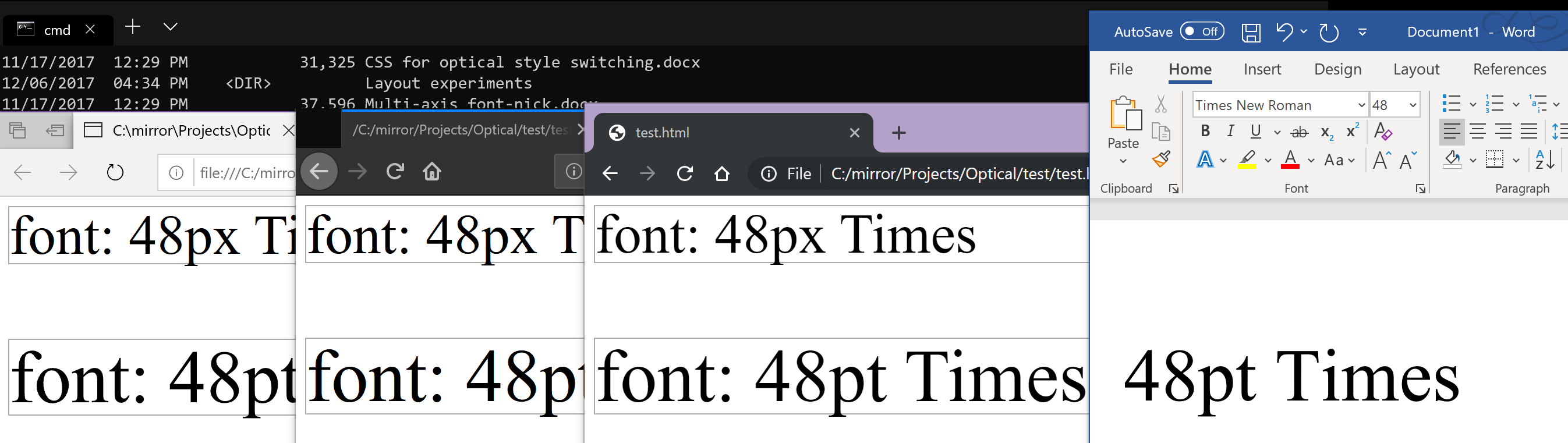
The observation that we made when we implemented optical sizing is that 1 typographic point = 1 CSS pixel.
This is clearly true: Safari, Firefox, Chrome, Pages, Microsoft Word, raw Core Text, and TextEdit all agree. Here is an image of Ahem rendered in all of those using a size of 48 typographic points:

You can see that the rendered size is the same in all of these different apps. In addition, Pages even puts units on the font size: "pt". The documentation for raw Core Text (the second to rightmost app in the above image) also indicates that its size is in points:
The point size for the font
So, when we apply an optical-sizing value of X typographic points, that is equal to CSS pixels, and we apply this correctly.
I'm not making a point (no pun intended) about what _should_ be true, or what the designers of desktop typographic systems _intended_ to be true. Instead, I'm making a point about what is, de facto, true _in reality_.
 litherum
on 17 Oct 2019
litherum
on 17 Oct 2019
@litherum please could you show us this on windows?
davelab6
on 17 Oct 2019
A CSS px is device pixels per inch / 96, and a CSS pt is device ppi / 72.
This is absolutely not true. See https://github.com/w3c/csswg-drafts/issues/614
litherum
on 17 Oct 2019
@svgeesus
the adjustment created by the font designer is not being applied correctly.
We are absolutely applying it correctly. See https://github.com/w3c/csswg-drafts/issues/4430#issuecomment-543315394
litherum
on 17 Oct 2019
@litherum when you say “typographic point” you seem to be referring to a very Apple-centric measurement, whose dimensions (measured with a ruler off a screen) started off in the 1980s as exactly 1/72 inches, conveniently aligning with early Macs having exactly 72 pixels to the inch. However since then, the size of the Apple 100% zoom screen point has varied significantly depending on the device. At the same time, Apple UIs and documentation continue to refer to this measure as “points” without very often reminding users or developers that each device applies its own scale factor such that these are no longer the 1/72 inch points defined in dictionaries.
As Dave implies, Windows specified its own definition for “standard screen resolution” of 96ppi, and, respecting the idea that a real-world point is 1/72 inches, observed a 4:3 ratio for a font size: in a traditional Windows app, 9 points is 12 actual pixels. Higher device resolutions meant that these pixels became virtual, and that Microsoft, like Apple, could gradually shrink the size of that virtual pixel and, along with it, the physical size of the Windows point.
In CSS, the idea of the “pt” unit is de facto standardized on the Windows relationship of points to pixels, and CSS px are based on the idea of the visual angle subtended by a single pixel on a ~2000-era computer. Thus modern browsers _including Safari_ treat 3pt = 4px.
It was therefore natural that font developers assumed browsers would adopt whatever the user agent defined a CSS pt to be as the scale for the opsz axis.
BTW it is regrettable there is no online reference for what 1px (CSS) measures on modern devices. Here are two classic pt measurements and three data points I just measured with my ruler. In all cases, 1pt (CSS) is 4/3 the size of 1px.
- Macintosh (1984): 0.353mm (1/72 inch)
- Windows points: 0.265mm (1/96 inch)
- MacBook Pro 15" Retina: 0.228mm
- iPhone 5S: 0.152mm
- iPhone 8: 0.152mm
Lorp
on 17 Oct 2019
Thus modern browsers _including Safari_ treat 3pt = 4px.
Yes, according to CSS Values and Units, 3 CSS points = 4 CSS pixels. We agree here. I'm claiming something different, about how CSS measurements relate to non-CSS measurements.
it is regrettable there is no online reference for what 1px (CSS) measures on modern devices.
CSS px is intentionally divorced from physical measurements. Again, see https://github.com/w3c/csswg-drafts/issues/614
litherum
on 17 Oct 2019
I'm not as nuanced in the CSS unit system, but it doesn't look to me like 1 typographic point == 1 CSS px, at least not on my Windows 10 machine. @litherum, am I misinterpreting your comment above?
(Left to right: Edge (MSHTML-based), Firefox 69.0.3, Chrome 77.0.3865.120, MS Word win32 build 1911).
The concern I have relates to how fonts are built. Microsoft Sitka has the following styles:
Low (>=) | High (<) | Style
-- | -- | --
0 | 9.7 | Small
9.7 | 13.5 | Text
13.5 | 18.5 | Subheading
18.5 | 23.5 | Heading
23.5 | 27.5 | Display
27.5 | ∞ | Banner
When a web developer sets font-size to 12pt (or 16px), it should be using the Text style of Sitka as that's optimized for body sizes (i.e. opsz=12). As I understand it, though, Safari, Firefox, and Chrome will pass 16 for the opsz in both these cases, resulting in Subheading being displayed, degrading the legibility of the font somewhat and deviating from the intention of the font designers. (Matthew Carter and John Hudson spent hours staring at different sizes and styles to determine these numbers, which is partly why they're strange numbers like 9.7).
If my interpretation of how browsers are working is correct, I worry that font designers will be struck with a difficult choice: build your font for the web, or for print - because you'll need different values of opsz for each to get exactly the results you'd like (type designers being a picky lot). They may choose to ship two versions (much to the confusion of their customers), or set values based on web or print depending on what their particular customers tend to use (thus you'll have customer confusion when one type studio caters to print media and another to web).
I hope, however, I'm just thoroughly confused and everything is fine (i.e. 12pt or 16px == opsz 12).
 robmck-ms
on 18 Oct 2019
robmck-ms
on 18 Oct 2019
@davelab6
please could you show us this on windows?
Yes, thank you for this suggestion, it was quite illuminating.

Here, no apps state any units, but you can see that the size in the native apps is different than CSS pixels in the browsers. The blue app feeds “48” directly into IDWriteFactory::CreateTextFormat(), whose documentation says:
The logical size of the font in DIP ("device-independent pixel") units. A DIP equals 1/96 inch.
From this result, it appears that the size of a typographical point is different between Windows and macOS / iOS. This is a very interesting result, and I didn't realize it or try on Windows when implementing this. Thanks @davelab6 for the suggestion!
litherum
on 18 Oct 2019
@robmck-ms
When a web developer sets font-size to 12pt (or 16px), it should be using the Text style of Sitka as that's optimized for body sizes (i.e. opsz=12)
This is very interesting. When a web developer sets font-size to 12pt (or 16px) on San Francisco on macOS & iOS, it should be using the optical sizing value of opsz=16.
So, this seems to agree that the size of a typographical point is different depending on which platform you're using.
We're making progress!
litherum
on 18 Oct 2019
it is regrettable there is no online reference for what 1px (CSS) measures on modern devices.
CSS px is intentionally divorced from physical measurements. Again, see #614
Indeed. My “point” is that the virtual “points” used by Apple and Microsoft have real-world measurements that not only vary just as much as the CSS px, but are also defined differently from each other (with a ratio of 4:3) — and web browsers adopted the Microsoft definition.
Lorp
on 18 Oct 2019
@litherum
When a web developer sets font-size to 12pt (or 16px) on San Francisco, it should be using the optical sizing value of opsz=16.
Font makers are going to be pretty consistent in interpreting a point to = 1/72 inch — that's how a point is defined in the mental space in which we operate, and has been for a long time —, and that's the unit in which we specify values on the opsz axis. If there's a notion of a 'typographical point' in use in CSS or other environments that is different from 1/72 point, than a) that seems a bad idea, and b) y'all are going to need to make scaling calculations to get the correct optical size design from the opsz axis.
If it helps, we could add an explicit statement to the opsz axis spec that 'point' in that context = 1/72 inch.
 tiroj
on 20 Oct 2019
tiroj
on 20 Oct 2019
Am I reading this thread correctly, in that basically the only fonts that assume px instead of pt for opsz are Apple system fonts?
Crissov
on 21 Oct 2019
Thanks Laurence and Adam for bringing this up. That it comes up again and again I think is the result of not taking issues of web typography on in real time, waiting for things to go wrong and then trying to fix them.
Deciding on and uniting behind 72, and not any of it’s parents, like 72.289, 72.27? And also discounting typographic points that were misrepresented by any system attempting to display typographic points accurately, for any of the many reasons that was done before pixels became smaller, then a lot smaller, than points?
Isn't device ppi desirable remove from quotes, as it is needed to represent the pixels of the users device, so opsz = actual size. Something out of type design scope, like “where the user is sitting” or what OS they use, doesn’t seem like it should be a “forever” issue in web font sizing wars?
Getting actual sizes begins to make the development of more sophisticated self-adjustment of type by users nearly thinkable? I.E. “who the user is”, is the goal for some I know who care for world-script use, to replace the “zooms” we’ve been given with a better opportunity to serve users type they will _each_ like reading?
@tiroj That’s agreed, FB and others join you in making opsz decisions based on typographic points. And we make a series of decisions inside the em, about how points are going to be distributed among glyph measures. This relationship between what is inside of the em, and what was going to happen outside, within 1/10,000”, used to be known and proudly used to make a vast range of things people wanted to read, or see.
That craft has not evolved very well as we can see. Right now, if type needs a small size and a W3C presence, a rut pretty clearly exists where it’s best if everything opaque inside the em is around just one measure that rounds to a minimum of little more than two px, (see default san serif fonts of the world), and that rut is swallowing the design of fonts, logos, and icons.
So I’d like to be onboard en route to discarding the tortured histories of non-standard rounding of 72, non-standard presentaion of what was purported to be 72, personal opinions of other people’s opsz implementations, distance of the user for whatever reason, false reporting of ppi by device manufacturers, and adoption of any of the above by W3C, or in practice there.
What to do to provoke a path to addressing the users’ stated device ppi, via ppi/72 = pts. per pixel or pixels per point? That is the question i want answered that I think “px” alone, or associated in some magically way with an actual size like opsz, does not.
 dberlow
on 21 Oct 2019
dberlow
on 21 Oct 2019
I think I see what's happening.
Font makers are going to be pretty consistent in interpreting a point to = 1/72 inch.
Yes, we agree.
Let's take a trip back in time, before the Web existed, when early Apple computers were being designed. Here, the OS was designed for 72dpi devices, such that one typographical point = 1 pixel on the screen. I don't think this is true for Windows (though someone can correct me if I'm wrong). This design has continued forward to today, and even into iOS, even being generalized from the concept of a pixel into the modern concept of "Cocoa point." Different physical devices are shipped with different physical DPIs because of physical constraints, but the design of the OS has followed this design from the beginning.
Then, the Web was invented, and CSS along with it. Using px as a CSS unit became common. Browsers on the Mac decided to map 1 CSS px to one physical pixel on the screen. This is understandable; it would have been unfortunate if every border sized be an integral number of CSS px ended up being fuzzy on the Mac. The browsers correctly abided by all the ratios listed in CSS, where 1 CSS pt = 4/3 CSS px. So far so good.
Now, we fast forward to today, where we are discussing optical sizing. This is a feature that is defined to be represented in typographical points - specifically _not_ physical pixels or CSS points. macOS and iOS are still designed under the design that one Cocoa point = 1 typographic point. So, if someone was trying to achieve a measurement of 1 typographical point = 1/72 inches (not CSS inches!) on macOS or iOS, the correct way to achieve that would be use a value of one Cocoa point, and the way of representing one Cocoa point in every browser on macOS & iOS is to use 1 CSS pixel.
I can't speak about any other specific OSes, but we can consider a hypothetical OS which was designed where 1 pixel = 1/96 inch = 3/4 typographical points. If someone was trying to achieve a measurement of 1 typographical point = 1/72 inches (not CSS inches!) on this hypothetical OS, the correct way to achieve that would be use a value of 4/3 pixels, and the way of representing 3/4 pixels in the browser might be to use 3/4 CSS pixels.
litherum
on 22 Oct 2019
The browsers correctly abided by all the ratios listed in CSS, where 1 CSS
pt= 4/3 CSSpx. So far so good.
Um, actually, some browsers _violated_ the original spec and authors relied on their behavior, so CSS was changed to accommodate them and the rest of the browsers had to follow suit. Originally, pt etc. were truly physical measures on all media.
Crissov
on 22 Oct 2019
If everyone agrees that Open Type for opsz assumes DTP points of 352+7/9 µm, this would require browsers to know the physical dimensions of the output device in order to implement _optical size_ correctly. (This would also make other physical units in CSS more likely. #614)
Only as a fallback, they may assume one of the classic values, i. e. 25400 µm = 1 inch = 72 or 96 device pixel or an integer multiple thereof like 216 (_Retina_ @2x) for desktop screens, or one of the modern values, e.g. 120 ldpi, 160 mdpi/@1x, 240 hdpi, 320 xhdpi/@2x, 480 xxhdpi/@3x and 640 xxxhdpi/@4x for handheld devices.
Unlike pt, browsers then _must not_ scale physical points to fit px, i. e. cinema projection and VR goggles would basically always use, respectively, the largest and smallest optical size.
Crissov
on 22 Oct 2019
Hi Miles,
So, if someone was trying to achieve a measurement of 1 typographical point = 1/72 inches (not CSS inches!) on macOS or iOS, the correct way to achieve that would be use a value of one Cocoa point, and the way of representing one Cocoa point in every browser on macOS & iOS is to use 1 CSS pixel.
Isn't this where it falls apart? You've defined a Cocoa point as =1/72 inch, but a CSS pixel is defined as 1/96 inch. So treating on typographic point as = one Cocoa point but using one CSS pixel to represent one Cocoa point is going to mess up the sizing of anything specified in typographic points.
I'm almost afraid to ask what a 'CSS inch' is. Are you referring to the fact that at lower resolutions there is rounding in display of absolute measurements? Otherwise a CSS inch is the same as a standard inch, no?
[The whole question of how best to implement resolution- and other device-dependent adjustments in OT variations design space is something most people are praying will go away. It may yet need to be better addressed.]
tiroj
on 22 Oct 2019
Isn't this where it falls apart?
Not at all. CSS pixels are not defined to have any physical length. A CSS inch is defined to be equal to 96 CSS pixels. It’s up to each UA to pick a size for 1 CSS pixel. All major browsers on the Mac agree to set 1 CSS pixel equal to 1 Cocoa point. The design of the OS models this as equal to 1/72 physical inch (though if you get your ruler out, you’ll find that the physical pixels don’t exactly match this).
Changing Mac browsers to treat 1 CSS pixel as 3/4 Cocoa point would Introduce the behavior the OP is asking for. However, that would 1) change the rendering of every website on the web, confusing users 2) remove interop that is already present, and 3) cause integral-px borders (which are common) to get fuzzy. Changing every website because of optical sizing, which is only used on few websites, doesn’t seem worth it.
If the optical sizing value was defined to be set in CSS points, there would be a different story. However, it is defined to be set in typographic points, and macOS and iOS are correctly honoring that definition.
litherum
on 22 Oct 2019
A CSS inch is defined to be equal to 96 CSS pixels.
Can you point me to the specification for this, because everything I've found so far suggests the opposite, that a CSS pixel is 1/96 of a standard inch (which is precisely how I recall it being defined when the move was made to make px a non device pixel measurement). I've not found anything that suggests that a CSS inch is derived from 96 CSS pixels, rather than the other way around.
It’s up to each UA to pick a size for 1 CSS pixel. All major browsers on the Mac agree to set 1 CSS pixel equal to 1 Cocoa point. The design of the OS models this as equal to 1/72 physical inch
Let me see if I get this straight:
You're standardising 1 CSS px = 1 Cocoa pt = 1/72 standard inch. Yes?
But 1 CSS px = 1/96 of a CSS inch. Yes?
So, for your OS, 1 CSS inch = 1⅓ standard inch. Yes?
tiroj
on 23 Oct 2019
Can you point me to the specification for this
https://drafts.csswg.org/css-values-3/#absolute-lengths
So, for your OS, 1 CSS inch = 1⅓ standard inch. Yes?
Yes! This is a better result than having most borders end up being fuzzy.
litherum
on 23 Oct 2019
Thanks for the link, Miles. I suppose the concept of the CSS pixel being the canonical unit that enables compatibility between the 'absolute' measurements does sort of imply that they are derived from it, rather than vice versa, but it still seems whacked out that this can inflate the size of these units so far from their standard measurements.
tiroj
on 23 Oct 2019
Windows rendering system at its most fundamental level assumes 96 pixels per inch. More accurately: it has the concept of 96 Device Independent Pixels (DIPs) per physical inch.
When Windows boots up, it queries the EDID from each of the displays to get the pixel counts and physical size, computes the physical ppi for the device (96ppi is the floor, so projectors and giant displays are treated as 96ppi). Then, it computes a scale level between the physical ppi and 96DIPs. If your monitor's 96ppi, then you'll be running at a scale of 100%. If 144ppi then 150%. The scale factor is not continuous (e.g. you can't do 107.256%), but is a step function amongst a set of fixed levels (e.g. 100%, 125%, 150%, ...) because there are a lot of bitmaps UI assets in applications and they can't support arbitrary scaling. The user can change this scale factor any time they want in the system display settings.
The nutshell of this is: Windows does a best-effort to get 96DIPs to be one physical inch, but it's not always precisely that. The rest of the rendering stack is based on that.
So, for Windows we can assume the following:
- There are 96DIPs in an inch (best effort).
- 72 points in the API = 96DIPs
- The OS and applications either use API points or DIPs. (I believe browsers generally use DIPs as that's what DirectX is built around).
So, since 72 CSS points = 96 CSS pixels, and (on Windows) 1 CSS pixel = 1 DIP and 96 DIP = 72 API points ~= 72 typographic points (best effort), then it is reasonable for browsers on Windows to use CSS Points (or at least 4/3 CSS pixels) for opsz.
But, actually, all this fuss to get close to 1/72 of an inch on a physical ruler misses a key point:
As I pointed out back in #807, opsz should vary based on the _document type size_, not the rendered type size. There are a lot of really legitimate reasons for the type size to be completely different than the opsz (e.g. for the severely vision-impared, they may have text rendered at 3 inches high on the screen, yet they absolutely need all the legibility features built into the opsz=12point). But, it should remain consistent within a document.
So, it makes more sense to use the units of the document. For HTML, that's CSS pixels and points (which are already defined in a 96:72 ratio). How those pixels and points map to typographic points, DIPs, or whatever unit system a given OS uses, is, I believe, not relevant as it's outside the context of the document. Within the context of an HTML document, there's only CSS pixels and CSS points. I recommend that opsz be set to CSS points as, within the context of the doc, that's the most relevant measure.
That document-centric view may also be helpful to avoid platform-dependent mapping issues. If browsers relied on underlying OS rules (e.g. 1 CSS pixel = 1 pixel = 1 typographic point; or 96 CSS pixels = 96 DIPs = 72 typographic points), then rendering would also end up being platform-dependent, which I don't think anyone wants, or force all browsers to adopt the underlying rules of only one platform, which I believe is the current state (if I'm not misinterpreting). The document-centric view keeps rendering consistent within the document, affords usability and other scenarios, and keeps everything independent of underlying platform assumptions.
/cc @gr3gh
robmck-ms
on 24 Oct 2019
The biggest difference between https://github.com/w3c/csswg-drafts/issues/807 and this issue is about implementer recommendations vs normative requirements. Our browser on our platforms needs to apply the optical sizing appropriate for the environment. Other behaviors are wrong on our platform.
litherum
on 25 Oct 2019
Our browser on our platforms needs to apply the optical sizing appropriate for the environment.
That's understandable, and I'm just trying to wrap my head around whether that's actually happening. Simply stated, and with all the usual caveats around resolutions and closest match, will your environment get the opsz instance that most closely matches the physical size of rendered type as expressed in typographical points? Put another way, if I have type that is something like 14pt in measurable size on a device, will an opsz 14pt instance be displayed?
tiroj
on 25 Oct 2019
will your environment get the opsz instance that most closely matches the physical size of rendered type as expressed in typographical points?
Yes.
litherum
on 25 Oct 2019
From this result, it appears that the size of a typographical point is different between Windows and macOS / iOS. This is a very interesting result, and I didn't realize it or try on Windows when implementing this.
I think this dates back to the original Macintosh (and Lisa?) which had 1/72 inch pixels, specifically so that 1 pixel would equal 1 point. This was way before CSS redefined SI measurement units :) and is also the source of the oft-quoted and wildly anachronistic "screen resolution is 72ppi, printers are 300 ppi" (from the original LaserWriter). _Edit_: I see several people already pointed this out.
It isn't the case on other systems though, which is why CSS eventually settled on the 1in = 2.54cm = 96px definition in V&U, largely for Web compat reasons.
svgeesus
on 28 Oct 2019
Chris,
It isn't the case on other systems though, which is why CSS eventually settled on the 1in = 2.54cm = 96px definition in V&U, largely for Web compat reasons.
There seems to be two different interpretations of that definition, though.
The first would be that a physical inch is divided into 96 CSS pixels, ergo that a CSS px is an absolute measurement value (rendering of that value may not be absolute because of resolution, but that's true of any absolute value).
The second would be that 96 CSS pixels of _arbitrary_ size constitutes a CSS inch (and a CSS 2.54cm!), which is hence also of arbitrary size, and which Apple treats as 1⅓ physical inches by virtue of how they define the size of a px unit.
Is either of these interpretations definitively correct relative to how the units are defined in CSS?
tiroj
on 28 Oct 2019
The second, as defined here: "All of the absolute length units are compatible, and px is their canonical unit."
svgeesus
on 28 Oct 2019
Browsers use the arbitrary conversion between OS (typographic) units and CSS units. For example, one of the types of zoom in WebKit is a layout zoom, where we intentionally change the conversion factor between OS and CSS units, thereby redefining each CSS pixels to be a larger amount of typographic points. This type of feature isn’t _incorrect_; it simply tweaks an implementation-specific conversion value.
litherum
on 28 Oct 2019
Browsers use the arbitrary conversion between OS (typographic) units and CSS units.
@litherum: I think I just got confused. I'd been assuming that the term 'typographic points' you'd used referred to physical points. E.g. if I put a typographer's ruler on the screen, '72 typographic points' would register 72 points or 1 inch on my ruler. But, in the quote above, you say something a bit more nuanced: 'OS (typographic)' that 'typographic points' is an interpretation by an OS and not a physical measure.
robmck-ms
on 28 Oct 2019
To wrap my head around all this, I did some testing to see what values of opsz browsers were using and how they actually render on screen. Quick summary: Macos is using unexpected values for opsz, and does not render 72pt at 72 physical points on-screen as measured with a ruler (in fact, it's 54pt which is 3/4 of 72, which may be interesting here). Windows Firefox uses values of opsz that are based on css px, while MSHTML-based Edge sets opsz based on css pt. All the Windows browsers render 72pt as 72 physical points as measured on screen with a ruler. (96dpi monitor with the OS at 100% scaling).
Test environment
I created a new version of Selawik Variable Test that adds an opsz axis. This font includes ligature glyphs that will show parameters that were given to the rasterizer (this comes thanks to some clever hinting tricks by @gr3gh, with tips from @nedley so that the hints execute even on macos), documented here. The new version of Selawik Variable Test is here.
The opsz axis in this font doesn't have any visual differences (the fvar table is the only table that it appears in). However, if you use the \axis2 ligature, then it will show you the normalized opsz coordinate used to render the font. The axis is defined as being from 0 to 100, which means the normalized coordinate is just the opsz coordinate / 100. (Note: there may be rounding errors due to axis coordinates being 2.14 fixed-point internally, thus the \axis2hex ligature gives you the exact normalized 2.14 value).
For measuring physical type size, you can also use the em-dash in Selawik as this glyph is the full UPM width. (Theoretically, you can also measure the distance between an ascender and descender, but you have to account for the difference between vertical metrics in the font and it's UPM value, so the length of the emdash is easier).
I've created a codepen for everyone to use to try out this font on various browsers and OSes: https://codepen.io/robmck/pen/GRREgzG (Thanks to @lorp for hosting the font).
Now here's the interesting bits:
Windows
- Edge (MSHTML-based). This gives the values I'd expect. Text set in 72pt is rendered with opsz=72. Text set in 72px is rendered with opsz=54 (see hex value) which is 72 * 4/3. When I measure text on a 96dpi screen at 100% scaling, I get text that is 1 inch (72pt) high.

- Firefox. 72pt is rendered with opsz=96, and 72px is rendered with opsz=72. This indicates that Firefox is using px for opsz, not pt. However, the text is the same size on screen as Edge-MSHTML.

- Chrome Canary 80.0.3951. Shows normalized values of 1.0 (thus opsz=100) for all sizes. I had thought automatic style scaling was turned on in Canary, but maybe not (@drott?).

macos
- Safari. 72pt is rendered with opsz=93.274, and 72px is rendered with opsz=52.954 (I used the hex values here to make sure there wasn't any rounding issues in the display of \axis2, which only shows 4 significant digits). These are unexpected values. Based on @litherum's description, I would have expected values like Windows Firefox. Perhaps something in my config? (Macbook Pro, macos 10.13.6). The physical size of the emdash is 0.75 inch = 54 typographic points. I note that this is 72/96 of 1 inch.

- Chrome Canary 80.0.3951. Same values and physical size as Safari.

- Firefox. Same values and physical size as Safari.

Thoughts
I had hoped there'd be more commonality here. Both opsz values and physical sizes differ.
From CSS/web folks, what would be expected here?
robmck-ms
on 28 Oct 2019
This is clearly true: Safari, Firefox, Chrome, Pages, Microsoft Word, raw Core Text, and TextEdit all agree. Here is an image of Ahem rendered in all of those using a size of 48 typographic points:
This basically means: Safari f#cked up, and Firefox and Chrome matched it. Doesn't make your claim true. :)
 behdad
on 28 Oct 2019
behdad
on 28 Oct 2019
@robmck-ms
I'd been assuming that the term 'typographic points' you'd used referred to physical points. E.g. if I put a typographer's ruler on the screen
No. There are 3 distinct coordinate systems here:
- CSS Units
- OS / Typographical Units
- Physical Units (as measured with a ruler)
The conversion between 1 and 2 is arbitrary, and browser features ("layout zoom") have even been built on top of this arbitrary conversion.
The conversion between 2 and 3 is arbitrary, because manufacturing processes are physical, constrained phenomena.
Optical sizing occurs in the 2nd coordinate system, because it has to match the rest of the system. I make no claims about anything that happens in the 3rd coordinate system.
litherum
on 29 Oct 2019
@behdad
Safari f#cked up
Please use civil language.
Also, we did not "f#ck" up. The fact that OS / typographic points match across the whole system, in browsers and in native apps, is a feature.
litherum
on 29 Oct 2019
@litherum
Please use civil language.
You are right. I apologize.
Also, we did not "f#ck" up. The fact that OS / typographic points match across the whole system, in browsers and in native apps, is a feature.
What I'm saying is that had Safari chosen to match CSS points, not pixels, to CoreText points, then everything would have still lined up and we wouldn't be having this conversation.
behdad
on 29 Oct 2019
If Safari matched CSS points, it would be incorrect on macOS and iOS. In fact, we used to do it wrong, and I fixed it in https://bugs.webkit.org/show_bug.cgi?id=197528
litherum
on 29 Oct 2019
It seems like there are two issues here:
1) The size that text is rendered
2) What value to set opsz to for a given size
For the first issue, the web community has gone through an enormous amount of work to carefully define units, sizes, etc to get this right, and has done so. E.g. as @litherum describes, on macos and ios, 1 CSS px = 1 CoreText pixel = 1 macos typographic point. That is exactly the right choice to ensure text size rendering across all applications on macos and ios. Similarly folks have analogous choices to maintain text size consistency on other platforms. None of this could or should change.
So we come to the second issue: what is the implementation recommendation for the value to set opsz to for a given text size in CSS, which can be defined in myriad ways, but ultimately comes down to CSS px? Safari's implementation (and FireFox and I believe Chrome following in suit) is to set opsz = px. This recommendation is consistent on macos because opsz is defined in terms of points, and macos typographic points = CSS px. To ensure cross-platform consistency, then other browsers on other platforms would have to follow suit and set opsz=CSS px, even though the assumption this is based on (CSS px = OS point) is not true.
I've several concerns with this approach:
1) There is no way for a font maker to make a single font that works the same in print as it does on the web. For example, many font makes have customers in the magazine, newspaper and book publishing world (as well as advertising), who care very much that print matches web. With the above recommendation, text at the same nominal size (e.g. 20pt) will look different between web and print. To satisfy their customers, font makers would have to issue two versions of the font - one for print, and one with opsz scaled by 3/4 for the web (and managing two versions of the same font isn't a great compromise for customers, either - especially since one of the selling points of variable fonts is simplifying the number of font files you have to deal with). An alternative implementation is for the W3C to ratify @lorp and @twardoch's proposal so foundries can tell their customers to go always set this property in CSS.
2) If designers don't know to apply the correction to fonts with an opsz axis built as the OpenType specification defines, then it negatively impacts legibility. The font will render with a higher effective opsz, which biases the font away from legibility and towards personality. In reading, legibility is everything.
3) This recommendation does not implement the OpenType specification as the specification was intended. As someone who worked the OpenType spec, I would love for the OpenType world and the CSS world to be able to work smoothly together, the two specifications complimenting each other. It doesn't feel so smooth right now. (But perhaps that's natural as we're all learning each other's context, assumptions, immutables, etc).
So, here is my proposal:
First, we must not make any changes to the fundamental assumptions that have already been made for text sizing. Macos will still have 1 CSS px = 1 CT px = 1 macos typo pt, as it should be, and analogously in other platforms. Second, the implementation recommendation would be that browser set the value of opsz to 4/3 of CSS px. As I understand it, the CSS px is the fundamental, common unit, so we relate the recommendation to it and not "point" as it is too varied in definition and implementation (CSS point, macos point, windows point, UK point, European point, ...).
By doing this, print matches the web; legibility is maintained; and the CSS specification and OpenType specifications are in harmony (as opposed to dissonance we are experiencing in this thread).
Failing that, then we still need some other solution. W3C could adopt @lorp and @twardoch's proposal, as it's a lovely compromise. But, I know I'd have to recommend everyone set font-optical-sizing to 0.75 to make fonts work, and the engineer in me cringes at the idea of having a solution in which everyone sets X to Y to work well. But perhaps there is another solution?
robmck-ms
on 29 Oct 2019
davelab6
on 30 Oct 2019
Why not just have browsers on each OS honor their OS's design? Browsers on macOS and iOS should match the typographical conventions of that OS, and browsers on other OSes should match the typographical conventions of those other OSes. Font creators can rely on the expectation that opsz is set to the font size in typographical points.
I believe your proposal requires text on macOS / iOS drawn in a browser looking different than text drawn in a native app at identical sizes. This would be extremely unfortunate.
litherum
on 30 Oct 2019
@robmck-ms Is this a correct tabular summary of your test results?
| OS | Browser / Engine | opsz @ 72pt | opsz @ 72px | 1in / 1 inch |
|---|---|---|---|---|
| macOS| _all_ | ~96 | ~54 | ~75% |
| iOS| Safari / WebKit | ~96? | ~54? | ~75%? |
| Windows| _non-browser_ | 72? | 54? | ~100%? |
| Windows| Edge / MSHTML | 72 | 54 | ~100% |
| Windows| Firefox / Gecko | 96 | 72 | ~100% |
| Windows| Chrome / Chromium | 96 (100) | 72 (100) | ~100% |
| Windows| Safari / Webkit |~96? |~54? |~75%? |
| Android| Chrome / Chromium | 96? | 72? | ~100%? |
(I tried the Codepen in Chrome on Android, but either opsz or TTF did not work.)
Crissov
on 30 Oct 2019
@robmck-ms Is this a correct tabular summary of your test results?
Mostly, yes, but some updates below:
For macos: I discovered that the avar table in the font was causing some problems on macos, so I removed it, and updated the URL in the codepen. (The avar table is not relevant to this test, so unnecessary) This accounts for the strange numbers I saw for macos, and brings us within rounding error of what I'd expect:
| OS | Browser / Engine | opsz @ 72pt | opsz @ 72px | 1in / 1 inch |
|---|---|---|---|---|
| macos | all | 95.996 | 72 | ~75% |
Currently, there is no "Windows non-browser" line yet as browsers are the only applications that currently support automatic optical size. (DirectWrite does not have an API specifically for optical size selection because it's concidered an app-level decision as it has the context of the rendering intent (e.g. it knows if its zooming or not)). If/when Office supports automatic optical size, it will be based on the point size of the text in the document.
I didn't test Windows / Safari as I didn't think there was such a thing anymore. Is there? I couldn't find a Windows webkit build.
I tried the codepen on my Android phone. The text size in landscape is much different than portrait, so I don't know what to use as a baseline, so I didn't report on Android. I added a third line to the codepen that forces opsz to 50 to verify that the font does work on Android.
robmck-ms
on 1 Nov 2019
Why not just have browsers on each OS honor their OS's design?
That's an important question. Paraphrased: why break consistency with other apps on the OS (especially after so much work went into getting the text size the same)?
Ultimately if you maintain that consistency, and the web follows the macos convention, then legibility will be reduced (due to using higher opsz than designed), and it will not be possible to build one font that works on both web and print.
But, I think you already have a consistency problem anyway: Safari will set opsz=16 for 12pt. Will TextEdit or Pages use opsz=16? I would expect that they would just call CoreText with 12pt, and since CoreText thinks 1pt = 1pixel (and has no 4:3 bulit into it), won't it use opsz=12? If so, native apps on macos will use opsz=pt, because there's no 4:3 mapping, while Safari uses opsz=4/3pt. That means the optical style will differ between Safari and these apps, despite them being rendered at the same physical size.
Looking beyond that, any app that considers print a primary endpoint (e.g. Microsoft Office, Adobe InDesign, Pages?...) will likely use the document point size for automatic optical size. I.e. 12pt text will use 12 opsz. (If/when Office supports automatic optical size, this is what we will do). When it comes to print, there's realy no other option: there is no other unit analogous to CSS px to fall back on (there is no device-independent pixel in print), and the output is always consistent (12pt is exactly 12/72"). So, between these apps and Safari, all set to 100% zoom, you'll have consistency in physical size, but inconsistency in optical style.
(It's worth noting that when I talk about print, I'm not just talking about printing a Word doc on your laser printer; I'm including the whole print industry - books, magazines, newspapers, advertising, packaging, etc. They're all run on applications that run on Windows and MacOS (more often on the latter)).
Ultimately, then, it looks like there's a tradeoff: On one hand: internal consistency on a given platform; on the other: legibility and the ability to make one font that works the same in print and web. If internal consistency is possible (I don't know that it is), is improving legibility and enabling one font to server print and web worth breaking that consistency? Or flipped: Is maintaining internal consistency worth reducing legibility and requiring print & web fonts to be built differently?
robmck-ms
on 1 Nov 2019
Side note: it's not strictly possible to have each browser support the OSes typographic conventions: To do so, macos browsers would all set opsz=16 for 12pt since one macos point is 1 CSS px, thus 4/3 CSS pt, and Windows browsers should set opsz=12 for 12pt since on 1 OS point = CSS point and 1 DIP = 1 CSS px. Of course, we can't do that because we wouldn't have cross-platform consistency. I believe this is why Firefox chose to have consistency, by supporting the macos typographic convention on all platforms, even Windows. That's not strictly honoring the host OS convention, but honoring the macos convention.
I guess my proposal comes down to this: do you set opsz to one OS point, or one CSS point? The former might have internal consistency on macos, but is inconsistent with print-based applications and, strictly speaking, browsers on other OSes (unless they adopt one macos point). The latter would be consistent amongst other OSes and print apps, but forces macos to break consistency and adopt a Windows point.
The real culprit is history: if the web had adopted macos conventions, then we'd be having this exact same conversation, with the roles swapped.
robmck-ms
on 1 Nov 2019
I’d like to add that in the old times with static TTFs, the original ppi difference between Mac and Windows resulted in different ppm sizes of the font being used for a given pt size. This was optical sizing to some extent on screen because of different hinting instructions being used, but the difference was quite small in most cases. Only very few fonts modified the advance width to a noticable extent, and ultimately many apps such as Word discouraged that, caching higher-res spacing and enforcing it — to prevent reflow when zooming.
But with opsz, it’s dramatic. Most fonts with opsz will have quite noticeable spacing differences between 9 & 12 or between 12 & 16. That's the whole point of optical sizing.
I’m no longer sure which numbers to use, but I know a few things:
When in doubt, it's better to user the lower opsz value. Choosing a “too low” opsz value will get you slightly clunkier text but it will be readable. Choosing a “too high” opsz value will get you unreadable text that’ll defeat the purpose of font-optical-sizing.
If we get end up having inconsistent implementations, then we really should stop. As the original author of the font-optical-sizing property, I’d call for its removal, and I’d recommend that opsz is never automatically selected.
Ultimately, we’re still early in the process (there aren’t many VFs with opsz, and if there are some, they can be fixed). But it really matters that we do it “right”, and communicate it clearly.
Adobe has the largest library of fonts with optical sizes as an axis (there were the old MMs and I imagine they could make some test VFs). Because perhaps we should try to eyeball it. Though still, a potential *0.75 difference is just huge.
Even if we adopt a consistent solution, this proposal for extending font-optical-sizing with a multiplier still is very useful. Ultimately, it’s a tool to control the viewing angle, or “gamma”. There will always be cases where the automatic opsz selection will be not optimal — for a tiny dense screen or when using a projector, or when designing something in DIN A4 that will then ultimately be printed as a poster.
 twardoch
on 1 Nov 2019
twardoch
on 1 Nov 2019
@robmck-ms
Of course, we can't do that because we wouldn't have cross-platform consistency.
There are plenty of things that are not consistent across platforms on the web. Text antialiasing, generic font families, behavior of editing commands, and now optical sizing. Indeed, having pixel-exact renderings across platforms is an anti-goal of the web.
and the web follows the macos convention
I’m not proposing that the Web following the macOS convention. I’m proposing that each browser follow the platform conventions that they’re running on.
Regarding optical sizing specifically, we’ve arrived at a tension between consistency across multiple apps on a particular platform, and consistency of a particular app across multiple platforms. When those two are in conflict, consistency across multiple apps on a particular platform wins, because there are way more users who use multiple apps on a particular platform than who use a particular browser across multiple platforms.
The bottom line is: We can’t have text rendering looking different in Safari than on the rest of the platform (by default - if the web author wants it to look different, they can use font-variation-settings).
litherum
on 3 Nov 2019
I’m proposing that each browser follow the platform conventions that they’re running on.
Regarding optical sizing specifically, we’ve arrived at a tension between consistency across multiple apps on a particular platform, and consistency of a particular app across multiple platforms. When those two are in conflict, consistency across multiple apps on a particular platform wins, because there are way more users who use multiple apps on a particular platform than who use a particular browser across multiple platforms.
Given that, do you believe then that Firefox (and I believe Chrome is going in the same direction) have incorrectly built their non-macos implementations as they follow the macOS one of opsz=CSS px, which does not equal the OS point size on other platforms?
If it is to be the case that some browsers follow opsz=CSS px, and other browsers and non-browser apps follow opsz=points (CSS, docx, pdf, etc), do you have a recommendation for mitigating the problem that one font cannot be designed for all this? Relying on font-variation-settings is untennable in practice as it does not cascade well in the complex DOMs in most big production sites. I've talked to several design studios of various Microsoft sites and they've all given up on font-variation-settings. Things need to work from the higher-level settings (font-weight, font-stretch, etc).
Also, I would still like to understand: How will optical size be handled on macOS outside the browser, as the rest of the platform does not have a 4:3 ratio to grapple with? Will there not be inconsistency already?
robmck-ms
on 4 Nov 2019
I can't comment on other specific implementations. (I've been yelled at before by maintainers of those other implementations for doing so.) All implementations should follow the individual typographic conventions of the platforms they ship on, for each platform they ship on. Luckily, the platforms I work on share this typographical convention.
Matching the typographical conventions of the OS is a good thing, and is correct. It _should_ be difficult to achieve incorrect behavior in CSS. It's certainly possible to achieve incorrect behavior in CSS, both in general, and with font-variation-settings. I don't think we should be making it easier for authors to achieve incorrect behavior when they can already achieve it themselves using the existing facilities.
litherum
on 5 Nov 2019
@robmck-ms
How will optical size be handled on macOS outside the browser
Sorry, I don't understand the question. App authors specify font size in points, and we render it at the appropriate size in points. There doesn't seem to be any inconsistency here.
litherum
on 5 Nov 2019
Matching the typographical conventions of the OS is a good thing, and is correct.
I would also say that producing legible text, and having fonts that work the same everywhere are also good things, both correct.
robmck-ms
on 5 Nov 2019
How will optical size be handled on macOS outside the browser
Sorry, I don't understand the question. App authors specify font size in points, and we render it at the appropriate size in points. There doesn't seem to be any inconsistency here.
This is exactly my point (pun not intended): As you describe, other apps will specify font size in points, thus opsz will be set to that same value. The app rendering 12pt text will do so with opsz=12. But, in the browser, a document that specifies font-size: 12pt will render with opsz=16. Thus, if you open a number of apps - Word, Pages, Text Edit, and Safari, with documents that specify 12pt in the documents coordinate system, and render at 100% zoom, Safari will render with opsz=16 and all others will use opsz=12. Safari will be inconsistent with everything else.
Your argument rests on the principle that internal consistency is paramount over all other issues (including cross-platform). My assertion is that Safari as implemented is already inconsistent from the point of view of the units that customers use in the documents they create. My assertion may be wrong, and if so I would happy to learn from my error.
robmck-ms
on 5 Nov 2019
On all Apple platforms, optical size is applied automatically for most fonts. Native app authors don’t have to do anything and they just get optical sizing goodness automatically. This is very similar to CSS where the initial value of font-optical-sizing is auto.
Even for fonts which don’t get automatic optical sizing, authors enable optical sizing by specifying "auto" for the kCTFontOpticalSizeAttribute key like so:
CTFontDescriptorRef descriptor = CTFontDescriptorCreateWithAttributes(@{(NSString *)kCTFontOpticalSizeAttribute : @“auto”});
CTFontRef resultFont = CTFontCreateCopyWithAttributes(originalFont, CTFontGetSize(originalFont), CTFontGetMatrix(originalFont), descriptor);
In fact, this code is exactly what WebKit does internally.
Native app authors can also specify a numerical value of optical sizing if they want, just like they can in CSS using font-variation-settings.
Therefore, by default, CSS text rendering uses the same optical sizing value as native text rendering on Apple platforms.
litherum
on 5 Nov 2019
Thus, if you open a number of apps - Word, Pages, Text Edit, and Safari, with documents that specify 12pt in the documents coordinate system, and render at 100% zoom, Safari will render with opsz=16 and all others will use opsz=12.
I thought I showed in https://github.com/w3c/csswg-drafts/issues/4430#issuecomment-543315394 that 1 CSS px in all browsers on macOS = 1 point in all native apps on macOS (for some definition of “all”). It seems to me that opsz values fall out naturally from this.
litherum
on 5 Nov 2019
Adobe has the largest library of fonts with optical sizes as an axis
@twardoch how many is that, exactly?
there were the old MMs and I imagine they could make some test VFs).
Err if they have old MMs and haven't converted them to OpenType VFs, I'm not sure they can be counted here :)
However, Httparchive shows that opsz is currently the most commonly used axis today, followed by weight and width. So resolving the problem @lorp has identified seems to me very urgent.
davelab6
on 20 Nov 2019
I've talked to several design studios of various Microsoft sites and they've all given up on font-variation-settings. Things need to work from the higher-level settings (font-weight, font-stretch, etc).
@robmck-ms I'm curious, did you tell them to use FVS using CSS custom properties as values?
@roeln blogged about this at https://pixelambacht.nl/2019/fixing-variable-font-inheritance/ and I believe this gives CSS authors the "higher level setting" capabilities they are ragequitting without... like the 'inheritance' that is the C in CSS ;)
I am hopeful that CSS custom properties used in this way will prevent the need for many new high level properties for axes that will soon be commonly used but not registered by Microsoft in the OpenType Spec
davelab6
on 20 Nov 2019
How about a new opsx axis that is specified to pixels not points?
davelab6
on 17 Jan 2020
There is opsz, but as we know now it is some value translated into some pixels translated in some size by environments, and not necessarily resulting in type where the input in points represents the output in typographic points.
We should then resurrect POPS, FBs proposed optical size axis that is valued only in typographic points, as determined by standard measure of 72 to the inch, or equivalent devices whose ppi can be measured in actual pixels per inch/72.
And PPMS could stand for an axis that represents pixels per em, which would be useful for variations based on pixels as the target for both typographic glyphs, (the more complex the glyph(s), the more useful such an axis would be), and also for emoji and other small graphics, where pixels are important, and either resolution is not, and/or hinting in not available. Such an axis could require separate x and y values, though today, its target would be primarily be a square grid.
On Jan 17, 2020, at 12:22 PM, Dave Crossland notifications@github.com wrote:
How about a new opsx axis that is specified to pixels not points?
—
You are receiving this because you commented.
Reply to this email directly, view it on GitHub, or unsubscribe.
dberlow
on 17 Jan 2020
We should then resurrect POPS
I thought you proposed that as OOPS :P
That is what I am suggesting, but I think to pair opsz with pops wouldn't be wise because they would not sort together in a simple alphabetical list of axes in a font; whereas opsx will sort next to, but just before, opsz, and is more obviously related :)
davelab6
on 20 Jan 2020
Whew, this is a long thread. I hope I don’t repeat points too much, but I think a couple are worth calling out.
There is no way for a font maker to make a single font that works the same in print as it does on the web. For example, many font makes have customers in the magazine, newspaper and book publishing world (as well as advertising), who care very much that print matches web.
Echoing @robmck-ms on this – to me, this is the single biggest problem in the current implementation.
As a personal example, I am working on a typeface which has a “Text” style at opsz=12. The basic idea here is to optimize this style for ideal readability at the common default text size of 16px on the web and 12pt in print (at least in MS Word). This is based on my speculation that the majority of the total words read in this font will be at platform default sizes.
I do not want to disrupt text scaling between browsers and the rest of macOS, and I don’t think anyone here is suggesting doing that. I don’t really mind that 12pt on my MacBook screen is not the same at 12pt on a typographic ruler. However, I _do_ worry about how I will explain to people that even though optical sizing is “automatic” in web browsers, it automates in a way that makes things more confusing, so they will still have to use font-variation-settings to accurately match the design of Text between web and print.
In my case, 12pt or 16px (on a MacBook Pro 16" screen at default scaling) is significantly physically smaller than 12pt printed out from a document in macOS Pages. The same test site renders with still smaller physical size when viewed on an iPhone XR.
This means that the optical size problem is compounded, because when the browser selecting opsz=16 rather than the intended opsz=12, it is inaccurate in the in an extra-unhelpful direction, making letterspacing even more extra-tight-fitting than its larger size. For designs that are high-contrast fonts (e.g. Didots), this would be an even worse problem. As @twardoch said:
When in doubt, it's better to user the lower opsz value. Choosing a “too low” opsz value will get you slightly clunkier text but it will be readable. Choosing a “too high” opsz value will get you unreadable text that’ll defeat the purpose of font-optical-sizing.

Before realizing the magnitude difference in physical scale between 12pt on screen vs 12pt on paper, I was pretty skeptical of the numeric scaling proposal at the top of this thread. However, with this physical difference in mind, I think it would be very sensible to give CSS users the ability to dial in the scaling of optical sizing.
The one tweak I would suggest is that it would probably make more sense to newcomers for the default to be font-optical-scaling: 1;, and for this value to make 12pt in CSS apply opsz=12, to better meet the OpenType spec (“Scale interpretation: Values can be interpreted as text size, in points.”) and to help make sure that default text at 16px can use a default Text opsz. This would not have to change anything about the way browsers scale px or pt; it would simply modify the way opsz is called to be more accurate. And then, if a magazine publisher wanted to _really_ match a certain context (e.g. Safari on the latest iPhone) to their print design, they would have the ability to tweak this automated behavior to achieve that goal (or even use JavaScript to match many different devices to the print sizing & optical design).
 arrowtype
on 20 May 2020
arrowtype
on 20 May 2020
As I prepare optical size upgrades to popular Google Fonts families for publication, this is becoming more vexing for me.
davelab6
on 20 May 2020
Thanks for this, @arrowtype. It’s a good suggestion. Even though CSS uses px as its basic measure, the notion of optical size is usually talked about in “points”, and all user agents know about CSS pt. As you say, it’s much more intuitive to authors if the default is 1. They will, it may be hoped, get a sense of what it means to make the value larger than 1 or less than 1.
Lorp
on 20 May 2020
While I agree 1/2-way with: As @twardoch said:
"When in doubt, it's better to user the lower opsz value. Choosing a “too
low” opsz value will get you slightly clunkier text but it will be
readable. Choosing a “too high” opsz value will get you unreadable text
that’ll defeat the purpose of font-optical-sizing."
The importance of size can cast doubt on that doubt, if it does not
entirely reverse it. So, when in doubt at small sizes, it's better to use
the smaller opsz value, as more readable text is likely while choosing a
“too high” opsz value is likely more economical, and likely less readable
text. And, when in doubt at large sizes, it's better to user the larger
opsz value, as more economical text is likely while choosing a “too low”
opsz value is likely to have less economical text. (Verdana headlines
anyone?)
In some other words, it is not my belief that some vague sense of aesthetic
improvement was, or should be today, the motive for the variation to larger
optical sizes. It's got economic purpose in print and online. What I think
this means to the implementation of opsz in css is that it should not end
up cheating "down" everywhere, if possible.
On Wed, May 20, 2020 at 5:48 AM Laurence Penney notifications@github.com
wrote:
Thanks for this, @arrowtype https://github.com/arrowtype. It’s a good
suggestion. Even though CSS uses px as its basic measure, the notion of
optical size is usually talked about in “points”, and all user agents know
about CSS pt. As you say, it’s much more intuitive to authors if the
default is 1. They will, it may be hoped, get a sense of what it means to
make the value larger than 1 or less than 1.—
You are receiving this because you commented.
Reply to this email directly, view it on GitHub
https://github.com/w3c/csswg-drafts/issues/4430#issuecomment-631368853,
or unsubscribe
https://github.com/notifications/unsubscribe-auth/AAO5VDQ7N55CTEGTPVZ6HEDRSORP7ANCNFSM4JBXYCMQ
.
dberlow
on 20 May 2020
That’s a good point, @dberlow. The ideal is obviously that opsz should be predictable and accurate, not cheated up or down.
My main point was that in the current implementation, the inaccuracy is bad for text on two levels: 12pt text on (my Mac & iOS) screens is already physically smaller than 12pt on paper, BUT it is given a higher optical size.
But yes, it is true that too-low-opsz headlines would not be a useful outcome.
arrowtype
on 20 May 2020
I think optical size is an "Effect" just like responsive CSS. I don't think it should be embedded in the font structure. You should just be able to state in CSS you want something "optical-size:5px pt em whatever measurement", and then if you animate the size or transition: optical-size, it should deal with it. Maybe one should provide the optical size axis array to CSS when loading a fontface just like one would embed it to OPS when compiling a variable font. Or maybe CSS should read the OPS from a variable font to retrieve such details and all you need to do is just activate the functionality. In the meantime i think one could achieve better optical sizing if he explicitly coded it in CSS and JS than the current state of variable interpolation that seems to miss hell of a lot because of some hard-coded threshold in size.
 VivaRado
on 21 May 2020
VivaRado
on 21 May 2020
The variable opsz axis provides a means for the font maker to tune the design of glyphs for specific sizes and size ranges (with a lot of flexibility in terms of how much or how little interpolation to rely on between size instance delta sets) and to deliver that size-specific design variation to users. How downstream clients interpret the opsz axis is in some respects up to them, but in order for everyone involved to be able to predict what the others are doing and provide the most useful and highest quality typographic tools to users, there needs to be some respect for an agreed and standardised scale. The scale unit defined in the OpenType Font Format specification is the typographic point, i.e. 1/72 physical inch. How that gets interpreted in e.g. applications that deal with visual angle and distance in VR/AR, is going to be different from how it gets interpreted in physical page layout software, but the point is that the standard scale needs to be interpreted, and pretending that the scale is px instead of typographic points isn't interpreting the scale: it's throwing it out and doing something unpredictable.
@davelab6 :
How about a new opsx axis that is specified to pixels not points?
That's relatively easy to add to the OT axis registry, and reasonably easy to add to existing fonts with optical sizes axes — much of it could be done using the same source masters and different mapping of design space units to axis units —, but re-reading everything above I'm not sure whether it would solve the problem or not. I mean, when someone makes a reasonable case that 1/72 inch and 1/96 inch are the same thing and anyway an inch isn't an inch, I lose all certainty about anything. 😬
tiroj
on 21 May 2020
@tiroj :
How about a new opsx axis that is specified to pixels not points?
I'm not sure whether it would solve the problem or not.
Right, because as @drott says in https://bugs.chromium.org/p/chromium/issues/detail?id=773697#c17, the real problem is now that,
We can't make a change in Chrome that breaks existing usage and introduces interoperability issues while currently all browsers are aligned.
So when you say,
the standard scale needs to be interpreted, and pretending that the scale is px instead of typographic points isn't interpreting the scale: it's throwing it out and doing something unpredictable.
it seems to me you are using the wrong tense: The reality here in May 2020 is that it WAS thrown out, because today all browsers (plus Apple's OSes) are indeed doing something "predictable" with opsz values – treating them as pixel sizes.
And therefore for MS to add a new opsx axis to the OT spec, that is specified to pixels not points, would not help, because it will take a couple of years for that to happen and be implemented, and opsz will still be treating the values as pixel values in browsers and Apple OSes.
So, it seems to me that given how little font-optical-sizing:auto has been implemented outside of browsers and Apple OS, rather than add an opsx axis, the only practical solution here apart from a new font-optical-sizing property, is for MS to update the OT spec to clarify that actually the opsz values are pixels, not points.
As far as I know (and I'll be happy to be corrected on this!) there are not yet any fonts widely adopted that use the opsz axis; not even the San Francisco or New York families in macOS, which can be downloaded from https://developer.apple.com/fonts – they are distributed as dozens of OTF files.
In fact, I would guess that the number of fonts ever made publicly known with an opsz axis is under 1,000, and therefore it is entirely practical to let everyone who has made opsz fonts know that the OT spec is about to change in this way, and allow them to recalibrate and prepare to re-release their fonts in advance of the change.
davelab6
on 21 May 2020
What if the new axis were Optical Point Sizing, (e.g. oppt or ptsz)?
The main problems, as I see them, are:
- Print-based applications set type in points, and this probably won’t change. Certainly, average word processors won’t add a choice of pt/px units, because average users would be perplexed by this. Further, professional designers are extremely unlikely to change their font sizes to px. So, simply changing
opszto px without a way to make this work in print would be bad for these users. - The web is obviously very centered on px units, and this probably won’t change, either. It is understandable that we wouldn’t want to change this & burden CSS writers with understanding that their font px sizing is converted to pts in the
opszaxis. It’s still early, but treatingopszin px is already fairly established in browsers & macOS and may be hard to change (and not necessarily beneficial to change).
And yet, if there is no way to predictably design fonts that act in the same way, it will be confusing for everyone (as is the case now). Type designers will have to create different axes for print vs web, which would add additional complexity and chance for error, and additional burden on users to know what to select. This would also cause issues for platforms like Google Fonts & Adobe Fonts, as they too would be faced with the challenge of helping users navigate this complexity.
However, if there were axes for both opsz (in px) and ptsz (in pt), this all might be resolvable.
Browsers could request opsz at the px size as they currently do, but could implicity _also_ request ptsz at px*0.75. Print-based apps could request ptsz at the pt size, but could implicitly also request opsz at pt*4/3.
If a CSS user requests font-variation-settings: 'opsz' 16;, I believe this should also implicitly request 'ptsz' 12, unless for some reason the user passes a different value for ptsz.
Then, in the OpenType spec, these two axes would refer to one another, making it clear to font designers that only one or the other of these axes should be used in the same font. It should also make it clear that software should make the implicit requests, with the suggested conversion of 3:4, pt:px.
Caveat: potentially, a type designer _would_ want different behavior between optical sizing in web vs print and so might reach for opsz+ptsz in the same font, _but_ I believe this would be a very good case for them to actually release two different fonts.
arrowtype
on 21 May 2020
Browsers could request opsz at the px size as they currently do, but could implicitly also request ptsz at px0.75. Print-based apps could request ptsz at the pt size, but could implicitly also request opsz at pt4/3.
If scaling is implicit, why do we need two axes?
My main concern about the proposal to redefine the scale unit of the opsz axis to px — apart from grumpiness about rewarding people for ignoring the spec — is that as type designers we have accumulated knowledge and experience about designing for and with the two sets of units — font units per em and typographic points — that are the common currency of our work. I know and can form mental pictures of 6pt type and how it differs from 12pt type, and my font development tools and most of my proofing environments are all built around the same units. I don't have a mental image of 6px or 12px type.
So I'm trying to imagine how, as a type designer, I would approach designing for an opsz axis in px units, and what kinds of tools I would want for that task that differ from my current tools. Probably, I want to continue to design point size masters, and have a px axis scale calculated on export.
Then there's the page layout apps, word processors, etc. that will have the job of interpreting (scaling) the px opsz axis to points and other units used internally. And what is the likelihood that some big player will decide 'Oh, we're just going to interpret the scale as typographic points, because that's easier for us and fits with some knot that we've previously tied ourselves up in'?
tiroj
on 21 May 2020
And what is the likelihood that some big player will decide 'Oh, we're just going to interpret the scale as typographic points, because that's easier for us and fits with some knot that we've previously tied ourselves up in'?
The likelihood is 1.0. That's a fact.
behdad
on 21 May 2020
In @lorp's OP here, he wrote,
font-optical-sizing: auto;use the font-optical-sizing ratio defined in the user agent stylesheet
@arrowtype :
Print-based applications set type in points, and this probably won’t change. Certainly, average word processors won’t add a choice of pt/px units, because average users would be perplexed by this. Further, professional designers are extremely unlikely to change their font sizes to px. So, simply changing opsz to px without a way to make this work in print would be bad for these users.
The consequence of updating OT opsz from pt to px for the print-focused applications that use pt, would be that the app should have to convert px to pt, and not require users to do it by hand all the time.
Afterall, since we are talking only about applications which auto-apply opsz, then those applications must have some equivalent to a "user agent stylesheet," even if it is just their code that says $TEXT_SIZE_VALUE == $OPSZ_VALUE and now has to say $TEXT_SIZE_VALUE == $OPSZ_VALUE * 1.25
So, average word processors don't need to add a choice of pt/px units, and average users don't have to do anything – and if the OT spec is NOT updated, then the average users WILL be perplexed by hugely inconsistent font styles.
Similarly, professional designers don't change their font sizes to px and remain in pt.
davelab6
on 21 May 2020
I'm trying to imagine how, as a type designer, I would approach designing for an opsz axis in px units
You have to do the 4/3 (or 0.75) math when at the very end of your process you configure your axis values. This is trivial.
davelab6
on 21 May 2020
I thought I showed in #4430 (comment) that 1 CSS
pxin all browsers on macOS = 1 point in all native apps on macOS (for some definition of “all”). It seems to me thatopszvalues fall out naturally from this.
That's a very passive way of saying "Safari screwed up". As long as there's such denial I don't think we can come up with a better proposal.
behdad
on 21 May 2020
Aren’t we counting angels on pins? We seem to be blissfully assuming that we all know what “Actual Size” or “100% zoom” means. The scale factor of so-called “actual size” to “real distance measured off the screen with a ruler” varies tremendously and is barely documented. Where can I find a table which states this scale for all iOS devices, or all Macs, or all Samsung phones, or all Surfaces? Why isn’t data so fundamental included in widely published “tech specs”?
A personal vent:
On the built in screen of my MacBook Pro, “Actual Size” increases significantly when I attach an external display, unmirrored. Possibly this new scale depends on the resolution of that display, possibly it always does that with external displays. I have no idea how to keep it at its native “Actual size”. How opsz is supposed to cope with this, I have no idea :-(
Lorp
on 21 May 2020
Aren’t we counting angels on pins?
I think this is why your OP proposal is good. But since we need to support optical size in a simple way, I believe we need to
- redefine the unit of opsz, AND
- add a 2nd oppt axis (same deltas, very small filesize impact to have both opsz and oppt in the same font), AND
- allow the CSS font-optical-sizing property to have numerical values, are all needed.
Perhaps for (1) it needs to be redefined from Typographic Points to CSS Points, not CSS Pixels, and then (2) is not needed. Or (2) has to be CSS Points.
davelab6
on 21 May 2020
@Lorp you proposed
font-optical-sizing: 0.5;custom behaviour where 2px = 1 opsz unit, to “beef up” the text (e.g. in an accessibility mode for visually impaired end-users)
But if this "beefs up" the text, and
font-optical-sizing: 2.0;custom behaviour where 1px = 2 opsz units, to reduce the “beefiness” of the text (suitable for large devices)
is "to reduce", then should this be instead of an opsz:px ratio, a px:opsz ratio, eg
font-optical-sizing: 0.5;custom behaviour where 1px = 2 opsz units, to reduce the “beefiness” of the text (suitable for large devices)font-optical-sizing: 2.0;custom behaviour where 2px = 1 opsz unit, to “beef up” the text (e.g. in an accessibility mode for visually impaired end-users)
0.5 for me is intuitive as "1px = 2 opsz" as 1/2
2.0 for me is intuitive as "2px = 1 opsz" as 2/1
davelab6
on 21 May 2020
Inverting the value is fine by me. I think my rationale for orientation was that 0.75 looks nicer than 1.333333333 :)
My “angels on pins” comment is mainly intended to remind us how much this stuff varies. I don’t mean to dump on device manufacturers. They’ve chosen these scales with good intentions, based on expected subtended visual angles. The lack of documentation is just a darn shame.
Lorp
on 21 May 2020
0.75 looks nicer
Fair enough, since its a very common value - arguably, the best default - then that is not just about looks.
I suppose that a value below 1.0 is more useful for 'small' text (where visually impaired end-users can be helped) also has some intuitive value! :)
davelab6
on 21 May 2020
@davelab6, I wanted to test a suggestion you made here:
add a 2nd oppt axis (same deltas, very small filesize impact to have both opsz and oppt in the same font)
I made a simple test of this approach, at https://github.com/arrowtype/overlapping-axis-test.
If I understood your suggestion correctly, you were suggesting that a font might be given two axes that controlled the same deltas, but with different scales. However, I believe my test shows that a variable font cannot currently do this. With either a simple or a complex approach, the two axes will have interdependencies with unintended results.
Therefore, I still believe that if we wish for one optical-sizing axis that can be defined in px and another that can be defined in pt, we would have to recommend type designers use one or the other, but not both. Additionally, the fact that several smart people in this thread are having challenges understanding the implications of conversion between these values indicates that this conversion should be handled in platforms rather than in all fonts, as there will be more fonts in the long term, and therefore more possibility for mistakes by the font creators.
arrowtype
on 21 May 2020
If I understood your suggestion correctly, you were suggesting that a font might be given two axes that controlled the same deltas, but with different scales. However, I believe my test shows that a variable font cannot currently do this. With either a simple or a complex approach, the two axes will have interdependencies with unintended results.
That would be addressed with avar2.
tiroj
on 21 May 2020
That would be addressed with avar2.
Thanks, that was my conclusion. (avar2 is the new name for xvar, correct?) Any guess at when this might this be implemented?
To @davelab6's comment:
So, average word processors don't need to add a choice of pt/px units, and average users don't have to do anything – and if the OT spec is NOT updated, then the average users WILL be perplexed by hugely inconsistent font styles.
Similarly, professional designers don't change their font sizes to px and remain in pt.
I am concerned that professional designers (or designers using pro tools, e.g. InDesign, Illustrator, Sketch, etc) will still want to have confidence that they are using the correct optical sizing. If they enter font size "10" and they allow opsz to be automatically set, won’t they be confused that their variable axis UI shows opsz at "13.333"? Presumably, this would lead to errors – I trust CSS devs to generally have a better grasp that font sizing can inherently have multiple different values, as this is core to the use of CSS (e.g. CSS authors use em, rem, vw, %, depending on their goals, whereas a print designer would very seldom stray from font sizing in points).
Maybe a good argument in favor of opsz in px is that print apps tend to base font selection on named instances, so users wouldn’t normally be confronted with the conversion. Most print designers still haven’t encountered the opsz axis yet, so they probably would just accept that its scale wasn’t set to match pts, even if they never quite understood the conversion. And, those that really wanted to understand conversion could figure it out.
To @litherum's comment:
Thus, if you open a number of apps - Word, Pages, Text Edit, and Safari, with documents that specify 12pt in the documents coordinate system, and render at 100% zoom, Safari will render with opsz=16 and all others will use opsz=12.
I thought I showed in #4430 (comment) that 1 CSS px in all browsers on macOS = 1 point in all native apps on macOS (for some definition of “all”). It seems to me that opsz values fall out naturally from this.
When text is at 12px in Safari, that indeed matches the font sizing of 12pt in macOS Pages at 100% scaling. Because Pages does not yet allow for custom variable axis settings and does not select opsz automatically based on size (it currently just allows selection of instances within a VF), I can’t say what opsz it might use for 12pt text, were it to support opsz in a more automatic way in the future.
However, if the OpenType spec remains the same, I would hope that Pages would set opsz=12 for 12pt text, so that printed documents would use the accurate opsz setting. If the opsz value were changed between what was shown on screen and what was printed to paper, then it might allow reflow to happen, which would be a pretty bad outcome.
And so, it would be better for Pages to preview opsz in points, regardless of the physical size on screen.
To @Lorp’s comment and others about not being able to predict real size:
I have no idea how to keep it at its native “Actual size”. How opsz is supposed to cope with this, I have no idea
I think this is the best case for the original proposal here, adding scaling numbers. Site owners who are really trying to get close to correct physical optical sizing could probably do so with some JS + CSS.
But, as you say, there is no clear documentation around what devices have what physical scaling, so this would basically require someone to do a lot of testing, and may need something like an NPM package to handle decently.
In the end, it’s hard to even be confident in knowing what paths there are forward on this. I think the options I see are:
- Browsers change opsz to use pt values, disrupting existing implementations and requiring CSS devs to understand conversion if they want predictable results.
- The OpenType spec changes opsz to use px values, requiring print designers to understand the scale conversion if they want predictable results.
- OpenType makes the oppx & oppt axes, and apps query for both with the conversions done implicitly. The main drawback here is that probably not all apps would adopt this, and users & type designers might be confused at the related but mutually-exclusive axes.
Maybe "the web way" just wins this one and we end up with route 2, simply because the web was the faster platform to adopt & support this axis?
In any case, I still think the original proposal here would be a helpful way devs could patch the fact that physical size varies by device.
arrowtype
on 21 May 2020
(avar2 is the new name for xvar, correct?) Any guess at when this might this be implemented?
avar2 refers to what seemed, as of the last face-to-face meetings in 2019, to be the most likely implementation of virtual/meta axis mapping, which would be a new major version of the avar table. So it's not finalised by any means, and I suppose xvar or some other new table could eventually win out, but for now I am calling it avar2.
As to implementation ... no idea. There's no one formally responsible for the OT spec at MS any more, so trying to move anything forward is frustrated.
tiroj
on 21 May 2020
@tiroj And what is the likelihood that some big player will decide 'Oh, we're just going to interpret the scale as typographic points, because that's easier for us and fits with some knot that we've previously tied ourselves up in'?
@behdad The likelihood is 1.0. That's a fact.
Kindly, yes, now all browser developers have made this issue entrenched. It is now a serious problem.
But I think we are still in the window of opportunity to address it, before it gets out of hand! :)
So, please lets take this seriously – a danger that is clear and present – and not weigh speculation about what some 'other big player' might do.
Such a player will be saying "we do not have existing usage to break, but we are willfully introducing interoperability issues with all browsers." It is a risk, not an actual and serious problem.
@litherum I thought I showed in #4430 (comment) that 1 CSS
pxin all browsers on macOS = 1 point in all native apps on macOS (for some definition of “all”). It seems to me thatopszvalues fall out naturally from this.@behdad That's a very passive way of saying "Safari screwed up". As long as there's such denial I don't think we can come up with a better proposal.
Well, hang on, Behdad :)
Miles' comment 543315394 is followed by comment 543319478 where he says emphatically,
We are absolutely applying [opsz values] correctly.
But then in comment 543408963 Miles says, emphasis mine,
From this result, it appears that the size of a typographical point is different between Windows and macOS / iOS. This is a very interesting result, and I didn't realize it or try on Windows when implementing this. Thanks @davelab6 for the suggestion!
That doesn't seem like 'denial' to me :)
So then in comment 547560995 Miles reaffirms that this platform consistency is desirable:
If Safari matched CSS points, it would be incorrect on macOS and iOS. In fact, we used to do it wrong, and I fixed it in https://bugs.webkit.org/show_bug.cgi?id=197528
@robmck-ms made this proposal, recognizing this desirability as its first poinit:
First, we must not make any changes to the fundamental assumptions that have already been made for text sizing. Macos will still have 1 CSS px = 1 CT px = 1 macos typo pt, as it should be, and analogously in other platforms.
Second, the implementation recommendation would be that browser set the value of opsz to 4/3 of CSS px. As I understand it, the CSS px is the fundamental, common unit, so we relate the recommendation to it and not "point" as it is too varied in definition and implementation (CSS point, macos point, windows point, UK point, European point, ...).
By doing this, print matches the web; legibility is maintained; and the CSS specification and OpenType specifications are in harmony (as opposed to dissonance we are experiencing in this thread).
Failing that, then we still need some other solution. W3C could adopt @Lorp and @twardoch's proposal, as it's a lovely compromise. But, I know I'd have to recommend everyone set font-optical-sizing to 0.75 to make fonts work, and the engineer in me cringes at the idea of having a solution in which everyone sets X to Y to work well. But perhaps there is another solution?
So, I believe the 'other solution' is simply making font-optical-sizing accept a ratio value, and making the CSS Fonts module recommend a default 0.75.
It seems clear that since "if Safari matched CSS points, it would be incorrect on macOS and iOS" then Apple is likely to retain a default of 1.0.
And therefore not everyone sets X to Y to work well, but only people who care about Apple's platforms.
So, I think really the big question here is for Miles – Miles, is this correct? Would you be willing to support font-optical-sizing values, and if so, what default would you use?
davelab6
on 21 May 2020
With either a simple or a complex approach, the two axes will have interdependencies with unintended results.
Only if you use both at the same time. Just don't do that.
davelab6
on 21 May 2020
We're talking about _optical_ design variation, i.e. tuning design to specific optical size. I could easily make the case for defining degrees of visual angle as being the most appropriate unit for opsz, but the point is that in order to be something targetable _in design_ the unit needs to be an absolute physical measurement because we have — better or worse — absolute physical eyes.
So type designers and, I believe, the authors of the opsz axis specification, understood ‘typographic point’ to be 1/72 of a physical inch. So Miles' observation that
it appears that the size of a typographical point is different between Windows and macOS / iOS
suggests to me that a) the spec fails to explicitly state what is meant by ‘typographic point’, and b) different people are using the term in different ways.
I think I understand Miles’ explanation of why there are CSS points, and Cocoa points, and probably other points, but there needs to be one term that refers explicitly to 1/72 of a physical inch, because that's the unit that type designers are targeting.
I'm not enthused about redefining opsz as having a px unit scale, because I suspect from what I have read here that everything that has been said about pt is also true for px: it isn't an absolute measurement, there are different kinds of px, there are different sizes of px, there are different numbers of px in different kinds of points, inches, etc..
The issue here isn't just of consistency in implementation — of getting the same opsz instance for the same _nominal_ type size in different platforms —, but getting the opsz instance that the type designer has created for an _actual_ size. Otherwise there's no point in calling this optical.
tiroj
on 22 May 2020
The issue here isn't just of consistency in implementation — of getting the same opsz instance for the same _nominal_ type size in different platforms —, but getting the opsz instance that the type designer has created for an _actual_ size. Otherwise there's no point in calling this optical.
I think that's the opposing position to the one @lorp staked out today, which boils down to that the "actual" size ship sailed a long time ago, and attempting to fix that is way out of reach for us bunch of nerds ;) And in fact, it's gone with good reason - the design ideology of CSS is device independence and easy end user overrides, and users can set their "100% zoom" to 120% or whatever and there's no way to know.
The CSS pixel isn't a physical unit, but it's the anchor for all other CSS units, including CSS points, so it's the best unit for the web.
I think if the MS opsz definition had said the opsz values are CSS px units, this issue's proposal would still exist.
So! Fixing the OT Spec is urgent, because more and more opsz fonts are becoming widely available, and the entrenchment of the problem is only going to get worse.
And today I experienced exactly that falling feeling on this topic, as I read that Apple San Francisco is finally available as an opsz VF:
https://web.dev/more-variable-font-options-in-chromium-83/
I was surprised to see that there are just 2 masters, not set up with a continuous range, as in Amstelvar or Roboto Flex, but as a step function at a break point, like Sitka. However, this offers the "Compress" benefit with backwards compatibility to the pre VF fonts, so fair enough.
All of Amstelvar, Roboto Flex, and San Francisco are using the GRAD axis tag, but SF is using a completely different set of min/default/max range or scale values. As a "custom" axis outside of the 5 in the OT spec, this is from one point of view fine, but given the extensive documentation about why @dberlow has GRAD the way it is in the former 2 fonts, it seems to me like it might be a missed opportunity to build momentum towards seeing a Grade axis be included in the OT spec.
I'm perfectly happy to advocate for all opsz fonts to include a OPPT axis, but this risks the same kind of calamity as we now see with GRAD.
I hope we can come into consensus on how to resolve this issue :)
davelab6
on 22 May 2020
The issue here isn't just of consistency in implementation — of getting the same opsz instance for the same _nominal_ type size in different platforms —, but getting the opsz instance that the type designer has created for an _actual_ size. Otherwise there's no point in calling this optical.
Oh wow, I am amazed to see @robmck-ms actually NAILED this back in December 2016 in #807:
One could also look at using physical, rendered size on screen, but that too has many problems. ... In the end, the approach we found worked best was that optical style was a function of the text size _within the document_. E.g. If the user selected 10pt type in Word or in CSS, then that is used to select the optical size, regardless of how big the letters end up in the real world. I.e. Pinch-zoom and other zoom actions (accessibility, ctrl-+, etc) happen _after_ style selection.
...
So, for HTML/CSS, I'd propose the value of the font-size parameter, converted to points, would be used for optical style selection.
And I see @litherum agreeing at that time with this, and me and @dberlow warning about this 4/3 issue. And here we are.
davelab6
on 22 May 2020
I think that's the opposing position to the one @Lorp staked out today, which boils down to that the "actual" size ship sailed a long time ago, and attempting to fix that is way out of reach for us bunch of nerds
I don't think it's an opposing position. I agree with Laurence that the relationship between physical size, nominal size, and applied size in our digital environments is basically uncertain. I'm saying that type design can't address uncertainty, so if you want optically tuned design for different sizes of type, you need to _start_ from an absolute physical unit, even if where you go from there in implementation of type sizing is relative and flexible. Then it becomes a job for text display to figure out the best conversion from the size of text actually displayed, in the circumstances in which it is displayed*, to the physical scale of the design axis to select an appropriate optically sized instance.
*Which might be e.g. on an electronic sign where the nominal size of type is huge, but is viewed from a long distance.
tiroj
on 22 May 2020
I think that's the opposing position to the one @Lorp staked out today, which boils down to that the "actual" size ship sailed a long time ago, and attempting to fix that is way out of reach for us bunch of nerds
I don't think it's an opposing position. I agree with Laurence that the relationship between physical size, nominal size, and applied size in our digital environments is basically uncertain.
Okay good :)
I'm saying that type design can't address uncertainty, so if you want optically tuned design for different sizes of type, you need to _start_ from an absolute physical unit, even if where you go from there in implementation of type sizing is relative and flexible.
What's wrong with using CSS px (aka Device Independent Pixels, dips) as that unit?
1 CSS px = 1/96th of 1in, more or less, but that's as good as it gets.
1 CSS pt = 1/72 of 1in, more or less, but that's as good as it gets.
Now browsers are entrenched with mapping opsz values to the former.
That's the fact. It isn't going to change
The ot spec needs to be updated to match this reality.
Non dips systems need to convert opsz values to pt; they don't exist yet and aren't entrenched.
davelab6
on 24 May 2020
What's wrong with using CSS px (aka Device Independent Pixels, dips) as that unit?
1 CSS px = 1/96th of 1in, more or less, but that's as good as it gets.
According to what Miles wrote above, 1 CSS px does _not_ equal 1 inch. Rather, 1 CSS inch = 96 px, and px ‘are not defined to have any physical length’. So from my perspective that is not as good as it gets, because a typographic point that is 1/72 of a standard physical inch is an absolute size that type designers can target. If the conversion from that to CSS or other non-physical units is approximate and sometimes lossy, that's something I recognise is beyond my control as a type designer. But please don't push that uncertainty down to the foundation level where we're trying to make fine optical size adjustments for text sizes.
tiroj
on 24 May 2020
I like whats happening here, sounds important ) almost damn scientific )
VivaRado
on 24 May 2020
1 CSS inch = 96 px, and px ‘are not defined to have any physical length’
If opsz is a CSS px unit, because we know that rasterization of a 1000 UPM grid space to a 12 dips-px grid space means a set of constraints that are different to rasterizing it to a 16 dips-px grid.
Why can't type designers target that?
For the purposes of type design, this works fine!
davelab6
on 27 May 2020
Rasterisation is a whole other topic. I'm talking about glyph outline design for specific optical sizes, which has to target an ideal physical size. Targeting outlines to specific ppem sizes is a different task—what we used to do with hinting. For this discussion, I'd like to leave rasterisation out of it, not least because the pixels involved in ppem raster sizes are real pixels, not CSS pixels.
In this thread, it is clearly stated that CSS px 'are not defined to have any physical length', and that relationship of a CSS inch to a physical inch is, hence, variable. Unless you can demonstrate that this is not the case—that CSS pixels are an absolute physical measurement—there is no point proposing them as a unit for _optical_ size design, because it isn't possible to make size-specific design adjustments if they may be displayed up to ±33% different _size_ in different places. That's the difference between 9pt and 12pt, which is precisely the range of optical size where very significant design variation occurs.
It seems to me, the best one could do in redefining the opsz scale to use 'px' as a unit would be to apply a special definition of that unit as being 1/96 of a _physical_ inch, which I suppose would address what some browsers are doing now while still providing type designers with an absolute size target. But that would have to be very clearly stated in the spec, and would mean that some environments should really be differentiating their internal CSS px sizes from the px size used in the opsz scale if the former were different from a physical inch.
tiroj
on 27 May 2020
Then if that’s the best it can be done, that an actual inch is 96 device pixels, I agree.
dberlow
on 27 May 2020
Rasterisation is a whole other topic.
Sure, in the details. Perhaps I should say 'quantization' rather than 'rasterization' as the point is that the glyph outline design (what I just called the '1000 UPM grid') is resolved to a 'css px' grid, that has a varying "resolution", and that grid, not a physical size, is what MUST be targeted - because the actual physical size has been abstracted away, along with ppem raster sizes and real pixels.
And hey, I am not "proposing" CSS px as a unit for optical size design, I am stating the fact that it is now already that unit, and this is unlikely to ever change.
The opsz scale HAS ALREADY been redefined to use 'px' as a unit.
There is a difference between 9pt and 12pt, but it is constant; and on the same computer running macOS or running Windows 10x, there is the very same difference between the macOS 9px and the Windows 9px. But the macOS is the "oddity," and the general assumption is that there are 96 dips to a physical inch.
Therefore, the point of the font-optical-sizing: FLOAT proposal is to allow CSS authors to account for that difference between 9px's, for the "oddity" casesl and to allow environments to differentiate their internal CSS px sizes from the px size used in the opsz scale, by documenting the font-optical-sizing ratio defined in the user agent stylesheet for font-optical-sizing: auto;.
davelab6
on 27 May 2020
Perhaps I should say 'quantization' rather than 'rasterization' as the point is that the glyph outline design (what I just called the '1000 UPM grid') is resolved to a 'css px' grid, that has a varying "resolution", and that grid, not a physical size, is what MUST be targeted - because the actual physical size has been abstracted away, along with ppem raster sizes and real pixels.
And yet it isn't really abstracted away, because there is an actual physical size to a piece of text that is displayed to a reader. There may be difficulties in determining what that size is going to be from an upstream perspective, given the variety of devices, platforms, libraries involved, and there may even be difficulties in determining what that size _is_, given the variety of resolutions involved. But the text is an actual, physical size, which is what the optics of the reader is seeing, and which optical size is supposed to address. If it really can't address that physical size any more, maybe the thing to do — given all those givens — is to throw out the concept of optical size as it is currently understood by type designers and typographers, to throw out all the analogues to size-specific metal fonts, and to instead embrace a more vague, less size-specific concept of 'size tuning' of design: smallest, smaller, small, smallish.... That suggests the possibility of a properly abstracted ‘size’ axis scale like that we have for wght, in which CSS might define what big round number equals 'Smallest' then 'Smaller' etc.. Then we could stop worrying about points and pixels, and just avar map our design spaces to the abstract scale.
The opsz scale HAS ALREADY been redefined to use 'px' as a unit.
What we disagree about, I think, is the implication of that decision. It isn't just a change to a different unit, but from an absolute, physical unit to an uncertain flexi-unit. Redefining the opsz scale to use px as a unit means redefining it as not optical. Yes, we can say that Mac OS is the oddity in the way it makes a kind of px and a kind of pt equivalent, and hence the size of px on that platform vs other platforms, but I'm not left with any reassurance that it is the only oddity or will remain the only oddity. Once you have a flexi-unit, you really can't make any assumptions or predictions.
tiroj
on 27 May 2020
that an actual inch is 96 device pixels
Not device pixels: abstract pixels (unless one happens to be using a 96 ppi device).
tiroj
on 27 May 2020
If the display device is anchored on physical units, an actual inch is exactly 1in is exactly 96px (and pixels may be meaningless in that environment otherwise). However, screens are the predominant output medium for browsers and they are anchored on a logical to physical pixel ratio. This, in fact, is an optical measure because unlike physical size it already factors in typical viewing distances. opsz retains the type designerʼs illusion (or, put nicer: informed assumption) that the physical size of the text using their font tells them something about the available output device resolution (e.g. re ink sinks) or its textual role (e.g. heading) in advance. It hardly does.
Crissov
on 28 May 2020
John: "Once you have a flexi-unit, you really can't make any assumptions or
predictions."
Yes, you can't. You have a flexi-unitized distance of user, and size of the
font, and weight, contrast and width.
And as Type Size in the world at large is a standard based on other
standards, and lots of other sized things have other units systems also
based on those standards.
So, we are here conversing about CSS not having the ability to represent
any of those standards or their offshoots, or know how much they are scaled.
On Wed, May 27, 2020 at 5:57 PM John Hudson notifications@github.com
wrote:
Perhaps I should say 'quantization' rather than 'rasterization' as the
point is that the glyph outline design (what I just called the '1000 UPM
grid') is resolved to a 'css px' grid, that has a varying "resolution", and
that grid, not a physical size, is what MUST be targeted - because the
actual physical size has been abstracted away, along with ppem raster sizes
and real pixels.And yet it isn't really abstracted away, because there is an actual
physical size to a piece of text that is displayed to a reader. There may
be difficulties in determining what that size is going to be from an
upstream perspective, given the variety of devices, platforms, libraries
involved, and there may even be difficulties in determining what that size
is, given the variety of resolutions involved. But the text is an
actual, physical size, which is what the optics of the reader is seeing,
and which optical size is supposed to address. If it really can't address
that physical size any more, maybe the thing to do — given all those givens
— is to throw out the concept of optical size as it is currently understood
by type designers and typographers, to throw out all the analogues to
size-specific metal fonts, and to instead embrace a more vague, less
size-specific concept of 'size tuning' of design: smallest, smaller, small,
smallish.... That suggests the possibility of a properly abstracted ‘size’
axis scale like that we have for wght, in which CSS might define what big
round number equals 'Smallest' then 'Smaller' etc.. Then we could stop
worrying about points and pixels, and just avar map our design spaces to
the abstract scale.The opsz scale HAS ALREADY been redefined to use 'px' as a unit.
What we disagree about, I think, is the implication of that decision. It
isn't just a change to a different unit, but from an absolute, physical
unit to an uncertain flexi-unit. Redefining the opsz scale to use px as a
unit means redefining it as not optical. Yes, we can say that Mac OS is the
oddity in the way it makes a kind of px and a kind of pt equivalent, and
hence the size of px on that platform vs other platforms, but I'm not left
with any reassurance that it is the only oddity or will remain the only
oddity. Once you have a flexi-unit, you really can't make any assumptions
or predictions.—
You are receiving this because you were mentioned.
Reply to this email directly, view it on GitHub
https://github.com/w3c/csswg-drafts/issues/4430#issuecomment-634964196,
or unsubscribe
https://github.com/notifications/unsubscribe-auth/AAO5VDXE6I4DYZ5PEAB3AVDRTWEDRANCNFSM4JBXYCMQ
.
dberlow
on 28 May 2020
But the text is an actual, physical size, which is what the optics of the reader is seeing, and which optical size is supposed to address.
Per Miles in 2017, there are 4 different zoom modes in Safari (https://github.com/w3c/csswg-drafts/issues/807#issuecomment-285703481), so while it is trivially true that any text is an actual, physical size, the 'logical' size is what optical size is supposed to address. Highway signage has letters physically a meter tall, but they are logically small-size and closer to caption or dictionary letters.
What we disagree about, I think, is the implication of that decision. It isn't just a change to a different unit, but from an absolute, physical unit to an uncertain flexi-unit.
Do you agree that the flexi part is handled by font-optical-sizing: FLOAT?
Redefining the opsz scale to use px as a unit means redefining it as not optical. Yes, we can say that Mac OS is the oddity in the way it makes a kind of px and a kind of pt equivalent, and hence the size of px on that platform vs other platforms, but I'm not left with any reassurance that it is the only oddity or will remain the only oddity.
Sure, but that's why the proposal is for extending font-optical-sizing to accept a FLOAT number value, and not merely extending the ENUM values from auto, none, inherit, initial, unset, to include apple, and then have to extend it as more oddities become culturally significant enough to warrant inclusion.
Once you have a flexi-unit, you really can't make any assumptions or predictions.
Yes, you can; you can predict what a 1000 UPM glyph drawing will do when quantized to a 12 css px size grid and a 16 css px size grid and a 144 css px size grid.
davelab6
on 28 May 2020
that an actual inch is 96 device pixels
Not device pixels: abstract pixels (unless one happens to be using a 96 ppi device).
Right, which is increasingly rarely the case, but because the number of device pixels is very rarely lower, but rather more and more increasing, this doesn't matter, because the 96 abstract pixels per inch look better and better.
davelab6
on 28 May 2020
If the display device is anchored on physical units, an actual inch is exactly
1inis exactly96px(and pixels may be meaningless in that environment otherwise)
No, the assumption that there are 96px to a physical inch has almost never been true. Eg https://en.wikipedia.org/wiki/Dot_pitch
opszretains the type designerʼs illusion (or, put nicer: informed assumption) that the physical size of the text using their font tells them something about the available output device resolution (e.g. re ink sinks) or its textual role (e.g. heading) in advance. It hardly does.
Yes, totally :)
If a digital graphics system does allow "the ability to represent any of those [ 'in the world at large' ] standards or their offshoots, or know how much they are scaled," there will be a lot of fuzzy graphics.
davelab6
on 28 May 2020
opsz retains the type designerʼs illusion (or, put nicer: informed assumption) that the physical size of the text using their font tells them something about the available output device resolution (e.g. re ink sinks) or its textual role (e.g. heading) in advance.
I disagree. The whole point of opsz as currently defined is that it isolates size specific design from thing like resolution and typographic role, in such a way that those can be handled orthogonally (in terms of variable font design space, this might be literally orthogonally). So, for example, I recently delivered Text and Display versions of a typeface to a client, but these are stylistic variants intended for different typographic roles, _not_ opsz variants of a single style. Similarly, the presence and size of ink traps or grade variations is not primarily a matter of size-specific design but of output medium. So if I were building a variable font that I wanted to have control of stylistic features appropriate to different typographic uses, and functional features appropriate to different output media (including possibly different kinds of features for digital display vs print media), I would want those to be independent of the opsz features, the latter being a kind of ideal of size-specific design for high resolution display and high quality offset printing or whatever medium is the target output of a particular project. So opsz doesn't provide a grab-all of features covering typographic role, output resolution, etc., but rather a starting point to which those kinds of features can then be applied.
However, screens are the predominant output medium for browsers and they are anchored on a logical to physical pixel ratio. This, in fact, is an optical measure because unlike physical size it already factors in typical viewing distances.
Type designers are also factoring in typical viewing distances when we design for physical size. The adjustments we make for 6pt type vs 36pt type are based on either typical reading distances, or on specific distances if we're designing for e.g. electronic signage displays to be installed in a known location.
I'm perfectly okay with the concept of type size anchored on a logical to physical pixel ratio that factors in typical viewing distances. I'm just concerned that this should give type designers a fixed target for optical size-specific design, and this seems to me to be in everyone's interest, because that last thing we should want is some type designers making opsz for Windows, and some for Mac OS, and others for Android. If different platforms are going to handle the logical to physical ratio differently, we'd still want the opsz design work to be based on a common set of 'informed assumptions'.
tiroj
on 28 May 2020
Ideally there would have been an axis for optical size used only in print, and a separate axis for document size or typographical role used on screens and in print.
Since standardizing a new axis and changing browsers and already-released San Francisco is unlikely to happen, the opsz axis is probably going to remain about document size or typographical role on the web (and non-web graphical interfaces). The question is then whether the opsz axis should also be about document size or typographical role in print, which means giving up on optical size entirely (and making the name of the axis a lie), or should be about optical size in print, which means different fonts are needed for web and print.
In both cases, numerical values in font-optical-sizing are useful. What the opsz axis means in print hardly seems within the purview of the CSS Fonts module.
Or am I wrong and is it worth trying to get an approximation of optical size on the web anyway?
 shimmark
on 28 May 2020
shimmark
on 28 May 2020
It looks like you're at the point in this debate where you're considering that you need some sort of unit based on an actual, physical measurement, rather than something nominal like a CSS pixel? If so that's currently a dead end. See https://github.com/w3c/csswg-drafts/issues/614.
 faceless2
on 28 May 2020
faceless2
on 28 May 2020
See #614
I think this is highly relevant thread, and I encourage anyone reading this issue who has not read that issue to do so in its entirety! :)
I myself had not caught up on the latest (2020) comments there, and the most recent one proposes:
On the pages where you need the accurate length ... set a
--unit-scale: 1.07;(subbing in the real value) property on thehtmlelement [ with the ratio of css cm to physical cm on your device and then ] instead ofwidth: 5cm;, writewidth: calc(5cm * var(--unit-scale, 1));.
This for me is very exciting, is very similar to this proposal :)
It seems to me, the best one could do in redefining the opsz scale to use 'px' as a unit would be to apply a special definition of that unit as being 1/96 of a physical inch, which I suppose would address what some browsers are doing now while still providing type designers with an absolute size target.
I think that might be a practical compromise... -if- MS was going to stick hard to the idea that opsz units should be interpreted as physical units size values. But! :) https://docs.microsoft.com/en-us/typography/opentype/spec/dvaraxistag_opsz says, bold emphasis mine:
The scale for the Optical size axis is text size in points. For these purposes, the text size is as determined by the document or application for its intended use; the actual physical size on a display may be different due to document or application zoom settings or intended viewing distance.
So it seems the existing OpenType 1.8 Spec already acknowledges that "points" is not actually physical points at all, but CSS Points or MS Word Points and so on.
davelab6
on 29 May 2020
So it seems the existing OpenType 1.8 Spec already acknowledges that "points" is not actually physical points at all, but CSS Points or MS Word Points and so on.
No, that is not what that statement means. When we drafted that text we were thinking specifically about zoom and display distance affecting size, as stated, and not about environments applying different definition of 'points' and hence different scaling of size _at the same zoom and distance._
tiroj
on 29 May 2020
It’s surprising to me that throughout this whole convoluted discussion, no one has explicitly proposed the idea of linking the opsz axis to a unit that is, and always has been, related directly to actual optical size in the most pure sense of relative/angular measurement – e.g. arcminutes, degrees, etc.
The CSS “pixel” (a.k.a. the “reference pixel”) was redefined by the W3C at some point, via reverse justification, to make it an angular measure, at least in theory (~0.0213 degrees). But in practice, if you do any tests for how that works with different devices when viewed at their typical/intended viewing distances, the unfortunate reality is all over the place. Such an unreliable unit isn’t very helpful for the purposes of fine-tuning optical size designs, not to mention being confusing, thanks to the many conflicting definitions of “1 pixel”.
With that in mind, why not invent a new unit of angular measure that corresponds to the perceived size of a physical typographic point when viewed at a typical viewing distance that designers could understand intuitively. The dmm was proposed for VR scenarios (1dmm = the perceived size of 1 millimeter when viewed from 1 meter away) … Why not tie opsz to a new typographic unit (dpt? oppt?) that equals, say, 1 physical point when viewed from 16 inches away (i.e. approximately 3 arcminutes)? Something like that would correspond very directly to the idea of pure optical sizing as @tiroj mentioned – separate from resolution, inking, output medium, etc.
As an added bonus, this might also provide new opportunities for addressing the relationship between virtual and physical size (which I have been writing and making tools about for years).
 nicksherman
on 2 Jun 2020
nicksherman
on 2 Jun 2020
I'd be quite happy with a unit based on 1/3 of a physical point at a viewing distance approximately 16 inches. It is easily translatable to the mental scale of type with which designers are already familiar, while introducing useful concepts of distance and optics.
Most of this discussion has been around how to address what browsers are already doing with the existing scale, which is tied up with existing platform legacies around treatment of points and pixels. Moving to a different, scale unit for opsz is attractive, but means all those browsers and platforms would need to rethink and recode how they make use of the axis. Personally, I think they probably should, but is there any willingness?
tiroj
on 2 Jun 2020
We just call "CSS pt" be that physical point. What's wrong with that?
behdad
on 2 Jun 2020
We just call "CSS pt" be that physical point. What's wrong with that?
I meant, "angular point".
behdad
on 2 Jun 2020
I support Nick's long term proposal, but there is an immediate, and urgent, need for action _now_ to address the inconsistency of OT spec and entrenched unified browser implementations.
davelab6
on 3 Jun 2020
We just call "CSS pt" be that physical point. What's wrong with that?
How big is a CSS pt? I thought it was 1/72 inch, but if some people are defining an inch as 96 flexible px units, I'm past accepting any undefined use of any of these terms.
tiroj
on 3 Jun 2020
How big is a CSS pt?
4/3 of a CSS px.
behdad
on 3 Jun 2020
It’s worth noting that the nature of a CSS pt (as well as px, in, cm, and all the other compatible “absolute” CSS units) actually changes between a fixed/physical measure and a relative/angular measure depending on the context (as if everything wasn’t already confusing enough).
To quote the W3C’s explanation:
For print media at typical viewing distances, the anchor unit should be one of the standard physical units (inches, centimeters, etc). For screen media (including high-resolution devices), low-resolution devices, and devices with unusual viewing distances, it is recommended instead that the anchor unit be the pixel unit. For such devices it is recommended that the pixel unit refer to the whole number of device pixels that best approximates the reference pixel.
So, for print, 1 CSS point should theoretically be the same as 1 traditional, physical point. For screen-based media, 1 CSS point should theoretically be about 0.0284 degrees when viewed from a typical distance. (As I mentioned before, though, the practical realities are very different. Even in print, the absolute CSS units are rarely reliable.)
The point of bringing this up is to show that mapping opsz to CSS points isn’t exactly the same thing as mapping to an angular measure, and definitely not one that is straightforward, reliable, intuitive, and easy to measure or test against.
If the OpenType spec adapted a more straightforward angular unit for the definition of opsz, user agents could interpret that value however was most appropriate for them, referencing whatever information they have (or don’t have). The results may vary from one place to another, but at least the design for the typeface can be very intentional and precise, based on a reliable and easily testable optical size. Otherwise, maybe don’t bother calling it “optical size”.
nicksherman
on 3 Jun 2020
So, for print, 1 CSS point should theoretically be the same as 1 traditional, physical point.
Nope. Only for "print media at typical viewing distances". So, a billboard will be handled the same way that a projector is. Really all it's saying is that "roughly about 72dpi angular at typical distance". That's the most specific one can define without forcing everyone into what they cannot deliver.
behdad
on 3 Jun 2020
I'm past accepting any undefined use of any of these terms.
Luckily, this is defined: https://www.w3.org/TR/css-values/#absolute-lengths
 frivoal
on 3 Jun 2020
frivoal
on 3 Jun 2020
@frivoal The same document that defines these 'absolute lengths' goes on to say that
All of the absolute length units are compatible, and px is their canonical unit.
From which I take it that the actual size of any of these units is ultimately dependent on the size of px, and that can vary quite a lot.
The concept of px is really nice — it's something close to the concept of measuring visual angle, since it ostensibly takes into account viewing distance—, but interpretation and implementation seems more varied than needed for size-specific design for text. Hence, earlier in the thread, I was suggesting that _if_ we were to redefine the unit scale of the opsz axis, we would need to more precisely define it than CSS px seems to be defined, and in effect that means locking in a standard viewing distance, such that one could say e.g. the unit is 1/96 of a standard/industrial/physical inch or, as Nick suggests, a degree of visual angle at that standard distance. That's what we need to be able to do the type design work. If we don't have something that precisely defined, then we're not doing size-specific type design any more.
tiroj
on 3 Jun 2020
@nicksherman CSS 1:
Pixel units (…) are relative to the resolution of the canvas, i.e. most often a computer display. If the pixel density of the output device is very different from that of a typical computer display, the UA should rescale pixel values. The suggested _reference pixel_ is the visual angle of one pixel on a device with a pixel density of 90dpi and a distance from the reader of an arm's length. For a nominal arm's length of 28 inches, the visual angle is about 0.0227 degrees.
What was fixed retroactively is the relationship between physical and pixel lengths.
I always thought that 1 arc minute would make a nice unit, as it is the nominal optimum visual acuity. The reference pixel is about 1.362 arcmin. The mentioned 1 mm/m or 1 mrad is about 3.44 arcmin (and is similar to 1/14 pt/in at 3.41 arcmin, while 1/16 pt/in is 0.868 mrad ≈ 2.98 arcmin).
Crissov
on 3 Jun 2020
Nope. Only for "print media at typical viewing distances".
Every single css-to-pdf converter I'm aware of maps 1 CSS point to 1 PDF point, which is 1/72inch. I'm aware that printing from a web-browser may not, and I'd consider that a bug.
If you choose to scale that PDF for printing that's well beyond the scope of anything you can solve in this issue. The same goes for any solution that depends on an accurate physical length on screen.
The description of the size of 1px is necessarily approximate. It gives authors, and implementers, a rough idea of how to map 1 CSS pixel to a display. But if you want something with a higher level of accuracy on screen, it's not there¹. In many cases, like projectors or dual monitors, no answer exists. This was the point being made in https://github.com/w3c/csswg-drafts/issues/614.
¹ Not always there. It could be for mobile, where the display hardware is fixed.
faceless2
on 3 Jun 2020
On the concept of an angle-subtended basis for text size, some research we did is published in slide form at https://bbc.github.io/csun/how_big_should_subtitles_be/index.html - head to slide 3.5 for a data table, and a few slides on we demonstrate the pain of trying to implement angle-based sizing, and how we ended up going for a rather flawed breakpoint-based design, because that's what we can currently do.
 nigelmegitt
on 3 Jun 2020
nigelmegitt
on 3 Jun 2020
There are two things I think have been pointed out since the beginning about optical sizes that I think are relevant to spend time on. First type designers since the beginning of punch cutting have understood that you can’t control the distance of the user. We are not designing type to be printed on peoples eyeballs, and then we make it smaller. We never have. Claiming distance is now a value to be considered for reading on computer screens is a hoax invented for another purpose.
Second, revaluing an existing system of typographic points, and that’s what’s being discussed, seems to think typographic points are going away, at best, getting confused at least. I’m not sure everyone thinks that’s a good idea, But perhaps that’s how this is the Next attempt to get type sizes right in css, inventIng imaginary values. But, even if one bolted the head of every user to the next invented value, the intended distance is factored by what?, all software has is the supposed scale factor, not the size it’s starting with in a useful value system, like an actual size.
On Jun 2, 2020, at 3:22 PM, John Hudson notifications@github.com wrote:
I'd be quite happy with a unit based on 1/3 of a physical point at a viewing distance approximately 16 inches. It is easily translatable to the mental scale of type with which designers are already familiar, while introducing useful concepts of distance and optics.
Most of this discussion has been around how to address what browsers are already doing with the existing scale, which is tied up with existing platform legacies around treatment of points and pixels. Moving to a different, scale unit for opsz is attractive, but means all those browsers and platforms would need to rethink and recode how they make use of the axis. Personally, I think they probably should, but is there any willingness?
—
You are receiving this because you were mentioned.
Reply to this email directly, view it on GitHub, or unsubscribe.
dberlow
on 3 Jun 2020
I was suggesting that _if_ we were to redefine the unit scale of the opsz axis, we would need to more precisely define it than CSS px seems to be defined, and in effect that means locking in a standard viewing distance, such that one could say e.g. the unit is 1/96 of a standard/industrial/physical inch
Right, that's exactly what I think is appropriate.
Scale interpretation: Values can be interpreted as text size, in points.
Becomes,
Scale interpretation: Values can be interpreted as text sizes in 1/96in. Values can be converted to Points (1/72in) by multiplying 0.75x.
And,
The scale for the Optical size axis is text size in points.
Becomes,
The scale for the Optical size axis is text size in in 1/96in.
If this redefinition of unit scale is made, is the original proposal required? I believe yes because on some systems it is ~1/72in or ~1/54in and CSS authors want to adjust it.
davelab6
on 3 Jun 2020
To me, the simplest, most intuitive (and, incidentally, least disruptive) approach would be to just say “1 opsz unit corresponds to an angular measure of 3 arcminutes, the equivalent of 1 typographic point when viewed from a typical viewing distance of about 16 inches”. Simple, easy, done. Browser makers can implement whatever logic they need to translate that into CSS pixels, and fonts that already use a typical interpretation of typographic points for the opsz values will still work as-is.
nicksherman
on 8 Jun 2020
Dave’s suggested interpretation for the opsz spec is:
Scale interpretation: Values can be interpreted as text sizes in 1/96in. Values can be converted to Points (1/72in) by multiplying 0.75x.
I just wanted to state what may have already been said before: this shifts the temporary complexity of change off of browser & OS developers, but turns it into permanent complexity for type designers & mainstream users. I can see why that is appealing in the short term, but preserving browser similarity in the short term shouldn’t justify user pain in the long run.
Nick’s suggestion is:
1 opsz unit corresponds to an angular measure of 3 arcminutes, the equivalent of 1 typographic point when viewed from a typical viewing distance of about 16 inches
I agree with the goal of including an interpretation that software/hardware vendors can use. However, I believe this might be simpler to understand & implement if it is modified slightly:
1 opsz unit corresponds to 1 typographic point. This is equal to 4/3 of a CSS px unit, or an angular measure of 3 arcminutes when viewed from a typical viewing distance of about 16 inches.
That is, we should prioritize the simple, actionable measures first, because most readers won’t know how to measure 3 arcminutes at 16 inches. (At least, I certainly don’t. I assume it would involved some trigonometry to calculate 1/72 inch?)
arrowtype
on 8 Jun 2020
I see, I partly missed the point of Nick’s suggestion.
It prioritizes the angular measure to start based on the idea of being equal to distance, rather than starting from the basis of absolute size.
However, I still do wonder whether it makes sense to lead with that. From what I’ve read so far in the thread, it seems that device makers already do try to set a CSS px unit to absolute sizes that correspond to expected user distance. So, 4/3 px should theoretically already equal 3 arcminutes on a phone, a desktop, and a football-stadium jumbotron.
arrowtype
on 8 Jun 2020
I assume it would involved some trigonometry to calculate 1/72 inch?
Yes, this is exactly the kind of relative-size calculation @chrissam42 and I made sizecalc.com for.
So, 4/3 px should theoretically already equal 3 arcminutes
That would be nice. However, the CSS spec uses 28 inches as the base viewing distance for its calculations, explicitly defining 1px as “about 0.0213 degrees” (i.e. ~1.278 arcminutes). As such, 4/3px only equals ~1.704 arcminutes.
nicksherman
on 8 Jun 2020
most readers won’t know how to measure 3 arcminutes at 16 inches
One of the main points of my proposal is users (and even type designers) wouldn't really need to know how to calculate arcminutes if they have an understanding of point sizes when viewed at a typical reading distance.
nicksherman
on 8 Jun 2020
FYI, there's now discussion of this issue among the ad hoc OTvar stakeholder group, in response to a testing-the-waters proposal I wrote to change the opsz scale unit to 1/96 of a physical inch, as Dave suggests. I'm now leaning away from that option, because after a slow walk through of what Apple is doing, it seems to me that they're actually the ones getting it right, and the fault is in browsers that assume some unit equivalences that apply on the Apple platform can be applied elsewhere. So my current inclination is to update the spec to clarify the meaning of 'point' in the opsz context (as being 1/72 of a physical inch, as elsewhere in the OT spec), and to explicitly state that it is not appropriate to interpret the opsz scale as any other unit, such as CSS px. [I do like Nick's 3 arcminutes suggestion, but wonder if adding references to other units within the spec would confuse rather than clarify.]
This means, of course, that non-conformant browsers will need to be fixed, and hence an effort to log bugs, do a better job of communicating the correct way to implement opsz instance selection, and live with a period of increased variance in behaviour between browsers that get it right and those that don't. The good news is that fonts would not need to be updated, and the relatively small number of shipping fonts with opsz support can help make the case to browser makers that they can fix their current behaviour with minimal impact on websites.
tiroj
on 8 Jun 2020
I'm now leaning away from that option, because after a slow walk through of what Apple is doing, it seems to me that they're actually the ones getting it right, and the fault is in browsers that assume some unit equivalences that apply on the Apple platform can be applied elsewhere.
Can you explain? Apple is the one who started passing CSS pixels to opsz in Safari.
behdad
on 8 Jun 2020
I asked Myles specific questions about what opsz instance selection is being made in a number of different situations on the Apple platform, and in each case Myles' answer, if accurate, indicated that they were treating the opsz unit as 1/72 of a physical inch (or as near as possible given particular displays). On that platform, the way they scale CSS px relative to points means that they can use px equivalence for opsz instance selection, because they treat
1 CSS px = 1 physical pt = 3/4 CSS pt
So if text in the browser were specified at 12 CSS pt, they would be using a 16 opsz instance, because that corresponds to their scaling of the type to match what they do across their platform. Given that scaling, requesting the opsz instance in terms of px is just a convenient way of them getting the appropriate size instance for their platform, i.e. they're not actually treating the opsz unit scale as px, but passing px is the method they use internally to translate opsz units to the scaling of type on their platform.
Where things seem to have gone wrong is in other browser makers not understanding the reason Apple was passing px, and why it wouldn't make sense to do that outside of the Apple platform and its specific scaling behaviour.
tiroj
on 8 Jun 2020
John. That doesn't make sense.
So you are suggesting that same browser, same page, same font, should invoke different opsz value on different operating systems.
behdad
on 8 Jun 2020
So you are suggesting that same browser, same page, same font, should invoke different opsz value on different operating systems.
If the resulting actual size of type displayed is different, _yes_. That's the whole point of opsz instance selection: it should be as close as possible to the optical size of the text displayed. As Myles pointed out early in the thread, the actual size of the same nominal size text does display at different sizes on different platforms, and displays larger on Mac than on Windows. What platforms are _supposed_ to do with the point unit scale of opsz is to translate to that from whatever scale they use internally to size type, and select an appropriate instance, and since a CSS pt is not necessarily equivalent to the physical point of the opsz scale, that means simply passing CSS pt values to opsz isn't always the appropriate thing to do. So what Apple are doing makes sense because, on their platform, 16 opsz units is the correct selection for the size at which they display 12 CSS pt text. If another platform is displaying 12 CSS pt text at something close to 12 physical points, then that platform should be using the 12 opsz instance. The specified size of the text is the same, but the platforms are differently scaling the type and hence need to use different methods to select an appropriate opsz instance.
tiroj
on 8 Jun 2020
I fully agree that it has been a source of confusion to everyone else that Apple chose to do the translation to opsz units in Safari via the expedience of passing px units, rather than expressing the translation as some kind of transformation between units.
tiroj
on 8 Jun 2020
they treat
1 CSS px = 1 physical pt
Maybe someone else should also test this, but ...
I don’t think that is even close to true on my Apple devices?
(Unless, perhaps, I am misunderstanding what you mean by “treat as equal.” I guess maybe there could be some kind of argument that a user tends to be closer to a laptop screen than to a printed page, and therefore treating as equal is attempting to match arc radians? Annecdotally, however, the opposite is true for me: I tend to read papers from maybe 16"–20" away, but I sit about 32" from my screen.)
Below is a photo comparing:
- the same page with 12px font-size on a MacBook Pro 16" at default scaling & 100% zoom and an iPhone XR at default scaling (with
initial-scale=1in thehead) - the same text set in the same font at 12pt on macOS Pages at 100% zoom, and then printed out onto standard letter-size paper without scaling.
The rendered font size of text really is consistent between the 12px in Safari & 12pt in Pages (sorry, I didn’t properly match the line height, but I checked with a screen capture overlay). However, 12px on the iPhone is far smaller, and 12pt on a printed page is far larger.

Even if I scale up my MBP display to its largest setting, the 12px type is still quite a bit smaller than 12pt printed text.
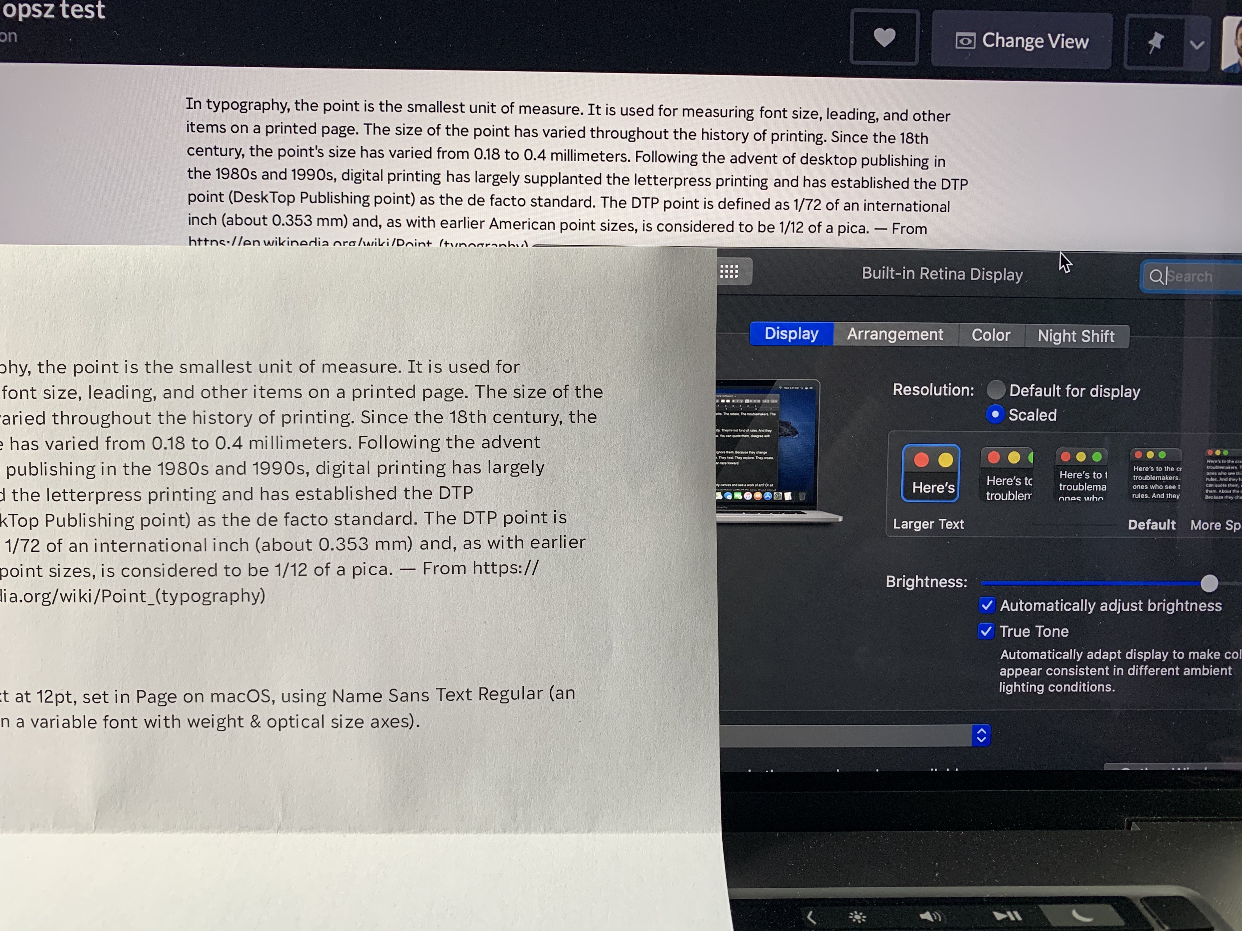
The closest I can get to a screen:physical match is if I 1) scale to the second-largest screen setting and 2) set the CSS to 12pt. But, even then, the printed size is still slightly larger.
Just to be sure this wasn’t some weird inconsistency in my own font, I also tested it with Times New Roman. Again, the apps match 12px/12pt on the same screen, but the physical size of printed 12pt text is about double the physical size of text on screen.
Or, have I completely missed the point of what you and Myles meant?
arrowtype
on 11 Jun 2020
I guess maybe there could be some kind of argument that a user tends to be closer to a laptop screen than to a printed page, and therefore treating as equal is attempting to match arc radians?
@arrowtype Based on our user testing results I would make exactly that argument.
nigelmegitt
on 11 Jun 2020
they treat
1 CSS px = 1 physical ptMaybe someone else should also test this, but ...
I don’t think that is even close to true on my Apple devices?
The core issue here is that on the one hand, John Hudson, David Berlow, Eben Sorkin, and presumably all other type designers, are designing opsz masters by looking at them in proofs printed where Points are 1/72 of a physical inch, and setting opsz values appropriately based on that. On the other hand, browsers are all using opsz values directly as CSS px values.
Per your evidence, "12pt" is massively inconsistent everywhere.
But is a 36 css px square massively inconsistent everywhere when measured on common devices with a ruler? That has certainly been my assumption, but I haven't tested it.
If this is true, then it seems to me that type designers should carry on designing and calibrating their opsz units for the absolute size of print media, and just let the chips fall where they may with web font rendering; and the OP proposal will be needed for authors who care to get it right.
If it is not true, then I am back to thinking that opsz units ought to be calibrated to that size.
davelab6
on 15 Jun 2020
At the risk of adding more grit and less light - I have been looking at print too but in the main I have been really deciding about opsz on screen with my face about a foot from the screen and using InDesign + Chrome. The reason was that I am expecting the most critical use will be in a browser.
 EbenSorkin
on 17 Jun 2020
EbenSorkin
on 17 Jun 2020
I do think that calculating arc radians based on distance is the best way even if it is a complex thing to do and arguably a bit fuzzy. I say this because I think that it is the best map of the human experience of our type which is what I hope the type I make serves in some way.
EbenSorkin
on 17 Jun 2020
Thanks for the insights, Eben. I'm working on some draft wording for a clarified opsz axis specification that makes clearer how to implement it, and may also provide some suggestions for how type designers can approach size-specific design with an eye to interoperability. The trouble with using screen as a base for the latter is that there are too many variables that can have a significant effect on physical size across devices and platforms. So while we all spend time testing our fonts on screen, we need a common target for size-specific design that has fewer variables, which implies e.g. a common or minimum resolution, a reference distance, and a physical scale unit. My intent is to be able to provide a solid base for implementors to make opsz instance selection based on all the available information in any given circumstances — which could ideally include nominal size on platform, device, resolution, and distance — which means among other things having a presumed distance targeted by design. I think it's probably something like print at 16 inches, but am talking with colleagues to see what distance or distance range people are actually using.
tiroj
on 17 Jun 2020
Thanks very much for doing that. If the result is something that offers one (or multiple) procedures or recipes to arrive at a common calibrated result that would be wonderful.
EbenSorkin
on 17 Jun 2020
For what it’s worth – if it’s helpful for factoring in angular measures to the context of an official spec – the German DIN standards for font sizing recommendations are based on angular measurement.
nicksherman
on 17 Jun 2020
<aside>
Recommended minimum legible font sizes in DIN 1450 are indeed based upon angles, as are ergonomic character heights in ISO 9241 Parts 30x.
DIN 1450 also prefers ex-height over em-height to specify font sizes (which CSS needs font-size-adjust for), but it also offers a mapping table to millimeters and pica points.

| | | _Signalisationstext_ (public signs) | _Konsultationstext_ (notes, captions, legends) | _Lesetext_ (main, body, paragraph) | _Schautext_ (headings, titles) |
| - | ---- | ---- | ---- | ---- | ---- |
| m | x-height, 1ex | 9′– | 10′– | 13′– | 20′– |
| g | stroke width | 0.17ex–0.20ex | 0.13ex–0.20ex | 0.10ex–0.20ex | — |
| h | hairline width | 0.12ex–0.19ex | 0.06ex–0.19ex | 0.04ex–0.19ex | — |
| n | font width | 0.45ex–0.55ex | 0.48ex–0.58ex | 0.40ex–0.60ex | — |
| a | character spacing, 1en | 0.45ex–0.55ex | 0.40ex–0.60ex | 0.35ex–0.65ex | — |
| f | serif spacing | — | 0.10ex | 0.05ex | — |
| Reading distance | _Signalisationstext_ (public signs) | _Konsultationstext_ (notes, captions, legends) | _Lesetext_ (main, body, paragraph) | _Schautext_ (headings, titles) |
| ---- | ---- | ---- | ---- | ---- |
| 0.4 m | | 2.75mm = 7pt | 3.5mm = 9pt | — |
| 1 m | 5.25mm = 15pt | 6.25mm = 17.5pt | 8mm = 23pt | — |
| 2 m | 10.5mm = 30pt | 12mm = 35pt | 16mm = 45pt | — |
| 4 m | 21mm = 60pt | 25mm = 70pt | 32mm = 90pt | — |
| 10 m | 53mm = 150pt | — | — | — |
| 40 m | 212mm = 600pt | — | — | — |
| 100 m | 530mm = 1500pt | — | — | — |
ISO 9241 assumes a preferred viewing distance for desktop monitors of 600 mm, varying from 450 mm to 750 mm with a minimum viewing distance for adults of 300 mm. Usual LCG character heights are then 20′ to 22′ with a minimum of 16′ and a maximum of about 30′, whereas typical CJK character heights are 25′ to 35′ with a minimum of 20′. On an ideal, paper-like display, the LCG minimum could be as low as 10′ to 12′.
ISO 24509, on the other hand, estimates minimum legible font sizes by age (for visual acuity), distance, luminance level, contrast, font type (serif/sans-serif) and writing system (alphabetic/syllabic/logographic), which results in vast tables which have been implemented in an online tool by AIST that is referenced in the standard.
Crissov
on 18 Jun 2020
So you are suggesting that same browser, same page, same font, should invoke different opsz value on different operating systems.
If the resulting actual size of type displayed is different, _yes_.
How does (or should) this interact with page zoom in browsers? If I hit Cmd-+ to zoom a webpage that uses optically-sized fonts, should the browser use a new opsz value to account for the new physical size?
What about if I pinch-zoom the display on a mobile device?
 jfkthame
on 22 Jun 2020
jfkthame
on 22 Jun 2020
The opsz axis definition already states
In applications that automatically select an Optical size variant, this should normally be done based on the text size with a default or “100%” zoom level, not on a combination of text size and zoom level.
I am working on proposed revision to the axis definition text to clarify some things, but this statement or something like it will remain.
tiroj
on 22 Jun 2020
If I hit Cmd-+ to zoom a webpage that uses optically-sized fonts, should the browser use a new opsz value to account for the new physical size?
What about if I pinch-zoom the display on a mobile device?
The types of zoom that _do not trigger re-layout_, should not change opsz variant either.
svgeesus
on 22 Jun 2020
The types of zoom that do not trigger re-layout, should not change opsz variant either.
This is a very good distinction. I've been wondering how different types of zoom are distinguished. Is there a standard for this? Or some distinguishing terminology?
tiroj
on 22 Jun 2020
If I hit Cmd-+ to zoom a webpage that uses optically-sized fonts, should the browser use a new opsz value to account for the new physical size?
What about if I pinch-zoom the display on a mobile device?
The types of zoom that _do not trigger re-layout_, should not change
opszvariant either.
That seems reasonable at first glance, but I'm not sure whether it's really the right answer. In a typical desktop browser, full-page zoom does trigger re-layout, but I'm unconvinced that it is appropriate for it to change opsz variants.
Imagine I'm viewing a page where the author has given the body text font-size: 12pt, captions have font-size: 9pt', and the title hasfont-size: 18pt`. The font being used has an optical size axis that ranges from 9 to 18, so I see clear differences between these sizes: the captions are wider, with less contrast and more letter-spacing, while the title is significantly tighter and has more contrast in its strokes.
Now I press Cmd-+ a couple of times to zoom the page for more comfortable reading, as I'm lounging back in my chair. This causes re-layout, because while the font sizes in CSS pixels are unchanged, the viewport width has effectively been reduced. But I would find it surprising (and unwelcome) for this to affect the choice of font faces (or used values of opsz), and perhaps erase the intended design difference between the elements.
Another surprising result would be that line breaks within a fixed-width block on the page (e.g. a sidebar that has an absolute width set in CSS pixels (or em units, or whatever) will change when the page is zoomed, if this results in an opsz change. I believe that is unexpected and unwanted.
jfkthame
on 22 Jun 2020
But I would find it surprising (and unwelcome) for this to affect the choice of font faces (or used values of opsz), and perhaps erase the intended design difference between the elements.
That presumes that the opsz variation is a form of stylistic differentiation between text elements, like bold or italic style, that one expects to be retained when layout changes. I think that is an error, because _optical_ size-specific design is about making adjustments appropriate to the size of text that the reader is seeing, not styling the text in a particular way.
So if text is being enlarged — as distinct from zoomed — such that a new layout with differently sized text is presented to the reader, then it absolutely makes sense that a new opsz instance is selected, even if that meant that some text elements that were previously dfferent opsz variants are now clamped to the same opsz variant. [In practice, I think few opsz variable fonts would have so narrow a range of opsz variation as 9–18.]
As noted in the draft rewording of the opsz axis definition, it is recommended that software provide means to override automatic Optical size variant selection, as may be appropriate for particular platforms, intended use, known viewing distance, or accessibility. That could include, I suppose, overriding behaviour in text resizing situations.
Another surprising result would be that line breaks within a fixed-width block on the page (e.g. a sidebar that has an absolute width set in CSS pixels (or em units, or whatever) will change when the page is zoomed, if this results in an opsz change. I believe that is unexpected and unwanted.
If I understand you correctly, this suggests that in a page content enlarging operation some text elements may need to allow reflow of layout and some may not, or, to put it another way, some may be enlarged and others zoomed. That seems to me something that CSS would need to be able to address.
tiroj
on 22 Jun 2020
As previously mentioned much earlier in this thread, opsz variation should be thought of as conceptually independent of text style, even if the latter includes styles suited to conventional size uses, e.g. ‘titling’ presumed to be large, ‘caption’ presumed to be small, and in some fonts implemented within the opsz axis. To understand why this conceptual independence is important, consider a type family in which Text and Display are separate styles, implemented in separate fonts, each with its own opsz axis, whose ranges overlap in a mid-size range in which typographers may choose either style for subhead use.
tiroj
on 22 Jun 2020
Does anybody have access to a table of physical measurements of dimensions specified in CSS absolute units, taken from a selection of current devices on default settings and “100% zoom”? For the avoidance of doubt, I mean taking real-world measurements from the screen with a physical ruler. Am I right in thinking no such table is currently published?
The compilation and publication of such a table – effectively the default scaling factors from real-world pt and mm to CSS pt and mm, that manufacturers embed in their devices – would contribute enormously to this discussion, in particular to help us define what it is exactly that we want to achieve with font-optical-sizing: auto, and whether it is achievable.
Here is the bare bones of such a table, based on measurements I took from my own devices some time ago. I’d happily transfer this data to Google Sheets and provide write access if there is interest.
| Device | Settings | Browser | CSS 50 mm | Scale | w×h (mm) | w×h (pixels) |
|---|---|---|---|---|---|---|
| MacBook Pro 15" Retina 2012 | Default scale | all* | 43 mm | 0.86 | 331×207.5 | 2880×1800 |
| " | +2 display scale | all* | 61 mm | 1.22 | " | " |
| " | +1 display scale | all* | 48.5 mm | 0.97 | " | " |
| " | -1 display scale | all* | 37 mm | 0.74 | " | " |
| " | -2 display scale | all* | 32.5 mm | 0.65 | " | " |
| iPhone 5S | - | Safari | 29 mm | 0.58 | 49.5×88.5 | 640×1136 |
| iPhone 8 | - | Safari | 29 mm | 0.58 | 58.5×10⁴ | 750×1334 |
The key column we should look at is the _Scale_ column. Remember that these scale factors are detemined by device manufacturers and browser makers, who are (I suggest) influenced by at least these three considerations:
- that users, for convenient website viewing, expect scale factors within a fairly small range from this device format;
- that CSS measurements maintain a useful relationship with the device’s internal scale factor regarding its text APIs (e.g. 1 CSS px = 1 Cocoa point);
- to cause the CSS px unit to be align with real pixel boundaries.
To contribute new data, please go to this website and measure the black square with a ruler to the nearest 0.5 mm. It is specified to be 50 mm in CSS units. Make sure your browser is at 100% zoom.
Caveat: I have not specified browser or platform or browser scale factors for any devices, so would be very pleased to understand this process in more detail including any more considerations and their relative importance. For example, we may also need an “intended viewing distance” column, to separate physical screen size from intended actual device usage.
* all = Safari, Chrome, Firefox, Edge
Lorp
on 22 Jun 2020
I don't think this is particularly useful or necessary. Browsers (and CSS in the context of browsers) just don't work like that. Absolute physical sizes made sense in a world of printed paper, but on the Web they're just not that important, nor are they reliably knowable.
Given a font with an opsz variation axis, a value like opsz=6 should be suitable for displaying text that's about the smallest that the viewer can reasonably read; opsz=72 should be suitable for huge titles; opsz=12 should be reasonable for the bulk of body text, and so on. But outside of the world of printed paper [intended to be held and read by an individual; things like billboards are different], this doesn't really have any fixed relation to physical sizes. A "body text" size for which opsz=12 is suitable might be 3mm high on a high-res phone screen, or it might be several inches high when projected on a conference-room screen. But either way, if the text is styled with font-size: 12pt in CSS, it should use the opsz=12 variation setting to produce rendering that's appropriate for comfortably reading small body text.
IMO the opsz value applied by font-optical-sizing: auto should be directly related to the CSS font-size, and the UA should not attempt to adjust for the physical size of the output, which in general it cannot know (and may not even be a single unique value -- consider mirrored displays of different physical sizes). This should be true no matter what kind of scaling is in effect to alter the mapping from CSS px to physical size: it might be OS-level resolution settings, it might be distance from a projection screen, it might be a page zoom factor, it might be CSS transform: scale(...), etc. No matter; opsz is simply based on font-size.
The key question here, really, is whether the opsz axis should be set according to CSS px units or pt units. That's a decision that I think the CSS WG needs to consider and specify once and for all.
The most "correct" answer, AFAICS, should be that auto opsz = CSS font-size in pt, but it seems browsers are currently shipping with opsz = font-size in px. I think this is a mistake, and we should fix it; the compatibility impact of doing so will be minor, as per https://github.com/w3c/csswg-drafts/issues/4430#issuecomment-543188228.
Maybe we should also extend font-optical-sizing as originally proposed here, to let the author (or UA, or reader) modify the font-size-to-opsz factor. This seems a reasonable and workable idea, though it's unclear to me how much of a use-case there is for it.
jfkthame
on 23 Jun 2020
The most "correct" answer, AFAICS, should be that auto opsz = CSS font-size in pt, but it seems browsers are currently shipping with opsz = font-size in px. I think this is a mistake, and we should fix it; the compatibility impact of doing so will be minor, as per #4430 (comment).
I am in complete agreement re. the current px implementation being a mistake and that we should fix that.
With regard to how opsz design variation targeting physical size should be interpreted and implemented in the naturally uncertain world of relative units, when the actual size of text seen by the reader and the physical distance from the reader cannot be known, my take is perhaps only subtly different from yours. I think the opsz axis as defined in the OpenType axis definitions registry, needs to give font makers guidance on how to design for opsz and other software makers some concepts on how to understand the aims of size-specific design. It is up to downstream standardisation and implementation to determine the appropriate way to implement opsz given the scale unit of the the axis definition and the information available, more or less incomplete, regarding size of text seen by the reader. So I'm not in favour either of the opsz axis definition trying to tell software makers they have to do something that is effectively impossible, nor in having it fail to suggest what they might do in a best case situation because we assume what is unknowable in some situations now will be unknowable everywhere and always. :)
So if the approach that some software makers take now is that opsz 1/72 inch point (standard use of point throughout the OpenType specification) is interpreted as equivalent to CSS pt, that seems to me one reasonable approach for some environments. My understanding is that it wouldn't be a reasonable approach for Apple given their existing scaling model and equivalences across their platform, so it actually doesn't make sense for this intepretation to be defined at e.g. the CSS level or elsewhere in web standards.
tiroj
on 23 Jun 2020
I added a note in the spec about this: https://drafts.csswg.org/css-fonts-4/#ref-for-propdef-font-size①⑧
litherum
on 23 Jun 2020
I think we are re-litigating https://github.com/w3c/csswg-drafts/issues/614 in this thread.
litherum
on 23 Jun 2020
@lorp There are sites for designers which are documenting the relationship of device pixel resolutions to CSS px resolutions on select mobile devices, e. g. Viewport Sizer, but the ones I found are lacking the physical dimensions of the screens.
Crissov
on 23 Jun 2020
FWIW, I measured that "50mm" square on both the displays I have on my MacBook (the built-in panel and an external hi-dpi Dell display), with both at their "default" settings (though I usually run with adjusted scale factors). At the default scale, it measures 36mm on the laptop screen, and 58mm on the external. But all the browsers I've tried treat both displays identically for the purpose of auto-opsz setting; they don't make adjustments to the text when I drag a window from one to the other, despite the physical size changing by a factor of 1.6.
(And this is how it should be, IMO: I would find it extremely annoying if moving window between these displays resulted in optical sizing changes and hence text reflow.)
Using the example at https://jfkthame.github.io/test/optical-sizing/amstel.html, I can see that all the browsers use the font-size in CSS px as the value for auto opsz setting. As noted above, I think this is wrong; it would be more correct to use the value of the font-size in CSS pt units, i.e. the 0.75 × the px value, as this is intended (
Where the browsers (on macOS) differ is in their handling of zoom: if I zoom the above testcase, I see that Firefox keeps the optical sizing constant regardless of zoom level, always being based on the CSS font-size, whereas Chrome and Safari adjust for the zoom scaling, so that at 75% page zoom (but only at that scale), the auto optical sizing matches the font-size as expressed in pt.
On my ThinkPad running Windows 10, it's a different story. Again, I have two screens, a hi-dpi laptop screen where the "50mm" square measures 45mm, and a lo-dpi external display where it measures 48.5mm. (So it's fairly close to "accurate" on both displays.)
Loading https://jfkthame.github.io/test/optical-sizing/amstel.html in Firefox, I see the same result as on macOS: the result of auto optical sizing corresponds to setting the opsz axis to the CSS font-size in px units, and stays constant when the window is moved between screens.
But in Chrome, the result is quite unexpected: if I load https://jfkthame.github.io/test/optical-sizing/amstel.html on the internal (hi-dpi) laptop screen, the auto optical sizing is giving me unexpectedly "thin" glyphs (large optical size); it only reaches the point where the auto rendering matches setting opsz explicitly to the CSS font-size if I zoom all the way out to 50%. (So it is using the page-zoom scale factor, like it does on macOS, but with a different starting point.)
However, if I move the window to the (lo-dpi) external screen, it matches Firefox's rendering at 100%. My conclusion here is that Blink on Windows is using the font size in device pixels as the basis for automatic optical sizing (and hence the need to zoom out to 50% on the hi-dpi screen to get the expected result). This is surely wrong.
Given the general lack of consistency/interoperability here, and the fact that there's probably not a huge amount of web content currently depending on fonts with automatic optical sizing, I do think there's an opportunity to fix things.
Comparing font sizes in the web browsers to font sizes in desktop applications such as word processors, it does appear that on macOS (as @litherum has pointed out), everyone has implemented things such that 1 CSS px = 1 Cocoa pixel = 1 typographic point (nominally, subject to actual display scale etc), so a font specified as 72px in CSS in the browser will match one specified as 72pt in a desktop word processor. I think this is unfortunate, as it means that (confusingly) 72pt in CSS does not appear the same as 72pt on the desktop, but that ship sailed long ago, I fear.
So on macOS, for automatic optical sizing to work the same in the browser as it does in native desktop apps, it should indeed be based on the CSS font size in px units (contrary to what I argued for above).
On Windows, OTOH, a font size specified as 72px in CSS appears significantly smaller than a font size of 72pt in a desktop word processor; indeed (as expected) I have to zoom the browser page to 133% for them to look the same. At 100% zoom in the browser, 72pt in CSS does appear the same as 72pt in a desktop app. So in this environment, the correct basis for automatic optical sizing should be the CSS font size converted to pt units.
I don't like this result; I think the same page, using the same font resources, displayed on similarly-sized screens on macOS and Windows ought to look essentially the same, and it won't if they're using these different factors to apply optical sizing. But I think -- at least for today! -- I've come round to accepting this incompatibility as the lesser of the various evils available.
jfkthame
on 23 Jun 2020
@svgeesus said in https://github.com/w3c/csswg-drafts/issues/4430#issuecomment-543257559:
I notice that the one rendering-based WPT test for optical sizing checks that the result of
setting the
font-size(in px) with the initial value (auto) offont-optical-sizingsetting
font-variation-settings: 'opsz'to the same value as the px valuematches. In other words, the test checks that
opszis set inpx. So yes there is interop but the rendered result in real-world usage will be suboptimal because the adjustment created by the font designer is not being applied correctly.
but in fact there is not as much interop as one might expect, given that according to my testing (see above), Chrome on Windows is using the font size in device pixels (not the CSS px value) to set the opsz variation. Therefore, its behavior varies depending on the user's display scaling factor; the testcase will fail for users with hi-dpi displays.
The fact that users are not vociferously complaining about this issue (AFAIK) encourages me to believe that we can improve behavior (in ways that may affect existing sites) without undue compatibility risk.
jfkthame
on 23 Jun 2020
Thank you for those interesting results, @jfkthame.
I ran some tests using a special version of Selawik produced by @robmck-ms in October 2019 (he permitted me to share it). This allows us to record the exact opsz values used in rendering, rather than guessing visually. The results lead me to state that current versions of Safari, Chrome and Firefox are inconsistent in their handling of opsz. Detailed explanation follows.
The font Selawik-variable-opsz-no-avar.ttf has two axes:
wghtis identical to the standard variable Selawik in Unicode.org’s rendering tests repoopszis new, and has min=0, default=0, max=100 (there is no gvar data for this axis)
A remarkable feature of Selawik is that (by means of @Gr3gH’s special hinting instructions, brilliant use of components and OpenType subsitutions) its axis locations can be queried by setting special text strings in the font itself:
\axis0obtains the normalized value in the range [-1,1] of the first axis, i.e.wght\axis1obtains the normalized value in the range [-1,1] of the second axis, i.e.opsz\axis0hexobtains the normalized value of axis 0 in hex\axis1hexobtains the normalized value of axis 1 in hex
I updated the Codepen mentioned above to be typeset in this version of Selawik, and used the \axis1 string to report normalized opsz units, so we can now obtain the opsz axis location by multiplying by 100. I set the text size using CSS font-size: 20pt.
On macOS 10.14.6, MacBook Pro 15.4" Retina 2012, 100% zoom, resolution “Default for display”:
- Safari 12.1.2 reports 0.2000 (=20.00 on the opsz axis)
- Chrome 83.0.4103.106 reports 0.2666 (=26.66 on the opsz axis)
- Firefox 77.0.1 reports 0.2666 (=26.66 on the opsz axis)
— and the same results on external Apple Cinema 24-inch (1920 x 1200) screen
On macOS 10.15.6, MacBook Pro 13" Retina 2019, 100% zoom, resolution “Default for display”:
- Safari 13.1.2 reports 0.2700 (=27.00 on the opsz axis)
- Chrome 83.0.4103.116 reports 0.2666 (=26.66 on the opsz axis)
- Firefox 77.0.1 reports 0.2666 (=26.66 on the opsz axis)
— and the same results on external LG 5K (5120 x 2880) screen at all 5 display scales
So the reports above (notably the note from @drott) that other browsers decided to match Safari behaviour, appear to be incorrect at least in both scenarios tested. In fact, it appears (_based on a very small sample_) that in macOS 14 Safari used CSS pt units as the reference to opsz, while Chrome and Firefox used px. Then in macOS 15, for 20pt Safari uses a 27/20 scale = 1.35 rather than 4/3 = 1.33333 used by the other browsers.
Behaviour using px units appears to be consistent on all three browsers on macOS 10.15.6, so Safari is curiously departing from the standard 4/3 pt:px relationship.
Please feel free to edit the font size and CSS font units in the Codepen CSS, and report opsz values for your system.
Note: According to the spec, opsz axis values, including the minimum, must be “strictly greater than zero”. However, results were exactly comparable with a test font that used 5 and 105 for opsz min and max, rather than 0 and 100.
Lorp
on 23 Jun 2020
I filed bugs on Chrome and Firefox (I’m assuming if Chrome fixes it, Edge would automatically pick up the fix):
https://bugzilla.mozilla.org/show_bug.cgi?id=1646946
https://bugs.chromium.org/p/chromium/issues/detail?id=1102532
litherum
on 6 Jul 2020
Some odd results. On Windows 10, Dell XPS 9560 15" 4k, display setting of font size 175%.
- Firefox 80.0a1 (2020-07-04) (64-bit) reports 0.2666 (=26.66 on the opsz axis) as reported on MacOS by @lorp
- Chrome Version 86.0.4196.2 (Official Build) canary (64-bit) reports 0.5133 (=51.33 on the opsz axis)
I'm unable to explain the Chrome result.
I also tried on Android 10, Samsung Galaxy S9+
- Samsung Internet 12.1.1.5 beta (Blink-based) (did not display the font correctly)
- Firefox Preview 5.0.0 (Build #21212137) same display as Samsung Internet
I guess this version of Android has problems with opsz regardless of browser engine

svgeesus
on 8 Jul 2020
@svgeesus I believe this font’s unusual hinting code is not executed in the configuration of FreeType used in Android. The composite glyph, that outputs the opsz value, appears to be a mess, but in fact that’s its unhinted appearance before @Gr3gH’s hints work their magic.
This is therefore unrelated to whether Android and its browsers have problems with opsz.
Lorp
on 23 Jul 2020
@jfkthame wrote:
Chrome on Windows is using the font size in device pixels (not the CSS px value) to set the opsz variation. Therefore, its behavior varies depending on the user's display scaling factor; the testcase will fail for users with hi-dpi displays.
I wrote:
(Windows 10) Chrome Version 86.0.4196.2 (Official Build) canary (64-bit) reports 0.5133 (=51.33 on the opsz axis)
15" 4k, display setting of font size 175%
51.33 / 1.75 = 29.33 which is the right order of magnitude but still somewhat different to what Firefox gets on the same machine.
svgeesus
on 25 Jul 2020
@lorp “It is notable that neither the OpenType spec nor Apple’s TrueType spec addresses the interpretation of opsz values in environments where the typographic point is not usefully defined.”
Can you please give 1 example of this?
dberlow
on 26 Aug 2020
The word “usefully” is probably not helpful. I’m referring to the issue where a UI developer, making use of an API that defines font size in “points”, is encouraged not to worry about the scale factor between these OS points and physical points. This scale factor (i.e. what is considered “100%”) changes depending on the device: an Apple Watch will display “12 point” text smaller than iPhones, while iPhones use various scale factors according to screen size & pixel rounding, and iPads and Macs use a range of larger scale factors, some of them almost 1.0. The ideal for the UI developer is to use “12 point text” on menus in apps for all of them. My point was this scale factor is not currently a concern of the OpenType specification.
Lorp
on 26 Aug 2020
The CSS Working Group just discussed [css-fonts] Proposal to extend CSS font-optical-sizing.
The full IRC log of that discussion
<dael> Topic: [css-fonts] Proposal to extend CSS font-optical-sizing
<dael> github: https://github.com/w3c/csswg-drafts/issues/4430
<dael> Rossen_: A rather large issue
<dael> myles: This font-optical-sizing property takes 2 values, auto and none
<Rossen_> q?
<dael> myles: Optical sizing is a way for letters to effect shape of outlines. On large sizes letter shapes are more delicate for visual beauty and when small serifs are elongated. Fonts can morph shape
<dael> myles: Impl with a variable feature. Inside the fonts the variable axis is set to the font size.
<dael> myles: Webkit sets to css pixel size. I think all browsers do, but not sure.
<dael> chris: They do not which is the problem
<dael> myles: Okay
<dael> myles: Another piece of information is open type spec which defines that axis says that this is supposed to be set to font size in points. Not css points, but points. Relevant to MacOS and iOS.
<dael> myles: Actual proposal is to extend syntax to not just be none and auto but add a number that's more expressive so authors can say if they want font size to be css pixels, css points, or something else.
<dael> myles: I have opinions but want to let others speak.
<dael> myles: I guess I can mention why I think it's bad. There is a right answer which is what open type spec says. On MacOS and iOS the OSs have a coordinate system. Designed such that 72 typographic points = 1 physical pixel.
<chris> q+
<dael> myles: In webkit we want integral sized pixel blanks on physical pixel boundaries. We have 1 css pixel = 1 typographic point. Gives crisp backgrounds. 1 css inch = 4/3 typographic inches.
<dael> myles: Means if you want length supplied in typographic points the way you get that on webkit is you supply css pixels. That's how we've defined it. It's correct though not intuitive. The spec...no reason to increase flexibility because we're doing it correctly.
<dael> chris: Backing myles up. He's explained how it comes to correct way. Others have seen that webkit sets in css pixels but don't have the rest so it comes out wrong. It's a problem. Easiest solution is for other browsers to fix it which is as simple has multiplying by 4/3.
<Rossen_> ack chris
<dael> chris: I think the proposal which is on this thread and on opentype list they assume browsers won't change so they need to fix it in the spec. I would prefer the other browsers did it so they get correct size and then we don't need anything else.
<dael> chris: jfkthame did point out the way the others browser do it. I hope he's on.
<dael> fantasai: Quesiton. If I write a document in MS word and say font size is 12 pt and have optical sizing enabled, print it. export to HTML. print that. Sizes are 12pt in both cases. Do I get different results?
<dael> chris: Interesting. Size in both prints and size on screen. I don't know.
<dael> fantasai: Authors would expect to render the same
<dael> chris: Yes
<dael> fantasai: Can we make sure that happens? I'm confused as to what is happening but I think that should be a constraint.
<faceless2> There is no support in PDF or PostScript for variable fonts. So any optical-sizing axis adjustments are done before the print layer, in the application.
<chris> q+
<dael> myles: Relevant piece here is the scale...on MacOS and iOS we have 1 typographic point = 1 css pixel. When you print that may not be true. COuld come out same even if you see on screen different for OS.
<dael> fantasai: Suppose I have a doc I'm looking at on screen. Optical sizing axis has significant differences. Will I get different shape text when print? Should I?
<dael> myles: You could, yes. CSS units to typographic units is different when printing. Could be because we've picked this scale because of screens. When printing don't have that.
<dael> fantasai: Optical sizing is change in glyph shape. What does it have to do with crispness of glyph?
<dael> myles: Sorry. We've scaled entire css coordinate system by 1/3. That's b/c in web today authros say 4px for things like border and margins. All over the place. If we made it such that 1 css inch = 1 typo inch the px length would not map to a physical pixel. Solved by scaling hte entire css coordinate system by 1/3 so things lie on pixel boundaries more often.
<dael> fantasai: ...okay
<dael> chris: True of original mac. Seems like high dpi devices there are more options. I guess these are micro-pixels?
<dael> myles: I'd like to not talk retina.
<dael> chris: I would because they're relevant
<bradk> Not every iPhone has a Retina display
<dael> myles: There's a 3rd system. There's phsyical if you measure crystal size. Not relevant b/c impacts by manufacturing process. More relevant is typographic b/c that's what OS is designed with.
<dael> myles: If I want something 1 inch big on an app I'll use pixels. Assumption is that because OS is designed with a coord system if you make something a certain number of points in the coord system it'll look close on the phsyical screen.
<chris> q-
<dael> Rossen_: At the hour and need to wrap. We're in the middle of the conversation. I see chris and fantasai on the queue so I encourage them to continue discussing on the issue and we can resume next week.
<dael> fantasai: Summary- What i'm saying is on the OS system level in different apps. Non web borwser 1pt = 1px. Within css 1 pt and 1 px and not same. So 1 css pt is different. When you print the points are equat to each other. We have inconsistent matchups. Issue is that WK choose to go along one set of eq. lines and hte people filing the issue picked a different set.
<fantasai> s/saying/understanding/
<dael> Rossen_: Let's resume in issue. myles when you feel it's ready please bring it back
 css-meeting-bot
on 16 Sep 2020
css-meeting-bot
on 16 Sep 2020
So, if I understood the conversation correctly, the situation is the following:
- On Mac screens, 1 Web px = 1 Application pt
- When printing, 1 Web pt = 1 Application pt
- Per CSS, 1 Web px = 0.75 Web pt
Fundamentally, this is an inconsistent system, and there is no winning.
WebKit chose to honor the "1 Web pt = 1 Application pt" equivalency when assigning optical size on screen. It's not clear what happens when printing, but this only leaves two options:
- Either continue to honor "1 Web pt = 1 Application pt", and have consistency between browser screen vs browser print—but not between browser print vs application, or
- Switch to honoring "1 Web pt = 1 Application pt", and have consistency between print output of browsers vs other applications—but not between browser screen vs browser print
Meanwhile, the people filing this issue would rather have printing be self-consistent and browser printing vs browser screen be consistent, and pay the price of making browser screen and application screen inconsistent.
 fantasai
on 16 Sep 2020
fantasai
on 16 Sep 2020
My suggestion would be to add two keywords, px and pt to font-optical-sizing, so that an author can choose to scale against a particular unit consistently—or inconsistently across media by using media queries if they want—and leave auto to choose one or the other or switch between the two depending on the environment as it sees fit.
(I also have no objection to adding <number> as it allows anything that can be calc()ed into a number to be the index into this particular variation axis. But I think in most cases, authors will want either pt or px to get the desired effect, so we should make that easy.)
fantasai
on 16 Sep 2020
FYI, this is the current draft revision to the font opsz OT variations axis description being considered to replace the existing text. The intent is to clarify the unit and more fully explain the intent of the opsz axis, how it is implemented by font makers, and how it can be handled.
Registered design-variation axis tag: 'opsz'
Axis definition
Tag: 'opsz'
Name: Optical size
Description: Used to vary design to suit different text sizes.
Valid numeric range: Values must be strictly greater than zero.
Scale interpretation: Values can be interpreted as text size, in points. As elsewhere in the OpenType specification, a point should be interpreted as a physical unit equal to 1/72 of a standard physical inch.
Recommended or required “Regular” value: A value in the range 9 to 13 is recommended for typical text settings.
Suggested programmatic interactions: Applications may choose to select an optical-size variant automatically based on the displayed text size.
Additional information
The Optical size axis can be used as a variation axis within a variable font. It can also be used within a STAT table in non-variable fonts within a family that has optical-size variants to provide a complete characterization of a font in relation to its family within the STAT table. In the STAT table of a non-variable font, a format 2 axis value table is recommended to characterize the range of text sizes for which the optical-size variant is intended.
Type designers may develop size-specific design variations based on print or screen rendering, typically evaluating and applying these variations at a typical reading distance of 14 to 16 inches. This can be used as a basis from which to calculate appropriate optical size selection for different distances.
The scale for the Optical size axis is text size in points (1/72 of a physical inch). For these purposes, the text size is as determined by the document or application for its intended use; the actual physical size on a display may be different due to platform or application scaling methods or intended viewing distance. Because the target of size-specific design is optical, i.e. tailored to what the reader is seeing, Optical size axis variant selection should be determined, so far as possible, by as much information as available regarding displayed size of text as seen by the reader, taking into account the scaling of type on specific platforms and the translation of document and platform units to 1/72 of a physical inch, as well as typical reading distances for applications and devices. This may mean that a nominally specified text size in a document, e.g. 12 CSS px, results in a different Optical size axis variant selection on different platforms and devices, determined by the actual size of text seen by the reader. When translating between document units and the 1/72 inch point, care should be taken not to assume equivalences between units that may only apply on some platforms.
If the size of displayed text is smaller or greater than the minimum and maximum extent of the axis range, Optical size axis variant selection should be clamped to the appropriate minimum or maximum axis value, not reset to the default instance.
In applications that automatically select an Optical size variant, this should normally be done based on the text size with a default or “100%” zoom level, not on a combination of text size and zoom level. Types of zoom that do not trigger re-layout of text should not change Optical size variant selection, while content enlarging or diminishing operations that change re-layout of text should make a new Optical size variant selection based on the new displayed sized.
It is recommended that software provide means to override automatic Optical size variant selection, as may be appropriate for particular platforms, intended use, known viewing distance, or accessibility.
tiroj
on 16 Sep 2020
My suggestion would be to add two keywords, px and pt to font-optical-sizing, so that an author can choose to scale against a particular unit consistently
Can you step through how that would work? i.e. what what would be the outcome of opsz variant selection based on using these keywords in CSS examples?
tiroj
on 16 Sep 2020
The problem comes in when you consider what happens when you look at something printed from the web next to something printed from non-web. If the two have the same font-size, they’d better have the same optical sizing.
The same is true for screen: If a browser shows some text next to a native app, and the two specimens end up being drawn at the same size (visually, to the user, regardless of what was in the stylesheet’s content or the coding of the native app), then those two had better have the same optical sizing.
The fact that one specimen came from CSS originally but the other specimen didn’t, can’t be relevant here. At the end of the day, type is drawn at a particular size, regardless of how it got there, and it needs to have optical sizing set accordingly.
If the author somehow _wants_ their content to use the wrong optical sizing, they can use font-feature-settings to intentionally choose the wrong value. But the default needs to be as stated above.
litherum
on 16 Sep 2020
@tiroj Given font-size: 16px = 12pt, font-optical-sizing: pt would get you opsz 12 and font-optical-sizing: px would get you opsz 16.
fantasai
on 16 Sep 2020
@litherum Your last comment is missing one side of the consistency triangle: the author might well expect that text rendered for print and text rendered for screen use the same glyph shapes. See https://github.com/w3c/csswg-drafts/issues/4430#issuecomment-693544285
fantasai
on 16 Sep 2020
@fantasai right, those authors can use font-feature-settings.
litherum
on 16 Sep 2020
@litherum font-feature-settings, as explained in the OP and as you well know, is an escape hatch for things that CSS has no provision for. It has very poor cascading behavior and it behaves particularly badly for optical sizing because its raw value needs to be synchronized with font-size. I don't think it can be considered a solution to any reasonably common problem.
fantasai
on 16 Sep 2020
@fantasai I agree, the proposal is improved if it allows px and pt. Are you suggesting something other than a <length>? I think @Crissov was the first to suggest that last year https://github.com/w3c/csswg-drafts/issues/4430#issuecomment-543306648, and it seemed reasonable to me, so percentages, floats, and lengths, all fine, and each with a use case to make it seem the most useful.
Perhaps we are beyond the possibility of reassigning the default ratio, but I can see authors defaulting to font-optical-sizing: 1pt in their own stylesheets. If they are obsessive about optical size per device, then they can make media queries or check User-Agent. If they want to adjust opsz in the hope that it improves accessibility, i.e. _reduce_ opsz, then they can _increase_ font-optical-sizing to 2, 2px or 2pt or whatever makes sense for them.
There’s one category of authors who still won’t be satisfied, and that’s those who want to choose a specific opsz whatever the font size. Under any version of this proposal so far they are out of luck and have to resort to font-variation-settings, with the big downsides of non-inheritability without affecting other axes (notwithstanding the custom properties hack published by @RoelN). I believe this use case is significant, especially as fonts with an opsz axis are unfamiliar to many authors, some of whom will be pleased to “fix” fonts at a certain opsz to avoid surprises (notably regarding element width) when resizing a widget, for example. Font makers need an easy answer for such customers.
So, assuming <length>, <number and <percentage> are acceptable values as well as auto and none, perhaps we can allow opsz as a keyword in the form of "<number> opsz" to fix optical size at that axis value, inheritably.
Lorp
on 16 Sep 2020
Okay, font-feature-settings and CSS variables.
We shouldn't add a mode that explicitly sets optical sizing to the wrong value.
litherum
on 16 Sep 2020
@Lorp I'm not suggesting a <length>; I'm suggesting two keywords that happen to match the two units that are commonly used for font sizes. They essentially map to 1.0 and 0.75 in the original proposal, just friendlier syntax...
@litherum The author shouldn't have to switch to using variables for every font-size declaration because you think mapping pt into opsz is "wrong". The system is inconsistent, as I wrote in https://github.com/w3c/csswg-drafts/issues/4430#issuecomment-693544285 ; any behavior you pick is going to create an inconsistency. I don't think it's reasonable to call other options that are equally self-consistent as your preferred behavior wrong.
fantasai
on 16 Sep 2020
My suggestion would be to add two keywords,
pxandpttofont-optical-sizing
This is fundamentally an incorrect design. font-optical-sizing: auto means "set it to whatever it needs to be to get good typography" which will end up being different values on different operating systems. For the same CSS content, browsers on different operating systems should set opsz to different values in order to match the coordinate systems of those operating systems. Having the spec say specifically "use px" or "use pt" will be wrong on half the OSes.
litherum
on 16 Sep 2020
@litherum I don’t think auto is going away, and it would remain default. Often “good typography” means predictable, consistent typography, and the best way to achieve that with a given font and document may be for an author to adjust or fix opsz.
@fantasai understood. What would you think of including the opsz keyword so authors can fix glyph shape and width?
<number> px
<number> pt
<number> opsz
Note spaces between number and keyword.
Lorp
on 16 Sep 2020
My suggestion would be to add two keywords, px and pt to font-optical-sizing
This seems like a potentially useful feature, _but_ it puts the onus on the font user for knowing what is correct for a particular font. How are they supposed to know what scale the font was developed and tested on by the type designer? Best case, they would have to learn this from documentation of a font. But, of course, this has a pretty low success rate (as any type designer could tell you about people’s awareness of OpenType features like stylistic sets).
What if, instead, the OpenType spec added a flag that could be set to indicate if a font’s opsz was designed for px vs pt units? Then, that flag could be checked by text layout/rendering engines. That way, fonts like SF could indicate that they are designed for a px scale, while fonts tested on a pt scale could also indicate that.
What is “correct/wrong” is ultimately whether the output consistently matches the design intent, right? It seems that px are a default baked into browsers while points are a default baked into the OpenType spec, so perhaps there needs to be some kind of flag to allow the two to be interoperable. But, this flag should be handled in the font, not in the CSS.
arrowtype
on 16 Sep 2020
@fantasai
Given font-size: 16px = 12pt, font-optical-sizing: pt would get you opsz 12 and font-optical-sizing: px would get you opsz 16.
But that pt is a CSS pt, defined relative to CSS px, not a physical point defined relative to a physical inch, right?
(I'm wary, after all the months of this discussion, about any less than explicitly defined unit reference.)
tiroj
on 16 Sep 2020
@arrowtype Or, we proceed on the basis that font makers are following the opsz spec as currently written and as clarified in the draft revision, which specifies that that the scale unit of the axis is a point (and that point is as used everywhere else in the OT spec: 1/72 physical inch). The issues you describe only arise if people don't respect the spec. If fonts are made consistently, then multiple levels of sophistication and accuracy are possible in opsz implementation in browsers and other software—including adjustments for devices, distances, and accessibility. I don't think we need flags for particular environment units, only a standard scale unit and a reference distance for optical size design.
tiroj
on 16 Sep 2020
@arrowtype
What is “correct/wrong” is ultimately whether the output consistently matches the design intent, right? It seems that px are a default baked into browsers while points are a default baked into the OpenType spec, so perhaps there needs to be some kind of flag to allow the two to be interoperable.
Further to this: CSS px is not a physical unit, ergo it is impossible to optically design to it. The closest you could come would be to design to the CSS _reference_ pixel, which does have a physical size at a particular distance.
tiroj
on 16 Sep 2020
@tiroj Okay, yes, those are good points. I agree.
arrowtype
on 16 Sep 2020
Lengths for font-optical-sizing are guaranteed to confuse authors and they will think they have to use pt or px values when what they actually want is auto or a unitless ratio. See what happened with line-height. Most websites use lengths even though they should use unitless values. The same will happen with font-optical-sizing if it supports lengths. Of course, with line-height lengths had to be supported because there was no other way to get a specific line height independent of font size for the cases where you really did want that. But for optical sizes you can use font-variation-settings.
Edit: font-variation-settings, not font-feature-settings.
shimmark
on 16 Sep 2020
My suggestion would be to add two keywords,
pxandpttofont-optical-sizingThis is fundamentally an incorrect design.
font-optical-sizing: automeans "set it to whatever it needs to be to get good typography" which will end up being different values on different operating systems. For the same CSS content, browsers on different operating systems should setopszto different values in order to match the coordinate systems of those operating systems. Having the spec say specifically "usepx" or "usept" will be wrong on half the OSes.
As I understand it, you're arguing that given content styled with font-size: 12pt, a browser running on macOS should apply opsz=16, while a browser running on Windows should use opsz=12 (right?).
Now, I can view that same web page using either my Mac or my Windows PC -- I can even connect the exact same display to either of them, and potentially see the content at the same physical size (depending on the OS-level resolution settings I've chosen). It seems regrettable that in these circumstances, the two browsers will be expected to use _different_ opsz values and therefore may get significantly different glyphs.
Maybe we're stuck with this, but it's an unwelcome inconsistency. I think it's reasonable for an author to want to override it and request a consistent behavior -- whether that's "opsz = CSS px" or "opsz = CSS pt" -- across platforms. And it shouldn't be necessary to use a font-feature-settings override to achieve this.
jfkthame
on 16 Sep 2020
As I understand it, you're arguing that given content styled with font-size: 12pt, a browser running on macOS should apply opsz=16, while a browser running on Windows should use opsz=12 (right?).
I don't think that's the automatically the correct assumption for Windows. The Mac environment has built-in equivalences — to provide consistency of scaling of text across applications — that don't have parallels on other platforms. So when you go on to say that you will potentially see different opsz selection depending on OS-level resolution settings you've selected, that indicates that opsz selection should take into account those OS-level resolution settings (which is what in effect happens on the Mac because the resolution settings are consistent).
Remember, spec'ing CSS font-size 12pt for browser text is not the same thing as spec'ing type in units of 1/72 physical inch for print, so there is always going to need to be a calculation to get the correct opsz selection that takes into account the local relationship of CSS pt or px to the physical unit of the opsz axis scale. Apple are just performing this calculation once for all, whereas other platforms may need to perform it based on device and system resolution.
tiroj
on 16 Sep 2020
@shimmark
But for optical sizes you can use font-feature-settings.
Do you mean font-variation-settings?
tiroj
on 16 Sep 2020
_Sidenote_: I find it troubling that we on this list are discussing a significant new variable in specifying type without all the data that we need, and almost certainly without a good understanding of the compromises involved. The new variable in question, Optical Size, depends for its effectiveness on a “real points to OS points” scale factor, which varies according to device, and which we are supposed to take on trust, i.e. we must apparently trust that OS and device vendors have determined it impeccably, everywhere, and without compromise. (BTW I don’t know why @tiroj states Apple is “performing this calculation once for all” when the scale factor varies on their platforms as it does on Microsoft and Android devices.)
Professionally, as an independent consultant with an interest in a beneficial outcome but without resources to compile such data myself, I feel obliged to request that major OS and device vendors — at least Apple, Google and Microsoft whose representatives are here and could push for this internally — compile and publish these scale factors, and also publish any complications and compromises known to be involved (e.g. inconsistent viewing distances for iPad; size adjustments for environments with subsecond attention spans such as automotive). I didn’t want to single you out, @litherum, but you sometimes seem to deny these various scale factors exist, which is problematic.
Lorp
on 17 Sep 2020
What would be the collective use of such published scale factors, Laurence?
Collectively, I'm not sure that we do need a lot of data about different OS and device vendor scale factors. Obviously the individual OS and device vendors need to know and understand their own scale factors—_and not make assumptions based on other vendors' opsz implementations!_—, but for opsz to work we really do only need a couple of data, _but we need those to be reliable_. We need to reliably know that e.g. a value of 6 on the opsz axis scale corresponds to an optical size design for type at a size of 6/72 of a physical inch at a typical reading distance of 14–16 physical inches.
If that can be relied upon, then how individual OS and device vendors make opsz selection that takes into account their various scale factors is their responsibility. And if some do it better than others, and some don't get it right at all, and some offer clever ways to adjust for accessibility preferences, or for dynamic real distance, or for virtual distance in 3D environments, while others do it fairly crudely on a 'near enough' basis, that's all still their responsibility, and the font maker can and should only being doing one thing, and that's making sure the optical size design is appropriate for the nominal text size in physical points at a typical reading distance.
My big worry is that font makers start trying to target specific scale factors in particular OS or device platforms, in which case opsz is doomed.
tiroj
on 18 Sep 2020
There seem to me to be two entangled unknowns making progress difficult:
- an unknown on the design side (quite apart from the present issue, calibrating
opszin a variable font is not settled science, as evidenced by significantly different approaches by type designers); - and an unknown on the device side, with type designers unable to simulate how their type will look on various devices (apart from those they own).
The proposal by @fantasai, simple px and pt keywords to avoid the media-sensitive recalibration initiated by Apple, is a very good step forward. I fully support it even if no other inheritable opsz scale adjustments become incorporated into CSS.
Lorp
on 18 Sep 2020
The proposal by @fantasai, simple px and pt keywords to avoid the media-sensitive recalibration initiated by Apple, is a very good step forward. I fully support it even if no other inheritable opsz scale adjustments become incorporated into CSS.
If I understand the proposal correctly, allowing authors to specify opsz in CSS as px or pt would create a new layer of scaling that browsers would then need to calculate in order to make an appropriate opsz selection based on the size of a CSS px or CSS pt—not a 1/72 physical inch point—: I think that's fine, so long as implementers don't get lazy and start assuming equivalences between units. I'm not sure that it really moves things forward without first fixing the auto behaviour, but as I said in our video call with Chris: I consider CSS options for adjusting opsz to be far downstream from what I or any other font maker should need to think about.
tiroj
on 18 Sep 2020
significantly different approaches by type designers
Leaving aside some recent attempts to work around buggy browser implementation by using 1/96 of an inch as a scale unit, I don't think approaches to optical size design by type designers are significantly different _in intent_. Individual designers working on specific designs will have particular ideas about how optical size should work within those designs, but there is a common understanding that a 6pt design is intended for optical use at 6pt size, that the pt is 1/72 of a physical inch, and that some idea of ideal distance and visual acuity is implicit. The distance is the factor most likely to vary, and which needs to be specified if we want opsz to be interoperable (unless we were to add a distance measurement data flag to the axis record; does anyone want to do that?) Presumed visual acuity is good, unless one is specifically making a font for people with eyesight problems.
From conversations with colleagues who make optical size families, from reading Tim’s book, and from looking at a lot of metal type, I think a typical reading distance based on holding the text medium in one's hands at a physically comfortable distance is indeed implicit in opsz design for _text_ — implicit distance for display size design varies more—, can be quantified, and can be made explicit in the opsz axis description.
[Where I have recently found colleagues to disagree is in what range of opsz the default instance should be. @dberlow has suggested a larger size than in my draft axis description, and it's something that I think is likely to be determined by target medium and use. It is, in any case, only a suggestion in the axis description.]
tiroj
on 18 Sep 2020
As I understand it, you're arguing that given content styled with font-size: 12pt, a browser running on macOS should apply opsz=16, while a browser running on Windows should use opsz=12 (right?).
I don't think that's the automatically the correct assumption for Windows. The Mac environment has built-in equivalences — to provide consistency of scaling of text across applications — that don't have parallels on other platforms. So when you go on to say that you will potentially see different opsz selection depending on OS-level resolution settings you've selected, that indicates that opsz selection should take into account those OS-level resolution settings (which is what in effect happens on the Mac because the resolution settings are consistent).
I don't think this is correct (though perhaps we're just misunderstanding each other). opsz selection on the Mac does _not_ take OS-level resolution settings into account (and I don't believe it should). The System Preferences panel on my MacBook offers me five different "resolution" (display scaling) options, from "Larger Text" to "More Space", with the ratio between the two extremes being nearly 1.8:1. This affects the size of everything rendered, so that the actual physical size of font-size:12pt on the screen varies hugely depending which setting I've chosen -- but the opsz value applied remains constant. This is true for both a desktop application like Pages and for browsers.
Remember, spec'ing CSS font-size 12pt for browser text is not the same thing as spec'ing type in units of 1/72 physical inch for print, so there is always going to need to be a calculation to get the correct opsz selection that takes into account the local relationship of CSS pt or px to the physical unit of the opsz axis scale.
I disagree here: opsz selection _should_ be based directly on the CSS font-size, and should _not_ be affected by scaling that may be happening. Text styled as font-size:24pt might be rendered mere millimeters high, thanks to transform: scale(...), for example, or might be rendered several times larger as the user zooms the page, but it remains _stylistically_ 24-point text and the optical size appropriate to this should be used. Zooming, transforms, OS resolution changes.... they're all simple linear scalings that should not result in a _different_ rendering.
Apple are just performing this calculation once for all, whereas other platforms may need to perform it based on device and system resolution.
Unfortunately, Apple has established some conventions here that have built-in inconsistencies. If I use an optically-sized font in Pages at 12pt, I get opsz=12 on the screen, and the same when I print. If I used that same optically-sized font in Safari at font-size:12pt, it looks 33% larger on screen, and uses opsz=16. Yet when I print the web page, it comes out the same size as the 12pt text from Pages.
One way to view it, I think, is that browsers on macOS have chosen to rescale web content (in comparison to content in native desktop apps) such that the default ("100% zoom") size is enlarged to 133%. So "1pt" in web content is larger on the screen than "1pt" in other applications. That in itself need not be a problem.... but now the opsz axis is being set based on this 133% view. That makes it inconsistent with how opsz is applied in other applications. And it means that _either_ it will be wrong for printed copies of web content (because the 133% scaling isn't applied to printed output) _or_ there'll be a mismatch between screen display and print, potentially resulting in surprising reflows, etc., when a document is printed.
jfkthame
on 23 Sep 2020
And it means that either it will be wrong for printed copies of web content (because the 133% scaling isn't applied to printed output) or there'll be a mismatch between screen display and print, potentially resulting in surprising reflows, etc., when a document is printed.
I tested this in Safari 13.1 on my MacBook, and confirmed that when printing, it maintains the _same_ opsz value as it uses for screen display. So this means it is using the "wrong" optical size setting for the actual printed output. If I print content with the same font, at the same physical size, using Pages.app then I get the "correct" optically-sized glyphs.
There's a fundamentally inconsistent set of requirements here. The "cleanest" resolution would probably be to recognize that the Mac browsers are presenting an enlarged-by-default view of content where opsz should be set according to the font size in CSS pt (not px, as they currently do), so that printed output (where "physical" units have a clearer meaning than they do on screens) is correct; the screen display would be a _linearly_ scaled-up (_not_ optically resized) view of this. But I'm doubtful we'll get agreement to make that change. It would mean that on-screen text in the browser looks a little different than it does in other applications, because for what looks on screen like the same font size, the browser is actually showing a 133%-scaled view of a smaller optical font size. But it would be consistent with the fact that "12pt" in the browser is displayed at a different size on screen compared to "12pt" in other apps.
Failing that -- if the Mac browsers insist on maintaining the opsz = CSS px setting -- then we have a system where _something_ is necessarily broken; and in that case, it makes sense to provide authors with a way to choose which behavior they want, and which inconsistency they will therefore accept as a trade-off.
font-optical-sizing: none | auto | pt | px does this pretty reasonably, I think.
(The geek in me quite likes the idea of font-optical-sizing: <number> as originally proposed here, though I would be inclined to argue that 1.0 should mean that CSS points -- rather than pixels -- are equated to opsz units, and the default macOS browser behavior would be equivalent to font-optical-sizing: 1.33333. But I'm not sure there's really a compelling case for the extra flexibility.)
jfkthame
on 23 Sep 2020
(The geek in me quite likes the idea of font-optical-sizing:
as originally proposed here, though I would be inclined to argue that 1.0 should mean that CSS points -- rather than pixels -- are equated to opsz units, and the default macOS browser behavior would be equivalent to font-optical-sizing: 1.33333. But I'm not sure there's really a compelling case for the extra flexibility.)
I too like the extra flexibility, and also the opportunity to reliably encode the Mac trade-off with an explicit value. But mainly because this is indeed a variable axis, and authors may choose to prefer a heavier/lower-contrast or lighter/higher-contrast rendering for a specific face, than the font designer provides by default. In the same way that they may prefer the look of a weight of 650 for bold or 424 for book, compared to what the font designer picked as a default.
As @tiroj said:
as I said in our video call with Chris: I consider CSS options for adjusting opsz to be far downstream from what I or any other font maker should need to think about.
So the font designer can provide what they think are the best defaults, and content authors can choose to deviate from that if they wish.
My preferred solution is therefore
font-optical-sizing: none | auto | pt | px | <number>
but I can live without number, if that is what we decide.
svgeesus
on 23 Sep 2020
@svgeesus the reason I recommend preserving @fantasai’s px and pt keywords even if you use <number> is to allow us to decide _separately_ if we want:
- automatic browser determination of
ptvspx(based on@mediaand maybe other factors) - rescaled
opsz
… leading to these examples:
font-optical-sizing: auto;  /* get font-size in pt or px, use as opsz */
font-optical-sizing: 2;     /* get font-size in pt or px, *2, use as opsz */
font-optical-sizing: px;    /* get font-size in px, use as opsz */
font-optical-sizing: pt;    /* get font-size in pt, use as opsz */
font-optical-sizing: 2 px;  /* get font-size in px, *2, use as opsz */
font-optical-sizing: 2 pt;  /* get font-size in pt, *2, use as opsz */
@jfkthame
Text styled as font-size:24pt might be rendered mere millimeters high, thanks to transform: scale(...), for example, or might be rendered several times larger as the user zooms the page, but it remains stylistically 24-point text and the optical size appropriate to this should be used. Zooming, transforms, OS resolution changes.... they're all simple linear scalings that should not result in a different rendering.
This is how the current draft revision to the opsz axis description discusses text scaling (using a distinction suggested by @PeterCon):
In applications that automatically select an Optical size variant, this should normally be done based on the text size with a default or “100%” zoom level, not on a combination of text size and zoom level. Types of zoom that do not trigger re-layout of text should not change Optical size variant selection, while content enlarging or diminishing operations that change re-layout of text should make a new Optical size variant selection based on the new displayed sized.
So yes, linear scaling should not result in reselection of automatic opsz instance, but forms of scaling that involve re-layout, e.g. enlarging text such that lines reflow, would.
I'd also suggest that if an override mechanism has been used to explicitly specify a 24pt opsz instance, rather than automatic opsz selection, that explicit setting should be preserved even when text scaling involves re-layout. That is, explicit opsz selection should be understood as text styling, akin to setting an explicit weight, witdth or slant, as distinct from opsz selection as text automation.
tiroj
on 23 Sep 2020
@tiroj writes:
if an override mechanism has been used to explicitly specify a 24pt opsz instance … that explicit setting should be preserved even when text scaling involves re-layout. That is, explicit opsz selection should be understood as text styling, akin to setting an explicit weight, witdth or slant, as distinct from opsz selection as text automation
If you accept this is a legitimate desire for CSS authors, then I point you to my comment last week which adds to my list of examples, so I now repeat all seven for clarity:
font-optical-sizing: auto;     /* get font-size in pt or px, use as opsz */
font-optical-sizing: 2;        /* get font-size in pt or px, *2, use as opsz */
font-optical-sizing: px;       /* get font-size in px, use as opsz */
font-optical-sizing: pt;       /* get font-size in pt, use as opsz */
font-optical-sizing: 2 px;     /* get font-size in px, *2, use as opsz */
font-optical-sizing: 2 pt;     /* get font-size in pt, *2, use as opsz */
font-optical-sizing: 10 opsz;  /* ignore font-size, use 10 as opsz inheritably */
@svgeesus:
authors may choose to prefer a heavier/lower-contrast or lighter/higher-contrast rendering for a specific face, than the font designer provides by default. In the same way that they may prefer the look of a weight of 650 for bold or 424 for book, compared to what the font designer picked as a default
Indeed, though the logical conclusion of your remarks goes further and allows direct glyph shape selection via opsz value.
I’d be amazed if specific glyph shape selection is not seen as legitimate for CSS authors. I cannot support an opsz implementation in CSS that offers a “miraculous” automatic setting without a manual setting.
Accepting the above would at least allow us make progress while browser makers decide what to do with auto. As @jfkthame says, they are still confused:
I tested this in Safari 13.1 on my MacBook, and confirmed that when printing, it maintains the same opsz value as it uses for screen display. So this means it is using the "wrong" optical size setting for the actual printed output. If I print content with the same font, at the same physical size, using Pages.app then I get the "correct" optically-sized glyphs.
Lorp
on 23 Sep 2020
@Lorp
font-optical-sizing: px;       /* get font-size in px, use as opsz */
font-optical-sizing: pt;       /* get font-size in pt, use as opsz */
If I understand correctly, what these options do is redefine the unit value of the opsz variations axis. I can imagine use cases, but I remain concerned that we've already got massive confusion over the actual unit value of the axis and how it should be interpreted for auto, and introducing CSS px and pt redefinition of the axis units confuses things further. I also think that this comment
font-optical-sizing: auto; /* get font-size in pt or px, use as opsz */
is possibly unhelpful, as it suggests — in light of the following — that the auto size can be either CSS px or pt and that those values can be used as opsz instance values, which is exactly not what we want for auto.
tiroj
on 23 Sep 2020
If I understand correctly, what these options do is redefine the unit value of the opsz variations axis.
Yes.
we've already got massive confusion over the actual unit value of the axis and how it should be interpreted for auto
Browsers may not yet have stabilised yet on how they behave in auto mode, as @jfkthame notes. Until his observation, we were under the assumption that browsers reliably use px for screen media and pt for print media for their calibration of the opsz axis.
Nevertheless, a clear CSS specification with manual options can help clarify the parameters that auto uses, clarification necessary for CSS authors, CSS spec authors, user-agent authors and producers of fonts.
So far we have been talking about auto effectively choosing px or pt depending on @media context (i.e. screen or print … that‘s what I meant by my brief comment “get font-size in pt or px”), but in principle it could be influenced by other factors such as physical screen size, viewer distance and accessibility settings. And that’s ok.
Using either the px or pt keywords would specify that font-size (in px or pt respectively) should be the only factor in determining optical size and the value should be used directly as the opsz axis value.
Lorp
on 23 Sep 2020
Proposed text for revision of the opsz axis definition is now part of the OT spec updates repo:
https://github.com/MicrosoftDocs/typography-issues/issues/310#issuecomment-708643967
tiroj
on 17 Oct 2020
Related issues
 castastrophe
·
3Comments
fantasai
·
3Comments
castastrophe
·
3Comments
fantasai
·
3Comments
 CJKu
·
4Comments
CJKu
·
4Comments
 tylersticka
·
3Comments
tylersticka
·
3Comments
 rachelandrew
·
3Comments
rachelandrew
·
3Comments
Most helpful comment
It’s surprising to me that throughout this whole convoluted discussion, no one has explicitly proposed the idea of linking the
opszaxis to a unit that is, and always has been, related directly to actual optical size in the most pure sense of relative/angular measurement – e.g. arcminutes, degrees, etc.The CSS “pixel” (a.k.a. the “reference pixel”) was redefined by the W3C at some point, via reverse justification, to make it an angular measure, at least in theory (~0.0213 degrees). But in practice, if you do any tests for how that works with different devices when viewed at their typical/intended viewing distances, the unfortunate reality is all over the place. Such an unreliable unit isn’t very helpful for the purposes of fine-tuning optical size designs, not to mention being confusing, thanks to the many conflicting definitions of “1 pixel”.
With that in mind, why not invent a new unit of angular measure that corresponds to the perceived size of a physical typographic point when viewed at a typical viewing distance that designers could understand intuitively. The
dmmwas proposed for VR scenarios (1dmm= the perceived size of 1 millimeter when viewed from 1 meter away) … Why not tieopszto a new typographic unit (dpt?oppt?) that equals, say, 1 physical point when viewed from 16 inches away (i.e. approximately 3 arcminutes)? Something like that would correspond very directly to the idea of pure optical sizing as @tiroj mentioned – separate from resolution, inking, output medium, etc.As an added bonus, this might also provide new opportunities for addressing the relationship between virtual and physical size (which I have been writing and making tools about for years).