Csswg-drafts: [selectors-5] Proposal for pseudo-selector :overflowed-content
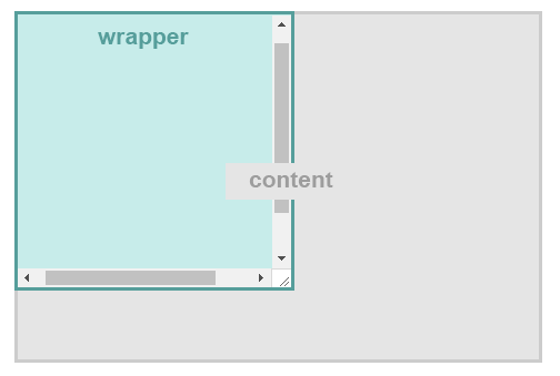
Currently there are no specs to target if element has wrapped content/text (outside the overflow:hidden area). It could be usable for example to decide if to show customized tooltip, apply special style, show dropdown, and probably more usecases.
Landing multiple line wrapping proposal #390 would make this even more actual ~, could specify it with :wrapped-line(n) like :wrapped-line(3)~.
For an example here is a CSS menu hack to decide if to show dropdown with wrapped elements http://kizu.ru/fun/chevron/, perhaps :wrapped-line could simplify things.
Update: Is changed to :overflowed-content [:overflowed-content-x, :overflowed-content-y]
 laukstein
All 27 comments
I'm afraid this could cause circular definitions like
:not(:wrapped-line) {
  height: 0;
}
 Loirooriol
on 26 Nov 2017
Loirooriol
on 26 Nov 2017
@Loirooriol, any suggestions? The same probably could say for :not(:first-line), etc.
laukstein
on 27 Nov 2017
::first-line is a pseudo-element, not a pseudo-class. There is no good solution, see #1656:
pseudo classes in particular cannot depend on layout
Loirooriol
on 27 Nov 2017
@Loirooriol then lets define it as "pseudo-element :wrapped-line"? Would it help?
laukstein
on 27 Nov 2017
But then I don't think this pseudo-element would be useful. You wouldn't be able to use it to target an element if it has wrapped content/text, which is what you wanted.
Loirooriol
on 27 Nov 2017
@Loirooriol What about specifying in media-query like @media (wrapped-line(.selector))? I think it is more logic.
laukstein
on 27 Nov 2017
Media queries currently would not work, because their conditions cannot depend on individual elements. Element queries are what would be necessary. They are already being had been investigated by the Responsive Images Community Group several years ago. But, as Tab Atkins pointed out in 2013, there are many barriers to implementing them that are similar to those of this proposal, especially circularity.
Edit: Recently, Tantek Çelik has rekindled discussion about standardizing element queries / container queries in the RICG, asking whether to try doing so in the WICG; see ResponsiveImagesCG/cq-usecases#44.
 js-choi
on 27 Nov 2017
js-choi
on 27 Nov 2017
Element queries aren't magical either; they're limited to a few bits of layout information, and have some important restrictions that make this information possible to obtain without circularity (for example, the "container" being queried for its size has to have contain: size, so it doesn't pay attention to the size of its children; this means that the children can do whatever they want in response to the query result, and it won't have a circular effect back on the query). This doesn't apply to the proposed :wrapped-line pseudo.
 tabatkins
on 27 Nov 2017
tabatkins
on 27 Nov 2017
@tabatkins are you saying :wrapped-line would cost performance, or there is another technical issue?
laukstein
on 27 Nov 2017
I'm saying it's circular, for the reasons given by others earlier. I was just explaining that EQs, while superficially circular, have some restrictions that let them dodge the circularity if they're carefully designed; :wrapped-line doesn't have that.
tabatkins
on 27 Nov 2017
Element queries are what would be necessary. They are already being investigated by the Responsive Images Community Group.
Haha no they're not. What have they done in the last 2-3 years? I see no activity at all that would indicate the RICG is even still alive.
During that time I have written what I believe to be the only element query spec that contains new syntax ideas which was based on the features of the EQCSS syntax and plugin.
We included a 'lines' feature, but of all of the features it's the least reliable element-based breakpoint, and it was a real challenge to calculate! After being able to experiment with the min-lines and max-lines feature via EQCSS, I now consider it the least-useful of any of the possible element-query breakpoints, so much that I had believed I had already removed it from my spec. There are a lot of useful things element queries can do, but sniffing the number of lines inside an element hasn't proven very useful.
On the other hand, I believe I have a demo (using EQCSS) that illustrates _exactly_ what you seem to be describe wanting to be able to do: https://codepen.io/tomhodgins/pen/KNywpV
.widget {
  width: 500px;
  height: 500px;
  margin: 0 auto 2em auto;
  border: 5px solid red;
  text-align: center;
  position: relative;
}
h2 {
  width: 100%;
  font-size: 50pt;
  margin: 0;
  line-height: 1.2;
}
@element .widget h2 {
  eval('offsetHeight <= parentNode.offsetHeight && "$this"') {
    position: absolute;
    top: 50%;
    transform: translateY(-50%);
  }
  eval('offsetHeight >= parentNode.offsetHeight && "$parent"') {
    overflow: auto;
    overflow-y: scroll;
    border-color: lime;
  }
}
So what's interesting to note here, is that even though EQCSS has a min-lines and max-lines breakpoint that _could_ be used, the easiest way to build what you described instead uses knowledge of the element's own offsetHeight compared to its parent's offsetHeight as the 'test' or 'breakpoint' for applying different values. Perhaps this same functionality could be achieved in CSS today through CSS variables which are set (and re-set) by JS! JavaScript can measure an element and its child, and assign different values to these CSS variables based on what it sees.
Here's a rebuild of my EQCSS-powered demo using HTML, CSS (with CSS variables), and JS — I think a solution like this is what you're looking for and thankfully it doesn't require CSS to be extended beyond what it's already capable of doing today :D
<div class=widget>
  <h2>Example</h2>
</div>

<div class=widget>
  <h2>Example sentence that's not too long</h2>
</div>

<div class=widget>
  <h2>This is an example sentence that's too long to be displayed centred, so it needs to scroll inside the parent element and be positioned normally.</h2>
</div>

<style>
  .widget {
    width: 500px;
    height: 500px;
    margin: 0 auto 2em auto;
    border: 5px solid red;
    text-align: center;
    position: relative;
    overflow: var(--overflow);
    overflow-y: var(--overflow-y);
    border-color: var(--border-color);
  }
  h2 {
    width: 100%;
    font-size: 50pt;
    margin: 0;
    line-height: 1.2;
    position: var(--position);
    top: var(--top);
    transform: var(--transform);
  }
</style>

<script>
  function OverflowOrCentered() {

    var widget = document.querySelectorAll('.widget')

    for (var i=0; i<widget.length; i++) {

      var headline = widget[i].querySelector('h2')

      if (headline.offsetHeight <= widget[i].offsetHeight) {

        headline.style.setProperty('--position', 'absolute')
        headline.style.setProperty('--top', '50%')
        headline.style.setProperty('--transform', 'translateY(-50%)')

      } else {

        headline.style.setProperty('--position', '')
        headline.style.setProperty('--top', '')
        headline.style.setProperty('--transform', '')

      }

      if (headline.offsetHeight >= widget[i].offsetHeight) {

        widget[i].style.setProperty('--overflow', 'auto')
        widget[i].style.setProperty('--overflow-y', 'scroll')
        widget[i].style.setProperty('--border-color', 'lime')

      } else {

        widget[i].style.setProperty('--overflow', '')
        widget[i].style.setProperty('--overflow-y', '')
        widget[i].style.setProperty('--border-color', '')

      }

    }

  }
  window.addEventListener('load', OverflowOrCentered)
</script>
 tomhodgins
on 27 Nov 2017
tomhodgins
on 27 Nov 2017
@tomhodgins, with :wrapped-line I meant content is cropped by overflow:hidden probably btter naming would be :cropped-content
testcase https://output.jsbin.com/rawezas/5/quiet

Simplified code:
p {
    overflow: hidden;
    max-width: 3em;
    white-space: nowrap;
}
p:cropped-content {
    color: red;
}
<p>Is cropped because exceeds 3em width, expected to be in red because of :cropped-content</p>
Perhaps would want to know if cropped horizontally or vertically -
:cropped-content === :cropped-content-x || :cropped-content-y
laukstein
on 28 Nov 2017
Ah okay, so you're thinking more horizontally then :D I've got a demo of 'overflow shadows' that make use of scrollLeft, offsetWidth, and scrollWidth of elements to compute whether a child element of another element is:
- not cropped
- cropped on the left side
- cropped on the right side
It should be possible to 'translate' my EQCSS demo here to native HTML + CSS + JS in the same way I did for the last demo.
Would this be something that applied only to individual elements, or would it apply to elements containing child HTML elements as well? In this example I'm working with 2 elements (rather than one) in order to measure something that's cut off, but it makes me wonder if we need something like:
:cropped-x-start:cropped-x-end:cropped-y-start:cropped-y-end
Where start = left, and end = right for Left-to-Right reading modes to cover all of the cases where content could be cut off. Is that closer to what you're thinking about?
tomhodgins
on 28 Nov 2017
I am changing it to :overflowed-content === :overflowed-content-x || :overflowed-content-y.
After more thinking,
it would be more universal if selector would cover any case when content is outside the wrapper area - having scroll (@tomhodgins mentions example https://codepen.io/tomhodgins/pen/KNywpV) or not (uses overflow:hidden).
@tomhodgins thanks for pointing the examples! It seems EQCSS handles also when used overflow:hidden https://codepen.io/laukstein/pen/gXBLXY. Any progress of standardizing this EQCSS part?
I was thinking only about x and y axis (horizontal, vertical), not start, end. Anyway needed more feedback from w3c team.
laukstein
on 28 Nov 2017
@Loirooriol
:not(:wrapped-line) {
height: 0;
}
and next one:
input:focus
{
   display:none;
}
Elements with display:none cannot be focusable. IE, FF and Cr differently handle this stylesheet.
 Nadya678
on 30 Nov 2017
Nadya678
on 30 Nov 2017
@Nadya678 That's an interesting testcase, which may be worth discussing in another issue, possibly with whatwg people.
I think the trick is that an element must have a box in order to be focusable, but once it has become focused, this restriction does not need to hold. That is, focused elements don't need to continue been focusable. This is how Firefox and Edge seem to behave.
Alternatively, Chrome seems to think that if a focused element stops being focusable, it should no longer be focused. But this does not imply that, if later the element becomes focusable, it will automatically become focused again.
In neither interpretation there is a circularity, unlike the proposed :cropped-content.
Loirooriol
on 30 Nov 2017
@Loirooriol notice I changed the recommendation to :overflowed-content, so that it handled any case when content (or part of the content) is located outside the wrapper (the wrapper size).
laukstein
on 30 Nov 2017
I do not see any approach for this that would break the circularity discussed above. Yes, it is unfortunate that CSS has this architectural limitation, but it does have it, and selectors cannot switch between matching or not matching depending on the result of layout.
This isn't a matter of cleverly playing with the syntax, it is a matter of what this means. In the general model of how CSS works, this does not make sense.
I am afraid the only thing we can do here is to close as WONTFIX.
 frivoal
on 14 Dec 2017
frivoal
on 14 Dec 2017
CC @atanassov @astearns
frivoal
on 14 Dec 2017
@frivoal why not to improve CSS capability and change the way it works? I think otherwise will continue over years to popup such questions, like EQCSS. This proposal I drafted many years ago, didn't had time (and good place) to post it.
laukstein
on 14 Dec 2017
If the question is "why can't we add this selector?" the answer is "because that's not how browsers work". If the question is "why don't we change how browsers work", we're going to need a separate discussion, and very substantive supporting arguments.
I am not familiar ith EQCSS. Maybe it is a good proposal, and presenting it to browser vendors and the CSSWG could be a worthy endeavor, if you think it is possible to implement at reasonable cost and solves a sufficiently important problem (there's a balance between these two things). Please open a separate issue about that if you want to pursue it.
Either way, this issue is not about EQCSS or some other way of overhauling browser architecture. It is about "can we have :overflowed-content?" And the answer, given the current state of browser architecture is that no, we cannot.
frivoal
on 14 Dec 2017
Can't you use an IntersectionObserver instead? https://jsfiddle.net/f2gp7pnq/
new IntersectionObserver(function([{intersectionRatio}]) {
  root.classList.toggle('overflowed-content', intersectionRatio < 1);
}, {root}).observe(root.lastElementChild);
@Loirooriol technically is possible everything. I posted here a propose for CSS. And @frivoal fyi EQCSS has been proposed multiple CSS solutions, and I think it is in work of progress; you can ask more to @tabatkins.
If you look above demos, you can see EQCSS giving solution for :overflowed-content too.
laukstein
on 16 Dec 2017
I am afraid the only thing we can do here is to close as WONTFIX.
Exactly.
 therealglazou
on 30 Jan 2018
therealglazou
on 30 Jan 2018
@Nadya678 @Loirooriol
One more case:
input:hover {
  height: 0;
  width: 0;
}
And we live with this for many years, without any real problems...
 imkremen
on 21 Jun 2018
imkremen
on 21 Jun 2018
@imkremen https://wiki.csswg.org/faq#why-doesn-t-this-argument-apply-tohover
Loirooriol
on 21 Jun 2018
Related issues
 gsnedders
·
3Comments
gsnedders
·
3Comments
 ExE-Boss
·
3Comments
ExE-Boss
·
3Comments
 CJKu
·
4Comments
CJKu
·
4Comments
 rniwa
·
3Comments
rniwa
·
3Comments
 bramdoppen
·
3Comments
bramdoppen
·
3Comments
Most helpful comment
Exactly.