Csswg-drafts: [css-grid-2] Ability for grid items to automatically span rows and columns based on content size
This has been asked by authors a number of times, both during in-person conversations and online. Linked are a couple of these requests and use cases.
Authors want items to automatically span based on content size, rather than needing to make that decision and add a span as grid-column-end or grid-row-end.
Rows: when the content of the item is taller than the available space in a fixed height row, span to the next row line.
Columns: when the content of the item is wider than the width of a fixed size track, span to the next column line.
The linked issues are from my AMA, and contain examples and use cases.
 rachelandrew
All 21 comments
There's a strongly circular aspect here, given that track sizing can depend on content size.
However, there might be room to restrict a grid to only fixed-size tracks, and then this sort of thing could work.
 tabatkins
on 15 May 2017
tabatkins
on 15 May 2017
This was considered during the initial design discussions, and rejected for this layout module due the circularity concerns Tab cites here. The original Line Grid proposal’s box-snap property was designed with this idea in mind, though -- with the idea that at some future point it could be extended to snap to named grid lines, not just line grid lines.
Either way it'd be a fundamentally different layout model, even if we do end up re-using some of the Grid syntax.
 fantasai
on 6 Nov 2017
fantasai
on 6 Nov 2017
This issue keeps coming up in discussions with authors. Especially once they realise they can size the tracks with the content sizing keywords, it seems the next logical leap is that the content should be able to dictate the span.
I understand the circular issue however, but it seems like there are enough use cases for this that it would be interesting to think around how this might look.
rachelandrew
on 6 Nov 2017
I want to add a further use case for this issue.
I am working on a classic e-commerce category page – a simple grid of products and some navigation elements at the top. This should be a prime candidate for CSS Grid.
In the top left corner of the category page, we show the category tree in a box. While most sites dedicate a full column to the category navigation, we also show products below the navigation box. The height of the navigation box varies – you can go deeper in the category tree and you may see all the different types of dresses, which add to the height of the box.
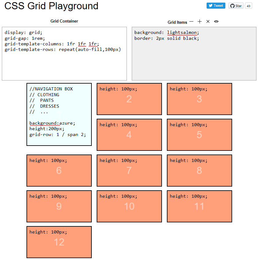
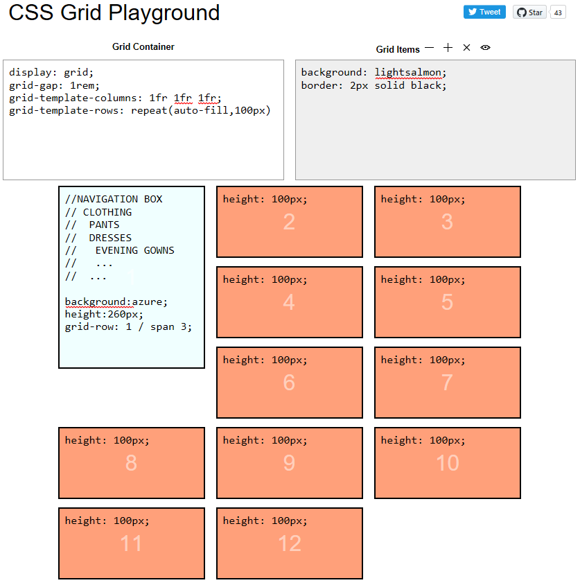
At the moment we use a float-based layout to accomplish this.
 maeh2k
on 18 Feb 2018
maeh2k
on 18 Feb 2018
if this is only allowed on fixed track/row sizes, is there still an issue with circular dependencies?
 juliusstoerrle
on 31 Mar 2018
juliusstoerrle
on 31 Mar 2018
@juliusstoerrle The problem is that the width of columns depends on what is inside them even if you specify them to be 1fr so it would be really difficult to make this useful. You would need both the width and the height of the spanned track to be pixels, at which point you might almost use position:absolute to achieve your layout.
 FremyCompany
on 3 Apr 2018
FremyCompany
on 3 Apr 2018
Another Use Case: Layouts like tumblr's feed (https://www.tumblr.com/explore/trending). They currently use js and absolute positioning.
How I imagine it to work in Grid: https://jsfiddle.net/_xlf/70nckeuj/ , what the Javascript does is basically grid-row: span auto
 xlf1024
on 26 Oct 2018
xlf1024
on 26 Oct 2018
I've tried to find this feature nearly every time I've used CSS Grids. I'd like to achieve rhythm over many rows of content where each row has a indefinite amount of content (e.g. paragraphs of different lengths, pictures of different heights). Given that so many websites have dynamic content a feature like this would be a wonderful addition to CSS Grid.
It's hard for me to imagine a scenario where I'd want to use this in combination with content-size defined tracks, so @tabatkins suggestion of limiting this feature to tracks of fixed size seems very reasonable.
 sgwilym
on 26 Feb 2019
sgwilym
on 26 Feb 2019
I've managed to achieve this by:
- lining up my grid item, using CSS Grids;
- providing a 'position: relative' on the same item to reset origin
- ... then providing a 'position: absolute' an an inner direct descendent container, to allow the contents to break out of the constraints set by the grid.
It works well for my use-case. YMMV.
 lukewhitmore
on 2 Apr 2019
lukewhitmore
on 2 Apr 2019
@lukewhitmore interesting, could you provide sample code? thanks!
 zakjan
on 2 Apr 2019
zakjan
on 2 Apr 2019
Another Use Case: Layouts like tumblr's feed (https://www.tumblr.com/explore/trending). They currently use js and absolute positioning.
I believe this is the same than issue #945 about masonry layouts.
 mrego
on 5 Apr 2019
mrego
on 5 Apr 2019
I'd like to add another vote for this kind of feature.
I have uses cases where, to either avoid or minimize text overflow, I'd want grid items to auto-snap their size to the next column or row boundary, _if_ the other dimension is constrained by an explicit or max value. Oversize items that start at the end of the grid axis (last cell) would simply wrap to start on the next column or row.
Would this maybe be an extension to the overflow spec combined with Grid?
For instance: overflow: next-column | next-row | minmax(next-column, row-end) or would we need to separate this as grid-overflow?
Could you have a combination of of this behaviour that, if it expands up to a maximum, will then obey a second, standard overflow behaviour? I.e:
grid-overflow-rows: 3, ellipsis;
would overflow the cell to a maximum of 3 rows, and at that point, if the text is still too long, truncate it with an ellipsis.
The next question I'd have is specificity. If I added it to a top-level Grid container element, would it automatically detect overflows in contained divs?
If I applied it to a lower-level div, could I expect it to communicate its overflow state upwards to the grid container, etc?
(And obviously, implications for subgrid etc.)
 ajkandy
on 14 Jun 2019
ajkandy
on 14 Jun 2019
Couldn't the circularity issue be solved by ignoring the specific grid cells that are set to auto-span?
Use case
For example in this use case the height has been set explicitly:
https://github.com/w3c/csswg-drafts/issues/1373#issuecomment-366522775
However in my experience, any time you have something with text in it, it is an absolutly terrible idea to set an explicit height on it.
So we want the grid in general to still be able to auto-size rows in that example.
Solution
If we want a grid-cell to auto-span, then we typically do not want it to auto-size the rest of that column/row. So if a grid cell is set to auto-span, its size should be ignored when determining the size of the overall column/row.
There is one major exception, if all of the grid cells in a row/column are set to auto-span, and thus none are contributing to column/row size, then we end up with grid columns/rows that are 0px in size which breaks the layout.
To avoid this problem, auto-span should only contribute to the row/column size if it is the smallest item in that row/column. Otherwise it spans across to the next column/row instead of increasing the size of that column/row.
I'm pretty sure this solves the circularity problem of having auto size grid cells that also auto-span.
 Dan503
on 6 Jan 2020
Dan503
on 6 Jan 2020
Oh one other thing. If the grid item that is set to auto-span is the last item in that column/row and that grid item is the largest item in that column/row, it should increase the size of the column/row instead of spanning to the next column/row.
If the grid item spanned to the next column/row instead of re-sizing, you would end up with an ugly overhang that doesn't line up with the edges of the rest of the grid.
Dan503
on 6 Jan 2020
I've put together this Code Pen visualising how I would expect the logic behind auto-spanning to work:
https://codepen.io/daniel-tonon/pen/ZEYrMQR
The key points in the Code Pen are:
- Proposed syntax:
- Span forwards:
grid-[row/column]: span auto; - Also span forwards:
grid-[row/column]-end: span auto; - Span backwards:
grid-[row/column]-start: span auto; - Span both forwards and backwards:
grid-[row/column]: span auto / span auto;
- Span forwards:
- The auto-placement algorithm can place auto-span grid cells onto new rows/columns if it needs to.
- Auto-span cells generally should not be able to generating new rows/columns through spanning. Only non-autospan grid cells can generate new rows/columns through spanning.
- If there are no valid rows/columns left that can be spanned, the auto-span grid cell starts growing in size instead. This in turn increases the size of the columns/rows that it is spanning.
- If a grid cell is set to span both columns and rows automatically, it spans columns first in an rtl or ltr language and rows first in an inline top to bottom language. When it reaches it's column limit (ltr language) then it starts spanning rows.
- If a grid cell is set to span both backwards and forwards, it will span forwards first until it can't span forwards any further then it will span backwards (this needs more discussion, I'm not sure if this is the best method)
I also proposed non-preferred options for auto-spanning if the idea of auto-span cells not being capable of generating new rows/columns through spanning isn't feasible:
- non-preferred row span limit: It stops spanning rows when it is the only cell applying height to a row.
- non-preferred column span limit: It stops spanning columns at the end of the explicit grid.
Dan503
on 11 Jan 2020
Oh actually I also like @ajkandy idea of being able to restrict a minimum and maximum span size. I would imagine the syntax to look like this though:
.minmax-span {
  /* Based on the size of the grid cell content, it can span between 1 and 3 columns */
  grid-column: span minmax(1, 3);
}
I think some of these designs might be possible to do with masonry layout (https://github.com/w3c/csswg-drafts/issues/4650) together with block-step-size.
 MatsPalmgren
on 15 Jan 2020
MatsPalmgren
on 15 Jan 2020
Oh, I've had another idea.
If the auto spanning explained in this comment is possible:
https://github.com/w3c/csswg-drafts/issues/1373#issuecomment-573290486
Setting height: 100% on a grid-row: span auto; cell and setting width: 100% on a grid-column: span auto; cell would be a way to force a grid cell to span to the end of the grid, including implicit grid cells. 😁
...I realise that doesn't really work though if the user tries to do both at once 🤔
Dan503
on 15 Jan 2020
I think some of these designs might be possible to do with masonry layout (#4650) together with block-step-size.
@MatsPalmgren https://github.com/w3c/csswg-drafts/issues/1373#issuecomment-574877505
That would be a very hacky solution though for creating a single auto-spanning grid cell. It wouldn't convey the authors intent.
It's much better to have a clear way to create auto-spanning grid cells.
Dan503
on 20 Jan 2020
I logged in for the first time in forever SPECIFICALLY to comment on this issue and throw my voice into the ring. Tonight I needed similar (although not quite identical) functionality whilst working on the home page rebuild of my own website, and I had to use an inelegant javascript hack to make something like this work.
CSS grid definitely needs auto-spanning, and I think making it work only when a fixed grid is explicitly defined in both dimensions would be an acceptable solution to the circular logic problem others have raised concerns about.
 dragon-architect
on 2 May 2020
dragon-architect
on 2 May 2020
Running into the same issue. Definitely need a way to auto-span.
 krsfryr
on 5 Aug 2020
krsfryr
on 5 Aug 2020
Related issues
 dauwhe
·
4Comments
dauwhe
·
4Comments
 heycam
·
3Comments
heycam
·
3Comments
 schenney-chromium
·
3Comments
schenney-chromium
·
3Comments
 bramdoppen
·
3Comments
bramdoppen
·
3Comments
 castastrophe
·
3Comments
castastrophe
·
3Comments
Most helpful comment
I'd like to add another vote for this kind of feature.
I have uses cases where, to either avoid or minimize text overflow, I'd want grid items to auto-snap their size to the next column or row boundary, _if_ the other dimension is constrained by an explicit or max value. Oversize items that start at the end of the grid axis (last cell) would simply wrap to start on the next column or row.
Would this maybe be an extension to the
overflowspec combined with Grid?For instance:
overflow: next-column | next-row | minmax(next-column, row-end)or would we need to separate this asgrid-overflow?Could you have a combination of of this behaviour that, if it expands up to a maximum, will then obey a second, standard overflow behaviour? I.e:
grid-overflow-rows: 3, ellipsis;would overflow the cell to a maximum of 3 rows, and at that point, if the text is still too long, truncate it with an ellipsis.
The next question I'd have is specificity. If I added it to a top-level Grid container element, would it automatically detect overflows in contained divs?
If I applied it to a lower-level div, could I expect it to communicate its overflow state upwards to the grid container, etc?
(And obviously, implications for subgrid etc.)