Csswg-drafts: [css-images] Add easing functions to color stops
A recent CSS-Tricks article (https://css-tricks.com/easing-linear-gradients/) and subsequent Twitter discussion (https://twitter.com/stubbornella/status/861603397677359104) spurred me to file this request for Level 4.
In summary, linear gradients are not always visually acceptable. This is particularly true when “fading out” a dark color to transparent. The article describes how to set up a bunch of color stops to ease out the gradient. A much better solution would be to add easing functions to all color stops after the first, with a linear default for backward compatibility.
The example in the article could be approximated like this:
linear-gradient(to bottom, black 0%, transparent 100% ease-in-out);
…instead of the 11 color stops used to get the effect. (Note that I don’t claim this would be a precise match; a cubic-bezier() easing would most likely be required for that. But it would be close.)
This would change the definition of <color-stop> (https://drafts.csswg.org/css-images-3/#typedef-color-stop) from:
<color-stop> = <color> <length-percentage>?
…to the following at a minimum:
<color-stop> = <color> <length-percentage>? <timing-function>?
As an author, I would probably prefer:
<color-stop> = <color> [ <length-percentage> || <timing-function> ]?
…since that would allow me to write the easing and distance in whichever order I liked. (For that matter, I’d prefer to be able to write all three in any order, but I don’t know if that would upset any implementors’ apple carts.)
 meyerweb
All 42 comments
Apologies for forgetting this at initial filing: <timing-function> would use the same values as transition-timing-function, with the same definitions. (https://www.w3.org/TR/css3-transitions/#transition-timing-function-property)
meyerweb
on 8 May 2017
I really like this syntax. I've long had an idea of proposing easing for SVG gradients by borrowing the SMIL keySplines attribute. But of course, named CSS easing functions are much nicer.
However, we would need to figure out how it interacted with the gamma curves created by color hints, since those are already implemented & will be moved up to CSS Images Level 3.
 AmeliaBR
on 8 May 2017
AmeliaBR
on 8 May 2017
However, we would need to figure out how it interacted with the gamma curves created by color hints, since those are already implemented & will be moved up to CSS Images Level 3.
Good point, see https://github.com/w3c/csswg-drafts/issues/1284 which adds a 'midpoint' - somewhat oddly named, it turns the linear interpolation between adjacent color stops into a curve, effectively moving the point at which the midway color is reached to be earlier (curve up) or later (curve down). This is way easier to understand with a diagram, of course. (an interactive diagram would be even better).
Being defined by a single point, it is less flexible than easing functions which are defined by two points, giving S-shaped curves as well..
 svgeesus
on 8 May 2017
svgeesus
on 8 May 2017
@meyerweb My attempt was mostly a proof of concept and as such nowhere near flexible enough so thank you very much for picking up my idea and making it way better 👍
I'm curious how the <color-stop> = <color> [ <length-percentage> || <timing-function> ]? would work in practice since timing functions refers to the transition between two stops.
Should one only be able to add timing-function to subsequent stops so it always describes how the gradient transitions from the previous stop to the stop with the timing-function applied?
Or would
linear-gradient(black 0%, transparent 100% ease-in-out);
effectively be the same as
linear-gradient(black 0% ease-in-out, transparent 100%);
and if so, then how should
linear-gradient(black 0% ease-in-out, transparent 100% ease-in);
be interpreted?
 larsenwork
on 8 May 2017
larsenwork
on 8 May 2017
@larsenwork: My thought was that the timing function (really an easing function) for a color stop described the easing from the previous stop to itself, so an easing function on the first color stop would be ignored (though not invalid).
Thus:
linear-gradient(black 0%, transparent 100% ease-in-out);
…describes an ease-in-out from the previous color stop (black) to the current color stop (transparent). Therefore, your second example:
linear-gradient(black 0% ease-in-out, transparent 100%);
…is actually equivalent to:
linear-gradient(black 0% ease-in-out, transparent 100% linear);
If the <color> [ <length-percentage> || <timing-function> ]? syntax were adopted, then this would also be equivalent:
linear-gradient(black 0% ease-in-out, transparent linear 100%);
…because the easing function and distances could be written in any order.
meyerweb
on 8 May 2017
To address @larsenwork's question, and also to synchronize with the mid-points syntax, maybe the easing function should be a separate item in the list. You would either use a
So, working from the value definition in CSS Images 4 the full syntax for a <color-stop-list> would be:
<color-stop-list> =
  [ <linear-color-stop> [, <linear-color-hint>]? ]# , <linear-color-stop>
<linear-color-stop> = <color> && <color-stop-length>
<linear-color-hint> = [<length-percentage> | <animation-timing-function>]
<color-stop-length> = <length-percentage>{0,2}
In English:
A color stop list is a comma-separated list of two or more color stops.
Each color stop consists of a color value and an optional position value, or start and end positions values.
Each pair of consecutive color stops may optionally be separated by an interpolation instruction, which is also set off by commas. The interpolation instruction may take one of two forms:
- a mid-point position, which is defined in the same way as a color stop position, or
- an interpolation function, which is identical to the timing functions defined in CSS Timing Functions 1.
PS, If this goes ahead, CSS Timing Functions 1 should probably be changed to CSS Interpolation Functions or some other dimension-agnostic name.
AmeliaBR
on 8 May 2017
so an easing function on the first color stop would be ignored (though not invalid)
Just out of curiosity then why no make it invalid on the first color stop?
I'm also not sure what would be gained by making the order of easing and distance flexible. I think it could end up making the gradient function harder to read so I'd vote for
<color-stop> = <color> <length-percentage>? <timing-function>?
but I think you @AmeliaBR make some really interesting points too. Just to understand the syntax you're proposing it would be something like
linear-gradient(black, ease-in-out, white)
right?
Which would make intuitively sense since the transition-functions (as I'd agnostically call them) describes how to transition between to stops.
larsenwork
on 8 May 2017
Just out of curiosity then why no make it invalid on the first color stop?
Because I don’t want to have the entire gradient fail to render just because someone left an easing function in when they deleted the first stop during authoring. Also it makes defining the value syntax easier, since there can just be <color-stop> instead of <first-color-stop> and <color-stop>.
meyerweb
on 8 May 2017
@larsenwork
Just to understand the syntax you're proposing it would be something like
linear-gradient(black, ease-in-out, white)right?
Right! Sorry, I should have actually included some examples.
It's not a perfect syntax, because it means the entries in the comma-separated list aren't all equal, but it's consistent with the existing mid-point color hint syntax.
AmeliaBR
on 9 May 2017
Having slept on it I'm leaning towards @AmeliaBR approach. To sum up:
Pros
- Consistent with current
<linear-color-hint>syntax - Has the logical limitation that easing can only be applied between color-stops
Cons
- The comma separated values aren't created equal but was already the case with hints
larsenwork
on 9 May 2017
What are color interpolation hints meant to be now? I can’t seem to find any examples, and the definition (https://drafts.csswg.org/css-images-4/#color-interpolation-hint) doesn’t make it at all clear what’s meant. Is it basically what this issue is about, or something else?
meyerweb
on 9 May 2017
@meyerweb the color hints only shifts the halfway point and effectively creates two linear gradients in the process — at least that's what I'm gathering from the description and examples on csswg where e.g.
linear-gradient(rgb(100%, 0%, 0%), 25%, rgb(100%, 100%, 100%))
renders like
linear-gradient(rgb(100%, 0%, 0%) 0%, rgb(100%,50%,50%) 25%, rgb(100%, 100%, 100%) 100%)
and as such of fairly limited use when wanting to create smooth gradients but maybe @AmeliaBR could clarify.
EDIT: no, I was incorrect. It does some smoothing. It's still not quite there visually compared to proper ease-functions.
EDIT 2: made a quick comparison of the output here: https://codepen.io/larsenwork/pen/pPpMpb/
larsenwork
on 9 May 2017
Yes, the color hint creates a curve. I'd really like to see better figures in the spec, but it uses the same math as a gamma correction curve like this one:
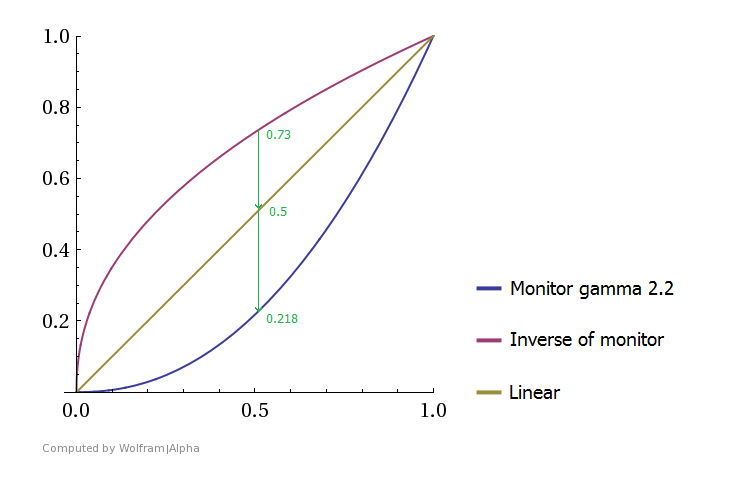
That graph is showing paired encoding and decoding gamma curves for luminance adjustment, which isn't relevant to this discussion.
But the shape of the curves is. One axis would be the distance along the gradient and the other axis is the distance in color-space. Normally, for an easing function the Y axis would be the color value, but for re-interpretting this graph as it's currently labelled, it's easier if you treat the X axis as the color value and the Y axis as the distance. A midpoint color hint of 73% says to use the curve where 50% in color-space is positioned at 73% in the gradient distance. A color hint of 21% says to use the curve where the mid-point color is positioned at 21% distance.
(And of course, a mid-point of 50% means the mid-point color gets positioned at the 50% distance, so it's equivalent to simple linear interpolation.)
AmeliaBR
on 9 May 2017
But to answer @meyerweb's question
Is it basically what this issue is about, or something else?
The color hints were one way to address the problems with linear gradients being ugly in many cases. They are based on gradients used in Adobe products. The mid-point position is easy to represent and intuitive to adjust in a visual editor.
But as @svgeesus noted, the curves created by mid-point adjustments are less flexible than the cubic bezier curves used in the transition functions, because they are defined by one point, not two. In particular, you can't create an S-curve, ease-in-out relationship. And you definitely cannot create steps. So I think there is a value in having both: the mid-points for their simplicity, and full transition functions for more control.
AmeliaBR
on 9 May 2017
Ah! Given that, I agree, putting the interpolation function into the same spot as the hints (as a separate comma-separated value) makes the most sense. To authors, it will feel like “here’s this new interstitial thing that gives me a lot of easing options” and that’s perfect. It also makes hard-stop gradients a _lot_ easier to create, simply by putting in a step rather than having to string together a whole series of color pairs with stop distances that touch adjacent pairs.
Would there be utility in allowing both a <length-percentage> and an interpolation function, as a way of modifying the shape of the interpolation? Or too many curves being smooshed together that way?
meyerweb
on 9 May 2017
Would there be utility in allowing both a
and an interpolation function, as a way of modifying the shape of the interpolation? Or too many curves being smooshed together that way?
How are you imagining that would work? I think the math would get pretty hairy.
Authors can always break the gradient down into multiple stops if they really want more control.
AmeliaBR
on 9 May 2017
I have no idea how that would work, to be honest. I brought it up mostly to see if the smarter and more math-oriented people on the thread (read: everyone) thought it would be useful.
meyerweb
on 10 May 2017
If the goal is modifiable interpolations then instead of length-percentage together with interpolation function I'd vote for ability to use cubic-bezier and not just ease, ease-in, linear etc. — or that was maybe already the idea?
so something like:
linear-gradient(black, cubic-bezier(0.470, 0.000, 0.745, 0.715), white)
Not sure how that would work for numbers > 1 though.
larsenwork
on 10 May 2017
@larsenwork
If the syntax referenced the timing-function/transition function data type, then a cubic-bezier() function would automatically be included, as an alternative to the shorthand keywords.
AmeliaBR
on 10 May 2017
If we added this, it would indeed extend the <linear-color-hint> grammar, so @larsenwork's example syntax (the timing function on its own, comma-separated from the two surrounding color-stops) is indeed how it would look.
This proposal overall sound interesting and is definitely potentially doable, but I'd like to see how far people can take just the mid-point approach first. None of the blogposts talking about smoothing gradients seem to acknowledge their existence (which is understandable, given that they're embedded deep in Images 4 right now). They should help things quite a bit.
 tabatkins
on 10 May 2017
tabatkins
on 10 May 2017
@tabatkins I will try to do a proper stress test of the hint approach to see what it can render but I'm not too confident in what it will yield as the critical part of easing a gradient is having something with a terminal and/or final "velocity" of 0 which doesn't seem doable with hints. But I'll give it a go and also update the plugin with the proposed syntax here to see an approximation of what you could do if this syntax was supported
larsenwork
on 10 May 2017
My concern is just whether the midpoint approach can give a decent-looking "soft fade", not whether it can reproduce any particular mathematical definition. It appears to be good enough for Photoshop, so I'm curious to see example of it not being good enough for CSS.
tabatkins
on 10 May 2017
I've quickly updated the playground to support the syntax proposed by @AmeliaBR e.g.
linear-gradient(black, cubic-bezier(0.48, 0.30, 0.64, 1.00), transparent)
NB - the plugin has some limits for now:
- hacks by creating many color stops and as such might have some artefacts.
- only supports
cubic-bezier(),ease,ease-in,ease-out,ease-in-outbut addingsteps()should be fairly trivial. - doesn't yet support
color-stop-positionsbut should also be easy to add.
http://codepen.io/larsenwork/pen/WjJorb?editors=0100
@tabatkins I haven't been able to easily recreate the curve in the example with hints (but again I'm not too familiar with the approach).
Basically I wanted a gradient that faded out nicely but also had a modified s-shape to avoid being too dark in top. Creating an asymmetrical s-shape like that with cubic-bezier() is much more intuitive than trying to balance out three color-stops with two hints even if it's possible to get something visually similar that way (I wasn't). I've never been satisfied with the gradient options in Photoshop and know designers who either stack gradients, use gaussian blur or other "hacks" to create visually pleasing gradients.
larsenwork
on 12 May 2017
Do we need the timing function for each stop, or could there just be one that applied to the entire gradient? Intermediate stops would just get interpolated.
 bradkemper
on 13 May 2017
bradkemper
on 13 May 2017
Created another demo. This one doesn't show why we'd want this compared to hints in terms of "soft-fades" (see the previous one for that) but I've added support for steps() which I also find quite useful. https://codepen.io/larsenwork/pen/LymMJy/?editors=0100
EDIT: Removed sidenote about steps — see #1371
larsenwork
on 14 May 2017
@larsenwork
Symmetrical step functions are currently being called frames(). But that is being debated in #1301 .
Your fourth example matches frames(4): four equally-allocated values, including both the start and end values. Your third example doesn't match any existing timing function.
AmeliaBR
on 14 May 2017
@AmeliaBR cheers, I'll crop it out of this discussion to keep it on track then :)
@bradkemper we want to add it between stops — see https://github.com/w3c/csswg-drafts/issues/1332#issuecomment-299990698 and https://github.com/w3c/csswg-drafts/issues/1332#issuecomment-300246439 for details. Maybe @meyerweb can update the first comment so that newcomers can quickly see what the request is :)
larsenwork
on 14 May 2017
@bradkemper: I can envision wanting a single easing over an entire gradient of un-positioned stops, like red, orange, yellow, green, blue, purple, ease-out but I don’t see how that can be done while also allowing for different easings between the various stops, like red, ease-out, orange, ease-in, yellow, linear, green….
meyerweb
on 16 May 2017
"Single timing function crossing all the stops" is not how animations work right now; when you supply an animation-timing-function, it just sets the default for all the keyframes' individual timing functions.
If you don't supply a hint between two stops (midpoint or timing-function), you'll just get a linear transition like you do today.
tabatkins
on 16 May 2017
Note that Web Animations lets you apply a single timing function crossing all the stops (keyframes) as well as timing functions between stops (keyframes). It's a very commonly requested feature so I suspect we'll end up adding some sort of "overall" timing function to CSS Animations Level 2 as well.
 birtles
on 17 May 2017
birtles
on 17 May 2017
OK, yeah, I was thinking of simpler gradations, but I can certainly see the need for easing in and out in different parts of the same one.
bradkemper
on 10 Jun 2017
FWIW I've created an easing-gradient editor https://larsenwork.com/easing-gradients/#editor so people can play around with it to see the possibilities/flexibility easing functions provides.
The end result has some banding because that's how I can currently fake it but I'd imagine native browser support resulting in silky smooth gradients.
I'll add steps() functionality to the editor soon too — probably with a syntax like this https://github.com/w3c/csswg-drafts/issues/1680#issuecomment-361550637 for now.
larsenwork
on 30 Jan 2018
Seems like a good case to implement this with Houdini
 Juribiyan
on 16 Mar 2018
Juribiyan
on 16 Mar 2018
I always thought that easing functions specify the rate of change of a parameter over time.
Since these do not seem to have a time element, is easing the correct name I wonder?
I think this might cause unnecessary confusion, since it starts with having a timing-function without any time related axis . .
 annejan
on 15 Apr 2019
annejan
on 15 Apr 2019
@annejan
Since these do not seem to have a time element, is easing the correct name I wonder?
Time doesn't appear in the actual syntax though.
linear-gradient(black, cubic-bezier(0.470, 0.000, 0.745, 0.715), white)
As people are already familiar with easing functions from CSS Animation, they should find it easy to apply the same concept here. Yes, it is a function wrt distance along the gradient, not wrt time. But the 2D graphs of the functions, and tutorials & tools that let you design these visually, will be similar enough that people will, I believe, find the analogous behavior more of a help than a hindrance.
@tabatkins
I'd like to see how far people can take just the mid-point approach first.
In theory, a cubic bezier smoothing function between stops S1 and S2 can be closely approximated with mid-points as follows:
- Calculate a new color stop S3 corresponding to the inflexion point of the bezier. The stops are now S1 S3 S2
- Calculate a mid point for S1 to S3, giving the first half of the bezier
- Calculate a mid point for S3 to S2, giving the second half of the bezier
- Adjust the values from steps 2. and 3. until the rate of change of slope at the inflexion point is the same on both halves (second order curve continuity).
So, if they are familiar enough with the math, content creators can _do the work_. The same argument can be used for why mid points are not needed - _just simply add_ four to seven additional calculated intermediate stops to approximate the result by curve tessellation.
The benefit of the proposed syntax, in both cases, is that it is simpler, more intuitive, and avoids doing some side calculations, and avoids having extra WET color stops whose value depends in complex ways on the value of other stops, and means that animating the color stops is simpler and easier (because animating the extra, derived color stops so as to maintain the curve shape is a pain in the ass).
In other words, far more content developers will be able to use it, and get the results they expect, and their CSS will be shorter, DRY, more readable, and more maintainable.
svgeesus
on 15 Apr 2019
All the necessary productions have been renamed to <easing-function> etc. now. Even the spec is now the CSS Easing Functions spec so there shouldn't be any need to refer to timing anymore.
We've also added the extra steps/jump keywords--jump-both in particular, was mostly useful for gradients I believe.
birtles
on 16 Apr 2019
@svgeesus You skipped over the "It appears to be good enough for Photoshop" part of my quote. I'm definitely not against easing functions from a theoretical point of view! But the mid-point based approach does appear to work fine for existing Photoshop content, or at least did back when I made that comment. Has the situation changed?
I could also believe that Photoshop's interface makes it easier to guess-and-check gradient-midpoints and generate new ones, such that CSS aping the functionality is missing the usability. Is this the case?
The issue really is one of need. Do midpoints provide sufficient ability to do a "soft fade" gradient, or do authors need more power to achieve their goals? And would <easing-function> solve those goals well? So far I haven't seen an argument from an actual need.
(Note that the original post made no mention of midpoints, because the proposal was buried in Images 4. (Still is, as it turns out, even tho the next month we resolved to move it to level 3. ^_^) The thread kinda skipped over mention of midpoints to focus on discussing adding easing functions, so it's unclear whether midpoints serve @meyerweb's needs sufficiently.)
tabatkins
on 16 Apr 2019
One particular example I would see as relevant is the fact that the midpoint-based interpolation is not symmetric around the center point. That is, a gradient like linear-gradient(blue, 10%, white, 90%, blue) does not have the first and second halves look like mirror images of each other. Using cubic-bezier(), on the other hand, would let you produce symmetrical results fairly easily.
(The best way to make a symmetrical gradient with midpoints is to make two gradients, each half-size, and pointing in opposite directions. That's annoying, obviously.)
tabatkins
on 16 Apr 2019
On the subject of mathing out midpoints versus easings, I created (with a _huge_ assist from Tab, who quickly wrote the JS it’d have taken me forever to puzzle out) a couple of demonstrations of how midpoints compare to cubic-bezier easing.
The first compares simple one-way easings to closely-equivalent midpoint gradients:
https://codepen.io/meyerweb/pen/GLQOqB
To be clear, the midpoint gradients are not mathematically equivalent to the eased gradients. They’re visually very close, and probably quite close in terms of the raw color values, but they’re not in 1:1 correspondence.
The second compares symmetric gradients with midpoints versus easing:
https://codepen.io/meyerweb/pen/oOqqmE
Again, the two approaches yield very similar results because of all the color-stop and midpoint fiddling I did, but they are not 1:1 equivalent. And I’m not about to claim my color-stop/midpoint versions are the most efficient or mathematically best approaches. I did what any author would do, if they were sufficiently motivated to do this at all: I set some stops and manually tweaked midpoints until I got a close match.
meyerweb
on 18 Apr 2019
Just wanted to chip in that the syntax where easing functions are defined, like interpolation hints, as individual items in the color stop list makes a lot of sense to me, and it extends hints intuitively. In fact, by defining the hint function as:
function midpoint(H) {
  // return an easing function for t ∈ [0, 1]
  return t =>
    H <= 0 ? 1 :
    H >= 1 ? 0 :
    Math.pow(P, Math.log(0.5) / Math.log(H));
}
(where H is the midpoint projected to the [0, 1] interval between its adjacent color stops, and with adjustments for H = 0 and H = 1), I was able to trivially replace that function with any easing function, allowing things like:
linear-gradient: (to right, red, green, midpoint(0.5), blue)
linear-gradient: (to right, red, green, ease-in-out, blue)
One thing that trips me up with the current midpoint syntax is that midpoints shift the color stops. By defining this hypothetical function midpoint() that takes an argument from 0 to 1, we decouple the midpoint from position computation.
__Update:__ I tried to build a stronger case for the midpoint easing function in #3935
 danburzo
on 15 May 2019
danburzo
on 15 May 2019
Seems like a good case to implement this with Houdini
Given the way the Houdini Paint API works right now, that would require re-implementing the entire gradient parsing and painting logic in canvas. It would be a HUGE library, but a relatively minor built-in feature.
 LeaVerou
on 13 Dec 2019
LeaVerou
on 13 Dec 2019
@bradkemper: I can envision wanting a single easing over an entire gradient of un-positioned stops, like
red, orange, yellow, green, blue, purple, ease-outbut I don’t see how that can be done while also allowing for different easings between the various stops, likered, ease-out, orange, ease-in, yellow, linear, green….
Perhaps something like linear-gradient(ease-in-out to bottom, red, white, blue) ? Would be equivalent of linear-gradient(to bottom, red, ease-in-out, white, ease-in-out, blue)
 proimage
on 9 Feb 2020
proimage
on 9 Feb 2020
Related issues
LeaVerou
·
3Comments
 fantasai
·
3Comments
fantasai
·
3Comments
 castastrophe
·
3Comments
castastrophe
·
3Comments
 nigelmegitt
·
4Comments
nigelmegitt
·
4Comments
 tylersticka
·
3Comments
tylersticka
·
3Comments
Most helpful comment
FWIW I've created an easing-gradient editor https://larsenwork.com/easing-gradients/#editor so people can play around with it to see the possibilities/flexibility easing functions provides.
The end result has some banding because that's how I can currently fake it but I'd imagine native browser support resulting in silky smooth gradients.
I'll add
steps()functionality to the editor soon too — probably with a syntax like this https://github.com/w3c/csswg-drafts/issues/1680#issuecomment-361550637 for now.