Split from #4755
The fonts currently used for the API docs are somewhat problematic. The current default font Avenir is not openly available and fallbacks Tahoma, Lucida Sans and Lucida Grande don't look very nice (imho).
I'd suggest to follow Crystal's CD font Roboto as specified on https://crystal-lang.org/media/ to have a similar visual style as other Crystal resources.
Alternative fonts are Muli and Lato whith a similar appearance to Avenir, so I added them as fallbacks, too.
It's also nice to have a second font for headlines and accented text. Montserrat fits great with Roboto for this purpose.
A different approach is to just use the default system fonts. This is becoming somewhat popular as a seamless integration into the system user interface, it's for example used by Github, Wordpress and Medium. However this means we don't have a unique style for Crystal API doc but slight differences between platforms.
Current fonts
body copy: "Avenir", "Tahoma", "Lucida Sans", "Lucida Grande", Verdana, Arial, sans-serif
code: Consolas, 'Courier New', Courier, Monaco, monospace

Variant Roboto + Montserrat
body copy: "Roboto", "Avenir", "Muli", "Lato", "Tahoma", "Lucida Sans", "Lucida Grande", Verdana, Arial, sans-serif
headlines: "Montserrat", "Lucida Sans", "Lucida Grande", Verdana, Arial, sans-serif
code: Consolas, 'Courier New', Courier, Monaco, monospace

LIVE PREVIEW (together with a few other changes from #4755)
Variant system fonts
body copy: -apple-system, BlinkMacSystemFont, "Segoe UI", Roboto, Helvetica, Arial, sans-serif, "Apple Color Emoji", "Segoe UI Emoji", "Segoe UI Symbol"
LIVE PREVIEW (together with a few other changes from #4755)
 straight-shoota
All 7 comments
 asterite
on 28 Sep 2017
asterite
on 28 Sep 2017
They use Merryweather with Lato for headlines and Inconsolata as monospace. That's a nice popular combination. I am however not sure about using a serif font for body copy... I don't think it is very common for documentation website, though Rust uses a similar set. And it definetly has something elegant about it.
straight-shoota
on 28 Sep 2017
Looking at different documentation generators (Rust, Elixir, Ruby) as well as GitBook, they all seem to use Georgia, either directly or as a fallback. This is my go-to font for all my ebooks, and IMHO the best readability.
I'd avoid @font-face that requires to bundle the fonts or force link each and every generated docs to some external CDN (meh). I'd go for something basic & concise such as Georgia, serif for both headings and copy. For the monospace fonts, I'd drop the awful 'Courier New', Courier fallbacks, and keep something like Consolas, Monaco, monospace.
 ysbaddaden
on 28 Sep 2017
ysbaddaden
on 28 Sep 2017
@ysbaddaden on linux, I don't have Georgia, and Consolas and Monaco don't appear to be ubiquitous on windows. I think we should have a webfont first and foremost to ensure good display, but with a solid set of backup typefaces.
 RX14
on 28 Sep 2017
RX14
on 28 Sep 2017
I like "Fire Coda" with font ligatures. Is it possible for docsite?
 akzhan
on 18 Oct 2017
akzhan
on 18 Oct 2017
No way. Fira Code is a very opinionated font which would alienate most readers because they're not used to ligatures for special character combinations.
straight-shoota
on 18 Oct 2017
I personally like Roboto + Montserrat variant.
For code, my preference would be for Source Code Pro:
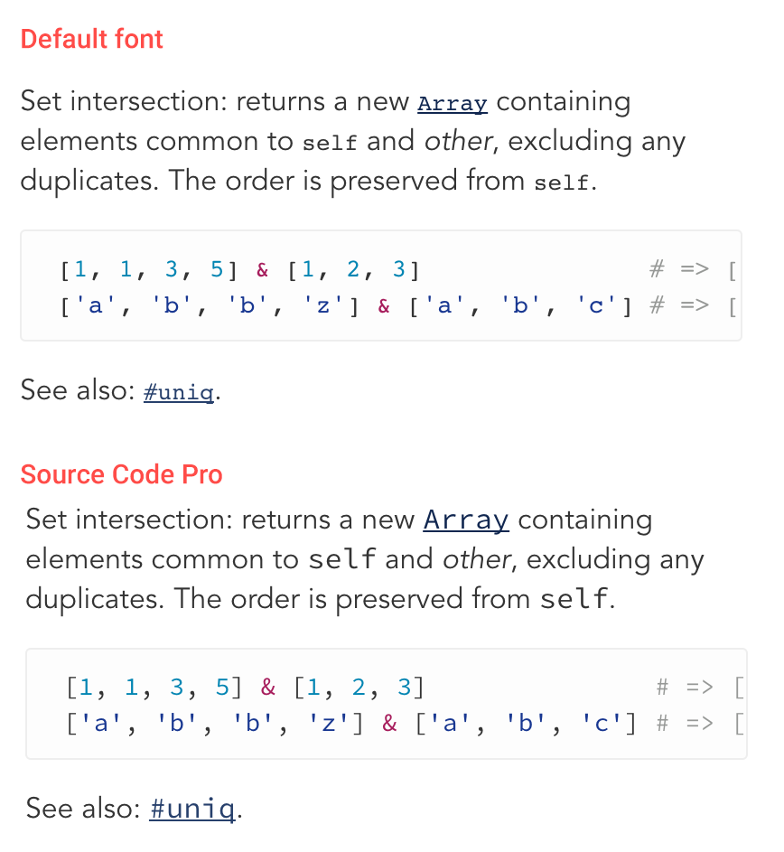
 kazzkiq
on 18 Oct 2017
kazzkiq
on 18 Oct 2017
Related issues
 Sija
·
3Comments
Sija
·
3Comments
 will
·
3Comments
will
·
3Comments
 ArthurZ
·
3Comments
ArthurZ
·
3Comments
 lgphp
·
3Comments
lgphp
·
3Comments
 lbguilherme
·
3Comments
lbguilherme
·
3Comments
Most helpful comment
@ysbaddaden on linux, I don't have
Georgia, andConsolasandMonacodon't appear to be ubiquitous on windows. I think we should have a webfont first and foremost to ensure good display, but with a solid set of backup typefaces.