Cropper: How to change shape from square to circle in crop area?

Hello,
i want to change shape from selecting area to square to circle.
which property should i use?
Please suggest me solution.
 shahbaz-gaxon
All 15 comments
The Cropper does not support circle crop box, but you can customize it by yourself.
 fengyuanchen
on 12 Dec 2015
fengyuanchen
on 12 Dec 2015
how can i customize to convert it circle box?
any suggestion or fiddle it?
shahbaz-gaxon
on 12 Dec 2015
Override the relative classes as .cropper-crop-box and .cropper-view-box with border-radius, and set both cropBoxMovable and cropBoxResizable options to false.
fengyuanchen
on 12 Dec 2015
ok sir i will try it i have no clue to done it.because i am newbie to using this plugin?
shahbaz-gaxon
on 12 Dec 2015
Hi,
I have been looking to achieve the same thing. Please note that you need to make use of the box-shadow property to create a rounded stroke, as outline currently doesn't follow the border-radius property in a cross-browser way.
I ended up using the following styles:
.cropper-crop-box, .cropper-view-box {
    border-radius: 50%;
}

.cropper-view-box {
    box-shadow: 0 0 0 1px #39f;
    outline: 0;
}
Tested in Safari, Chrome and Firefox on Mac OS, if you want to support IE8 you should consider resetting the outline for that browser, as it doesn't support border-radius and box-shadow.
I also had to set highlight: false when initializing cropper.
 schuma7
on 13 Dec 2015
schuma7
on 13 Dec 2015
Hii , schuma7
i have using your code..
.cropper-crop-box, .cropper-view-box {
    border-radius: 50%;
}

.cropper-view-box {
    box-shadow: 0 0 0 1px #39f;
    outline: 0;
}
It does seems good. i want something like that round shape. good work.
Thanks schuma7
shahbaz-gaxon
on 14 Dec 2015
Hi Guys i'm also looking for this, where we need to change above css?
 Sandeepwal
on 21 Mar 2018
Sandeepwal
on 21 Mar 2018
@Sandeepwal Here is an example from Cropper.js.
fengyuanchen
on 1 Apr 2018
Hey all by doing some css work we can make image crop into circle

.cropper-crop-box, .cropper-view-box {
    border-radius: 50%;
}

.cropper-view-box {
    box-shadow: 0 0 0 1px #39f;
    outline: 0;
}

.cropper-face {
  background-color:inherit !important;
}

.cropper-dashed, .cropper-point.point-se, .cropper-point.point-sw, .cropper-point.point-nw,   .cropper-point.point-ne, .cropper-line {
  display:none !important;
}

.cropper-view-box {
  outline:inherit !important;
}
 Siva-Ganesh-VR
on 10 Jul 2019
Siva-Ganesh-VR
on 10 Jul 2019
As rectangular outer shape with handles might be easier to use, also most users are familiar with it more than circle (UX), I have another solution: Round internal plus rectangular outer shape as below:

Very little CSS to add to make it like this:
.cropper-view-box {
    box-shadow: 0 0 0 1px #39f;
    border-radius: 50%;
    outline: 0;
}
.cropper-face {
    background-color:inherit !important;
}
.cropper-view-box {
    outline:inherit !important;
}
 power-media
on 9 Sep 2019
power-media
on 9 Sep 2019
Have nice result with css from @Siva-Ganesh-VR and some magic from me)
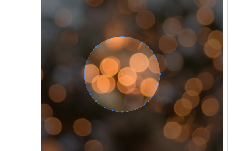
css:
.cropper-crop-box, .cropper-view-box {
    border-radius: 50%;
}
.cropper-view-box {
    box-shadow: 0 0 0 1px #39f;
    outline: 0;
}
.cropper-face {
  background-color:inherit !important;
}

.cropper-dashed, .cropper-line {
  display:none !important;
}
.cropper-view-box {
  outline:inherit !important;
}

.cropper-point.point-se {
  top: calc(85% + 1px);
  right: 14%;
}
.cropper-point.point-sw {
  top: calc(85% + 1px);
  left: 14%;
}
.cropper-point.point-nw {
  top: calc(15% - 5px);
  left: 14%;
}
.cropper-point.point-ne {
  top: calc(15% - 5px);
  right: 14%;
}
 EugeneMeles
on 19 Sep 2019
EugeneMeles
on 19 Sep 2019
any example about rectangle shape
 GiangTruong-afk
on 17 Jan 2020
GiangTruong-afk
on 17 Jan 2020
Here's another solution, derived from the one by the one from @power-media.
In my application, I think it makes more sense to retain the blue border around the rectangle since that's the most "traditional" UI. Our users respond poorly to non-traditional implementations. The semi-opaque circular area is just an indication to the user regarding how the resulting image will be used (it will be enclosed within a circle). After all, there's no such thing as a circular image.
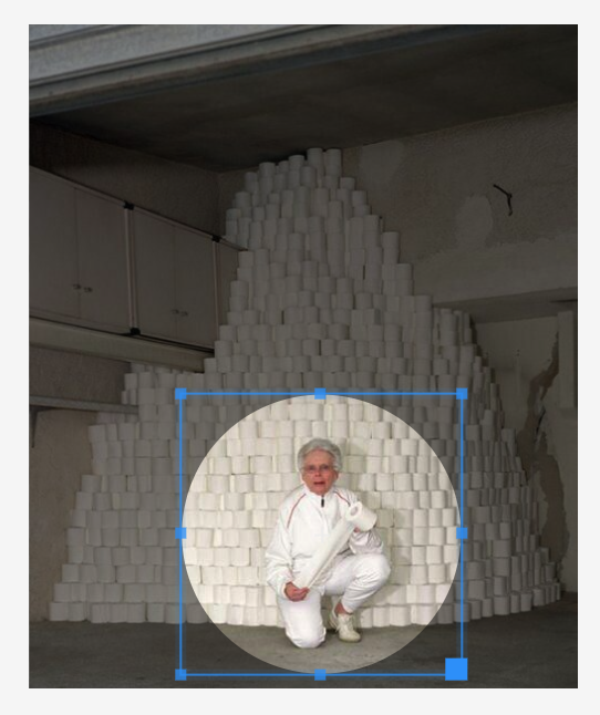
The CSS is surprisingly quite simple! 🎉🥳
.cropper-view-box {
    border-radius: 50%;
}
.cropper-face {
    background-color:inherit !important;
}
If you'd like to remove the dashed lines (like I have in the screenshot above), that CSS is also quite simple:
.cropper-dashed {
    display: none;
}
 rinogo
on 13 May 2020
rinogo
on 13 May 2020
How can I change the black transparent background for a white background without transparency please?
 AxelBriche
on 13 Jul 2020
AxelBriche
on 13 Jul 2020
@AxelBriche It's all CSS - just inspect the elements and apply some CSS to make the changes. If you need more info, you may want to open a new issue.
rinogo
on 13 Jul 2020
Related issues
 JSteunou
·
7Comments
JSteunou
·
7Comments
 zilions
·
3Comments
zilions
·
3Comments
 jloguercio
·
6Comments
jloguercio
·
6Comments
 WillJW
·
3Comments
WillJW
·
3Comments
 naglalakk
·
5Comments
naglalakk
·
5Comments
Most helpful comment
Hi,
I have been looking to achieve the same thing. Please note that you need to make use of the box-shadow property to create a rounded stroke, as outline currently doesn't follow the border-radius property in a cross-browser way.
I ended up using the following styles:
Tested in Safari, Chrome and Firefox on Mac OS, if you want to support IE8 you should consider resetting the outline for that browser, as it doesn't support border-radius and box-shadow.
I also had to set highlight: false when initializing cropper.