Covid19india-react: Showing Data for Maharashtra instead of complete India, on right opening the website.
Describe the bug
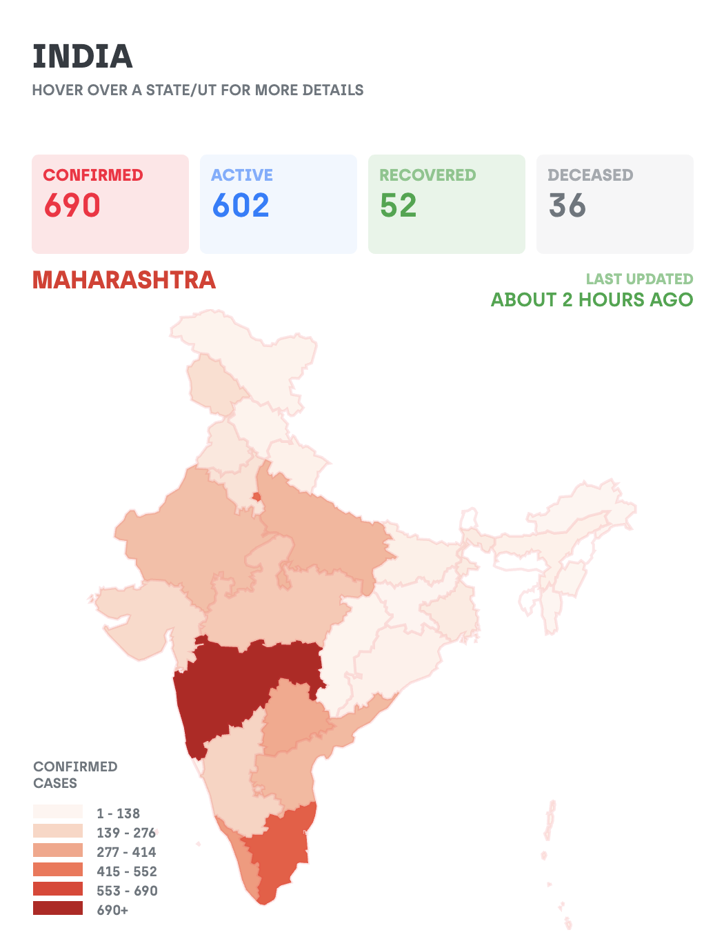
When a user opens the website, It shows the data which represents only data for Maharashtra, even when user didn't even hover on any of state on the map. Until user hovers on any state, It should show complete data for all India, instead only for a single state.
To Reproduce
Steps to reproduce the behavior:
- Go to 'https://www.covid19india.org/'
- Scroll down to until you see map.
- See the data showing of a single state, instead, it should show data for India not just for a single state, until a user clicks/hovers on any state.
Expected behavior
Show data representing India, not a state.
Screenshots
If applicable, add screenshots to help explain your problem.
Desktop (please complete the following information):
- OS: Any
- Browser: Any
- Version: Any
Smartphone (please complete the following information):
- Device: Any
- OS: Any
- Browser Any
- Version Any
 DashmeetArt
All 5 comments
Working on this issue
 nehalb123
on 5 Apr 2020
nehalb123
on 5 Apr 2020
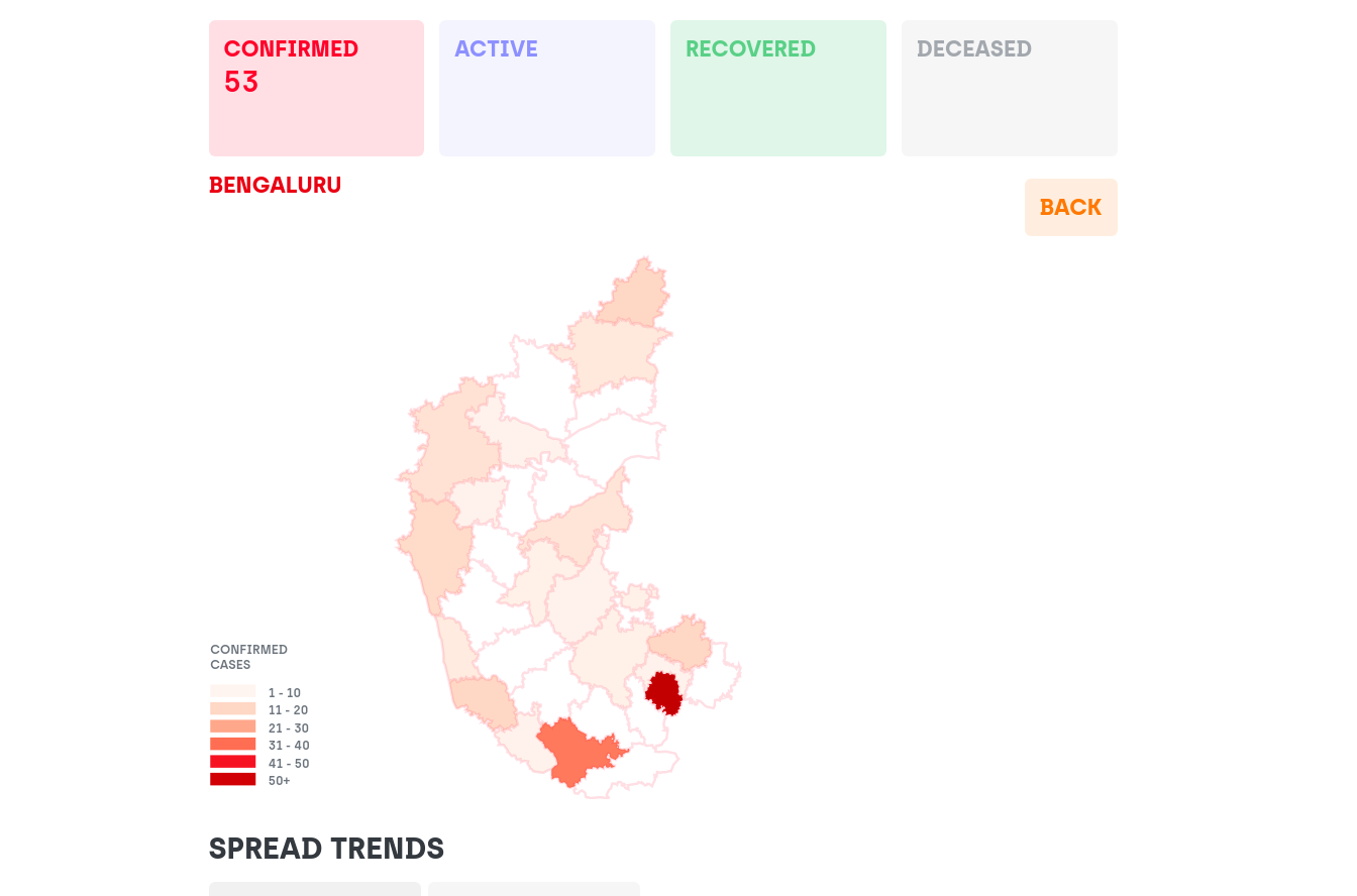
This issue is also showing up on a state map.
It will display statistics of some random region of the state.
Instead of this, it should display statistics of the entire state until a region is selected by the user.
 sumukhah
on 5 Apr 2020
sumukhah
on 5 Apr 2020
Hey, thanks for filing the issue! I'd like to understand why the map should show the statistics of India as a whole in the beginning given that we are already showing those stats on the primary header.
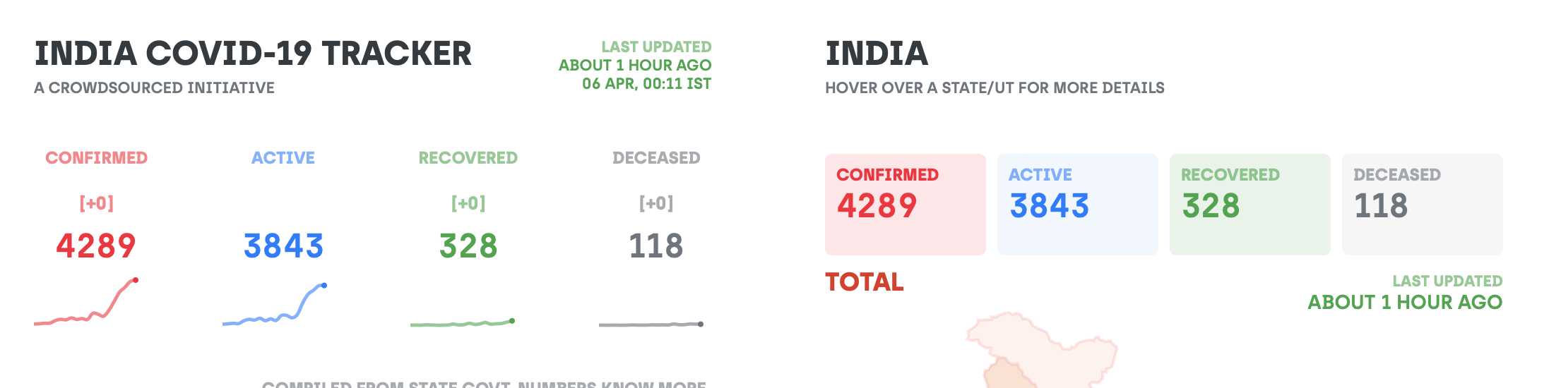
This would just make the numbers look redundant across the screen. Having a state selected (in this case we're selecting the state with the highest number of confirmed cases) in the beginning hints to the user that the map can be used to see state specific data :)
 jeremyphilemon
on 5 Apr 2020
jeremyphilemon
on 5 Apr 2020
@jeremyphilemon , if we are showing the data for particular state of India based on number without user hovering on that, then I think we should highlight the area on map with boundaries, similar to when mouse hovers on that.
Because showing complete map, but data of particular region doesn’t make any sense, or at least add text among that data, that why that particular state’s data has been showing like Most effected state in India and when in state Most effected city in Maharashtra. If it makes sense.
DashmeetArt
on 9 Apr 2020
@DashmeetArt thanks for your input. I agree with you, having the border visible always makes sense. Closing this because we decided to show "Total" stats on the homepage anyway because the graphs need to be shown for all India, and the map is synced with the data fed to graph 🤷
jeremyphilemon
on 17 Apr 2020
Related issues
 ShadabFaiz
·
6Comments
ShadabFaiz
·
6Comments
 ninjakx
·
3Comments
ninjakx
·
3Comments
 Cryptonex7
·
6Comments
Cryptonex7
·
6Comments
 tshrwbl
·
5Comments
tshrwbl
·
5Comments
 shekhars271991
·
5Comments
shekhars271991
·
5Comments
Most helpful comment
Hey, thanks for filing the issue! I'd like to understand why the map should show the statistics of India as a whole in the beginning given that we are already showing those stats on the primary header.
This would just make the numbers look redundant across the screen. Having a state selected (in this case we're selecting the state with the highest number of confirmed cases) in the beginning hints to the user that the map can be used to see state specific data :)