Covid_19: Add world data (e.g. italy, south-corea) in same format for comparison
When visualizing data, it would be great to be able to compare CH-data with trajectories of other countries, most notably Italy and South-Corea.
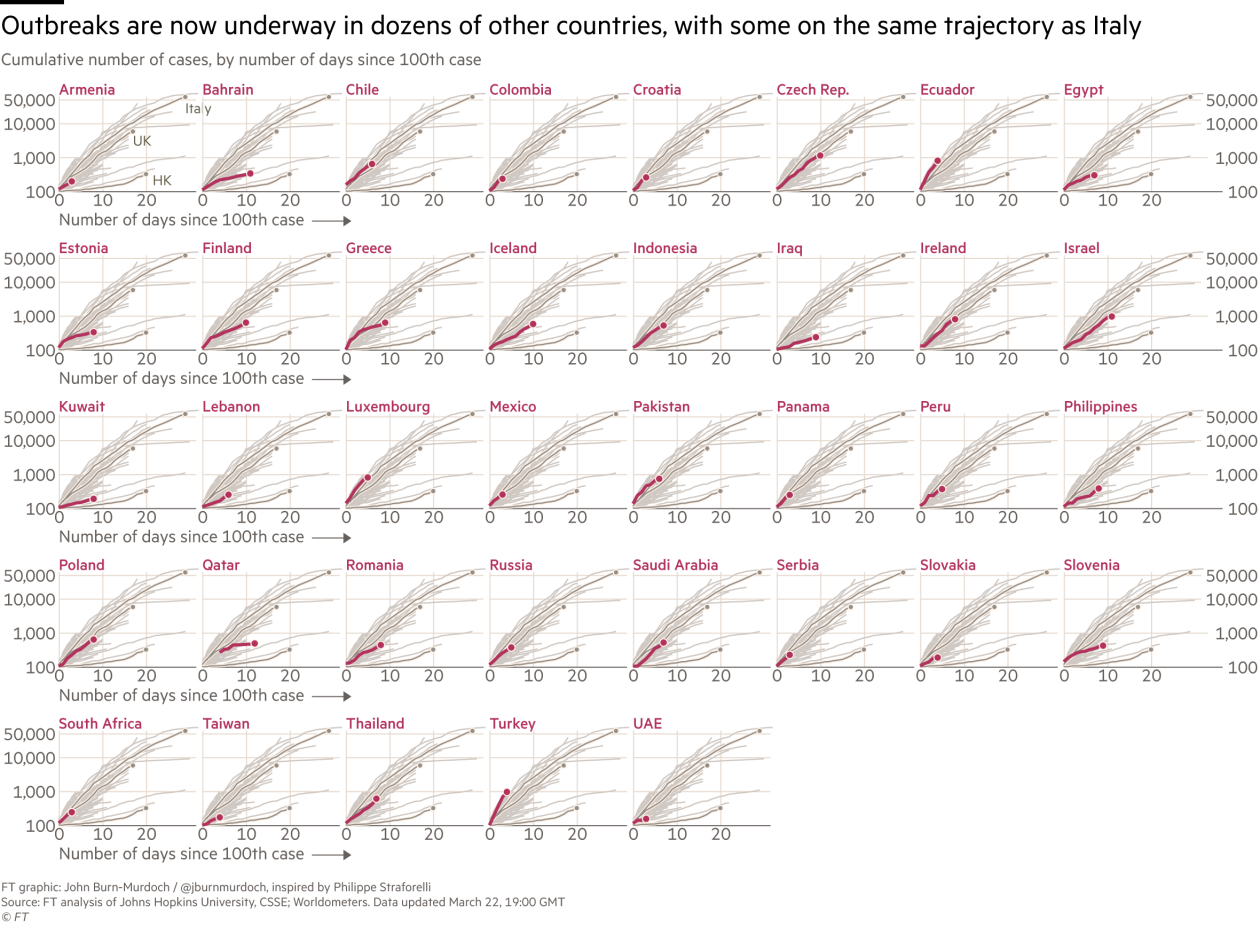
Specifically, we'd like to develop "small multiples", displaying each CH-canton.
Visualization could be along the lines of this FT viz, thus we need world data to provide the lines in the grey backdrop:
 netzwerg
All 6 comments
@netzwerg where do you have the South Korea Data from?
 zdavatz
on 24 Mar 2020
zdavatz
on 24 Mar 2020
@zdavatz I don't know yet, that needs to be investigated. Some data seems to be available, e.g. on Wikipedia.
netzwerg
on 24 Mar 2020
zdavatz
on 24 Mar 2020
South Korean data can be found here:
 jb3-2
on 24 Mar 2020
jb3-2
on 24 Mar 2020
I opened (and closed, see comments as for why) a similar ticket for neighbouring countries: https://github.com/openZH/covid_19/issues/77
You can note the links listed there.
 Eisit
on 24 Mar 2020
Eisit
on 24 Mar 2020
Closing this in favor of: https://renkulab.io/projects/covid-19/covid-19-public-data
netzwerg
on 24 Mar 2020
Related issues
 sandrasurber
·
4Comments
sandrasurber
·
4Comments
 MeMent0L
·
8Comments
MeMent0L
·
8Comments
 jeanbrouille
·
6Comments
jeanbrouille
·
6Comments
 herbertvonkaramalz
·
7Comments
herbertvonkaramalz
·
7Comments
 andreasamsler
·
7Comments
andreasamsler
·
7Comments