Converse.js: Add a separator between views
...a simple vertical line or maybe a slight background tint

..so it's not continuous white between roster and chat, or roster and input box.
IIRC, it used to be one.
 licaon-kter
All 21 comments
@licaon-kter Hi, could you tell me how I can replicate this behavior? I just built the project and I don't have the same design.
 bernard-ng
on 8 Jul 2020
bernard-ng
on 8 Jul 2020
You build from git HEAD?
licaon-kter
on 8 Jul 2020
yes
bernard-ng
on 8 Jul 2020
You are not building from Converse HEAD, look at the icons...
licaon-kter
on 8 Jul 2020
All right, how can I build from HEAD and reproduce this bug? I'm trying to fix it.
bernard-ng
on 9 Jul 2020
Yes...be my guest...
licaon-kter
on 9 Jul 2020
This is how I build from head:
git pull upstream master(to pull in the latest code)make cleanmake watch
Then, I open the file fullscreen.html (that is in the root of the source tree) in a browser.
Like @bernard-ng I'm having trouble reproducing this issue. Using the current head (commit bb9ee4caab3272dc530bd1b6b3bd89cbf881df72), I _do_ get a spacer (the vertical bar that I highlighted in the screenshot below). I can resize the window at will, which adapts the layout - but the spacer stays. I'm using Google Chrome 83.0.4103.97
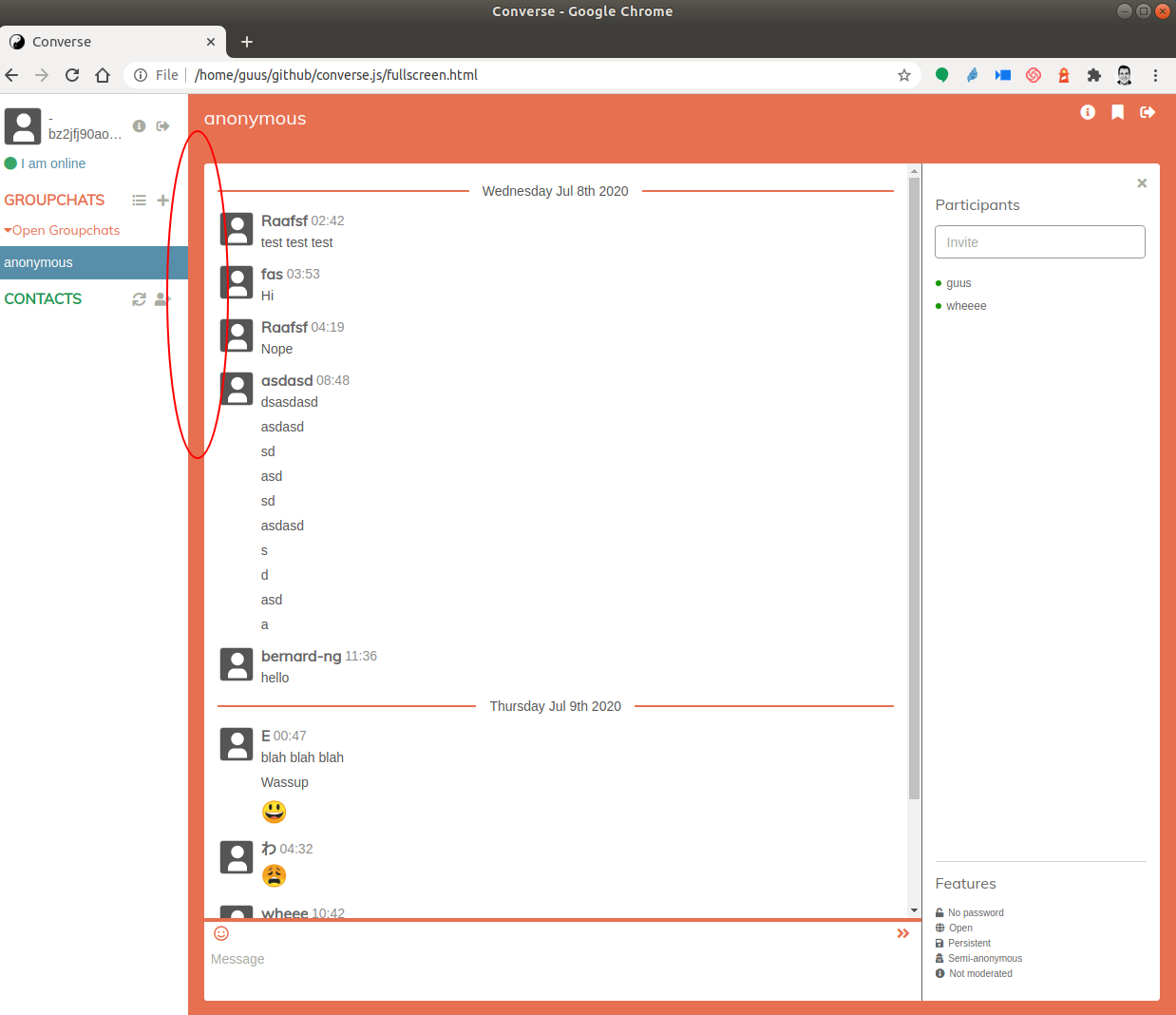
@licaon-kter can you please explain how you reproduce this issue?
 guusdk
on 9 Jul 2020
guusdk
on 9 Jul 2020
Sigh. That fullscreen.html is pulling converse in from a CDN :'( It's not using the version that was build locally.
guusdk
on 9 Jul 2020
Gotcha!!! :)
I build like this on a Debian Buster VM with:
cd ~/converse.js
make clean
git reset --hard
git pull
make -j $(nproc) dist
With some help from @jcbrand I've found that doing make dev generates a distribution that can be used with the dev.html file that is in the root source (note that make dist generates minified files, that are not used by dev.html.
dev.html uses the 'concord' theme, which uses a different background for both views. That kind of makes the problem disappear.
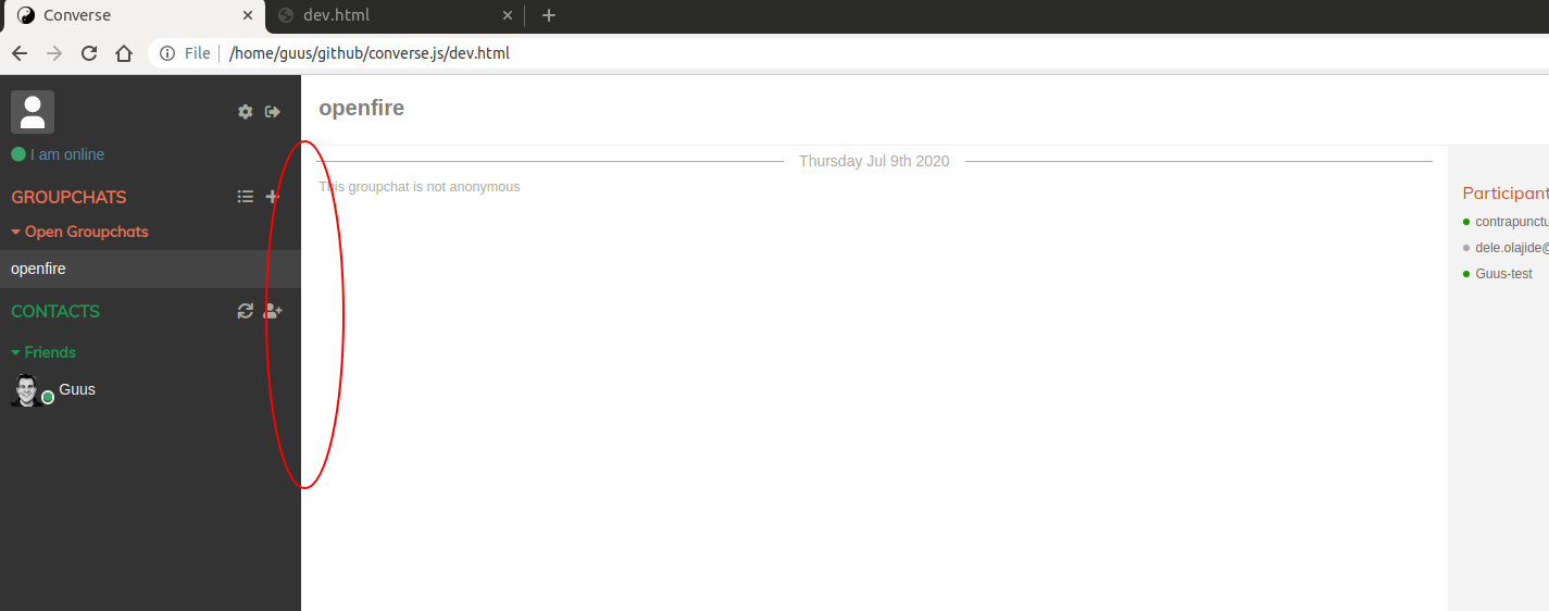
When I use the default theme (just remove the 'theme' reference in the initialization of converse in dev.html) then I do reproduce the isssue:
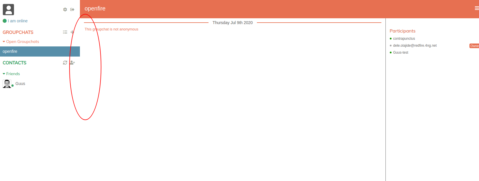
I'm thinking that the new layout is a design choice by @jcbrand? Maybe we should play a little with the default background colors in the default, just like in the concord theme?
guusdk
on 9 Jul 2020
Maybe we should play a little with the default background colors in the default, just like in the concord theme?
Yes, not much just a bit darker I'd guess, but then again I'm no UX person
@Nyco ? :)
/LE:
note that make dist generates minified files, that are not used by dev.html.
Yes, I use those directly as I don't dev :)
licaon-kter
on 9 Jul 2020
I'm thinking that the new layout is a design choice by @jcbrand?
The lack of separator? That wasn't intentional IIRC.
Maybe we should play a little with the default background colors in the default, just like in the concord theme?
For the default theme, we could make the controlbox background dark blue (like the highlight color). I'm not sure how much work that would be.
 jcbrand
on 9 Jul 2020
jcbrand
on 9 Jul 2020
For the default theme, we could make the controlbox background dark blue (like the highlight color). I'm not sure how much work that would be.
@bernard-ng want to give that a try?
guusdk
on 9 Jul 2020
oh yeah 😁
bernard-ng
on 9 Jul 2020
as a side-note: we discussed a lot of this (plus ways to improve the project to make it more accessible to newcomers) in the chatroom. Your input there would be valuable!
guusdk
on 9 Jul 2020
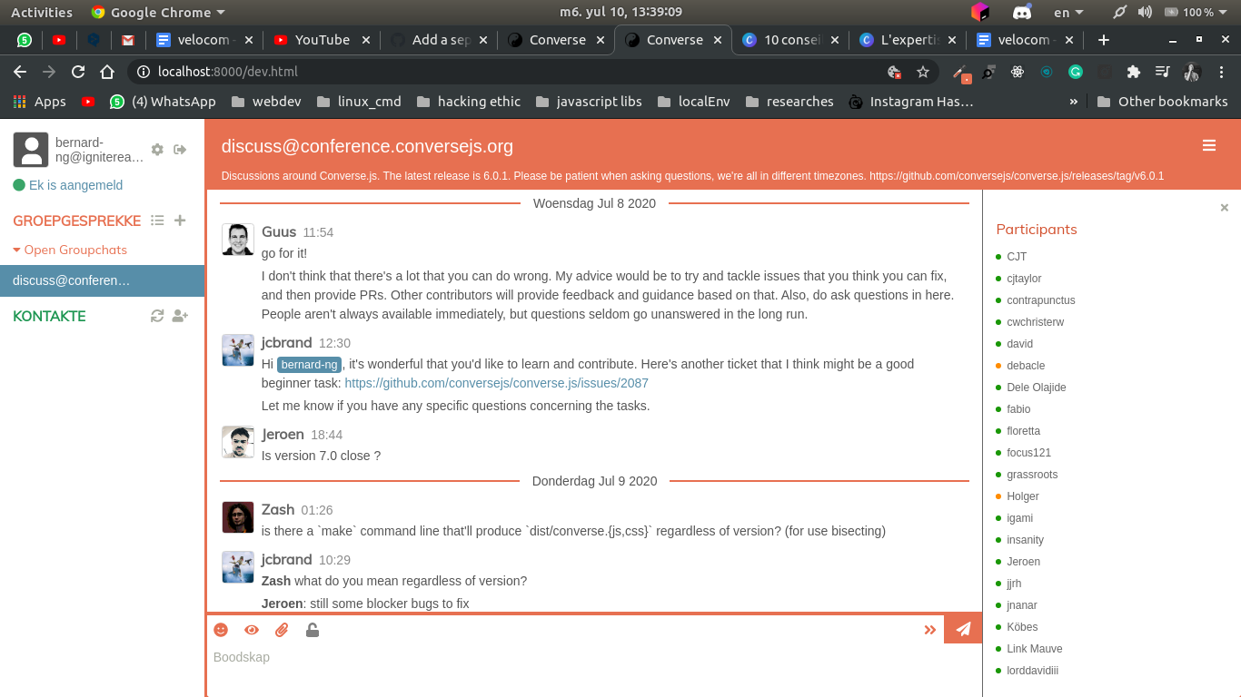
what do you think about this?
will change the default theme cause changes to the other themes?
bernard-ng
on 10 Jul 2020
Hi @bernard-ng, looks good :+1:
will change the default theme cause changes to the other themes?
That depends on the changes that you made. If you make a PR I can give better feedback.
jcbrand
on 10 Jul 2020
I have zero weight in any discussion related to design, but I like it.
I do not know if other themes are affected, but I guess you can try a couple, and find out? Should be a matter of changing / adding one line in the configuration object that initializes converse.js.
guusdk
on 10 Jul 2020
There are only two themes in the repo currently, the default one and concord
jcbrand
on 10 Jul 2020
here is my pull request #2135
bernard-ng
on 10 Jul 2020
Thanks @bernard-ng
licaon-kter
on 22 Jul 2020
Related issues
 srgcdev
·
3Comments
srgcdev
·
3Comments
 golangbu
·
6Comments
golangbu
·
6Comments
 HadronCloud
·
6Comments
guusdk
·
5Comments
HadronCloud
·
6Comments
guusdk
·
5Comments
 ge0rg
·
7Comments
ge0rg
·
7Comments