Conda-forge.github.io: Homepage not responsive in mobile view
- [x] I read the conda-forge documentation and could not find the solution for my problem there.
Issue:
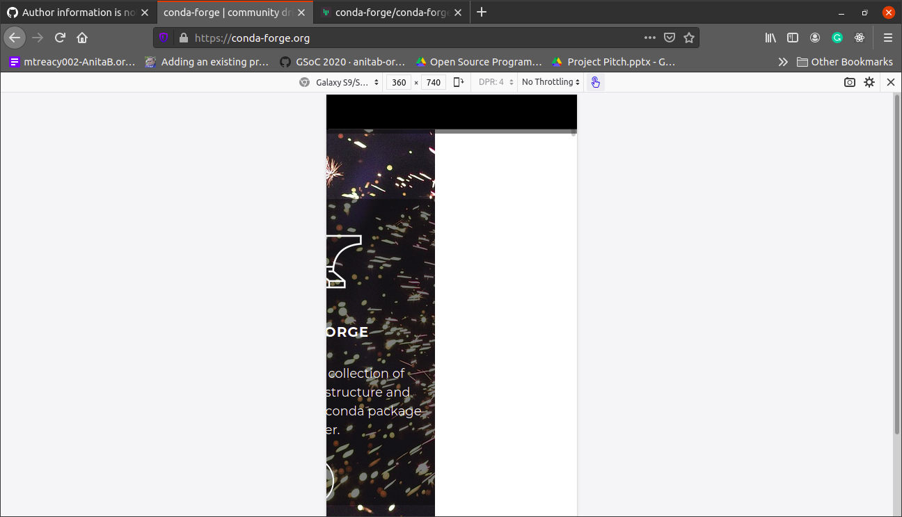
The homepage is not responsive in smaller screens/mobile view.
Check below screenshots
 Aaishpra
All 22 comments
@viniciusdc there is a similar problem in the blog section but at the footer instead of navbar.
I was confused about where to open the issue for it here or in conda-forge/blog
Aaishpra
on 12 Apr 2021
This works fine on my iphone. are you sure?
 beckermr
on 12 Apr 2021
beckermr
on 12 Apr 2021
Yupp, checked on my phone too
Aaishpra
on 12 Apr 2021
@viniciusdc also mentioned it here
Aaishpra
on 12 Apr 2021
It is responding fine in my brower as I resize the screen and on my phone. I can reproduce the issue you posted only when using the browser inspection to resize the screen and not resizing the actual window.
beckermr
on 12 Apr 2021

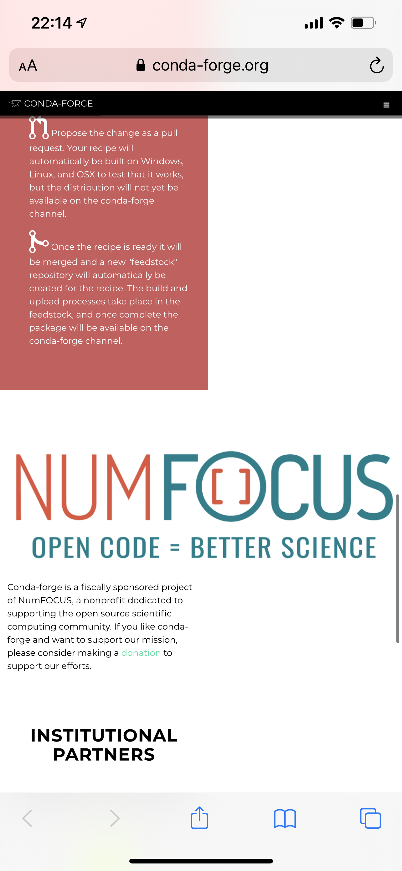
This is what is see on my phone when i open the homepage
Aaishpra
on 12 Apr 2021
It is responding fine in my brower as I resize the screen and on my phone. I can reproduce the issue you posted only when using the browser inspection to resize the screen and not resizing the actual window.
Try a little bit scrolling to the right when you open it on phone, the navbar menu is present at the rightmost corner.
Yes, same behaviour here too.
 viniciusdc
on 12 Apr 2021
viniciusdc
on 12 Apr 2021
I think this comes from the NUMFOCUS graphic:
It's only there though if I zoom out on my phone or scroll to the right.
 BastianZim
on 12 Apr 2021
BastianZim
on 12 Apr 2021
I think this comes from the NUMFOCUS graphic:
It's only there though if I zoom out on my phone or scroll to the right.
oh great point, I do agree with you that it might be the culprit. I think that the next step is deciding if we can do a dynamic resize of that logo.
viniciusdc
on 12 Apr 2021
Maybe something like so:
https://www.w3schools.com/howto/tryit.asp?filename=tryhow_css_image_responsive2
https://www.w3schools.com/howto/howto_css_image_responsive.asp
BastianZim
on 13 Apr 2021
@viniciusdc Outreachy Applicant here. Please I'd like to work on documenting this issue. Kindly assign the task to me and confirm I can go ahead.
 Martins-O-U
on 15 Apr 2021
Martins-O-U
on 15 Apr 2021
@Martins-O-U i am already working here, although if you want we can collaborate.
Aaishpra
on 15 Apr 2021
@Aaishpra yes, that would be great. I'd love to collaborate with you.
Martins-O-U
on 15 Apr 2021
Sure, @Martins-O-U
@viniciusdc can you assign both of us here. I have started looking into the issue 😄
Aaishpra
on 15 Apr 2021
Thank you @viniciusdc
Martins-O-U
on 15 Apr 2021
Thanks for your comment @BastianZim I have solved this issue, basically, the problem was arising because the NUMFocus logo and the youtube video were not responsive.
Aaishpra
on 17 Apr 2021
@Martins-O-U basically what I did was add a class in index.html.tmpl named responsive to both logo and the Youtube video,
and add some custom css in ../css/theme.css
Here are the code snippet of what I did
- Add responsive class in line 149 of
index.html.tmpl
<iframe width="560" class="responsive" height="315" src="https://www.youtube.com/embed/EWh-BtdYE7M" frameborder="0" allow="accelerometer; autoplay; encrypted-media; gyroscope; picture-in-picture" allowfullscreen></iframe>
- and same class in line 250 of the same file
<img src="img/NumFocus_LRG.png" class="responsive" alt="Numfocus Logo" />
- and here is the code of what I added in
theme.css
.responsive {
    max-width: 100%;
    height: auto;
  }
Since we both were working on this issue you can go forward and make a PR for this with the code I provided, just add me as coauthors in the description of the PR.
and as @viniciusdc already has said the PR can be counted as both of our contributions.
Aaishpra
on 17 Apr 2021
Adding screenshots for confirming


Aaishpra
on 17 Apr 2021
awesome @Aaishpra, I am on it
Martins-O-U
on 17 Apr 2021
Fix completed, and a Pull Request has been raised. https://github.com/conda-forge/conda-forge.github.io/pull/1392
Martins-O-U
on 18 Apr 2021
closing this issue as #1392 solved it! :tada:
viniciusdc
on 18 Apr 2021
Related issues
 scopatz
·
4Comments
scopatz
·
4Comments
 croth1
·
5Comments
croth1
·
5Comments
 prachi237
·
3Comments
prachi237
·
3Comments
 jakirkham
·
4Comments
jakirkham
·
4Comments
jakirkham
·
4Comments
jakirkham
·
4Comments
Most helpful comment
Fix completed, and a Pull Request has been raised. https://github.com/conda-forge/conda-forge.github.io/pull/1392