Components: Flexible connected overlay has incorrect position on Mobile
What is the expected behavior?
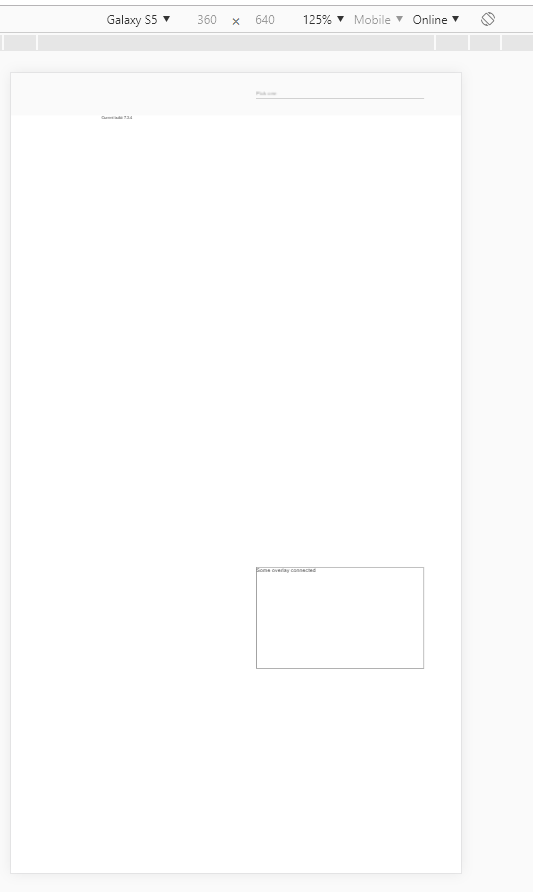
The flexible connected overlay should appear near the origin on Mobile browsers with custom viewport:
<meta name="viewport" content="width=device-width, initial-scale=-1, maximum-scale=-1"/>
What is the current behavior?
The overlay appears on the bottom of the screen
Reproducible at least on:
- Chrome for Android
- Chrome for Windows (with device toolbar enabled, Device type = Mobile)
- Safari on IPhone
What are the steps to reproduce?
https://stackblitz.com/edit/angular-9bewwa-k9rrhg
- Open example in new window
- Open dev tools
- Toggle device toolbar
- Select some mobile phone in portrait mode
- Click on input
Actual result: Overlay appears on the bottom of the screen
Expected result: Overlay appears under the input
Which versions of Angular, Material, OS, TypeScript, browsers are affected?
Angular: latest
Material: latest
OS: Windows, Android, IOS
Browsers: Chrome, Safari
Is there anything else we should know?
 ToniaDemchuk
All 2 comments
Any progress on this? All dropdowns and overlays are not usable in Mobile browsers.
ToniaDemchuk
on 15 May 2019
It seems to have something to do with the fact that the form-field is at the top of the screen. If I add margin-top: 400px to the form in the provided stackblitz it goes back to looking normal
 mmalerba
on 10 Jul 2020
mmalerba
on 10 Jul 2020
Related issues
 Hiblton
·
3Comments
Hiblton
·
3Comments
 shlomiassaf
·
3Comments
shlomiassaf
·
3Comments
 alanpurple
·
3Comments
alanpurple
·
3Comments
 kara
·
3Comments
kara
·
3Comments
 vanor89
·
3Comments
vanor89
·
3Comments
Most helpful comment
Any progress on this? All dropdowns and overlays are not usable in Mobile browsers.