Components: matPrefix element not aligned properly in form field with appearance fill and outline
Bug, feature request, or proposal:
Bug
What is the expected behavior?
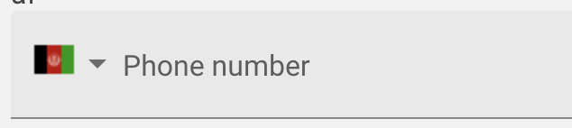
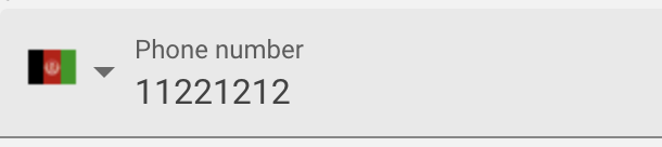
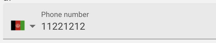
matPrefix Element should be aligned properly with matLabel in MatFormField with appearance set as "Fill" and "Outline"
What is the current behavior?
Not as expected
What are the steps to reproduce?
https://stackblitz.com/edit/angular-xfexy1

What is the use-case or motivation for changing an existing behavior?
Which versions of Angular, Material, OS, TypeScript, browsers are affected?
6
Is there anything else we should know?
 NehalDamania
All 11 comments
I wonder how is this supposed to work. I don't see any win-win situation here unless prefix animates along with input focus / label minimisation.
I have a similar problem, trying to combine select with input, unfocused it's fine (don't mind the fact and I haven't really properly aligned it yet)
focused it looks stupid
ideally I'd want to end up with something like this
if the value is set or input is focused
 fxck
on 24 Aug 2018
fxck
on 24 Aug 2018
It's getting even more ugly ;-) Using an icon as a prefix
https://stackblitz.com/edit/angular-otnpxn?file=app/input-prefix-suffix-example.html
 richardsengers
on 5 Nov 2018
richardsengers
on 5 Nov 2018
Any updates on this? For such a glaring bug, I'm surprised it's still present in 7.2.1.
 inorganik
on 11 Jan 2019
inorganik
on 11 Jan 2019
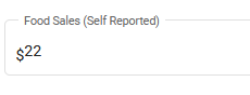
From https://material.io/design/components/text-fields.html
If the textfield has a label, the input text should be slightly to the south relative to the suffix icon.

But when there is no label, the input text should be centered relative to the suffix icon.
Angular Material's behavior is this:
Notice that the icon isn't perfectly centered relative to the fill background either.
 taneltm
on 20 Feb 2019
taneltm
on 20 Feb 2019
First let me just give some background on how the form-field wound up in this state. We implemented the appearance=fill and appearance=outline UI when it was still fairly new in the spec. These new appearances differed in an important way from the previous UI (what is now called standard/legacy). The difference is that in the new appearances the floating label did not have the same vertical alignment as the actual text inside the input.
At the time the spec gave no guidance on how to reconcile this with prefix and suffix text. I made the assumption that based on the omission of text prefix/suffix from the spec and the fact that the concept was not really compatible with the new UI (see this stackblitz), that the spec was essentially saying not to use that pattern anymore.
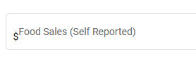
To me it seemed the best way to reconcile all of this was to recommend only using icons in the prefix or suffix slots. If users really wanted a text prefix (e.g. '$' in front of a currency), I thought that input text masking would be a better solution, and to have that only show up when the label was floating and the value/placeholder was visible.
The spec has updated since then, and now shows the floating label and text aligned the same for outline appearance. However the issue still exists for the fill appearance.

Luckily, the spec also now includes guidance on what to do about text prefix/suffixes:

The spec came to essentially the same conclusion I did, that the text prefix/suffix should only be shown when the label is floating. Whether text masking is the best way to do that is definitely debatable though. We could just have a matTextPrefix and matTextSuffix or something instead, that would be easier to implement. What I do still stand by is that this can't be the same thing as matPrefix and matSuffix. The behavior is too different.
The text prefix/suffix:
- Is only visible when the label is floating
- Is aligned with the input value
- Does not push the form-field label in
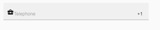
The icon prefix/suffix by comparison:
- Is always visible
- Is center aligned in the filled/outlined region
- Does push the form-field label in
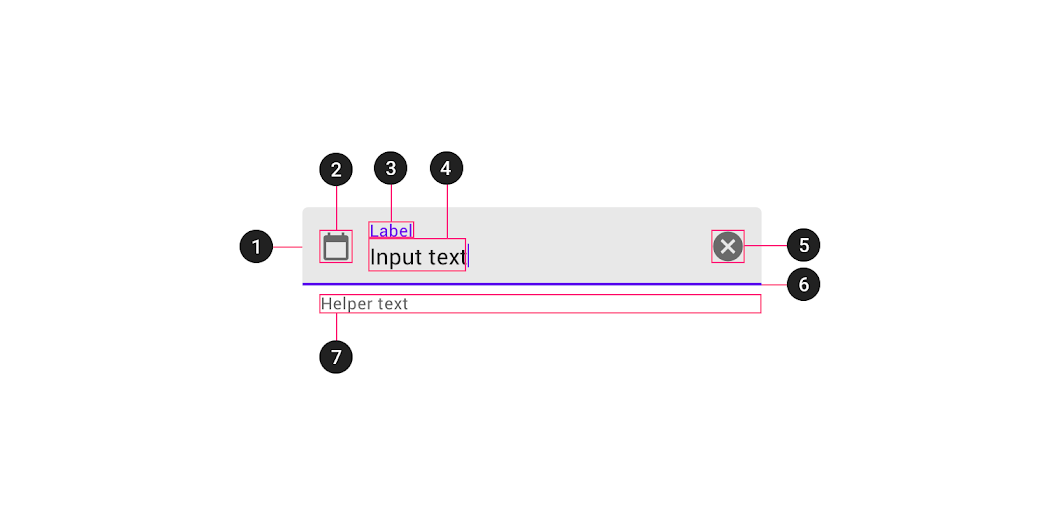
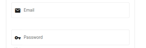
For comparison, this image shows how the icon prefix/suffix fits in with the other parts of the form-field
And this video demonstrates the behavior when the label goes from resting to floating.
 mmalerba
on 9 Jun 2020
mmalerba
on 9 Jun 2020
Thanks for that detailed breakdown! Having 2 new directives seems reasonable since the behavior is different as you noted
 jermowery
on 10 Jun 2020
jermowery
on 10 Jun 2020
Any ETA on when we might get an implementation?
jermowery
on 18 Jun 2020
Any updates? Came across this issue using an input with the outline appearance. The added mat-prefix is misaligned with the input.
Found in Angular V10.1.5
 rainydevbs
on 19 Jan 2021
rainydevbs
on 19 Jan 2021
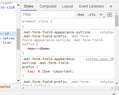
I have found a workaround to solve this problem.
here is my form
I managed to change the styling of the prefix putting this in the global styles
.mat-form-field-appearance-outline .mat-form-field-prefix
  top: 0.15em !important
now it feels better
and the default top 0.25em was overwritten
 guihcs
on 30 Jan 2021
guihcs
on 30 Jan 2021
My workaround:
.mat-form-field-appearance-outline .mat-form-field-prefix,
.mat-form-field-appearance-outline .mat-form-field-suffix {
  place-self: center;
}
 ben12
on 23 Feb 2021
ben12
on 23 Feb 2021
Working with Angular and Material versions both at 11.2.3 I've noticed an alignment issue with the suffix on outline appearance. Alignment was only off when I set the suffix to some text value, whereas icon button suffix (i.e. date picker) posed no issue.
A solution that works for my scenario was to add a global style to the src/styles.scss file and apply that new class to each of the mat-form-field usages. Code example below:
styles.scss
// note that both classes are on the same element
// no need to add !important
.fix-suffix.mat-form-field-appearance-outline .mat-form-field-suffix {
  top: 0;
}
custom.component.html
<mat-form-field appearance="outline" class="fix-suffix">...
This targets only the elements that I choose instead of a global change. As noted above in my comment not all suffix implementations had a visual bug so being able to pick and choose which to apply a fix to worked for me. When a fix comes out for this I can remove the global style in one place to test and find/replace the class name throughout the template files.
 ashnewport
on 24 Mar 2021
ashnewport
on 24 Mar 2021
Related issues
 shlomiassaf
·
3Comments
shlomiassaf
·
3Comments
 xtianus79
·
3Comments
xtianus79
·
3Comments
 MurhafSousli
·
3Comments
MurhafSousli
·
3Comments
 crutchcorn
·
3Comments
crutchcorn
·
3Comments
 alanpurple
·
3Comments
alanpurple
·
3Comments
Most helpful comment
Any updates on this? For such a glaring bug, I'm surprised it's still present in 7.2.1.