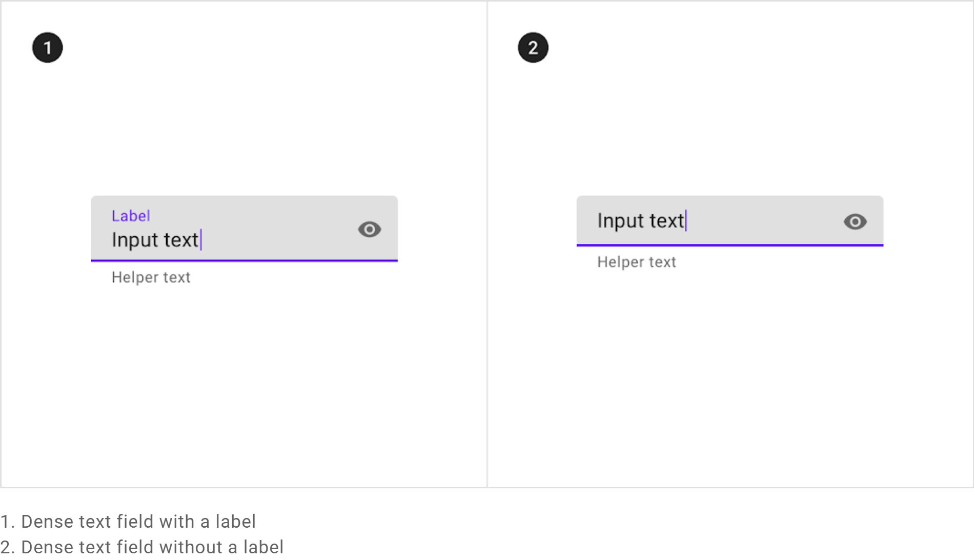
Components: Fixed height of mat-form-field even without mat-label or mat-hint
Bug, feature request, or proposal:
Fixed height of mat-form-field even without mat-label or mat-hint
What is the expected behavior?
Without any mat-label or mat-hint defined inside mat-form-field with appearance standard, fill or outline,
mat-form-field's height should be reduced and content should be centered.
What is the current behavior?
Height of mat-form-field is not changed. Label is just hidden at the reserved place. Same thing for mat-hint.

What are the steps to reproduce?
Providing a StackBlitz reproduction is the best way to share your issue.
StackBlitz starter: https://stackblitz.com/edit/angular-urvaf8-4b9lc1
What is the use-case or motivation for changing an existing behavior?
New fill appearance is used by Google on new product like Google Agenda. No floating label, and height of component is reduced.

Which versions of Angular, Material, OS, TypeScript, browsers are affected?
All
Is there anything else we should know?
Thanks a lot. Hope this report will help.
All 14 comments
The issue with doing this is that if you placed a form field with a hint and one without next to each other, they wouldn't align anymore.
Would it be too much if we had some more attributes like nolabel nohint? I kind of understand @tfalvo's fustration (I haven't had a situation like his, but this flexibility would be welcome).
Thank you for your reply!
I understand completely the problem.
However, as a developer, it's our responsibility to ensure the coherence of design, and so to be sure to respect same height/same appearance for each form field of the same group/page.
What do you think about it?
But I know also that material design spec doesn't mention this "compact" appearance. But Google doesn't respect itself the spec, and use a lot of this new appearance, in addition to this, with a leading icon at the left (and not inside the box)... I like this new layout... what a pity this is not officially mentioned in spec.

I concur with this, especially because the non-compact version does not fit nicely into a mat-toolbar.
In my case I am trying to use:
<mat-form-field appearance="outline">
If anyone wants something like an input that is smaller (but not perfect), then see my code below. Sorry don't have time to make a demo.
<mat-toolbar [color]="themeService.toolBarColor" class="mat-elevation-z2">
  <mat-form-field appearance="outline" fxFlex>

    <button mat-button fxFlex>
      <input matInput placeholder="P" [matAutocomplete]="autop" [(value)]="selectedP.name"
[formControl]="pControl"
        matTooltip="Search available P">
      <mat-icon [matMenuTriggerFor]="pMenu">arrow_drop_down</mat-icon>
    </button>
    <mat-menu #pMenu="matMenu" xPosition="after">
      <ng-template matMenuContent>
        <ng-container *ngFor="let outer of nestedArray">
          <ng-container *ngFor="let inner of outer.p">
            <button mat-menu-item (focus)="true" (click)="onClick();">
              {{inner.name}}
            </button>
          </ng-container>
        </ng-container>
      </ng-template>
    </mat-menu>


    <mat-autocomplete #autop="matAutocomplete" [displayWith]="displayFn">
      <mat-option *ngFor="let item of filteredOptionsP | async" [value]="item" matTooltip="{{item}}"
        (onSelectionChange)="doSomething()">
        {{item}}
      </mat-option>
    </mat-autocomplete>

  </mat-form-field>
</mat-toolbar>
In the css file:
mat-form-field { /* Changes the input styling to just about nothing so that button styling can take over */
  font-size: 1px;
}

/* ::ng-deep .mat-form-field-appearance-outline .mat-form-field-outline {
  color: transparent !important; //remove border if needed
} */

.mat-button {
  padding: 0 30px; /* Changes position of dropdown icons */
}
With some tweaking, this allows me to still follow the Material Design Spec (https://material.io/design/navigation/search.html#usage) for a component that does not exist in the available angular material library.
I also support this idea. We also have separate labels (not in the input element), and in most places, no hint or error text. Therefore it takes way too much space, and it seems to be difficult or feels like a hack to overcome that.
Additionally, it might be a nice idea if the space is only taken in error-case (configuration).
According to https://material.io/components/text-fields/#outlined-text-field, the height can stay the same even when there's no label. This part could be improved by adding a "dense" attribute, but shrinking the field does not have to be the default behavior.
On the other hand, the vertical alignment is clearly an issue and should be fixed.
Here is a quick fix applied to the global CSS:
.mat-form-field:not(.mat-form-field-has-label) .mat-form-field-infix {
  border-top-width: 0;
}
It might not cover all the use cases, especially with prefix/suffix icons, but I hope this helps.
I think the current padding (which is 1em) in the mat-form-field-infix class does not follow the spec : https://material.io/components/text-fields/#outlined-text-field.
Did anyone noticed it ? It has bigger padding-top than it should be.
@adrogon fix + wrapper setting below made the input box "normal" for me...
.mat-form-field:not(.mat-form-field-has-label) .mat-form-field-infix {
  border-top-width: 0;
}

.mat-form-field-wrapper {
  padding-bottom: 0px;
  margin-bottom: 0px;
  margin-top: 0px;
}

.mat-form-field-label-wrapper {
  padding-top: 0px;
}
Thanks!
Related to #5227
Using @adrogon solution, I adjusted the top of the infix slightly and have nice alignment with matPrefix and matSuffix:
.mat-form-field:not(.mat-form-field-has-label) .mat-form-field-infix {
   top: -0.2em;
}
@tfalvo material spec has added dense fileds in spec now, according to material spec https://material.io/components/text-fields both filled and outlined text field can have dense spacing.
@jelbourn when dense fields will be supported in angular material?


Here is a quick fix applied to the global CSS:
.mat-form-field:not(.mat-form-field-has-label) .mat-form-field-infix {
  border-top-width: 0;
}
It might not cover all the use cases, especially with prefix/suffix icons, but I hope this helps.
I worked for me but adding the prefix ::ng-deep
Most helpful comment
Would it be too much if we had some more attributes like
nolabelnohint? I kind of understand @tfalvo's fustration (I haven't had a situation like his, but this flexibility would be welcome).