Components: feat(toolbar): support vertical dividers through `mat-divider`
Bug, feature request, or proposal:
Bug
What is the expected behavior?
It should be possible to display a divider in a mat-toolbar per the spec:
What is the current behavior?
Placing <mat-divider [vertical]="true"> creates a 0 x 1 pixel element.
What are the steps to reproduce?
In this StackBlitz, you can see the top toolbar has the divider but it's not visible, while the bottom toolbar manually styles the divider to show up correctly.
Which versions of Angular, Material, OS, TypeScript, browsers are affected?
Latest everything, as far as I can tell.
Is there anything else we should know?
In the StackBlitz, I have to guess at the pixel height of the divider because I can't find exactly how tall the line is supposed to be in the spec, even though they do call out the spacing between the line and the icons on either side of it. I think it's a blind spot in the spec, since neither the Structure nor the Toolbars section actually mentions the use of dividers to logically group controls.
 thw0rted
All 10 comments
Another approach: https://stackblitz.com/edit/angular-material2-issue-ec8ueb
 julianobrasil
on 22 Mar 2018
julianobrasil
on 22 Mar 2018
In your example, the spacing is wrong between the divider and the adjacent buttons. If I'm going to manually style stuff anyway, I don't think I'd want to add extra wrapping elements like the div you used. The point of the issue is that <mat-toolbar><button/><mat-divider/><button/></mat-toolbar> should lay out according to the spec without manual styling, and right now it does not.
thw0rted
on 22 Mar 2018
Oh, it was not supposed to be a solution, just an idea of a possible workaround. But you can achieve the spacing you desire (the one you used in the second toolbar) by adding fxLayoutGap="8px" to the wrapper div: https://stackblitz.com/edit/angular-material2-issue-ec8ueb
In theory, you could also use fxLayoutAlign="start stretch" fxLayoutGap="8px" directly in <mat-toolbar> as it is a flexbox. But it would need some additional styling because stretch would force mat-divider to take all of the height and align the inner flex items to the top.
I'm a huge fan of @angular/flex-layout 😄
julianobrasil
on 22 Mar 2018
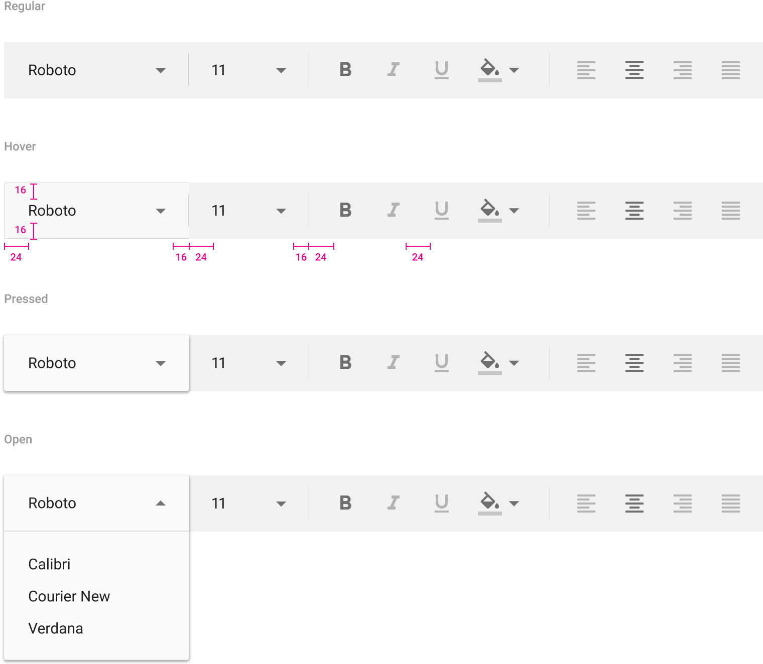
So I think the issue is two-fold: the styles for the elements inside the toolbar is wrong, and the style for the divider is wrong. It should be something like this (though the sibling CSS might be wrong, it's the intention):
.mat-toolbar > * + .mat-divider-vertical {
    margin-right: 16px;
}

.mat-toolbar > .mat-divider-vertical + * {
    margin-left: 24px;
}

.mat-toolbar > .mat-divider-vertical {
    margin-left: -1px;
}
Does this look right to you? I'm not going to comment on the internal sizing of the button in relation to the spec, mostly because it's not defined in that example. So while it looks like it should be smaller, since it's not defined, I think it's fine.
Edited: I keep forgetting that there's no previous sibling selector, so instead of the second and third styles, maybe just something like:
.mat-toolbar > .mat-divider-vertical + * {
    margin-right: 24px;
    margin-left: -1px;
}
 CaerusKaru
on 22 Mar 2018
CaerusKaru
on 22 Mar 2018
I'm not a CSS expert but I'm not clear on why the sibling element style would be changed -- shouldn't the divider just contribute its own margin and trust the siblings to make up the rest? What if a toolbar element wants to set its own margin for whatever reason? It looks like the spec doesn't work that way, but that bothers me for some reason.
thw0rted
on 22 Mar 2018
The facts remain that this is how the spec is defined. If someone wants to override the spec margins, they are free to do so. The important thing about sibling selectors is that you don't want errant margins showing up in case someone puts a divider first or last.
I'll put together a PR and hopefully the Material Design team can comment on it with the internal guidelines on this.
CaerusKaru
on 22 Mar 2018
was this ever fixed ? I've just hit the same problem
 jmls
on 25 May 2019
jmls
on 25 May 2019
@devversion any chance this is going to be fixed? I'm hitting it as well.
 ShaneLillieRAD
on 27 Nov 2019
ShaneLillieRAD
on 27 Nov 2019
Hitting it too
 qortex
on 1 Dec 2019
qortex
on 1 Dec 2019
any update? @devversion
 lorenzocovarrubiasjr
on 7 Nov 2020
lorenzocovarrubiasjr
on 7 Nov 2020
Related issues
 jelbourn
·
3Comments
jelbourn
·
3Comments
 dzrust
·
3Comments
dzrust
·
3Comments
 constantinlucian
·
3Comments
constantinlucian
·
3Comments
 alanpurple
·
3Comments
alanpurple
·
3Comments
 MurhafSousli
·
3Comments
MurhafSousli
·
3Comments
Most helpful comment
was this ever fixed ? I've just hit the same problem