Components: [Tabs] Header with icon+text not vertically aligned
Bug, feature request, or proposal:
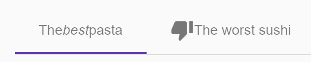
Tab with Icon and Text label not aligned vertically center, currently aligned bottom
What is the expected behavior?
Expect to align text and icon in middle. (as In Button with Icon and Label)
Tab Label and Icon are aligned in

What is the current behavior?
Tab with Icon and Text label not aligned vertically center, currently aligned bottom
What are the steps to reproduce?
Providing a StackBlitz reproduction is the best way to share your issue.
StackBlitz starter: https://goo.gl/wwnhMV
https://stackblitz.com/angular/rlqokrmnevel?file=app%2Ftabs-template-label-example.html
<mat-tab>
        <ng-template mat-tab-label>
          <mat-icon>attach_file</mat-icon> Attach File
        </ng-template>
<div class="demo-tab-content">
          Lorem ipsum dolor sit amet, consectetur adipiscing elit. Nulla venenatis ante augue.
#### What is the use-case or motivation for changing an existing behavior?
</div>
</mat-tab>
Which versions of Angular, Material, OS, TypeScript, browsers are affected?
@5.2.2
Is there anything else we should know?
 sujithtomy
All 7 comments
It's correct behaviour. That vertical alignment is your own case, you can just wrapp the content to some div block with the classes row align-items-center, for example, where the class row contains display: flex and the class align-items-center contains just align-items: center.
 kodwi
on 25 Feb 2018
kodwi
on 25 Feb 2018
@sujithtomy, what I found in specs is that when you have icon and text, you should align both at the center (horizontally) and the icon should be in one line and the text on the line below the icon. Like this:

MatTable has a header row height of 48px, recommended for text or icon labels, but the specs say that to hold an icon + text, it should use a 72px-height header. You can modify its css to increase the height up to the right value if you really want icon + text in the label _and_ also wants to follow the specs.
 julianobrasil
on 25 Feb 2018
julianobrasil
on 25 Feb 2018
@julianobrasil @kodwi - thank both of you for reply and examples really helpful.
When I saw mat-button with icon aligned center; I expected the same behavior.
MatButton:

sujithtomy
on 25 Feb 2018
@sujithtomy, I think we can't say that the specs forbid an icon to be beside the text. Reading more carefully the part I've linked above, I see it's talking about mobile. Apparently, there's nothing specific to desktops. I normally assume a similar behavior to desktops in this cases, but it's a choice of mine.
julianobrasil
on 25 Feb 2018
@julianobrasil In mobile its true, as we have space constraint in small devices (also it expands to 72px height by default). but in desktop utilize the horizontal space available helps accommodate more space for contents inside tabs. Also, if default behavior is icon and text on two lines then default styling should handle by expanding height to 72px. isn't is? (its my opinion).
sujithtomy
on 26 Feb 2018
Workaround: Wrap the icon and text in a div container with class for:
.flex-vert-center {
  display: flex;
  align-items: center;
}
BUT in my opinion (and I'm sure I'm not alone with it) the material ui framework has to handle it. Please add official support for icon and text.
 Domvel
on 20 Mar 2018
Domvel
on 20 Mar 2018
Related: #1481 just got auto-closed.
Also, the docs include an example of using an icon, under a section about "more complex labels", but it looks pretty bad with no additional styles.
Also, note that the other tab in the example, that uses an <em> tag, has spacing issues due to the use of a flex container as its immediate parent. I honestly can't think of a case where it would look good to have multiple immediate child nodes under the tab container, vertically aligned to baseline, rammed together horizontally with no space between them. Of course we can just wrap the content in a <p> tag or whatever makes semantic sense, but the out-of-the-box behavior should make sense for the most common spec-compliant use case, which is vertically-stacked.
ETA: I just checked the updated specs and while there is one rogue example of an icon to the left of the text, every other example has the icon above the text, with no distinction between mobile and desktop. Vertical stacking should clearly be the default behavior, with spec-compliant spacing.
 thw0rted
on 11 Sep 2019
thw0rted
on 11 Sep 2019
Related issues
 LoganDupont
·
3Comments
LoganDupont
·
3Comments
 savaryt
·
3Comments
savaryt
·
3Comments
 vanor89
·
3Comments
vanor89
·
3Comments
 vitaly-t
·
3Comments
vitaly-t
·
3Comments
 dzrust
·
3Comments
dzrust
·
3Comments
Most helpful comment
Workaround: Wrap the icon and text in a div container with class for:
BUT in my opinion (and I'm sure I'm not alone with it) the material ui framework has to handle it. Please add official support for icon and text.