Components: Form field prefix and suffix icons not aligned properly
Bug, feature request, or proposal:
Bug
What is the expected behavior?
Material design guidelines for text field boxes specify icons to have 16px vertical spacing between itself and the input line.
What is the current behavior?
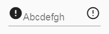
Icons as prefix or suffix are currently raised 14px above input line for both box and non-box text fields. This does not meet material design specifications for either style of text field.
What are the steps to reproduce?
https://stackblitz.com/edit/angular-jzfsl9
What is the use-case or motivation for changing an existing behavior?
Current appearance is not ideal and material guidelines are not being followed. Appearance is especially bad for ordinary text fields without a floating label.
Which versions of Angular, Material, OS, TypeScript, browsers are affected?
Angular 5.2.6
Angular Material 5.2.1
Is there anything else we should know?
I already know how to override CSS for example to fix problems. I'm reporting this not simply to get you to fix my problems, but so that you can improve your product and so that others can also benefit.
 gtranter
All 9 comments
Closing as duplicate of #10089
 josephperrott
on 22 Feb 2018
josephperrott
on 22 Feb 2018
@josephperrott This not a duplicate - please re-read. This is a follow up. The spec is 16px, implemented is 14px.
gtranter
on 22 Feb 2018
I'm not sure if the spec gives an exact pixel amount and I may have misspoke when I said the current was 16px (it depends on what font size you're using). The important part is that its clear from the spec that the icon is vertically centered in the space above the underline. I'm not sure if the appearance="legacy" version is perfectly centered, but the appearance="standard" version that we will encourage people to use post 6.0.0 appears to be correct (background color added to show the box that we want to be centered in):

So this has been fixed in master for 6.0.0
 mmalerba
on 23 Feb 2018
mmalerba
on 23 Feb 2018
@mmalerba thanks to your image I now understand the intent of positioning icons that high. That being said, the spacing looks pretty awkward when there's no floating placeholder (ie. floatPlaceholder="never").
If we don't consider this a bug, can we at least call it a feature request?
 adamdport
on 3 May 2018
adamdport
on 3 May 2018
The float never thing was actually something that was added back when the spec didn't differentiate between placeholder and label. It was a way of getting the label to behave more like a traditional placeholder. Now that it's possible to specify the label and placeholder separately, we plan to eventually remove the float never option.
So we probably won't add any official support for it, but you can always add CSS rules to tweak it how you like
mmalerba
on 3 May 2018
@mmalerba how can we style that suffix icon to be lined with text? I tried negative margins, but does nothing. even without floatLabel and with standard appearance the icon is not position well verticaly
 sangecz
on 13 Nov 2018
sangecz
on 13 Nov 2018
Adding vertical-align: bottom to the <mat-icon> should do it, but it doesn't look great when the label is floating
mmalerba
on 13 Nov 2018
@sangecz :
.mat-form-field-appearance-legacy {

    .mat-form-field-prefix,
    .mat-form-field-suffix {
        align-self: flex-end;
    }
}
vertical-align: bottom doesn't position the icon low enough IMO - it is not quite centered vertically with the text.
gtranter
on 13 Nov 2018
This issue has been automatically locked due to inactivity.
Please file a new issue if you are encountering a similar or related problem.
Read more about our automatic conversation locking policy.
_This action has been performed automatically by a bot._
![angular-automatic-lock-bot[bot] picture](https://avatars.githubusercontent.com/in/40213?v=4&s=40) angular-automatic-lock-bot[bot]
on 10 Sep 2019
angular-automatic-lock-bot[bot]
on 10 Sep 2019
Related issues
 vanor89
·
3Comments
vanor89
·
3Comments
 crutchcorn
·
3Comments
crutchcorn
·
3Comments
 savaryt
·
3Comments
savaryt
·
3Comments
 shlomiassaf
·
3Comments
shlomiassaf
·
3Comments
 MurhafSousli
·
3Comments
MurhafSousli
·
3Comments
Most helpful comment
@sangecz :
vertical-align: bottomdoesn't position the icon low enough IMO - it is not quite centered vertically with the text.