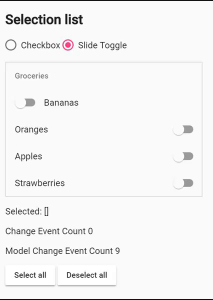
Components: feat(mat-selection-list): add slide toggle as alternative for checkbox
Bug, feature request, or proposal:
feature request
What is the expected behavior?
Option lists can have slide toggles instead of checkboxes, as you can see on Android OS.
What is the current behavior?
Option lists are only for checkboxes and if you want to create something that has the same look but has a slide toggle instead, you will have to implement by yourself.
What is the use-case or motivation for changing an existing behavior?
Its a very common option list format, very used on Android 5~6.
Which versions of Angular, Material, OS, TypeScript, browsers are affected?
Material 5.1
Is there anything else we should know?
You can find it in Material's guidelines:

(switches are very cute btw)
Cute sidebar example:

(inspired by Twitter's PWA, achieved with slide-toggle, mat-list and ::ng-deep, that's a lot more than I expect to write)
 odahcam
All 9 comments
I agree. That would be really nice to have.
We need to see how we can developers let decide which element to pick (_checkbox, slide-toggle_)
 devversion
on 1 Feb 2018
devversion
on 1 Feb 2018
As long as switches are most used for options, what about create a mat-options-list that uses slide toggles by default and leave mat-selection-list as is?
odahcam
on 2 Feb 2018
cc. @jelbourn
This would be actually pretty easy to implement. We could have something like a [indicatorType] input binding that allows deciding which indicator to use (e.g. checkbox, slide-toggle).
It just feels a bit unfortunate, that we would need to have a dependency on the MatSlideToggleModule. We could fix that by either letting the user project the indicator manually, or by having a separate module for the selection list.
devversion
on 12 Feb 2018
The list-option currently uses a pseudo-checkbox in order to avoid the cost of a full checkbox (since they are SVG-based), and because they _shouldn't_ be real checkboxes for a11y. We may want to do something similar for slide-toggle.
 jelbourn
on 12 Feb 2018
jelbourn
on 12 Feb 2018
Yeah I noticed that while playing with that issue. Although, I think having something like a pseudo slide-toggle kind of might be difficult. Especially with the dragging functionality.
Letting the user project the indicator component itself, feels like the best solution, but unfortunately will involve so much boilerplate.
<mat-list-option>
  <mat-slide-toggle matOptionIndicator></mat-slide-toggle>
</mat-list-option>
I noticed that the mat-list-..'s checkbox has a little different visual behavior than the checkbox component itself, should it be that way?
@DevVersion I noticed that as developers in Angular Material we can't customize as much as we can in Bootstrap, because you always try to make things as simpler as possible. That's good and that's bad too. I already had difficults with other components because of that. I don't know what you wanna do at this point, but you could build the components in layers, exposing the base and the abstracted version, so devs can mix components. I know that this could allow some people to mess things up, bug it's worse when we do that mess in SCSS with shadow piercing. Another advantage of letting devs customize things is that some of new (and not already implemented) components in Material would be covered up with some component mixin. It's a hard decision btw.
For now, I think that the easiest to stay in the project standards/guidelines, would be create a new component called mat-option-list which would have a different purpose than mat-selection-list and could share the same logic behind the hood (could have a lower level component, where Material team would create the boilerplate).
Just some ideas, thanks for taking this issue forward. 😊
odahcam
on 12 Feb 2018
In our app we had the lists with the slide toggle, but because it is not possible now, we had to change them to the checkboxes. and that's really not good, because our users were used to something else....😥
 max-SS
on 1 Jun 2018
max-SS
on 1 Jun 2018
any updates on if this will be implemented?
 ngehlert
on 6 Jul 2018
ngehlert
on 6 Jul 2018
I need the same thing but for star icon and star_bordred icon
 FARHANE
on 8 Aug 2018
FARHANE
on 8 Aug 2018
Related issues
jelbourn
·
3Comments
 michaelb-01
·
3Comments
michaelb-01
·
3Comments
 vitaly-t
·
3Comments
vitaly-t
·
3Comments
 3mp3ri0r
·
3Comments
3mp3ri0r
·
3Comments
 xtianus79
·
3Comments
xtianus79
·
3Comments
Most helpful comment
cc. @jelbourn
This would be actually pretty easy to implement. We could have something like a
[indicatorType]input binding that allows deciding which indicator to use (e.g.checkbox,slide-toggle).It just feels a bit unfortunate, that we would need to have a dependency on the
MatSlideToggleModule. We could fix that by either letting the user project the indicator manually, or by having a separate module for the selection list.