Components: Document hue options available for mat-color sass function
Bug, feature request, or proposal:
proposal: Improve documentation for theming
What is the expected behavior?
I find all informations i need in the material documentation regarding the theming feature, especially for custom components.
What is the current behavior?
I don't find all informations i need. Some examples
- how do i use the correct contrast value to a corresponding value of a palette? I only know
color: mat-color($app-primary, default-contrast)
but when i use
background-color: mat-color($app-primary, 50)
and the default-contrast is white, i have white text on a bright background - how to theme existing components in depth
- how to theme a input if i use it in the toolbar (default input is black, this often doesn't fit in a toolbar)
- best practices how to structure theming in the project
- best practice: what should go in my theme.scss, what belongs to a component.css, what in the styles.(s)css?
Thanks.
 KlausHans
All 16 comments
Your point on the contrast colors is fair, nothing really touches on that in the current documentation.
The rest is either covered by existing guides or is outside the scope of Angular Material (e.g. project structure)
 jelbourn
on 24 Jan 2018
jelbourn
on 24 Jan 2018
Hi, I was hoping to take a stab at this.
Would adding the available values and a link to the online palette to the theming.md file like this be the way to go? Inserting it before or after the example code block seems like an abrupt change in topic, and this seemed like the most relevant code block that it could be added to.
 timmoy
on 25 Jan 2018
timmoy
on 25 Jan 2018
@timmoy I mainly had in mind the fact that our theming supports specifying contrast, lighter, and darker colors, though it is probably worthwhile to link out to the colors page of the Material Design spec.
jelbourn
on 25 Jan 2018
@jelbourn following your advice, I did some experimentation and have updated my branch with this commit.
I did use some of the documentation from _theming.scss to make it more visible and added a short explanation of "-contrast".
timmoy
on 26 Jan 2018
Thanks, but "or any of the aforementioned prefixed with "-contrast"." is very confusing imho. First, "-contrast" works only with default, lighter and darker, not with 500, ~A400~, etc. So not with any aforementioned values.
Second, "-contrast" is a suffix ;)
KlausHans
on 7 Feb 2018
That's true, I think using the wording prefixed with "-contrast" is confusing when it is meant that the hue is prefixing "-contrast". Changing or any of the aforementioned prefixed with "-contrast" to or any of the 3 previous word hues prefixed to "-contrast" might help clarify it?
I'm hesitant to change it right away as it would touch wording that was originally here. Perhaps it's best to wait for confirmation before updating the preexisting wording?
timmoy
on 8 Feb 2018
Yes, your proposal is much better imo.
KlausHans
on 8 Feb 2018
You actually can use -contrast with the specific hue numbers. Are you not seeing that to be true?
jelbourn
on 8 Feb 2018
From my testing, I wasn't able to use the specific hue numbers like 50 or 900. But for numbers like A100, they work with -contrast to provide a contrast color.
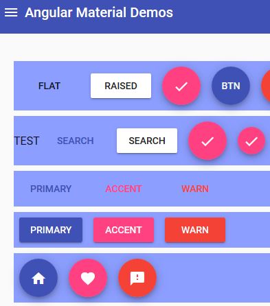
I tested by updating the button-demo.scss file in the demo-app as well as adding some text to one of the section elements.
SCSS file after modifications:
@import '../../lib/core/theming/_theming'; // Gets the theming functions
@import '../../demo-app/theme'; // Gets the predefined colors
.demo-button {
  button, a {
    margin: 8px;
    text-transform: uppercase;
  }

  section {
    display: flex;
    align-items: center;
    margin: 8px;
    background-color: mat-color($candy-app-primary, 900); // sets background color for section elements
    color: mat-color($candy-app-primary, 900-contrast); // sets text color in section elements
  }

  p {
    padding: 5px 15px;
  }

}
In the button-demo.html file I added the word TEST to the second section element:
  <section> TEST
    <a href="http://www.google.com" mat-button color="primary">SEARCH</a>
    <a href="http://www.google.com" mat-raised-button>SEARCH</a>
    <a href="http://www.google.com" mat-fab>
      <mat-icon>check</mat-icon>
    </a>
    <a href="http://www.google.com" mat-mini-fab>
      <mat-icon>check</mat-icon>
    </a>
  </section>
The result of 900 for background color and 900 for text color was the same as when I used 900-contrast for text color. It does seem odd that I see the contrast pairings in the palette file, but they don't seem to take effect for me.
Other text/background color pairings:
A100/A100

A100-contrast/A100
900/50
50/50
50-contrast/50

900/900

90-contrast/900
timmoy
on 9 Feb 2018
@jelbourn yes, something like
mat-color($app-primary, 300-contrast);
results in a compiler error:
Failed to compile.

./src/assets/css/*****-theme/*****-theme.scss
Module build failed: ModuleBuildError: Module build failed:
undefined
^ Argument `$color` of `opacity($color)` must be a color
Backtrace:
node_modules/@angular/material/_theming.scss:1149, in function `opacity`
node_modules/@angular/material/_theming.scss:1149, in function `if`
node_modules/@angular/material/_theming.scss:1149, in function `mat-color` stdin:28 [...]
A100-contrast indeed works. This is quite confusing.
KlausHans
on 9 Feb 2018
When I try a reduced example it works: https://gist.github.com/jelbourn/dec98041a489e3ac34e4287f736b2685
jelbourn
on 9 Feb 2018
I noticed that when I called my code in my testing, it was without quotes for the hue like: 900-contrast, but there were quotes in the gist '100-contrast'.
I tried calling the mat-color function again with quotes and it worked. It seems that without the quotes the $color variable gets detected as a number and causes trouble with the opacity function from what I can tell from @KlausHans' error message.
Code change in my test branch here.
Screenshot of it working.

timmoy
on 10 Feb 2018
@jelbourn do you think the documentation should be updated to include an example for needing quotes when using the -contrast modifier with a digit only hue indicator?
timmoy
on 15 Feb 2018
Sure
jelbourn
on 15 Feb 2018
How I can get the background color of Angular Theme.
I have the following code:
$primary: map-get($theme, primary);
$accent: map-get($theme, accent);
$warn: map-get($theme, warn);
$background: map-get($theme, background);
$foreground: map-get($theme, foreground);
If can use:
a {
color: mat-color($primary, 400);
}
And its works
but when I use
a {
background-color: mat-color($background, 400);
}
the application stops working. How I can get de Background-color?
 juanjinario
on 25 Oct 2018
juanjinario
on 25 Oct 2018
This issue has been automatically locked due to inactivity.
Please file a new issue if you are encountering a similar or related problem.
Read more about our automatic conversation locking policy.
_This action has been performed automatically by a bot._
![angular-automatic-lock-bot[bot] picture](https://avatars.githubusercontent.com/in/40213?v=4&s=40) angular-automatic-lock-bot[bot]
on 10 Sep 2019
angular-automatic-lock-bot[bot]
on 10 Sep 2019
Related issues
 dzrust
·
3Comments
dzrust
·
3Comments
 RoxKilly
·
3Comments
RoxKilly
·
3Comments
 LoganDupont
·
3Comments
LoganDupont
·
3Comments
 theunreal
·
3Comments
theunreal
·
3Comments
 alanpurple
·
3Comments
alanpurple
·
3Comments
Most helpful comment
I noticed that when I called my code in my testing, it was without quotes for the hue like:
900-contrast, but there were quotes in the gist'100-contrast'.I tried calling the mat-color function again with quotes and it worked. It seems that without the quotes the

$colorvariable gets detected as a number and causes trouble with the opacity function from what I can tell from @KlausHans' error message.Code change in my test branch here.
Screenshot of it working.