Components: feat(button): Dropdown buttons
Bug, feature request, or proposal:
feature request
What is the expected behavior?
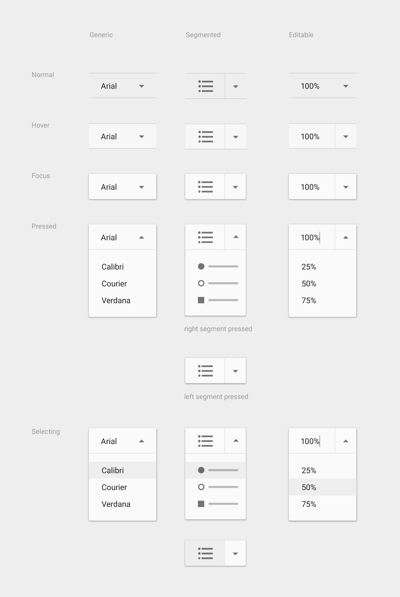
Implement dropdown buttons as defined in Material Design guidelines
Generic overflow dropdown button
The generic overflow dropdown button displays an arrow or menu button by default. When the button is pressed, the menu appears. Pressing an option on the menu navigates to further settings for that option.
Segmented dropdown button
A segmented dropdown has two sections: the current state and the dropdown arrow icon. Pressing the current state will cause that state’s action to fire within the screen. Pressing the dropdown arrow will display all the state options. Selecting one will change the displayed state.
https://material.io/guidelines/components/buttons.html#buttons-dropdown-buttons
Editable segmented dropdown button
This button has a segmented dropdown, where the displayed state is text editable, such as a font size picker. Pressing the current state causes both that state’s action to fire and makes the displayed state editable. Pressing the arrow displays all the state options.

All 9 comments
This is the mat-select
@jelbourn Well mat-select is not really an equivalent. As of now, there are no ways to have a segmented button. Even the "generic" dropdown button which looks a lot like the mat-select is not made to be used in forms but in a toolbar for example. Thus the look and feel is a little bit different.
@jelbourn I don't think it's possible to make a Segmented Button (middle column in the OP's images) using a mat-select, and mat-select is not styled correctly for any dropdown button.
The current mat-select behavior implements the selection list as a menu, with styling according to the menu spec (which is allowed per the text field spec). This includes more whitespace between items than the Generic overflow dropdown button spec.
The middle column in the images depicts a button that performs an immediate action when the left segment is clicked (the example is to create a bullet list in Google Docs), but opens a select-style dropdown with other options, which when selected will change the left-side action. Currently, mat-select will display the text content (only!) of the selected option in the left side of the component; any additional markup will be discarded. The existing API also does not expose any way to capture or differentiate a click on the left side (content) separately from the arrow icon (trigger), which would be required to implemented a split button.
If I'm mistaken, I'd appreciate a pointer in the right direction to use mat-select to make such a button. If not, please re-open the issue and assign a priority.
@thw0rted I've made it work with Button Groups. Here is a quick and dirty example, it needs binding to the menu value.
          <mat-menu #appMenu="matMenu">
            <button mat-menu-item>... Black Forest</button>
            <button mat-menu-item>... Salted Caramel</button>
          </mat-menu>

          <mat-button-toggle-group>
            <mat-button-toggle (click)="doSomethingBig()">
              Tell me about Earl Gray Ice Cream
            </mat-button-toggle>

            <mat-button-toggle [matMenuTriggerFor]="appMenu">
              <mat-icon>arrow_drop_down</mat-icon>
            </mat-button-toggle>
          </mat-button-toggle-group>
@sughodke Thanks for your solution.
Do you have a way to make the drop down button less padding?
Currently, it only contains an arrow, which is not pretty with 16px padding on both sides.
why was this closed? Seems a legit problem for me , which cannot be fixed with mat-select
Since @jelbourn didn't respond to my comment from more than 6 months ago (!) it might be best to open a new issue and just reference this one. I agree that this is still not fixed.
@jelbourn please reopen?
This issue has been automatically locked due to inactivity.
Please file a new issue if you are encountering a similar or related problem.
Read more about our automatic conversation locking policy.
_This action has been performed automatically by a bot._
Most helpful comment
@thw0rted I've made it work with Button Groups. Here is a quick and dirty example, it needs binding to the menu value.