Components: [md-card] Add md-card-header (similar to md-card-footer)
Feature request
Add a md-card-header, similar to md-card-footer, but on top of the md-card.
What is the expected behavior?
I would expect a md-card-header, so that we can place something inside a md-card, but on top, without any padding.
What is the current behavior?
md-card partially supports this with md-card-footer, but it is limited to the bottom of the md-card
What is the use-case or motivation for changing an existing behavior?
The use-case for this came to my mind when I was trying to make a md-card similar to this (example taken from the md-input documentation)

I.e. I wanted to have a md-card, with a md-toolbar as header. If I copy/paste the code given for this example, the md-toolbar would (of course) appear with a padding. We would have to apply custom css styles to make something similar. I think that it's a quite common use-case for a md-card to have a md-toolbar as title, so I would suggest to add a md-card-header, so that we can apply an element to the md-card-header, ignoring the paddings.
I think that this could easily be implemented, since it is quite similar to the md-card-footer.
Note
I know that one could just change the markup to something like this:
<md-toolbar color="primary">Basic</md-toolbar>
<md-card>
    <!-- content... -->
</md-card>
The problem with this approach is, that the md-toolbar then would have no box-shadow, which doesn't look that good. Applying a shadow to the md-toolbar would not only be redundant, but the shadow would also overlap with the md-card
 ghost
ghost
All 15 comments
I was having the same issue, this quick workaround seems to fix it. I think it would be more intuitive to be able to use md-toolbar inside a card, than create a md-toolbar-header with the same functionality (the <img /> tag does this as well inside a card for the header image).
md-card > md-toolbar {
    margin: -24px 0 24px -24px;
    width: calc(100% + 48px);
}
<md-card>
  <md-toolbar color="primary">
    <span>Title</span>
  </md-toolbar>
  <md-card-content>
  ...
Edit: I think padding should not be applied to md-card, but to the md-card-content, md-card-title, md-card-footer components. This is the way it is done in material1, and this way you can put md-toolbars, md-lists and other 100% width elements inside a card.
 TimKlein87
on 1 Nov 2016
TimKlein87
on 1 Nov 2016
@TimKlein87 thanks for the response. I have implemented something similar, but I expect material to offer some functionality for this.
And you are right that an md-toolbar could be automatically aligned, without a md-card-header, but I thought that a md-card-header would be more generic, so we could place anything there and not only a md-toolbar. It would also be more consistend.
Maybe someone wants to use a huge md-card and wants to have md-toolbar subheadings. Your approach would break that.
ghost
on 2 Nov 2016
I'm confused, md-card-header is documented for MdCard as of today (a new version, alpha.10, was released just yesterday).
https://github.com/angular/material2/blob/master/src/lib/card/README.md
Preset layouts
You can also leverage preset layouts that format some of the sections together.
<md-card-header>Formats the following sections into a header:
<md-card-title>: title to format within header
<md-card-subtitle>: subtitle to format within header
<img md-card-avatar>: image to use for avatar
 littleninja
on 12 Nov 2016
littleninja
on 12 Nov 2016
@TimKlein87 Do you happen to know how to change the height of the toolbar in an Overlay?
Using
md-card > md-toolbar {
  margin: -24px 0 24px -24px;
  width: calc(100% + 48px);
  height: 40px;
  min-height: 40px;
}
could change the height of md-toolbar. But I couldn't find a way to overwrite the height of md-toolbar-row within a component. ( I could only achieve this by overwriting the style in app's global style file)
 chouclee
on 16 Dec 2016
chouclee
on 16 Dec 2016
Why this is still opened?
 michaeljota
on 30 Mar 2017
michaeljota
on 30 Mar 2017
@michaeljota Most likely because of the fact that the team is not currently working on it, but it has been considered as good for the future.
 dahaupt
on 30 Mar 2017
dahaupt
on 30 Mar 2017
@dahaupt as @littleninja said (six months ago) this feature it's already implemented. I don't think they used this to track the implementation of that feature. So... Why this is still opened?
michaeljota
on 30 Mar 2017
@michaeljota It is not implemented because the md-card-header currently doesn't act like a md-toolbar, with a possibility to get a full-width background color. I think they've finished working on md-card until other components are done. Once that is done, they will continue to work on these nice to have features.
I.e. I wanted to have a md-card, with a md-toolbar as header.
dahaupt
on 30 Mar 2017
Then you should just add a Toolbar. They are different components, why they
should do something like this? Is it in the Material Specification guide or
something? If so, please, share the link.
2017-03-30 15:35 GMT-04:00 Daniel H. notifications@github.com:
@michaeljota https://github.com/michaeljota It is not implemented
because the md-card-header currently doesn't act like a md-toolbar, with
a possibility to get a full-width background color. I think they've
finished working on md-card until other components are done. Once that is
done, they will continue to work on these nice to have features.I.e. I wanted to have a md-card, with a md-toolbar as header.
—
You are receiving this because you were mentioned.
Reply to this email directly, view it on GitHub
https://github.com/angular/material2/issues/1650#issuecomment-290520944,
or mute the thread
https://github.com/notifications/unsubscribe-auth/AKBWAGvhSARrdb7bnkTcD_cHrBNhwCfaks5rrAQKgaJpZM4KkEe2
.
michaeljota
on 30 Mar 2017
It looks very much like what he wants.
https://material.io/guidelines/components/cards.html#cards-actions

Avatar, Title, and Subtitle area
Height: 72dp
Left and right padding: 16dp
Top and bottom padding: 16dp

I have the impression the padding is for the header not for the card.
 lsaudon
on 20 Apr 2017
lsaudon
on 20 Apr 2017
@michaeljota I think updating the components/cards with a few more details and examples would be incredibly helpful. Currently it is not that straight forward on how it should be used. Actually I am working on wrapping my head around it myself. As soon as I understand it better I might give it a try to contribute to the documentation myself.
 skofgar
on 11 May 2017
skofgar
on 11 May 2017
What if there is no subheader? I didn't find this on the specs.
On lists, the title go to the middle (vertically).
 peluprvi
on 14 Jun 2017
peluprvi
on 14 Jun 2017
It would be really nice to have official support for that and avoid all the css tweaks to achieve the result.
I know the team have other considerations and a lot of work is done, no worries :ok_hand:
 maxime1992
on 3 Oct 2017
maxime1992
on 3 Oct 2017
mat-card-header exists
 jelbourn
on 26 Jan 2018
jelbourn
on 26 Jan 2018
Would like to second the notion of having more examples/use-cases covered in the examples of the documentation. This PR/comment in particular contains a bucket of them which I just don't see in code anywhere: https://github.com/angular/material2/pull/12731#issue-209323926
Here is only 1 use-case: https://material.angular.io/components/card/examples
When using the schematic for a form or dashboard the titles are contained within a header which gives the title 16px margin on either side making it look a bit like a dogs dinner making me wonder if it's broken or not. Is it supposed to be used without a card-avatar?

Where I previously worked we had a bucket of custom styles on top of Material to achieve different UI variations which made updating Material extremely scary as markup constantly changed and broke everything.
Coming from Bootstrap 4 I can't help but feel Material cards really lack composability. Still no idea how you would compose pieces for this without just going entirely custom: https://github.com/angular/material2/issues/1650#issuecomment-295752636
Feel like I should just stick to Forms, Buttons for pretty ripples and CDK
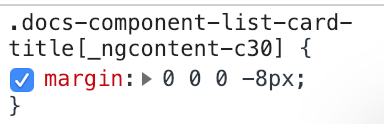
Even material.angular.io is hacking at the titles to reduce the margins applied when they're inside headers:
 intellix
on 4 Jan 2019
intellix
on 4 Jan 2019
Related issues
jelbourn
·
3Comments
 3mp3ri0r
·
3Comments
3mp3ri0r
·
3Comments
 michaelb-01
·
3Comments
michaelb-01
·
3Comments
 julianobrasil
·
3Comments
julianobrasil
·
3Comments
 vanor89
·
3Comments
vanor89
·
3Comments
Most helpful comment
I was having the same issue, this quick workaround seems to fix it. I think it would be more intuitive to be able to use
md-toolbarinside a card, than create amd-toolbar-headerwith the same functionality (the<img />tag does this as well inside a card for the header image).Edit: I think padding should not be applied to
md-card, but to themd-card-content,md-card-title,md-card-footercomponents. This is the way it is done in material1, and this way you can putmd-toolbars,md-listsand other 100% width elements inside a card.