Community-edition: Service bar as vertical
I switched to Rambox very happy but the service bar as horizontal use so many space and today the monitor are 16:9 so it will be better have that bar with all the services vertical like slack do.
 Mte90
Mte90
All 15 comments
Hello Mte90,
Would: http://rambox.pro/100/ be of interest?
From what I know there are plans to do a better interface which is planned more for 1.0.0
 nmat
on 20 Jun 2017
nmat
on 20 Jun 2017
Seems in the right way but the bar in that screens is always on the top in horyzontal and I am asking if it possible to have vertical
Mte90
on 21 Jun 2017
We can think in a future release to add an option to switch...
 saenzramiro
on 15 Aug 2017
saenzramiro
on 15 Aug 2017
I would also like to see this feature. An option could be added to the PREFERENCES section
TABS POSITION : Left / Right / Top / Bottom
TABS DISPLAY : Show / Hide
 RYRNRY
on 16 Oct 2017
RYRNRY
on 16 Oct 2017
I've done some work on this issue that lets any user select whether they want their tab bar to show up horizontally or vertically. It defaults to horizontal (no changes here) and simply changes the tab bar's position and rotation when the user changes something in their preferences.
Still needs some polish, though - the change only takes place after a full reload of Rambox, and service names don't play very well when vertical.
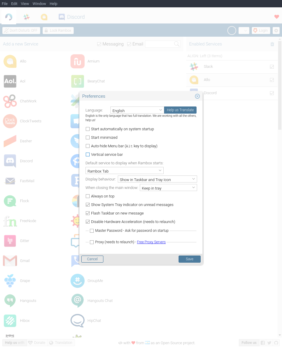
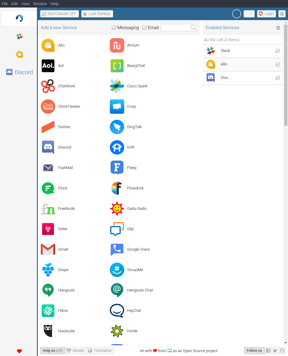
Will see how far I get by the end of the weekend and send a PR if I think it's sufficient work for the feature. You can see what I have so far over in my fork. Screenshots below.
Preferences screen:
Vertical service bar:
 KTOmega
on 29 Apr 2018
KTOmega
on 29 Apr 2018
Has this been committed? Can't see in latest
 reelism
on 30 Aug 2018
reelism
on 30 Aug 2018
@reelism, this was committed in 3a4c89bd65c23284640d3f098c0b449f96ab6075. However, I am unsure if a release was created that includes this change.
KTOmega
on 30 Aug 2018
So committed back in May. Any insights on the delay?
reelism
on 30 Aug 2018
No, there are no new release also if there are new changes in trunk since months...
Mte90
on 30 Aug 2018
To be honest vertical icon bar in Franz looks much better and is more elegant. Rambox logo icon which sticks out on the UI makes the tabs look great in comparison (which they don't).
So much vertical space is lost due to window frame, menu, tabs with excessive padding and a label - it does not feel modern too.
Feature icons scattered around the window do not help too - why Help us / Follow us / facebook etc need to be always visible? It just adds clutter to already cluttered web realm of 2018.
With over a year wait for a feature which is already at least partially implemented just asks to look for an alternative - or a fork :( Or writing own implementation without the electron dependency - just pure webkit. Anybody knows such alternative or close match already exists?
 t00
on 12 Sep 2018
t00
on 12 Sep 2018
With over a year wait for a feature which is already at least partially implemented just asks to look for an alternative - or a fork :( Or writing own implementation without the electron dependency - just pure webkit. Anybody knows such alternative or close match already exists?
You can try https://wavebox.io/ It already has spellcheck, vertical bar and support for extensions like Markdown here. Pricing might be an issue though.
 talha131
on 12 Sep 2018
talha131
on 12 Sep 2018
@saenzramiro, any updates on whether a new release will be created soon based on the latest of master? Seems like there's been a lot of features over the last few months that still need to be released.
KTOmega
on 12 Sep 2018
@saenzramiro - this preference seems to be on the top of many issues. Would you be able to release a new version with the latest fixes sometime soon?
 vraravam
on 2 Oct 2018
vraravam
on 2 Oct 2018
There is a lot of people waiting for a new release...
Mte90
on 3 Oct 2018
This thread has been automatically locked since there has not been any recent activity after it was closed. Please open a new issue for related bugs.
![lock[bot] picture](https://avatars1.githubusercontent.com/in/6672?v=4&s=40) lock[bot]
on 2 Nov 2018
lock[bot]
on 2 Nov 2018
Related issues
 julien-tmp
·
4Comments
julien-tmp
·
4Comments
 jvdmeij
·
4Comments
jvdmeij
·
4Comments
 arnauldb
·
4Comments
arnauldb
·
4Comments
 saalkom
·
3Comments
saalkom
·
3Comments
 MakuSensei
·
4Comments
MakuSensei
·
4Comments