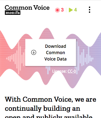
Common-voice: [Mobile] Download Common Voice Data button should not stack text
There should be enough space to make the "Download Common Voice Data" text on the button just span 1 line on mobile screens.
cc/ @m-branson
ui-polish
 ivonnekn
All 5 comments
@iveskins I also centered the license label & link as I felt it looks better that way on mobile. lmkwyt
 Gregoor
on 28 Nov 2017
Gregoor
on 28 Nov 2017
😕2
@Gregoor I'm guessing you mean me, not @iveskins ? :)
ivonnekn
on 28 Nov 2017
@Gregoor Can you keep the width of the button just large enough to fit the text and icon, rather than stretching to fit the width of the screen? At a maximum it should have left and right margins that align with the margins on rest of the content.
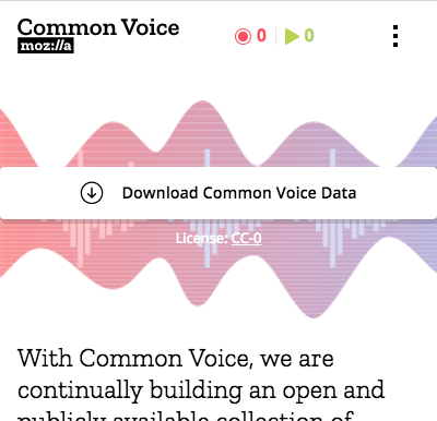
Like the centered license text!
Thanks!
ivonnekn
on 28 Nov 2017
Yaiks, this is getting embarrassing, I'm sorry iveskins!
Made the change so that it doesn't go full width.
Gregoor
on 29 Nov 2017
😄1
verified - thanks @Gregoor!
ivonnekn
on 29 Nov 2017
Was this page helpful?
0 / 5 - 0 ratings
Related issues
 mikehenrty
·
3Comments
mikehenrty
·
3Comments
 kenrick95
·
3Comments
kenrick95
·
3Comments
 nevik
·
5Comments
ivonnekn
·
4Comments
mikehenrty
·
3Comments
nevik
·
5Comments
ivonnekn
·
4Comments
mikehenrty
·
3Comments