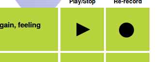
Common-voice: UX: Icon for re-record in review looks like "close".
Problem: The ✕ icon for "re-record" the review view, where you can re-listen and submit your recordings looks like "delete" or "close".
Solution:
- Make it look like the symbol for "record" ●
- Since there is no standard icon for re-record, it might be better to write it out instead
(related to #278 since it can be assumed that ✕ allows to exclude the recording from the submission.)
 jdittrich
All 6 comments
I dont see an assignee on this issue.
Looking to contribute to UX for this project.
Can I take this up?
Thanks
Ruchita
 ruchitarr
on 21 Jul 2017
ruchitarr
on 21 Jul 2017
Sounds great @ruchita20! Unfortunately, I don't have much input into how to fix this issue except to say that I agree this is a problem. I know @jdittrich is also a UX expert, so perhaps you can use this gh issue to collaborate and arrive at a good solution. I'll be here if you need me, and I'll make sure your work makes it in the final product 👍
 mikehenrty
on 21 Jul 2017
mikehenrty
on 21 Jul 2017
you can use this gh issue to collaborate and arrive at a good solution.
…here my visualized suggestions:
- Change the icons like this:
Change the text on top of the row of Play from
Play/Stopto Play/Pause (since that reflects its behavior)Change the back arrow in the record step:
Currently it looks like:
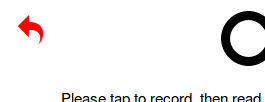
It should look like:
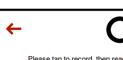
So the arrow looks less like the "redo" for the current step. But feel free to make the arrow a bit fatter, this was the first one I found.
jdittrich
on 21 Jul 2017
Thanks for your UX/UI input here @jdittrich! We're currently assessing and aggregating updates for our next round of UX iteration and will indeed be including your language and icon suggestions. (Also note, the back arrow may change a bit, but will be an icon that is distinct from 'redo' in previous screens.) Cheers and thanks again.
cc @mikehenrty
 mbransn
on 27 Sep 2017
mbransn
on 27 Sep 2017
Working on this one :)
 elahmo
on 14 Oct 2017
elahmo
on 14 Oct 2017
This is being handled in various broken out bugs. Since @elahmo fixed the undo arrow in https://github.com/mozilla/voice-web/commit/0cbfa132d55575d975fea3756d48081bec70966c, we will close this one.
mikehenrty
on 14 Oct 2017
Related issues
 ivonnekn
·
4Comments
ivonnekn
·
4Comments
 r00ster91
·
4Comments
r00ster91
·
4Comments
 jankeromnes
·
3Comments
jankeromnes
·
3Comments
 ftyers
·
4Comments
mbransn
·
5Comments
ftyers
·
4Comments
mbransn
·
5Comments
Most helpful comment
…here my visualized suggestions:
Change the text on top of the row of Play from
Play/Stopto Play/Pause (since that reflects its behavior)Change the back arrow in the record step:
Currently it looks like:

It should look like:

So the arrow looks less like the "redo" for the current step. But feel free to make the arrow a bit fatter, this was the first one I found.