Just a few UI suggestions - hope you don't mind a dot-point list
- Can the
Add a line itembe a button, or something a bit more obvious? - When adding a new line item, can a bit more information about the purchasable be shown? For instance, the Product Type, and what type of purchasable it is?
- I know there's a yellow background to the newly added line item, but could this be visually differentiated a bit more? Because each line item's rows take up a lot of room, there's a heap of scrolling to do, and you can easily get lost.
- I know its probably a pipe-dream, but would love line item options to be a little less free-edit. We use them on a lot of sites, but its just not client-friendly to write stuff in JSON. They're also required to know the exact keys for things.
 engram-design
👍4
All 4 comments
@engram-design I did a PR for your last point as its something I often need too: #1050
 joshangell
on 14 Oct 2019
joshangell
on 14 Oct 2019
👍1
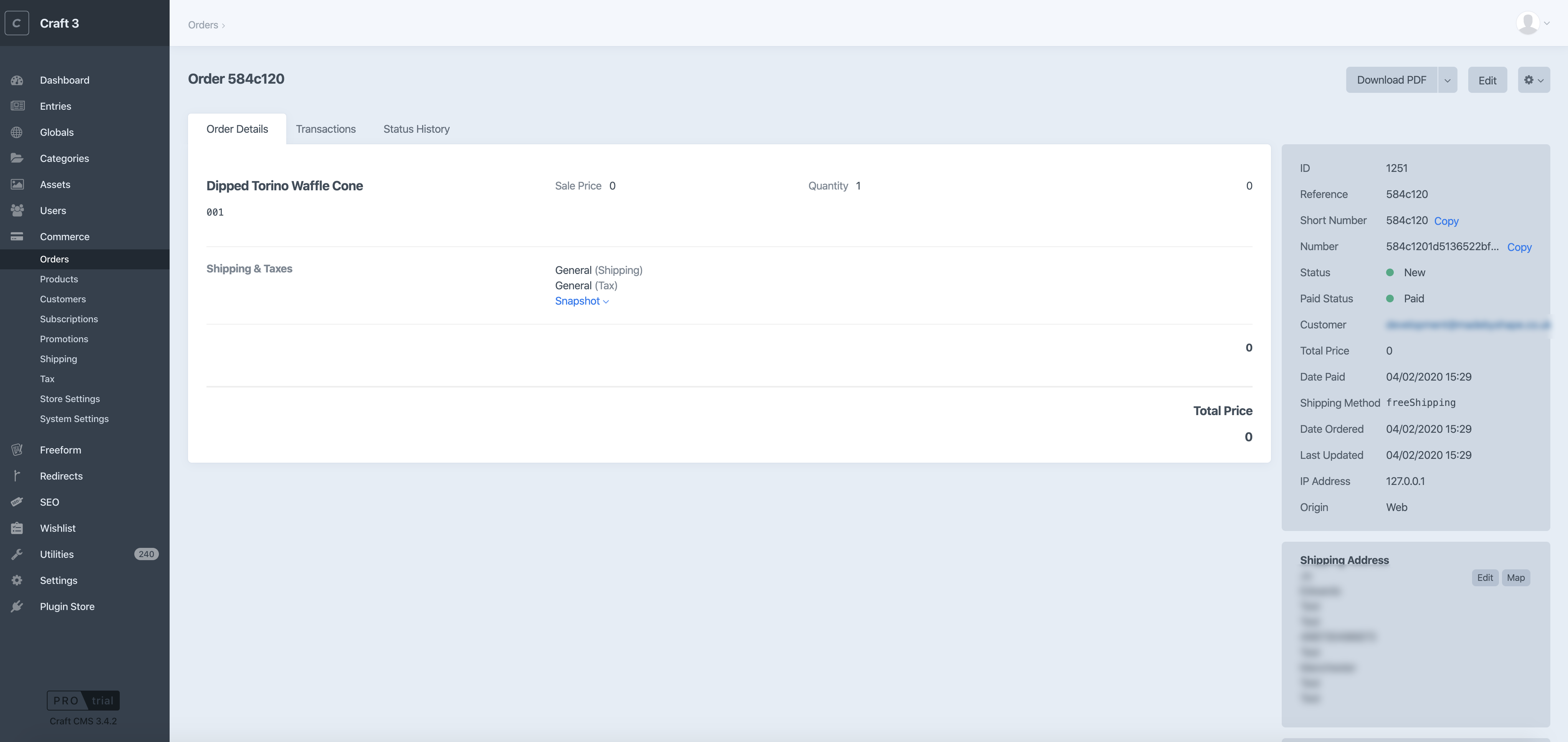
Coming from Commerce 2, the Commerce 3 interface seems very clunky. I love the VueJS aspect of it, and how everything is editable in the order etc. That is amazing. But I feel the whole UI for the line items and order history is not clear:
- Theres too much space. One line item takes up 300px of height, on a 1,152px screen height. Adding more than one item in to the order just makes the page ridiculously long.
- Similar, the space makes it unreadable and scannable. In the screenshot, what are the random 0's? I know they are the total item prices, but clients aren't this clever.
- LOVE the snapshot feature, but does all this need to stack?
- Would it be possible to pull in a thumbnail of the product? Again, making it scanable.
- When your adding a line item, the JSON feature is really nice to add options. But to Sue in finance, this makes no sense to her.
- I feel a lot of it could be hidden on the right hand side bar, with maybe an 'Expand' for more information. IP Address, Origin, 4 order / transaction ID's, and 2 Total Prices just aren't needed in view all the time. This essentially pushes the shipping address down, which is usually more important to our clients who are shipping the products.
 bymayo
on 4 Feb 2020
bymayo
on 4 Feb 2020
👀1
@bymayo Thanks for the great feedback, we definitely have plans to improve the order edit page, including most of what you mention. Stay tuned to this issue!
 lukeholder
on 4 Feb 2020
lukeholder
on 4 Feb 2020
👍1
There have been a number updates to the Edit Order page as of the release of 3.1.
I will close this issue in favour of making new specific issue related to the current version.
Thanks!
 nfourtythree
on 2 Apr 2020
nfourtythree
on 2 Apr 2020
Was this page helpful?
0 / 5 - 0 ratings
Related issues
 stenvdb
·
4Comments
stenvdb
·
4Comments
 jmauzyk
·
5Comments
jmauzyk
·
5Comments
 codyjames
·
6Comments
lukeholder
·
5Comments
codyjames
·
6Comments
lukeholder
·
5Comments
 Tam
·
4Comments
Tam
·
4Comments