Codeigniter: Doucumentation View is not showing properly on mobile view 320px
Dear Sir,
I read daily ## codeigniter user guide via offline daily on mobile .I am facing problem to read on mobile the user guide offline on 320px for the latest Version 3.1.2. It break the html norm .I attached the image also taken from Mozilla at 320px. Please fix it.
Thanks
Asraful Haque

 hqasraful
All 22 comments
I don't really care about the docs working on mobile browsers, but our last 2 doc builds were indeed broken ... We've fixed them, does it display correctly now?
 narfbg
on 22 Nov 2016
narfbg
on 22 Nov 2016
Dear Sir,
Thanks for your response. But I need it because I have only one
source to study it on Mobile. I use Firefox and Chrome . On both browsers
it is broken. If you fixed it , it will be helpful for me!
Thanks
_Asraful Haque_
_hq.[email protected] hq.[email protected]_
_wintellect.[email protected] wintellect.[email protected]_
_Mob: +91-7042805660_
On Tue, Nov 22, 2016 at 4:16 PM, Andrey Andreev [email protected]
wrote:
I don't really care about the docs working on mobile browsers, but our
last 2 doc builds were indeed broken ... We've fixed them, does it display
correctly now?—
You are receiving this because you authored the thread.
Reply to this email directly, view it on GitHub
https://github.com/bcit-ci/CodeIgniter/issues/4912#issuecomment-262207761,
or mute the thread
https://github.com/notifications/unsubscribe-auth/AHa0tYyj2Kj_5fXWCCLDw7LldmmWlb_zks5rAsf6gaJpZM4K2LGq
.
hqasraful
on 22 Nov 2016
You'll have a very hard time convincing me that you're programming on a mobile device with a 320px-wide screen, which is the only case you'd really "need" it.
But beside that, you didn't directly answer my question - after trying to open it now, is it still not displaying properly for you?
narfbg
on 22 Nov 2016
Dear Sir,
I wrote you that _I have only one source to study it on Mobile
but not programming_ . How can I program on mobile! I used CodeIgniter
project in our small office but love to study on Mobile browser at home. I
don't have any PC/Laptop.
*Yes , Still is same problem.It is broken.*
Thanks for your swift response!
_Asraful Haque_
_hq.[email protected] hq.[email protected]_
_wintellect.[email protected] wintellect.[email protected]_
_Mob: +91-7042805660_
hqasraful
on 23 Nov 2016
I just tested the user guide on my Samsung Rugby, running Android 4.1.2.
The classic layout button does not appear top right, in any orientation.
Going back to my desktop, the classic layout button appears at higher resolutions (which is what I tested originally), but disappears at "small" and "extra-small" window sizes (<772px, it would seem).
I went back to the CI 3.1.0, where the classic layout button appeared "normally", but it disappeared at "small" window size too. The same happens with the CI 3.0.6 user guide.
Conclusion: I suspect that the classic layout button may have been not visible at smaller window sizes for some time now, and that that is an issue possibly unrelated to the current fix :(
@hqasraful Which is the newest version of CI where you noticed the user guide having a working classic layout button visible at smaller resolutions?
 jim-parry
on 23 Nov 2016
jim-parry
on 23 Nov 2016
Dear Sir ,
I am tired to explain . I have attached three images. All Snapshot taken on the 320px basic!
I am using current version CodeIgniter Version 3.1.2. It is also showing classic button but now working(create event).
Show pretty good! Old version

Show nothing on codeigniter 3 1 2 documentation

After some change of the theme.js file on line no 43
(// $('.wy-nav-content-wrap').css({background: 'none repeat scroll 0 0 #fcfcfc;', 'margin-left': '300px'});)
My content shows just perfect except Classic Layout

Thanks
Asraful Haque
hq.[email protected]
hqasraful
on 23 Nov 2016
Well, I'm tired of this too.
@jim-parry All is up to you here.
narfbg
on 23 Nov 2016
I think, just remove the old button version 2 and upgrade the new Sphinx RTD Theme with a little customization.
 sayonara90s
on 23 Nov 2016
sayonara90s
on 23 Nov 2016
The latest version of Sphinx causes other issues, like the button disappearing altogether at all sizes :(
It could be that a fresh implementation of the feature, and/or getting to the bottom of the latest Sphinx problems, would be a logical next step ... for someone more familiar with Sphinx, and with some time to put into the task.
The CI4 user guide has the same issue, with the classic layout button disappearing at smaller screen sizes.
This needs to be solved at some point, but doesn't feel like a high priority compared to the other work on our plates :(
@hqasraful Have you tried the epub format of the user guide? I seem to recall us adding that becuase of a community member wanting to read the guide on their tablet or smartphone.
jim-parry
on 24 Nov 2016
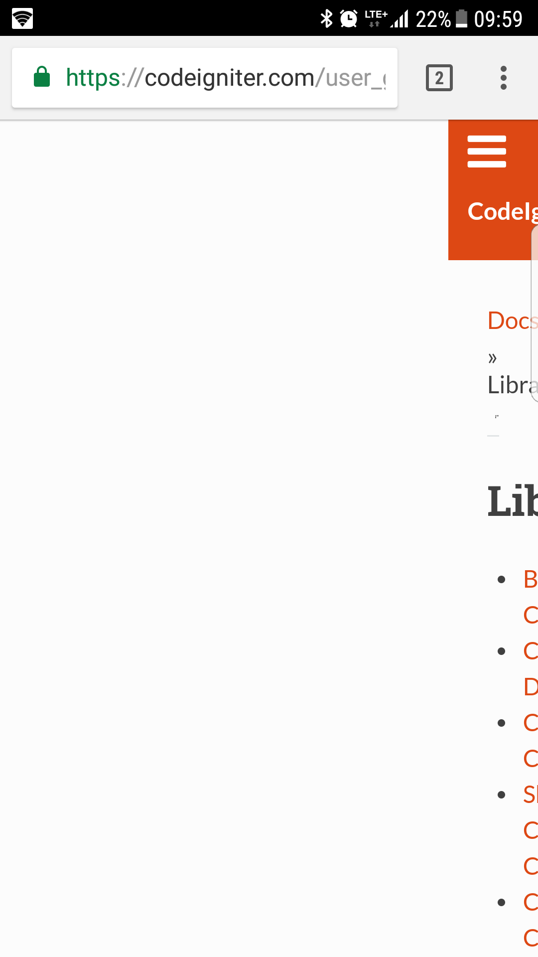
This is how it looks on my Samsung Galaxy S7 Edge:
 ml054
on 15 Nov 2017
ml054
on 15 Nov 2017
I have also experienced this problem. It should be fixed.
 pSnehanshu
on 21 Dec 2017
pSnehanshu
on 21 Dec 2017
Same on One plus one with Firefox
 reeslo
on 17 Jan 2018
reeslo
on 17 Jan 2018
I think I have a fix for this but I need a confirmation, why is the section.wy-nav-content-wrap element's margin-left is set to 300px?
 mehdibo
on 29 Jan 2018
mehdibo
on 29 Jan 2018
This is what causes the problem.
Line 43 in theme.js:
$('.wy-nav-content-wrap').css({background: 'none repeat scroll 0 0 #fcfcfc;', 'margin-left': '300px'});
I added a breakpoint and it solved it:
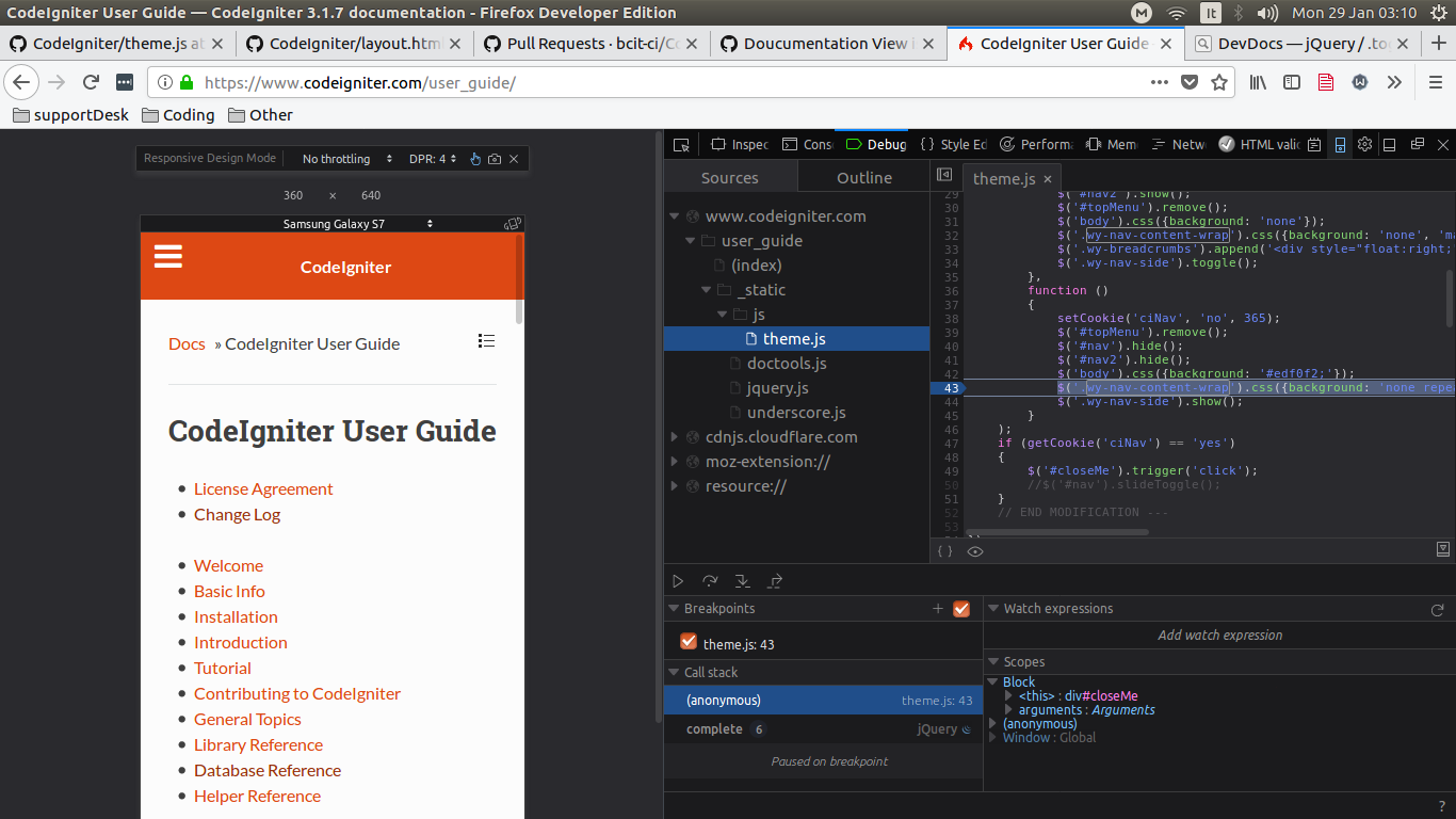
And after stepping over:
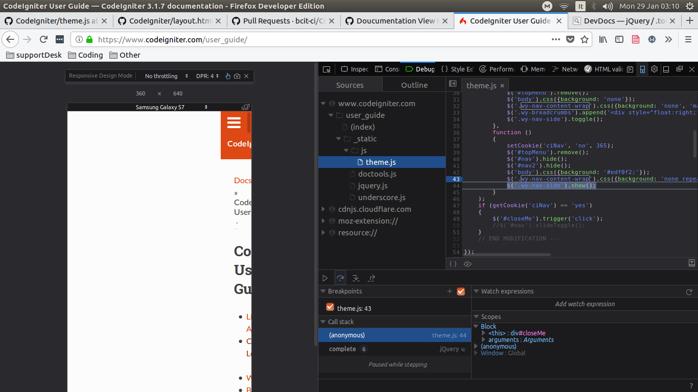
What I don't know though is, why is this code there in the first place? is it safe to remove it? I tried manually removing the margin-left style and it worked just fine in both Mobile view and Laptop view.
mehdibo
on 29 Jan 2018
No idea and the guy who wrote that is no longer involved with us.
@jim-parry Do you happen to be familiar with that?
narfbg
on 29 Jan 2018
Yes, removing , 'margin-left': '300px' at line 43 of https://github.com/bcit-ci/CodeIgniter/blob/develop/user_guide_src/source/_themes/sphinx_rtd_theme/static/js/theme.js will fix it.
 Elias-Black
on 30 Jan 2018
Elias-Black
on 30 Jan 2018
Hmm - I thought this had been fixed, but obviously not.
@Elias-Black A 300px margin is mentioned in two places: lines 43 and 99. Are you suggesting that only the one should be changed?
There was a suggestion emailed to me that one/some of the screen width tests should be looking for a width of 980, presumably in place of 768. Does this make sense?
jim-parry
on 14 Feb 2018
@jim-parry about the resolution of 768 and 980 pixels: no, it does not make sense. Code from 83 to 101 line works on resize only... I have the bug without entering to these conditions.
Line 43 works on load the pages.
Elias-Black
on 14 Feb 2018
Try this:
// resize window

function setMargin(res, margin) {
    // show side nav on small screens when pulldown is enabled
    if (getCookie('ciNav') == 'yes' && $(window).width() <= res) { // 768px is the tablet size defined by the theme
        $('.wy-nav-side').show();
    }
    // changing css with jquery seems to override the default css media query
    // change margin
    else if (getCookie('ciNav') == 'no' && $(window).width() <= res) {
        $('.wy-nav-content-wrap').css({'margin-left': 0});
    }
    // hide side nav on large screens when pulldown is enabled
    else if (getCookie('ciNav') == 'yes' && $(window).width() > res) {
        $('.wy-nav-side').hide();
    }
    // change margin
    else if (getCookie('ciNav') == 'no' && $(window).width() > res) {
        $('.wy-nav-content-wrap').css({'margin-left': margin});
    }
}


$(window).load(function () {
    setMargin(768, '300px');
});

$(window).on('resize', function(){
    setMargin(768, '300px');
});
But I don't know why this needs to be in js - this is so simple layout?
 maciejcieslik
on 14 Feb 2018
maciejcieslik
on 14 Feb 2018
Hello, I checked the documentation on mobile and this is still the same. The issue is still there.
The problem is when the DOM is ready inline style "margin-left: 300px;" is get added to the section.
One simple fix i came with is adding !important to the css media query here:
file at line: 4
@media screen and (max-width: 768px)
.wy-nav-content-wrap {
     - margin-left: 0;
    + margin-left: 0 !important;
}
This seems to solve the issue.
 om-mahato
on 5 Apr 2019
om-mahato
on 5 Apr 2019
@jim-parry Again, leaving this one all up to you. I suck at front-end stuff anyway ... :)
narfbg
on 7 Apr 2019
Hopefully put to bed :)
jim-parry
on 23 Apr 2019
Related issues
 erikk1986
·
3Comments
erikk1986
·
3Comments
 sasbass
·
7Comments
sasbass
·
7Comments
 sarciszewski
·
5Comments
sarciszewski
·
5Comments
 vahidvdn
·
4Comments
vahidvdn
·
4Comments
 Tjoosten
·
6Comments
Tjoosten
·
6Comments