Cockroach: ui: Admin UI doesnt appear to reflect activity shown in SHOW QUERIES
BUG REPORT
- Please supply the header (i.e. the first few lines) of your most recent
log file for each node in your cluster. On most unix-based systems
running with defaults, this boils down to the output of
root@pm-cluster-ams2-01:~# grep -F '[config]' cockroach-data/logs/cockroach.log
I170825 18:17:01.754401 1 util/log/clog.go:977 [config] file created at: 2017/08/25 18:17:01
I170825 18:17:01.754401 1 util/log/clog.go:977 [config] running on machine: pm-cluster-ams2-01
I170825 18:17:01.754401 1 util/log/clog.go:977 [config] binary: CockroachDB CCL 798df64 (linux amd64, built 2017/08/21 15:05:23, go1.8.3)
I170825 18:17:01.754401 1 util/log/clog.go:977 [config] arguments: [/usr/local/bin/cockroach start --certs-dir=./certs --advertise-host=146.185.156.213 --join=192.241.150.167]
root@pm-cluster-nyc1-01:~# grep -F '[config]' cockroach-data/logs/cockroach.log
I170828 11:49:01.458805 1 util/log/clog.go:977 [config] file created at: 2017/08/28 11:49:01
I170828 11:49:01.458805 1 util/log/clog.go:977 [config] running on machine: pm-cluster-nyc1-01
I170828 11:49:01.458805 1 util/log/clog.go:977 [config] binary: CockroachDB CCL 798df64 (linux amd64, built 2017/08/21 15:05:23, go1.8.3)
I170828 11:49:01.458805 1 util/log/clog.go:977 [config] arguments: [/usr/local/bin/cockroach start --certs-dir=./certs --advertise-host=192.241.150.167]
root@pm-cluster-sfo2-01:~# grep -F '[config]' cockroach-data/logs/cockroach.log
I170828 02:28:02.426696 94 util/log/clog.go:874 [config] file created at: 2017/08/28 02:28:02
I170828 02:28:02.426696 94 util/log/clog.go:874 [config] running on machine: pm-cluster-sfo2-01
I170828 02:28:02.426696 94 util/log/clog.go:874 [config] binary: CockroachDB CCL 798df64 (linux amd64, built 2017/08/21 15:05:23, go1.8.3)
I170828 02:28:02.426696 94 util/log/clog.go:874 [config] arguments: [/usr/local/bin/cockroach start --certs-dir=./certs --advertise-host=138.197.195.129 --join=192.241.150.167]
root@pm-cluster-nyc1-02:~# grep -F '[config]' cockroach-data/logs/cockroach.log
I170826 16:11:02.124537 1 util/log/clog.go:977 [config] file created at: 2017/08/26 16:11:02
I170826 16:11:02.124537 1 util/log/clog.go:977 [config] running on machine: pm-cluster-nyc1-02
I170826 16:11:02.124537 1 util/log/clog.go:977 [config] binary: CockroachDB CCL 798df64 (linux amd64, built 2017/08/21 15:05:23, go1.8.3)
I170826 16:11:02.124537 1 util/log/clog.go:977 [config] arguments: [/usr/local/bin/cockroach start --certs-dir=./certs --advertise-host=165.227.80.203 --join=192.241.150.167]
- Please describe the issue you observed:
What did you do?
I ran the tpcc load generator to drive traffic to a 4-node cluster.What did you expect to see?
I expected to see the admin UI show a large amount of traffic.What did you see instead?
The admin UI shows virtually no update activity.
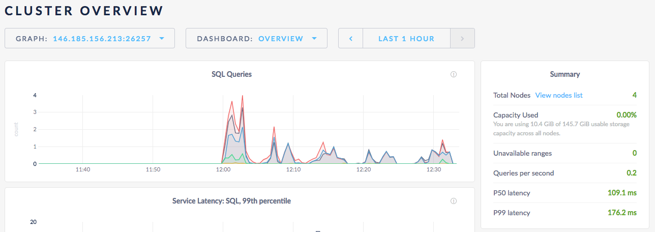
When I do SHOW QUERIES, I can see in a given moment there are at least 6 updates running.
 nstewart
All 15 comments
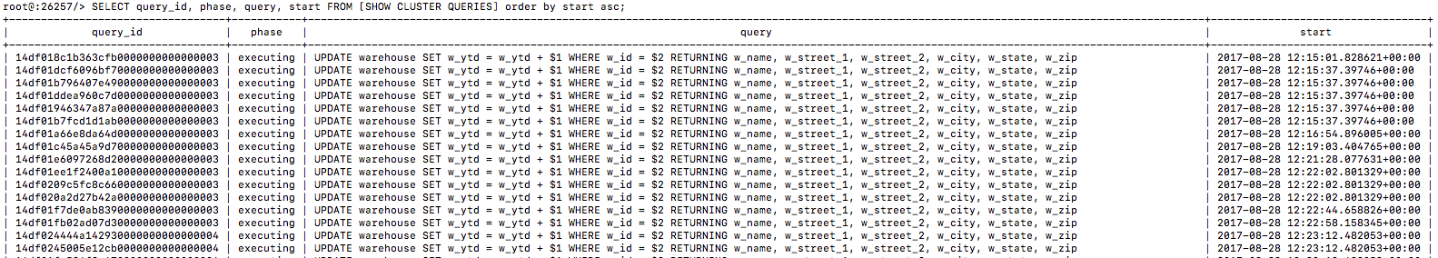
Here's a better view at 12:24:38 there are 15 queries running, for example
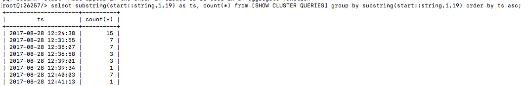
But the chart shows ~3 in that time period
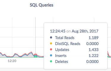
One consideration is that the show queries command shows running commands, not completed commands. What are we actually plotting in this chart?
nstewart
on 28 Aug 2017
The stats are 10s averages. I've criticized that in the past.
On Mon, Aug 28, 2017, 09:02 Nate notifications@github.com wrote:
Here's a better view at 12:24:38 there are 15 queries running, for example
[image: image]
https://user-images.githubusercontent.com/894257/29774415-5a8ef47e-8bcf-11e7-8cb7-57a826536f27.pngBut the chart shows ~3 in that time period
[image: image]
https://user-images.githubusercontent.com/894257/29774402-508a5982-8bcf-11e7-840c-26de997a2af9.pngOne consideration is that the show queries command shows running commands,
not completed commands. What are we actually plotting in this chart?—
You are receiving this because you are subscribed to this thread.
Reply to this email directly, view it on GitHub
https://github.com/cockroachdb/cockroach/issues/17948#issuecomment-325346945,
or mute the thread
https://github.com/notifications/unsubscribe-auth/AE135GIryjXh7ZYD1bmWCusfCIWDkT1Bks5scrpKgaJpZM4PEdtM
.>
-- Tobias
 tbg
on 28 Aug 2017
tbg
on 28 Aug 2017
As you suggested in your second comment, the graph also doesn't show the average number of queries running. It shows the average number of queries that started processing per second.
 a-robinson
on 28 Aug 2017
a-robinson
on 28 Aug 2017
Got it, so the admin UI graph is showing a 10-second rolling average of the # of queries started per second. cc @dianasaur323 -- Let's look back over your user stories and confirm that's what we really want here. In the mean time let's update the labels so this is clear.
nstewart
on 28 Aug 2017
Hm... that's odd behavior. Let me dig into what others show and get back to you on this. It seems to make sense that we are showing # of queries started per second, although that seems to go against a general question someone might have: how many queries are currently running? I think we should create a separate issue for updating the tool tip: https://github.com/cockroachdb/cockroach/issues/17994
 dianasaur323
on 29 Aug 2017
dianasaur323
on 29 Aug 2017
It is impossible to actually determine the rate per second more accurately, without increasing the collections frequency of our metrics to once per second. A few alternatives:
- Increase collections frequency to once per second (I don't think this is a good idea for performance reasons).
- Begin displaying the units we actually collect, which is rate per ten seconds. This was the original choice, but was deemed confusing.
- Display at a lower resolution, such as rate per minute. We could also reduce our collection frequency to once per minute.
 mrtracy
on 5 Sep 2017
mrtracy
on 5 Sep 2017
@mrtracy my understanding is that the issue isn't the lack of resolution, but the inability to grasp from the graphs what's actually being shown. I think one factor in this is that we plot points as opposed to bars. If you have 10 requests at one instant and nothing else, you get a bar of width 10s and height 1. This indicates 1req/s over 10s, which is exactly what we measure (and mathematically it also makes sense because the area under the graph is actually the "real" number of requests).
What I suspect people (including myself) see when they look at the current graphs is a delta function.
If it's not onerous to change to a bar graph (at least experimentally), and if the design folks think that's suitable -- it would solve the problem, at least for me (not sure how representative that is, though).
tbg
on 5 Sep 2017
+1 for "...but the inability to grasp from the graphs what's actually being shown". I'd just make sure we start from what we truly want to show before we switch to a new type of visualization for what we are currently calculating.
nstewart
on 18 Sep 2017
https://honeycomb.io/blog/2017/01/instrumentation-the-first-four-things-you-measure/
some valuable stuff in there
 vivekmenezes
on 18 Sep 2017
vivekmenezes
on 18 Sep 2017
+1 on Tobi's suggestion of a bar graph. Something that looks like this:
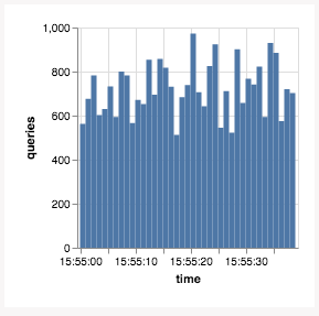
…suggests that "over this time window" (the width of the bar) "there were N queries" (the height of the bar).
If we like this, we should use it for all graphs that are showing a rate (a derivative query on a counter that's always going up). Gauge metrics (values that go up and down over time, e.g. memory usage) would remain lines.
Thoughts, @josueeee?
 vilterp
on 20 Dec 2017
vilterp
on 20 Dec 2017
@vilterp that looks quite nice!
dianasaur323
on 20 Dec 2017
I'd like to go back to the original question of what do we ACTUALLY want to answer here? I think the graph makes sense for what we are currently calculating for the reasons that Toby mentioned, but I do think asking most people to essentially calculate an integral/area under the curve to get # queries running/started is a big cognitive ask for our general UI.
@dianasaur323 or others, how do other tools handle this? just increase the sampling rate?
nstewart
on 21 Dec 2017
From the link I pasted earlier:
1. A counter that is incremented for each request that you start serving.
2. A counter that is incremented for each request that you finished serving, aka responses, labelled by successes or errors.
3. If you feel like it, throw in a gauge that represents the number of ongoing requests (helps identify leaks, deadlocks and other things that prevent progress).
I think this graph was intended to measure inbound qps (1)
vivekmenezes
on 21 Dec 2017
See also #5980
 couchand
on 24 Apr 2018
couchand
on 24 Apr 2018
The situation here is better now; closing due to age.
 jordanlewis
on 6 Oct 2020
jordanlewis
on 6 Oct 2020
Related issues
 intech
·
3Comments
intech
·
3Comments
 ajwerner
·
4Comments
ajwerner
·
4Comments
 awoods187
·
3Comments
jordanlewis
·
4Comments
awoods187
·
3Comments
jordanlewis
·
4Comments
 lwsanty
·
4Comments
lwsanty
·
4Comments