Cockroach: ui: Visually Correlate "Events" with graphs
The Admin UI is currently primarily organized around time series graphs. However, in addition to time series, we currently record major "events" that occur whenever a significant cluster state change occurs. These events currently consist of node membership changes and DDL changes.
Due to the nature of these changes, they may correlate strongly with visible changes in our time series; for example, a node going down temporarily may result in an increase in traffic to other nodes, or a significant amount of rebalancing traffic. Schema changes may result in increased error counts if they break an application, or in the case of large tables may result in a lot of internal traffic to alter an index.
In order to help clarify this to users, we are going to attempt to overlay these events visually on the graphs. Some of these events (such as a new node joining) occur at an immediate instant in time; others, such as a schema change or a node being down, occur over a period of time. In either case, these can be overlaid as vertical markers on our graphs with a time axis.
Three parts to completing this enhancement:
- [x] Ensure that a timestamp (or time range) can be extracted from all events. This is currently possible for all events except for node rejoin; this event is being augmented to record the time that the node went down (in addition to the time when it is coming back up).
- [ ] When displaying events on our dashboard, constrain the events displayed to the currently selected time scale (currently the most recent events are always displayed, even if a custom timescale is selected).
- [ ] Overlay a vertical line or bar over the graphs for each event in the current timescale.
- [ ] Display event information in the interactive tooltip when it hovers over an event on the graph.
There is design work in progress to find an acceptable appearance for the overlays; that may include a decision as to whether events are always visible overlaid, or whether they can be toggled through some mechanism. However, much of the technical work can be
 mrtracy
All 20 comments
I'm in for having these events to be _always_ visible on the timeframe selected, rather than having a toggle.
 kuanluo
on 2 Feb 2017
kuanluo
on 2 Feb 2017
Here's my preferred visual to implement the time range on graphs:
- Left gray one is the normal state
- Right one is the hover state (It would require a single color for the events that we can't use for the line graphs, otherwise it might be confusing.)

Other ideas are:


kuanluo
on 2 Feb 2017
Proposed Alternative Implementation
After some work towards this implementation, we have noticed a few issues with very large numbers of events:
- It is quite common to have a large number of simultaneous events; for example, when installing or upgrading an application, when spinning up a large number of nodes at once, etc. This is exacerbated on wider time-scales, when events that happen rapidly (but not simultaneously) still must be displayed in overlapping fashion. The designs above did not provide a way to handle large numbers of events like this (3+ events at once)
- At very large time scales, even if there are not many overlapping events it is possible to have a very large number of events visible. This was causing problems for the "Events List" which is also on the cluster overview page.
- Similarly, the interactive tooltip when overing over a graph was beginning to display too much information. We have graphs with 5+ series, and in a situation with 3+ events the tooltip was displaying a lot of information, and may become very tall and wide. Because it's position is tied to the mouse, it is also not possible to drill down further into the information.
- Events were being overlaid on each graph individually, which is a lot of additional graphical processing to display the same information.
A proposed alternative solution is to develop a single "events" timeline that will display above the graphs. This would replace "events over graphs", as well as the "events list" on the right-hand summary bar.
- Displays over top of all graphs, and is scroll-locked (like the current page controls).
- Shares interactive guideline with graphs.
- Has multiple modes - hidden, compact, and expanded.
- Compact mode would display one line per type of event; for instance, there would be a single line for any node being down. There would not be additional lines if multiple nodes are down simultaneously. Types of events might be limited to "Node Membership changes" and "Schema Changes" for now.
This control, when designed, would be more insulated from issues arising from large number of events.
Current Work
The current designs are still seen as being adequate for our current goals of supporting 10-node clusters well. Issues with huge number of events do not become intractable until clusters and applications reach a somewhat larger scale. That scale is an inevitable target for our UI, so we are recording this alternative solution here; however, for the 1.0 timescale we are continuing with the current events-on-graph design.
mrtracy
on 7 Mar 2017
@mrtracy
This is what the alternative solution might look like:

Perhaps we can allow some sort of toggles on top of the current implementation to avoid some obvious problems, or make them optional at least. Here's an idea of what that might look like:

kuanluo
on 9 Mar 2017
I like the second (more compact) one better, especially if I can hover over one of those dots and have it tell me about the event or highlight the event in the event list.
 petermattis
on 9 Mar 2017
petermattis
on 9 Mar 2017
That's the plan, @petermattis.

@vivekmenezes suggested to take out the midpoint (diamond icon) of the events, and currently this work is reprioritized to be done after @mrtracy tackles some bugs.
kuanluo
on 10 Mar 2017
moving to 1.1 milestone
 dianasaur323
on 14 Apr 2017
dianasaur323
on 14 Apr 2017
For our 1.2 scope, here are the acceptance criteria that we need to meet. @kuanluo It would be great if we could get a first pass design within the next week or so. Let me know if you need more time.
Acceptance Criteria
- [ ] Visually correlate events with performance metrics
- [ ] Allow navigation over a 30-day time period
- [ ] Surface additional metrics unique to each event
- [ ] Offer users next steps to resolve events
- [ ] Events should be easy to add with repeatable components
- [ ] Should not adversely affect monitoring performance
- [ ] Be able to filter events by table and scope
Supported User Flow
Step 1: Identify that an event occurred at a time period that may or may not have resulted in a change in performance metrics.
Step 2: Dig in deeper to get more actionable insights and context on the event
Step 3: Get pointed towards more information that users can use to take action and resolve the problem.
Feature Specification
- [ ] Node joined or re-joined
- Timestamp
- Node ID / IP Address
- Joined, re-joined, or re-commissioned
- Startup configs
- Action: link to node list
- [ ] Node down
- Timestamp
- Node ID / IP Address
- Down or decommissioned
- Action: link to node list
- [ ] Zone configuration changes
- Timestamp
- Field + New Value (be aware of the edge case if someone puts in a .yaml file)
- Link to cluster overview
- May need to specify an additional field for partitioning
- [ ] Cluster setting change
- Timestamp
- User
- Setting Name + Value
- Link to cluster setting document
- [ ] DDL statements
- Timestamp
- CREATE, DROP [name]
- User
- Link to relevant database view
- [ ] Jobs
- Start time, end time
- Job ID
- Job Status (Succeeded, Canceled, Paused, Resumed, Failed, In Progress)
- Link to Jobs Table and relevant Job ID
- [ ] Event log
- Support navigation and drill down
- Allow users to move back and forth between event log and performance metrics
- Do we still need the front page event log?
- All things shown in the graphs should also be surfaced in the event log
Design States Needed
- [ ] Event module
- [ ] Visual correlation to performance metrics
- [ ] Improved event log
- [ ] Loading states and user flows from event modules to other pages in the UI
Edge Cases
- [ ] What would this design look like for clusters with multiple databases?
- [ ] Multiple nodes / multiple events - what does it look like when you overload the graph?
- [ ] What does this look like for a cluster undergoing chaos?
dianasaur323
on 7 Sep 2017
@kuanluo FYI, I just added in two states for the jobs metrics - paused and resumed. We probably want to surface what this looks like there.
dianasaur323
on 16 Sep 2017
3 main problems with the current design approach
- Stacking of the events on the graph, depending on the number of events, will make the graphs unreadable.
- Mouse cannot hover on top of the tooltip because the hover follows the mouse.
- Event log isn't useful with information truncated.
Alternatives
To address 1, we discussed a heatmap approach where all events are presented on the same height. The darker the color, the more events are overlapping in the same period of time.
To address 2 & 3, the proposal is to make the events in the log clickable. On hover, it will highlight the corresponding event on the graph. Once clicked, it will expand to show the full info.
Conclusions and next steps:
- Team is onboard with the click to expand full event info approach.
- Team agreed that the events in the log should only show the events given the duration in the time selector above.
- Given that we're exploring the cluster viz, and will potentially get rid of the summary box on the monitoring view, @couchand suggested to have the event log be sticky to the top, so graph and event log will have separately scroll bars.
- Per @mrtracy's suggestion, Design will explore 1) having the events at the bottom of the graph, underneath the time axis. 2) option to expand the heatmap into individual lines, when necessary.
- I will schedule a follow-up with the group next week to review the designs.
cc @dianasaur323 @cuongdo @josueeee @Amruta-Ranade
kuanluo
on 29 Sep 2017
Thanks, @kuanluo. All your suggestions sound good. Looking forward to the next round of designs!
dianasaur323
on 29 Sep 2017
Revised designs based on last week's discussion
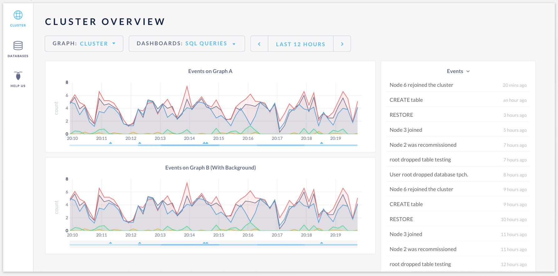
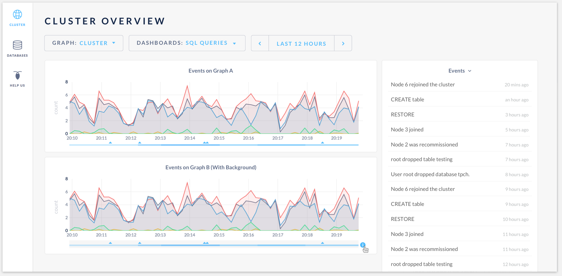
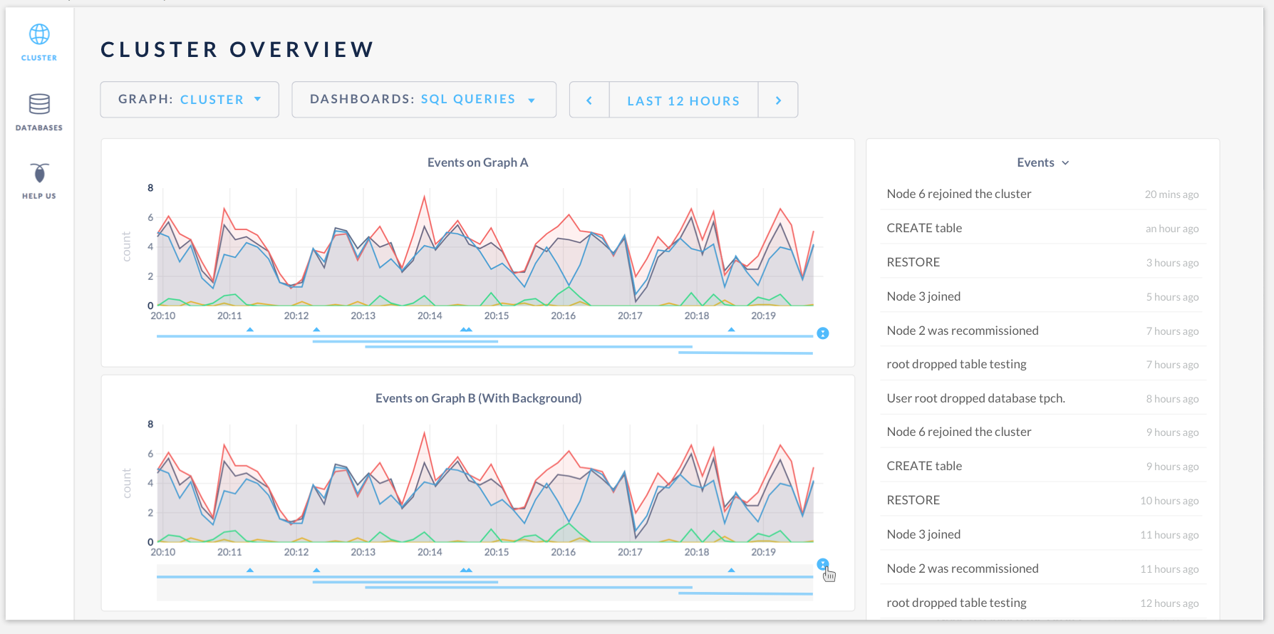
Having events heatmap at the bottom of the time series graph:
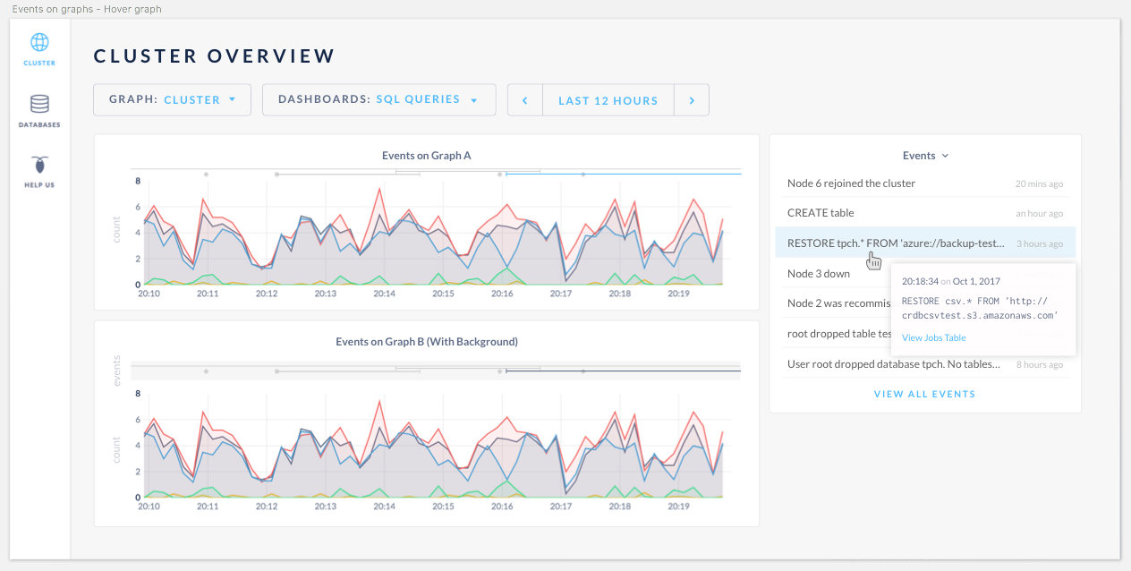
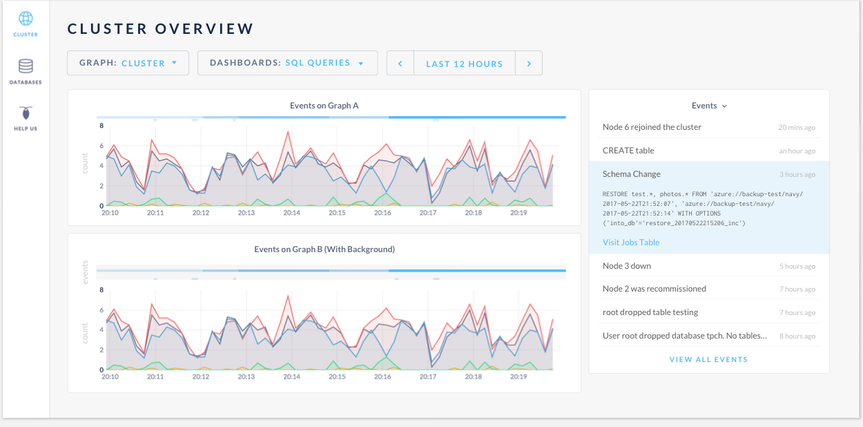
Hovering the events will highlight them in the events log. The tooltip will display graph data as well as the events:
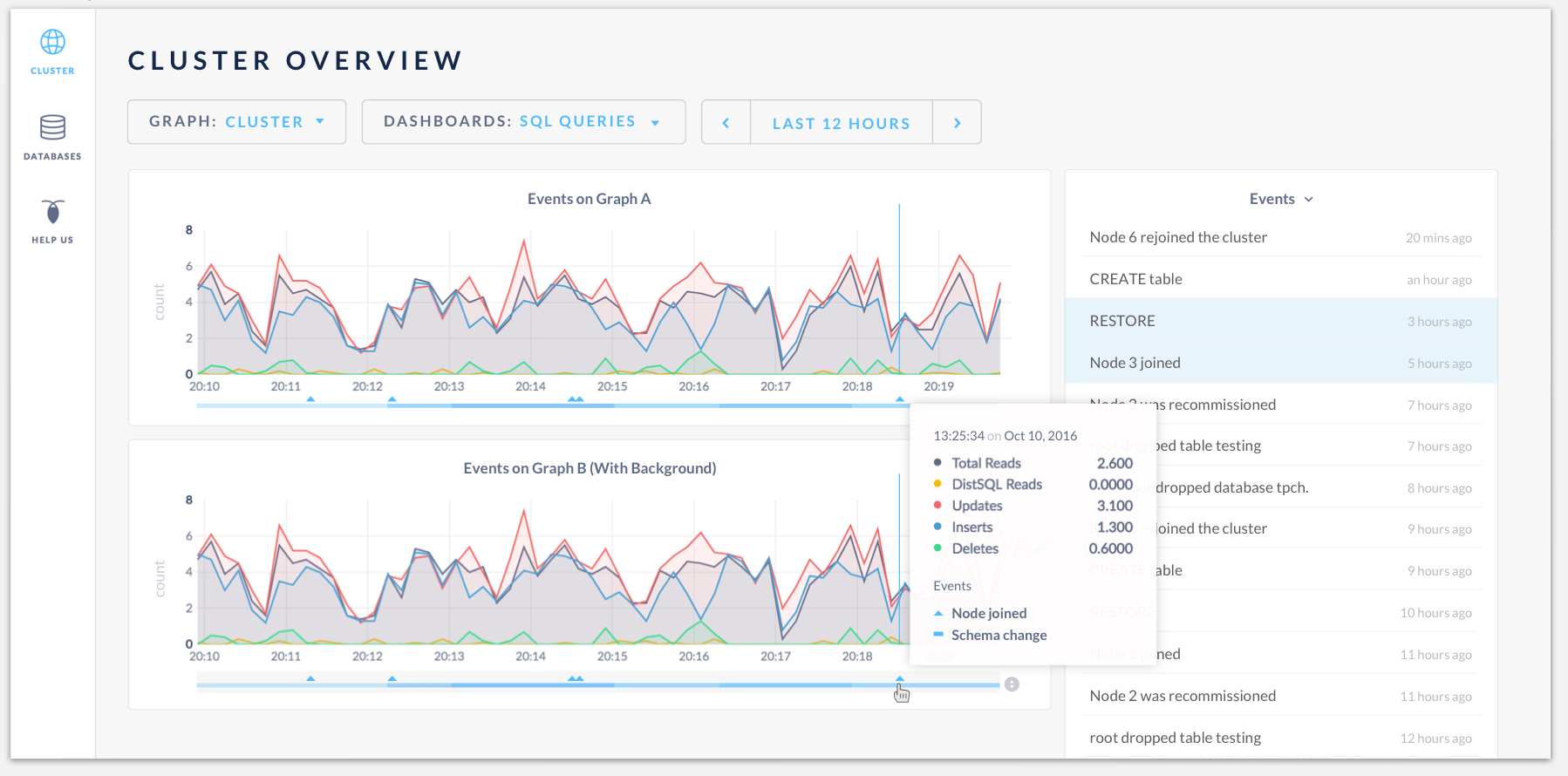
Hovering on the "click to expand" icon:
Click to expand the events:
Conclusions and next steps
- Design for events on graphs is complete. Everyone is onboard with the revised designs.
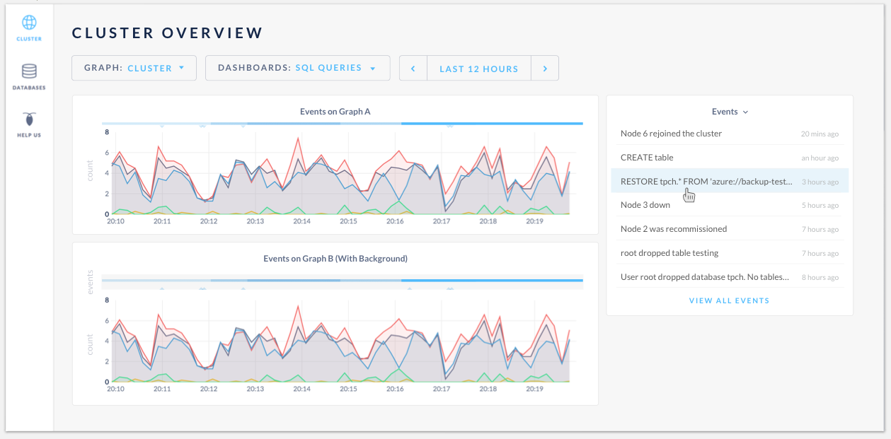
- Team prefers having the gray box as a background for events to create separation from graphs.
- Need input from @Amruta-Ranade and @dianasaur323 to finalize the list of short event titles (schema change, table creation, etc) to categorize all types of events for the event log, so when user clicks on the event, the cell will expand to have more info. The event titles should be short and descriptive enough to not truncate in the space, but gives users good clue of what event it is.
- Having the event log corresponding to the time selector opened up a question whether the full event log page is useful. @couchand brought up an excellent point of combining all event pages (events, jobs and future schema change, etc) into one log, but this is a separate conversation, and I created a new issue #19071 for that.
- @mrtracy is going to work on the feature, and Design will move the mocks to a final sketch file.
kuanluo
on 5 Oct 2017
This looks nice!
 cuongdo
on 6 Oct 2017
cuongdo
on 6 Oct 2017
@kuanluo this looks great, and we can finalize text in your sketch file. I think a full event log is still useful, so we still need that page. I believe we also wanted an expanded view in the event log side bar, so that users could expand that and see more info? It looks like it's included in an alternative view in an issue above. Is that going to be included in the sketch file? I have noticed that sometimes we are missing some edge cases in the user flow when we build out some admin UI pieces (thinking of the jobs table last time), so lets make sure to capture those this time around.
dianasaur323
on 9 Oct 2017
Yes, @dianasaur323 thanks for bringing that up. The "click to view full event details + actionable links" will be included in the sketch file.
kuanluo
on 9 Oct 2017
I'll just go ahead and register my dissenting opinion here that I don't think the gray background adds any value, I think it looks cleaner without it. Otherwise I think this looks great.
 couchand
on 10 Oct 2017
couchand
on 10 Oct 2017
List of events (Need UI text for these):
case eventTypes.CREATE_DATABASE:
case eventTypes.DROP_DATABASE:
case eventTypes.CREATE_TABLE:
case eventTypes.DROP_TABLE:
case eventTypes.ALTER_TABLE:
case eventTypes.CREATE_INDEX:
case eventTypes.DROP_INDEX:
case eventTypes.CREATE_VIEW:
case eventTypes.DROP_VIEW:
case eventTypes.REVERSE_SCHEMA_CHANGE:
case eventTypes.FINISH_SCHEMA_CHANGE:
case eventTypes.NODE_JOIN:
case eventTypes.NODE_DECOMMISSIONED:
case eventTypes.NODE_RECOMMISSIONED:
case eventTypes.NODE_RESTART:
case eventTypes.SET_CLUSTER_SETTING:
 Amruta-Ranade
on 10 Oct 2017
Amruta-Ranade
on 10 Oct 2017
I agree, I don't like the grey background. Thanks for adding that, Amruta. Helpful.
dianasaur323
on 10 Oct 2017
Ok @kuanluo, here are the flows that we can cover with users:
Let's go with the three user flows described in the acceptance criteria comment above. Namely, for each of the below scenarios, we should ask them to identify an issue, dig in deeper to understand the issue, and identify where they would go next after identifying the issue.
Scenario 1: backup causes fall in SQL queries
Scenario 2: node failure causes SQL queries for that node to go to zero before it recovers. Overlay this with a bunch of schema changes and backup and restore events to see if user can parse things out
Scenario 3: A node failure occurred yesterday. See how user expects time selection changes to effect the event log.
That should be good enough for now. Open to comments from anyone else who might have an opinion on this.
dianasaur323
on 13 Oct 2017
Moving this into our next release for now :'(
dianasaur323
on 13 Dec 2017
Related issues
 HeikoOnnebrink
·
4Comments
HeikoOnnebrink
·
4Comments
 tim-o
·
3Comments
tim-o
·
3Comments
 mjibson
·
3Comments
mjibson
·
3Comments
 ajwerner
·
4Comments
ajwerner
·
4Comments
 richardanaya
·
3Comments
richardanaya
·
3Comments