Cockpit: services: Redesign service states
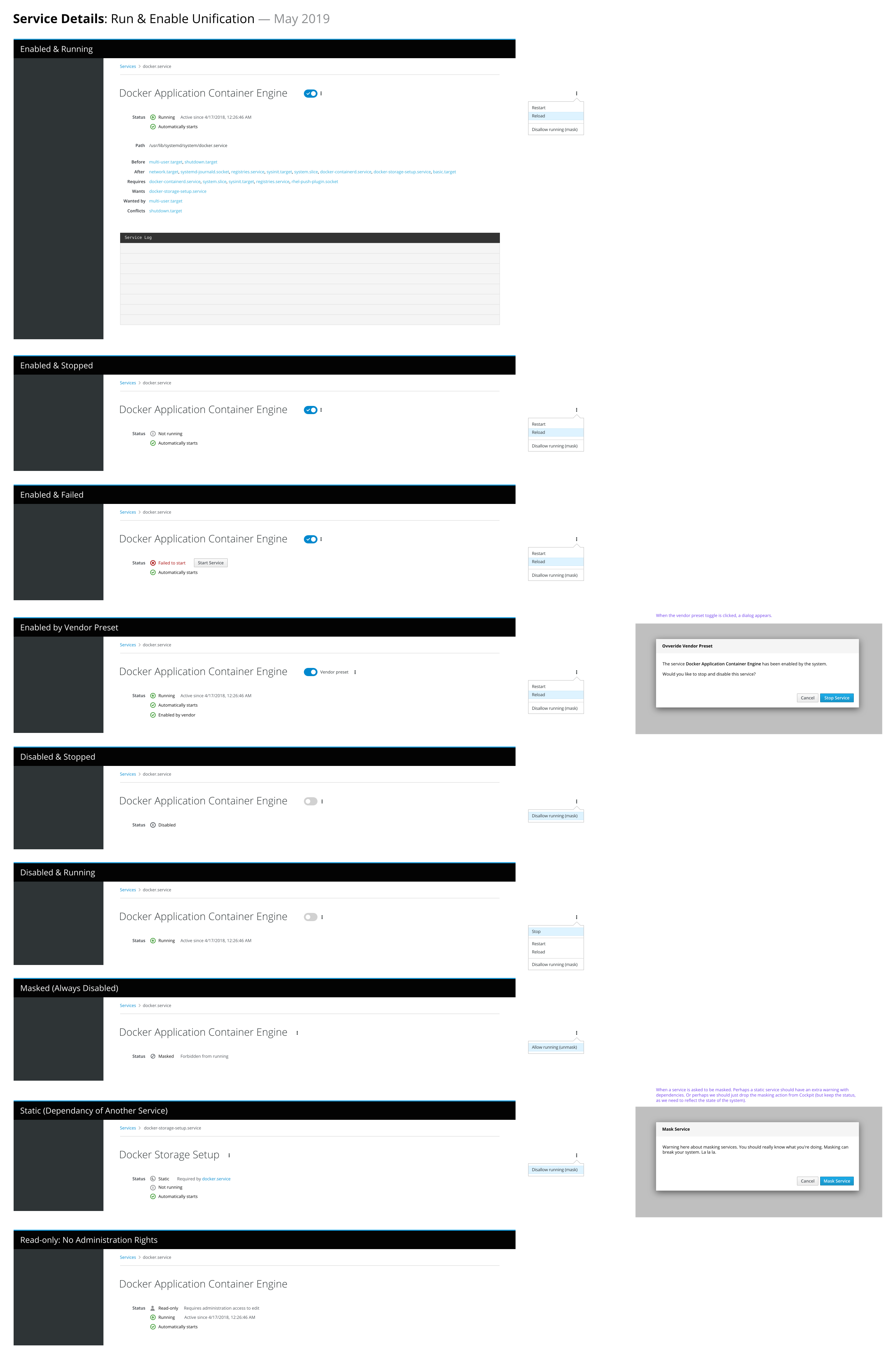
The service page should unify the concept of starting and enabling, make the current status clear, and show easier to understand messaging using simple explanations.
Anything done from Cockpit should keep both enable/disable and start/stop in unison. The status area can show when the two states are desynchronized and provides ways to bring them back into alignment (often with the toggle, but sometimes with a dropdown action or a contextual button).
The overall list needs to be reworked to reflect these changes too. I'll design that next and add it to this issue soon.
Details Page
This should show pretty much every state possible:
Services List
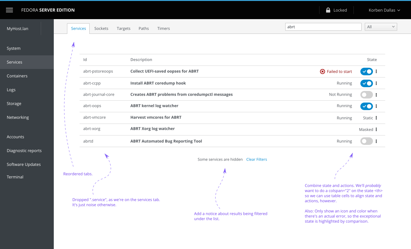
Refreshed to bring it in line with the details page:

 garrett
All 19 comments
BTW: The dialogs show up in cases where an action is not a simple enable/disable + start/stop, but would require more changes (changing a preset, masking, or unmasking).
Language may change. And I should probably make the masking dialog styled more like a warning, as it _could_ break the system.
garrett
on 16 May 2019
I'm just lurking here, but FWIW, I find the wording in the "Mask Service" dialog confusing.
"Would you like to mask Docker Storage Setup" to prevent the service from running?
Which service does "the service" refer to? (The dependent service, or the "dependee") What's the impact of this choice?
Also how does one "disable" (rather than "mask") a service from these dialogs? Or maybe I'm misunderstanding? (Is there a state transition diagram somewhere?)
Thanks; hope this is constructive.
 davidmalcolm
on 16 May 2019
davidmalcolm
on 16 May 2019
@davidmalcolm: Thanks for your feedback! Yeah, you're right.
I threw together the dialogs quickly to illustrate the concept. They need more work, especially with the language.
After talking a bit more with others, including people from the systemd team, I think we might drop the whole masking and unmasking actions from within Cockpit. Lennart says it's for "super gurus", after all.
Of course, we still need to have masked states represented in Cockpit, but it would probably just be read-only.
I'll adjust the mockup to match next week (Monday, most likely).
A state transition diagram is a good idea. I have one trapped in my head; I just need to draw it out. :wink:
garrett
on 16 May 2019
In the string _Unmask(enable running)_ is that related to _systemctl enable_?
If not, _allow_ would be a more suitable verb to _prevent_
 andreasn
on 17 May 2019
andreasn
on 17 May 2019
From systemctl's man page:
mask UNIT...
    Mask one or more units, as specified on the command line. This will link these unit files to /dev/null, making it impossible to start them.
    This is a stronger version of disable, since it prohibits all kinds of activation of the unit, including enablement and manual activation.
    Use this option with care. This honors the --runtime option to only mask temporarily until the next reboot of the system. The --now option
    may be used to ensure that the units are also stopped. This command expects valid unit names only, it does not accept unit file paths.

unmask UNIT...
    Unmask one or more unit files, as specified on the command line. This will undo the effect of mask. This command expects valid unit names
    only, it does not accept unit file paths.
 larskarlitski
on 17 May 2019
larskarlitski
on 17 May 2019
We could flip the wording around to be friendly with a verb first and have the actual command be in parenthesis. Perhaps re-word "enable" too, as it would be overloaded.
- "Allow running (unmask)"
- "Disallow running (mask)"
But still, if Lennart thinks we should drop masking, then perhaps we should. Or we could have a compromise and have the actions in the dropdown only (and not be reflected in the toggle whatsoever).
garrett
on 20 May 2019
We could flip the wording around to be friendly with a verb first and have the actual command be in parenthesis. Perhaps re-word "enable" too, as it would be overloaded.
Sounds good to me.
andreasn
on 20 May 2019
Added refreshed services list in the main comment.
I cleaned up a few details while I was at it. Comments are on the mockup itself, in purple, with arrows. We can re-order and drop the .services either in the same issue+PR (as they're minor) or in a follow-up (as they're not completely related, unless we consider it all a refresh of the services page).
Context menu would be the same as in the details page. The actions are a shortcut, eliminating the need to visit the details page, unless one wants to see actual details. This should make starting/stopping/enabling/disabling/restarting/reloading services much clearer & easier.
garrett
on 21 May 2019
Hmm, perhaps the filter clear "link" should be a button? It doesn't go anywhere, unless you consider the full list as a place... which you _could_. It's debatable. A link happens to be less heavyweight too; that's why I used it.
We could just ignore that part of the design (or I could remove it), as it looks like it is not in PF4.
garrett
on 21 May 2019
I've updated the service details mockup with tweaks suggested in this issue thread. As the mockups are hotlinked above, they should both be at the latest versions.
garrett
on 21 May 2019
@marusak: Is this something you would be interested in implementing?
 martinpitt
on 27 Jun 2019
martinpitt
on 27 Jun 2019
@marusak: Is this something you would be interested in implementing?
Yes, very much so :)
 marusak
on 27 Jun 2019
marusak
on 27 Jun 2019
Mostly implemented by #12265, the "vendor" stuff was not yet implemented nor changes on the overview page.
marusak
on 21 Jul 2019
I did a quick update of the services page mockup, to move the error'd services to the top:
garrett
on 1 Oct 2019
It would be nice to complete the redesign. Right now, the overview and status pages are out of sync.
garrett
on 1 Oct 2019
It would be nice to complete the redesign. Right now, the overview and status pages are out of sync.
When redesigning and getting dirty with the code, it is definitely worth writing it in react.
I think it should not be that big task. I am interested to do it when I find some spare time :)
marusak
on 1 Oct 2019
@marusak I've added it to the agenda for today's weekly meeting. I'd like it to be a card in the sprint.
Also, as the design is from the PF3 era, we might need to reconsider what it would look like in PF4 too. This would probably affect the header area and such. The general design would probably still stand just fine.
We'll probably want to attach the filtering to the list like this PF pattern, as seen in the toolbar design docs:

It could wind up resembling something kind of like this (old) PF4 mockup:
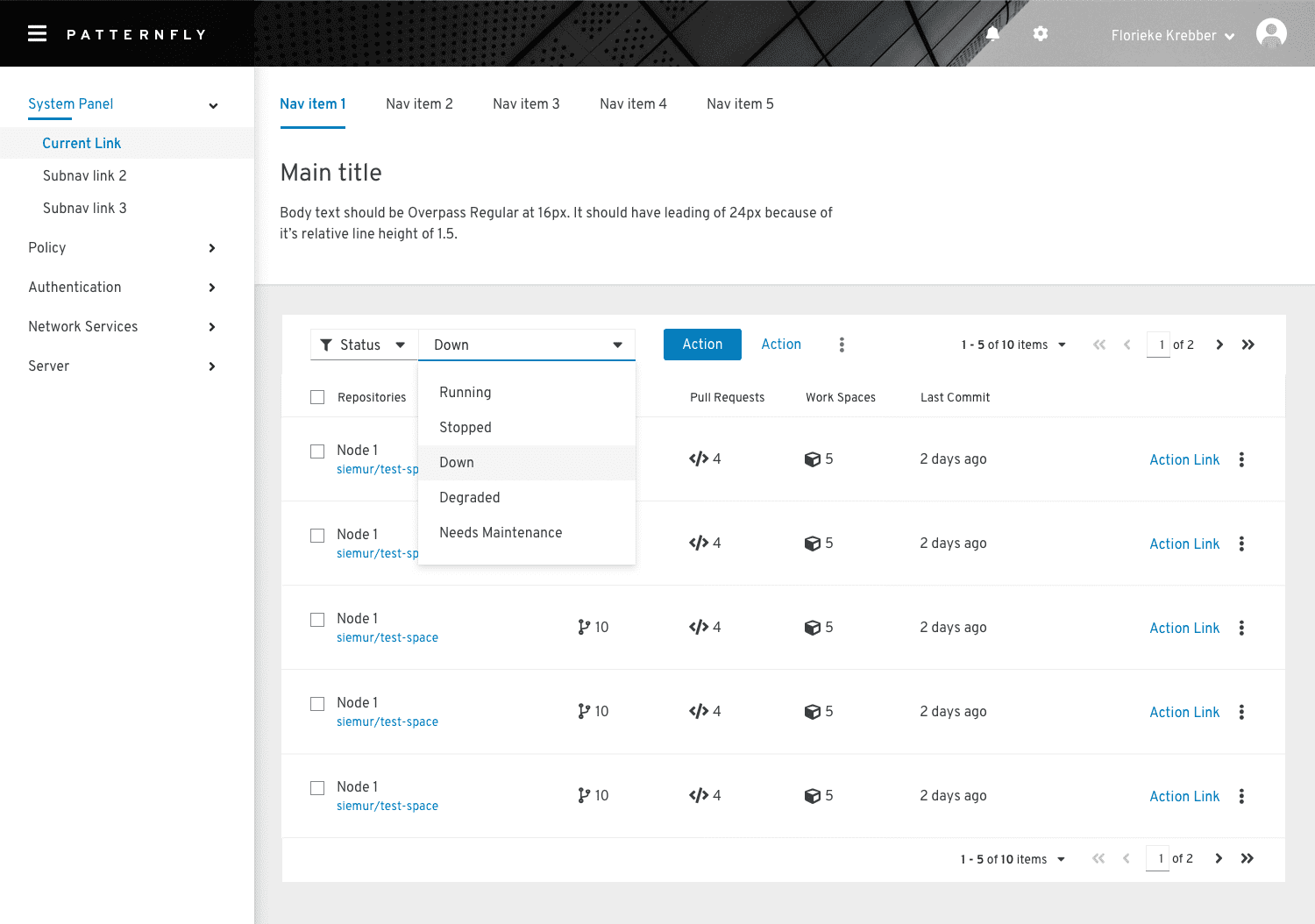
Disregard the style and the actual contents of the mockup (especially the list).
The important parts, which still stand, are:
- Tertiary nav items at the top (not tabs)
- Heading with description (we may want to consider this... or perhaps not; I consider it optional)
- List in a card
- Filtering on the list
I strongly suggest we do _not_ do pagination. It causes all sorts of issues and is unneded for our use. It's in the PF4 mockup because some apps use pagination, so they're showing all the possibilities together.
garrett
on 2 Oct 2019
I've updated the list mockup to be more in line with PF4. It now includes correct fonts and the tertiary (in-page, nav "tabs") navigation.
garrett
on 3 Mar 2020
This has been implemented in #13695
Any follow ups should be tracked separately.
marusak
on 6 May 2020
Related issues
 Viktova
·
4Comments
Viktova
·
4Comments
 MauriceNorden
·
3Comments
MauriceNorden
·
3Comments
 daniel-wtd
·
8Comments
daniel-wtd
·
8Comments
 Discusal
·
4Comments
Discusal
·
4Comments
 FireDrunk
·
6Comments
FireDrunk
·
6Comments