Cockpit: implement form grid for dialogs
This is for PR #10688, and intended to be done in a generic way to simplify our HTML and do auto-layout and align everything properly (both vertically & horizontally).
 garrett
All 13 comments
I made a sketch on how this could work with CSS grid, but it's a rough example of how it could work. Don't worry if it looks messy or complicated, I'll make sure it isn't. (This is just trying to figure out if it could make sense and how it might work.
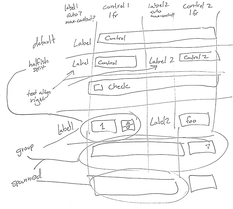
Assumptions:
- We basically have label on the left and then a control for the rest of the space by default.
- If we split the width, we'd just do so once. (More-or-less in half. Right?)
- We want form grouping to associate elements with one another.
- Alignment would be handled automatically.
In most cases, the HTML+React would probably look similar to this pseudocode:
<form class="form-grid">
  <label for="text1">Text input 1</label>
  <input id="text1" value="foo">

  <label for="text2">Text input 2</label>
  <input id="text2" class="form-grid-split" value="foo">

  <label for="text3">Text input 3</label>
  <input id="text3" value="foo">

  <label for="group1">Group1</label>
  <fieldset id="group1">
    <label><input type="checkbox">One</label>
    <label><input type="checkbox">Two</label>
    <label><input type="checkbox">Three</label>
  </fieldset>
</form>
And this would make something that looks like:
Label1 | Control1 | Label2 | Control2
--: | -- | -- | --
_Text input 1_ | [_____ | __________ | _____]
_Text input 2_ | [_____] | _Text input 3_ | [_____]
_Group 1_ | ☑ One | ☑ Two | ☑ Three
(The last 3 columns in row 1 & 3 would span fully across.)
The part you really would need to care about is the HTML and how simple it is. There's no column splitting, no sizing, or anything. I think I can make it where you do the split only on the first control element (or control group, which would be a fieldset probably).
garrett
on 29 Nov 2018
FWIW: This is designed to use CSS grid. I'm not sure if I made that clear enough in the above text. :wink:
garrett
on 29 Nov 2018
Example HTML+CSS preview of this concept: https://garrett.github.io/cockpit-mockweb/forms/grid
garrett
on 29 Nov 2018
Notes:
Perhaps we should remove "grid" from the name. The goal is to do auto-layout without having to worry about additional markup or classes (for the most part) — and everything should just _automatically_ work. Perhaps something like
form-autoorform-layoutwould be better? It should be short and easy to remember.It's neat for the demo that the split (
form-grid-splitabove) automatically splits the form in half and puts the next item and its label into the grid half-way — but in real life, we sometimes want half the size for the form and then a full widget. Therefore, there shouldn't be this much magic. _Additional half-width elements should be explicit._Perhaps this should be extended to 3-up instead of 2-up and splits should be thirds? And it defaults to half unless the third column is used? Or we use a 2-up by default and there could be a 3-up variant with an alternate classname in the
<form>element? I'm going to look into this.- The big question is if we actually might want to horizontally stack 3 widgets and their labels into the grid next to each other, or if 2 is enough.
- Of course, the fieldset grouping would be immune from grid placement. We could have it do alignment with a sub-grid relative with itself though, if desired.
garrett
on 3 Dec 2018
Next step is to implement a few dialogs.
First, implement the dialogs in https://github.com/cockpit-project/cockpit/pull/10688#issuecomment-442112609 (what this was originally intended for)
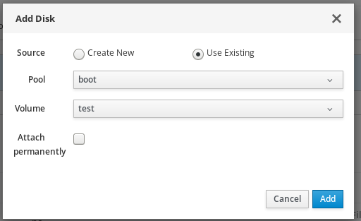
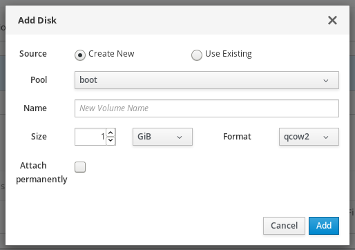
When implemented, it will look a little different from the above screenshots, but it'll be the same general idea.
It would be nice to also implement a few others just to be sure this works well enough elsewhere. Any contenders?
To me, these look interesting:
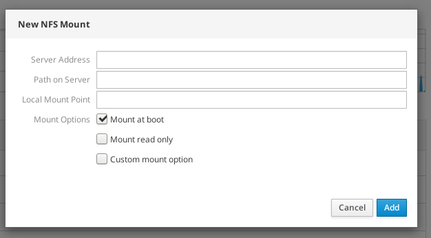
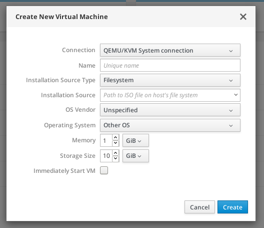
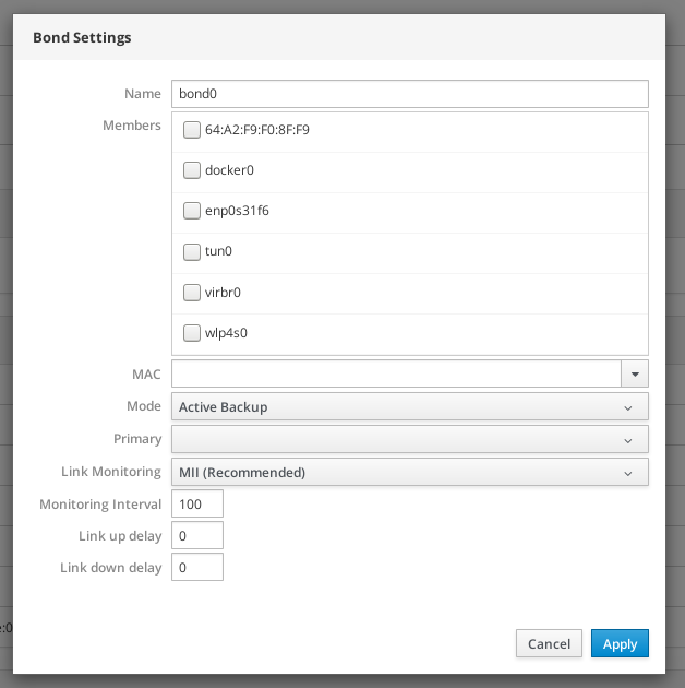
Elements still needed:
- Vertical spacer
- Should this be based on an
<hr>? Or should it just be an additional class, empty div with a class or something else? (I think an HR makes sense, as it is a separator semantically and would mean something in screen readers... it could/should be restyled to not be visible outside of the the space it takes.) If an HR, then should it just be an HR and styled on context or have to have a classname too?
- Should this be based on an
- Relaxed width for elements
- (_Optional_) 3-up grid?
- I haven't seen anywhere else in Cockpit have elements that are 3-up, so 2-up is probably enough, really. I'm happy to be shown somewhere that does have more complex layouts though.
...and I think that's it? Outside of the above comment where splits should only affect the element the class is attached to
Open questions:
- Should we go with the Cockpit style light grey labels (to be consistent with the rest of Cockpit for now) or the PatternFly style dark, bold labels (and also change it globally across Cockpit)?
- ^^^ This is a question directed toward @andreasn mainly.^^^
garrett
on 4 Dec 2018
Should we go with the Cockpit style light grey labels (to be consistent with the rest of Cockpit for now) or the PatternFly style dark, bold labels (and also change it globally across Cockpit)?
Note: Even the screenshots above are inconsistent. The main label style across Cockpit seems to be a similar grey, but it's mixed on whether it is bold or not. I'm happy to keep the styling similar in the layout. (It's most likely just 1 line of CSS, to change the color.) We'll want to do alignment too.
garrett
on 4 Dec 2018
I think we would benefit from moving over to the color used by Patternly. It's also what Composer uses.
I can't quite remember why we decided to override that, but the more we integrate external things, the less attractive the benefit is to go for our own style. Also less custom code to worry about.
 andreasn
on 4 Dec 2018
andreasn
on 4 Dec 2018
@andreasn: I suppose this means we should _probably_ have another PR that removes the custom style. And, ideally, it would probably land before this one? (Although, I noticed a couple of dialogs that are inconsistent already.)
garrett
on 4 Dec 2018
Right, the ones that uses react are using the patternfly style already. Separate PR sounds good to me.
andreasn
on 4 Dec 2018
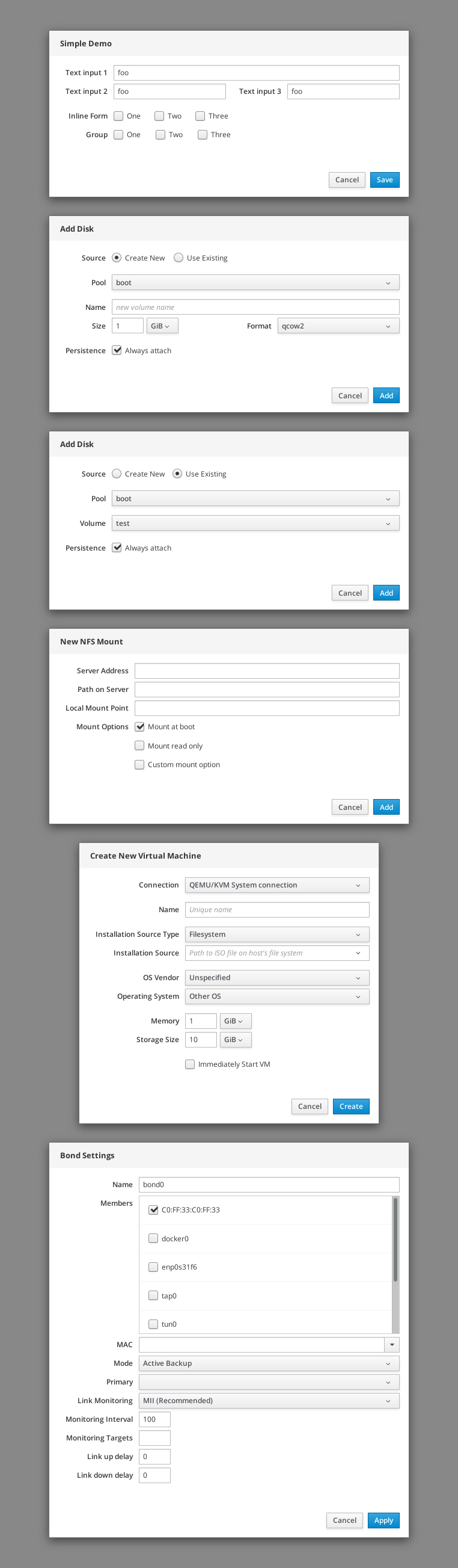
OK, I've implemented every dialog that I referenced above and updated the preview link @ https://garrett.github.io/cockpit-mockweb/forms/grid
When porting the dialogs over, I removed SO MUCH HACKY HTML. You wouldn't believe it.
Here's an actual screenshot of the dialogs being laid out with the grid-based forms auto layout CSS:
garrett
on 5 Dec 2018
I think there are only a few more things to do:
- [x] Handle smaller widths better!
- Mainly for mobile / narrow mode
- I had this working in-browser, but a lot of stuff changed since, so I removed it and need to implement it again. It's probably just a line or two. Super simple. We should be mostly there already, thanks to grid and intrinsic sizing.
- This is mainly for the side-by-side elements that should wrap to be vertical instead.
- [x] Comments!
- I don't want to be the only person who understands how this works. :wink:
- [x] Documentation!
- Possibly as comments. It might be enough to have it in the CSS/LESS file. It's actually really simple to use.
- [x] Integration!
- I need to get this into Cockpit and push up a PR.
garrett
on 5 Dec 2018
Checking the TODO list: Responsiveness, comments, and docs
Today, I've added responsiveness and commented the CSS, as outlined in the TODO. I've also ported the SASS to SCSS, which is Jekyll-friendly and mainly similar to LESS, which should make porting to Cockpit itself pretty easy. (The main change is that we probably want to redefine some spacing as PatternFly variables.)
SCSS: https://github.com/garrett/cockpit-mockweb/blob/master/forms/grid.scss
The documentation is in the file, inline with comments that should not be compiled into the resulting CSS.
Playground?
@KKoukiou mentioned that we probably want to have an example section in the playground. But this is also simple enough that it should become evident once we port a few forms over.
Future: 3-up?
I haven't added 3-up forms yet, but it should be super-easy (if/when we decide to do so — if it is even a good idea), especially since the CSS uses a variable to change the # of times it repeats.
Integration into Cockpit
As for integration, I think it should live in pkg/lib/form-layout.less. It could be included by default as one of our stock bits of CSS or pulled in on a case-by-case basis. Regardless, using it is an opt-in, as none of it applies unless the form element (or another container element) adds ct-form-layout... then the magic happens.
I think the way this should happen is by making a PR to add the file in the mentioned location. Then we'll port over a form or two and see how well it works inside of Cockpit.
garrett
on 10 Dec 2018
Cockpit implementation-in-progress is in PR #10793.
garrett
on 10 Dec 2018
Related issues
 vazquezrodjoel
·
8Comments
vazquezrodjoel
·
8Comments
 tmjpugh
·
8Comments
tmjpugh
·
8Comments
 digitalformula
·
3Comments
digitalformula
·
3Comments
 cedroid09
·
5Comments
cedroid09
·
5Comments
 daniel-wtd
·
8Comments
daniel-wtd
·
8Comments