Cms: Entry Publishing UX Improvements (listing drafts)
So 3.6.3 (and 3.6.4) were released with a few draft publishing improvements.
What was the issue before 3.6.3?
3.6.3 tried to address two issues: #7401 and #7473.
To make it short, drafts were only listed in a Drafts menu and not directly visible in the default entry list, so when we were saving a draft, we were sent back to a list where the just edited entry was not listed. Plus, there were no way to know if an entry had any drafts pending.
What 3.6.3 (and 3.6.4) did to address these?
3.6.3 moved drafts entries (the ones without a source entry, new unpublished entries) to the default list, adding a large DRAFT tag toward the end of the entry title. 3.6.4 tried to refine this by removing the publish status (the colored dots) for drafts but made things worse because it’s actually lying (a draft can be prepared for live or pending when published but appears in the list as deactivated).
3.6.3 also added an optional drafts column to list pending drafts for published entries.
3.6.5 should go further! (What’s wrong with the way it is?) ;)
So does this work? In a way, yes, it’s better than what it was. But it feels like patching something that deserves to be rethought. Let’s try and start over:
Every entry starts life as a draft (multiple first drafts should be allowed, but that’s for another improvement issue).
So it makes sense that the default entries list should show these working copies. 3.6.3 shows that we agree on this.
But every published entry can start a new life as a draft (or multiple drafts).
So i make the case that the default entries list should show these drafts as well as they represent a work in progress. And that should be forced on the user in the same way it is for a first draft. It shouldn't be just an optional drafts column.
Plus the DRAFT tag feels like old design. That’s not necessarily a bad thing, but it feels like a patch and not something Craft would do (it’s not my fault if you set the bar so high that even good design is not enough good design anymore ;)).
And the drafts column is not very usable, accessing more drafts (+n button) resizes the column unexpectedly... and it looses precious horizontal space for something that shouldn’t be an option.
So which challenges must we overcome?
It should be glanceable which entry is published and which entry is a draft. Glanceable but discrete, in a Craft way should i say.
For entries which are published and having a pending draft, it should be clear that this is not only a draft but also an entry with a current status. Going even further, we should be able to easily access the draft version or the source current version depending on which has been edited last.
We should be able to access more drafts should they exist and not only the last saved one directly from the list of entries. And this should apply for first draft entries should you one day implement multiple first drafts.
All of this must be compatible with the structured view (that’s not an easy one).
How do we do it?
I do have some UX and design background so I’ll hasard a proposition.
Often, the simplest design is the most complicated to come by. But the simplest design is also the most effective one. Trade offs must be made and we will have to, like sacrificing some vertical space for entries with drafts.
So I’ll update this post with a mockup (hopefully on Monday) of how I see things, but in a nutshell:
- Use the draft icon in place of the publish status dot for drafts entries. If you think it’s not glanceable enough, make it white in a gray squared rounded box.
- Drop the DRAFT tag in the entry title.
- Append the draft name to the entry title after an em space and em dash to effectively show separation.
- For an entry with a current status (a source entry)
- If the draft’s last updated date is more recent than the source’s one, make the draft the main title (with appended draft name) and show the current (source) entry as a secondary title (below the first one) along with its dot published status.
- Inverse the logic if the dates say so (always show at least the last updated draft).
- Use +n to show more drafts (in the status column ?).
A mockup is worth a thousand words so I’ll report back asap.
More Entry Publishing Improvements
Individual issues still need to be opened, it takes time, I’ll reference them here when I'm done, but I thought I'd list them briefly:
- Every publishing status is a plain colored dot except for disabled which is a gray circle. This wouldn’t be an issue if you didn’t use the same circle for « all ». I suggest making disable a full gray dot to differentiate it.
- Trashed entries should be viewable so that we can check it before restoring (the same way revisions are).
- Trashed entries and revisions should be restored as drafts so that if their status was live then, we can restore them safely, modify them if needed, and then publish them again. It would make the actual behavior two steps (restore > publish).
- Enabling a draft should check for required fields while still allowing for saving. So that publishing a live draft would reduce the possibility of a field missing. This could be implemented with a warning message (and icon next to the green automatic save) as well as display the error message for all the concerned required fields.
- We should ponder the option for allowing to unpublish an entry (back to a draft version).
- Publishing a draft should offer the option to remove all other pending drafts in order to keep the entry as much uncluttered as possible.
- Allow for multiple first drafts to foster ideas, initiative and collaboration.
Thanx for reading thus far (English is not my mother tongue so BIG thanx actually).
 JeanLucEsser
All 8 comments
Thanks for the feedback! I’d love to see the mockup, but here are my thoughts based on what you‘ve said, in case it saves you some time.
3.6.4 tried to refine this by removing the publish status (the colored dots) for drafts but made things worse because it’s actually lying (a draft can be prepared for live or pending when published but appears in the list as deactivated).
This is how I felt at first. I changed it to a nondescript white circle because at _best_ the draft status was just added noise on the entry index view (as it’s not relevant until the draft is published), and at worst it was leading to confusion (as it gave the impression that these draft entries were currently live at first glance). I would say it is now _more_ accurately representing the draft’s status as far as the front-end is concerned, which is how authors are interpreting it.
(multiple first drafts should be allowed, but that’s for another improvement issue)
I highly doubt we could do this in a way that is intuitive.
But every published entry can start a new life as a draft (or multiple drafts).
So i make the case that the default entries list should show these drafts as well as they represent a work in progress.
I disagree. We _have_ to show unpublished drafts in the entry index because that’s all that they are at that point. Listing published entries’ drafts right alongside everything else would add too much noise. I think the new optional “Drafts” column is the ideal UI for showing those.
That said, as of Craft 3.6 it’s possible to define new sources that show drafts of published entries using a module. And we’ll be making entry indexes even more flexible in Craft 4.
And the drafts column is not very usable, accessing more drafts (+n button) resizes the column unexpectedly... and it looses precious horizontal space for something that shouldn’t be an option.
It’s consistent with how we show related elements, if a relational field’s column has been added. And most of the time, you’re just going to want to access the most recently-edited draft, which is the first one that gets listed, so the +X button will rarely need to be clicked.
It should be glanceable which entry is published and which entry is a draft. Glanceable but discrete, in a Craft way should i say.
I‘m not sure that’s possible? _Glanceable_ and _discreet_ are mutually exclusive UI goals.
For entries which are published and having a pending draft, it should be clear that this is not only a draft but also an entry with a current status. Going even further, we should be able to easily access the draft version or the source current version depending on which has been edited last.
I’d say it’s already clear what’s a published entry vs. an unpublished draft, and with the new “Drafts” column it is possible to quickly access publish entries’ most recent drafts.
We should be able to access more drafts should they exist and not only the last saved one directly from the list of entries.
Also possible already via the “Drafts” column.
- Use the draft icon in place of the publish status dot for drafts entries. If you think it’s not glanceable enough, make it white in a gray squared rounded box.
- Drop the DRAFT tag in the entry title.
I did consider this when I added the DRAFT badge, but it would cause the draft entries’ titles to be misaligned with the others, which wouldn’t look right.
- For an entry with a current status (a source entry)
- If the draft’s last updated date is more recent than the source’s one, make the draft the main title (with appended draft name) and show the current (source) entry as a secondary title (below the first one) along with its dot published status.
- Inverse the logic if the dates say so (always show at least the last updated draft).
I’m almost certain this would add confusion, and that our current “Drafts” column is a better UX.
(English is not my mother tongue so BIG thanx actually).
Your English is better than most native English speakers :)
 brandonkelly
on 6 Feb 2021
brandonkelly
on 6 Feb 2021
Thanx for all these comments. Having your side of the story is actually gonna help me for my mockup.
And to try and convince you on some of our disagreements ;)
The main one is about the case of a published entry for which a draft exists.
My reasoning is as follows:
- If the author starts a draft for a published entry, it means it probably wants to replace the published entry at some point when he'll be satisfied with the draft he's working on.
- If the author did start a draft, it also means that this is the way of updating an entry he likely prefers, and there is less a chance that he needs to access the source to update it (except for an emergency or a typo).
- With that in mind, in the entry list, if the draft is more recent than the source, there is a big chance that the author wants to access the draft directly and not the source.
That's the reason why I'm trying so hard to show the most recent draft in the entries list while still showing the current source entry but only as a secondary option. It may add confusion. Only way to be sure is to mock it. Which I'll do ;)
Another big advantage of this is it's immediately obvious for all other authors of which one could be interested in working on this entry that it's already being worked on and he should preferably access the current working draft. It may make the "oops I created a draft and didn't see you already did" a thing of the past.
Another plus of surfacing drafts this way would be to force authors to clean unused drafts.
But that's just an added benefit.
Teaser:
_(btw, for this design to work, it will be better with a new "kind of top" alignment for rows)_
JeanLucEsser
on 6 Feb 2021
If the author starts a draft for a published entry, it means it probably wants to replace the published entry at some point when he'll be satisfied with the draft he's working on.
I feel like this kind of assumes that drafts are always created as a conscious effort by an author. In reality, drafts are often auto-created by Craft due to the author entering live preview, or because they clicked the "New entry" button (and not necessarily because they actually wanted to save or publish anything).
Personally I feel like the current UX is about as clear and intuitive as it can probably be at the moment (the latest 3.x updates have helped a lot). Until there's either a clear distinction between manually created/saved drafts and auto-drafts, or auto-drafts are made more ephemeral in the sense that nothing is created (or persisted) _unless the author makes a conscious decision to create/save it_, I think a lot of these suggestions would add to the confusion and/or frustration in this area.
 mmikkel
on 6 Feb 2021
mmikkel
on 6 Feb 2021
I feel like this kind of assumes that drafts are always created as a conscious effort by an author.
Yes it does. Plus as a new entry, which is obviously a conscious effort.
In reality, drafts are often auto-created by Craft due to the author entering live preview
I totally forgot that live preview created an auto-draft.
Thanx for your input there.
I agree, this makes matter worse and my proposition won't make any sense until this is resolved. Live preview shouldn't create a draft, or at least it shouldn't be visible by the author nor should he be aware of this happening behind the scenes... this doesn't make any sense that I can see. But maybe am I missing something?
A draft should only be created in two situations:
- when creating a new entry
- on an existing entry at the explicit request of the author
JeanLucEsser
on 6 Feb 2021
- With that in mind, in the entry list, if the draft is more recent than the source, there is a big chance that the author wants to access the draft directly and not the source.
I do agree with this. I’ll take it one step further: if an author has an active draft, there’s a good chance that they are more interested in editing that than _any_ other entry.
So maybe the best solution would be to list all of the current user’s active drafts at the top of the table (including new, unpublished drafts), visually separated from the main entry list under a “My Drafts” heading. Then we continue to show normal (published) entries below, just like we currently do (except w/out unpublished drafts).
Until there's either a clear distinction between manually created/saved drafts and auto-drafts, or auto-drafts are made more ephemeral in the sense that nothing is created (or persisted) _unless the author makes a conscious decision to create/save it_, I think a lot of these suggestions would add to the confusion and/or frustration in this area.
That’s a good point (discussed at #6681), though the “My Drafts” table idea would make it easier to clean up unwanted drafts as well, as @JeanLucEsser mentioned. If you don’t actually have any current drafts you care about, you can just select all of your drafts and delete them in one stroke.
brandonkelly
on 8 Feb 2021
if an author has an active draft, there’s a good chance that they are more interested in editing that than any other entry
I agree but in my proposal, the reason I'm showing the current version alongside the draft is to give context to the author as to what is the status of the entry as a whole, is it currently live, is it disabled and should I consider finishing this draft an emergency and so on... I think that if it can be done without too much added confusion, it should be. After all it's only one more line that can be somehow muted in the title section.
list all of the current user’s active drafts at the top of the table (including new, unpublished drafts)
Yeah I thought about this as well. But the issue with this is that a golden rule of UX is that the user should know what to expect from an action before doing this action. And I'm not sure that would be true when filtering or sorting the list, or even searching. Do you keep the top portion of the table when searching? How about when sorting? Or filtering for live entries? Do you include drafts in that case? Or do you include the draft for which the status is live? Or the draft for which a current version exists and is live? This is not so clear cut a decision. And I'm pretty sure that asking ten users you'll get 10 different answers.
And I'm not even talking about the structured view which poses others challenges.
Maybe this top portion of the table wouldn't be at all considered for any searches, sorting or filtering... why not... but then we must be sure that the number of drafts is manageable or it would push the normal entries too far below. For that I'm still not seeing why auto drafts are created when entering live preview (will react on the #6681 issue next / just checked at my largest client the situation on this and I almost felt off my chair).
Thank you for your continued comments on this issue, I think we'll eventually get somewhere here ;)
(Still trying to find time to finish that mockup ^^)
JeanLucEsser
on 9 Feb 2021
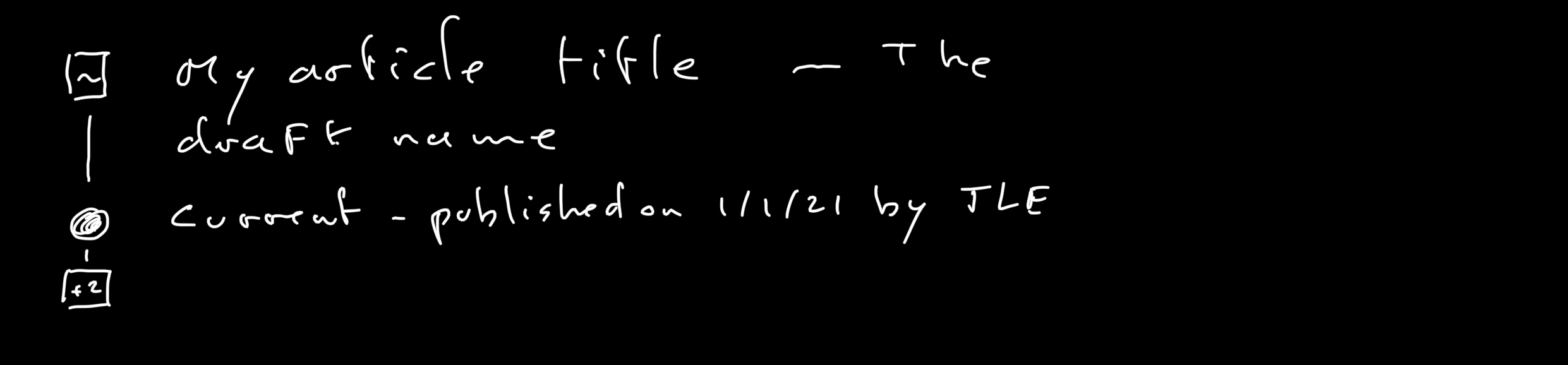
I’ve just made a couple changes for the next release, which I think will be helpful (considering the other issues like #6681).
First, draft styling has been cleaned up in the Entries index page:

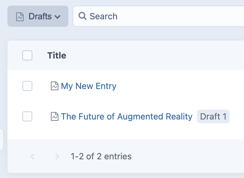
Second, the “Drafts” status now shows all drafts – not just unpublished ones (as originally requested by #6632). Drafts of published entries are distinguished from unpublished drafts because they also display their draft name:
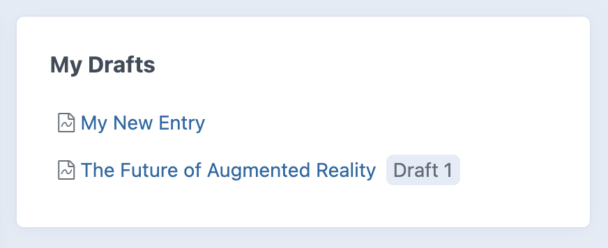
And finally, there’s a new “My Drafts” dashboard widget, which lists the logged-in user’s recently-updated drafts (both unpublished drafts and published entries’ drafts):
There’s still room for improvement, but I suspect these changes (particularly the widget) will help give authors a more direct workflow to accessing and editing drafts they’re working on.
brandonkelly
on 10 Feb 2021
Craft 3.6.5 is out now with those changes ✨
brandonkelly
on 10 Feb 2021
Related issues
 mattstein
·
3Comments
mattstein
·
3Comments
 michaelhue
·
3Comments
michaelhue
·
3Comments
 davist11
·
3Comments
davist11
·
3Comments
 leigeber
·
3Comments
brandonkelly
·
3Comments
leigeber
·
3Comments
brandonkelly
·
3Comments