Cms: Inappropriate state for the My account button
Wrong state conveyed to screen reader users
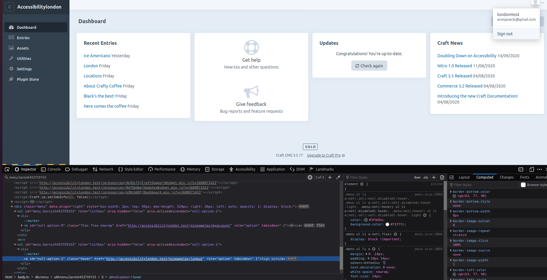
I ran into an issue where the My account button was indicating the expanded state when the menu was collapsed (image below)
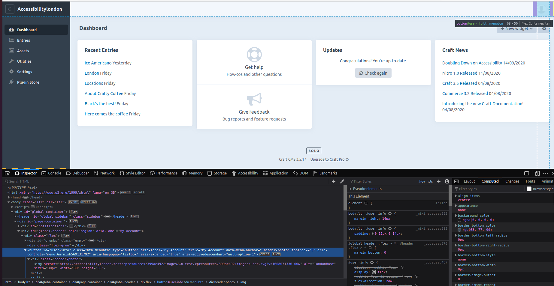
The menu that expand has two elements with the role="listbox" that have children with role="option". Technically, aria 1.2 requires elements with that role to have aria-selected.
My recommendation is not to userole="listbox". They imply that you may choose an option and the options are static (not links- something like the <select> element). The role="menu" seems more appropriate. Github has a nice pattern which could be replicated. Something in the lines of:
<details>
  <summary aria-label="My account"><img alt="ajanec01" /></summary>
  <details role="menu">
    <a href="#" role="menuitem"></a>
  </details>
</details>
Additional info
- Craft version: 3.5.17.1
 ajanec01
All 5 comments
Agreed, this should be changed to an ARIA menu.
 missmatsuko
on 19 Dec 2020
missmatsuko
on 19 Dec 2020
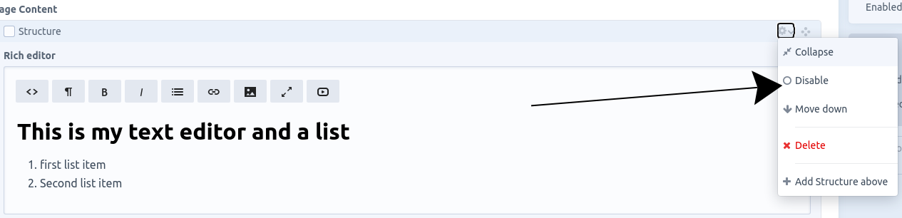
Are you looking at the redactor plugin as well? I've noticed the same pattern in there too. There're also other issues , e.g. lack of aria-expanded on menu buttons. I will test it a bit more over the next few days and try to squeeze everything into one issue. I'll do it in the redactor repo but I thought I would let you know too.
ajanec01
on 20 Dec 2020
Sorry, got a bit confused, the action menu element seems to be part of Craft interface and not redactor.
ajanec01
on 20 Dec 2020
No worries!
Redactor is a third-party plugin that makes up the WYSIWYG editor part of that screenshot.
Yes, we should update that dropdown as well. Appreciate your feedback!
missmatsuko
on 21 Dec 2020
Just run the assets page through the validator. There is one issue for parsing criterion. More of nitpicking- there is a div inside the My account button. A technical issue that will have no effect on sr but I thought I should raise it.
ajanec01
on 9 Jan 2021
Related issues
 Mosnar
·
3Comments
Mosnar
·
3Comments
 darylknight
·
3Comments
darylknight
·
3Comments
 richhayler
·
3Comments
richhayler
·
3Comments
 angrybrad
·
3Comments
angrybrad
·
3Comments
 leigeber
·
3Comments
leigeber
·
3Comments