Cms: Re-consider the UI for custom on/off states for lightswitches
Description
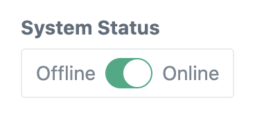
This is visually ugly and confusing. It just doesn't work having two labels with an associated input in the middle.
Can I suggest that we keep the lightswitch to the left of the label, and we simply change the label text to match the currently selected value for the on/off state?

 MattWilcox
All 7 comments
That said, suggested solution may _also_ be confusing. Hmmm.
MattWilcox
on 18 Aug 2020
Ugly maybe – especially if placed beside another field as you’ve got it in the screenshot – but not sure I agree with it being confusing. Seems pretty straightforward to me. Only showing one label would lead to confusion though.
 brandonkelly
on 19 Aug 2020
brandonkelly
on 19 Aug 2020
Ugly a bad choice of word; "unexpected". Here, the position of the circle is supposed to indicate which label is active... but then we also have the green as a state indicator; which is confusing. What does that mean? This isn't an on:off switch.
I have never seen this style of UI component on a web form before - I also don't have a simple solution other than orientating the toggle vertically and having the on:off labels top and bottom, by the side of a vertical toggle - and ditching the green colour when these labels are used.
MattWilcox
on 19 Aug 2020
I agree; my initial inclination was to only add the right-side label (see https://github.com/craftcms/cms/issues/3741#issuecomment-673169690). It’s been done before though (e.g. https://mdbootstrap.com/docs/jquery/forms/switch/).
brandonkelly
on 21 Aug 2020
Just slightly restyled Lightswitch fields when they have ON/OFF labels. Looks less ugly now :)
brandonkelly
on 27 Aug 2020
Looks tidier, nice one thanks.
MattWilcox
on 1 Sep 2020
Craft 3.5.8 is out now with that change.
brandonkelly
on 1 Sep 2020
Related issues
 mccombs
·
3Comments
mccombs
·
3Comments
 benface
·
3Comments
benface
·
3Comments
 timkelty
·
3Comments
timkelty
·
3Comments
 davist11
·
3Comments
davist11
·
3Comments
 richhayler
·
3Comments
richhayler
·
3Comments
Most helpful comment
Craft 3.5.8 is out now with that change.