Cms: UX: Improve matrix field bar visibility issues introduced in 3.4 theme updates
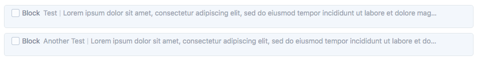
With Craft 3.4, matrix field "settings" dropdowns and "move" icons are only visible on hover. Also, the color fades into the field, so the bar that you can double click to collapse a block isn't clearly defined.
Craft 2
Craft 3.4

Craft 3.4 (hovered)

I feel like this is a downgrade in usability and the icons should always be visible, and that the bar should stand out against the rest of the field.
 jsunsawyer
All 5 comments
This should also affect the "status" icon when a block is disabled.
jsunsawyer
on 19 Feb 2020
Felt relevant to post this here.
Would you consider adjusting the bottom spacing when a block is collapsed so it appears to be vertically aligned? At the moment it looks top aligned.
 jonleverrier
on 20 Feb 2020
jonleverrier
on 20 Feb 2020
Just improved the look of Matrix fields for the next 3.4 release (probably dropping later today).
@jonleverrier Thanks for pointing that out – fixed that extra padding as well.
 brandonkelly
on 20 Feb 2020
brandonkelly
on 20 Feb 2020
3.4.7 is out now with that change.
brandonkelly
on 20 Feb 2020
Thank you!
 darylknight
on 21 Feb 2020
darylknight
on 21 Feb 2020
Related issues
 Mosnar
·
3Comments
Mosnar
·
3Comments
 angrybrad
·
3Comments
angrybrad
·
3Comments
angrybrad
·
3Comments
angrybrad
·
3Comments
 timkelty
·
3Comments
timkelty
·
3Comments
 mattstein
·
3Comments
mattstein
·
3Comments
Most helpful comment
3.4.7 is out now with that change.