Cms: Vertical alignment of fields inside the table field
Description
A small point... Would you consider vertically aligning all field content in the table field to the top?
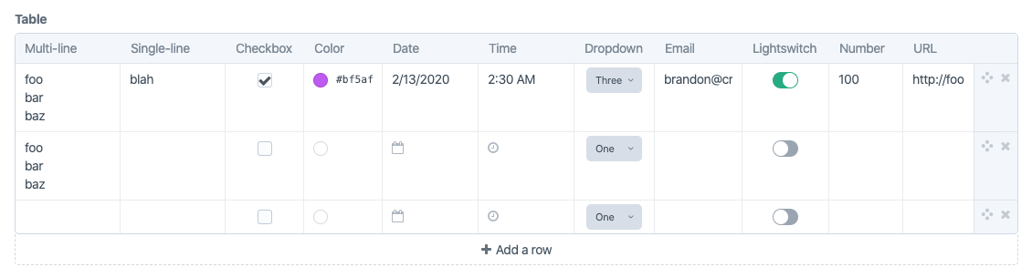
When a multi-line text, single line text or number field is in play, it makes it harder to scan the data in the table because of the different vertical alignments:

Table field
|Field type |Vertically aligned |
|---|---|
|Checkbox | Center |
|Colour | Center |
|Date | Center |
|Dropdown |Center |
|Email |Center |
|Lightswitch |Center |
|Multi-line text |Top |
|Number |Top |
|Single line text |Top |
|Time |Center |
|URL |Center |
Apologies - I should of mentioned this in https://github.com/craftcms/cms/issues/5611
Steps to reproduce
- Create a table field
- Add an
emailandmulti-linetext field - Assign field to an entry
- Add lots of content to the
multi-linefield and complete theemailfield - Notice how the
emailfield is vertically aligned to the center, not to the top
Additional info
- Craft version: 3.4.2
- PHP version: 7.3.13
- Database driver & version: MySQL 5.5.5
- Plugins & versions: Commerce 3.0.5
 jonleverrier
All 2 comments
Good call. Just made that change for the next release.
Apologies - I should of mentioned this in #5611
No apology needed – this is a separate issue, so better reported separately :)
 brandonkelly
on 7 Feb 2020
brandonkelly
on 7 Feb 2020
3.4.5 is out now with that change.
brandonkelly
on 7 Feb 2020
Related issues
brandonkelly
·
3Comments
 timkelty
·
3Comments
timkelty
·
3Comments
 michel-o
·
3Comments
michel-o
·
3Comments
 richhayler
·
3Comments
richhayler
·
3Comments
 angrybrad
·
3Comments
angrybrad
·
3Comments
Most helpful comment
3.4.5 is out now with that change.