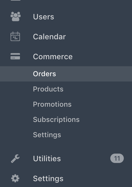
The new 12px font in sidebar sub-menus (introduced in https://github.com/craftcms/cms/commit/ad6aa784d574ec6d0424d87a8f1a000a8edc53fe) makes the items feel lost in the CP, where sizes generally increased compared to Craft 2. Can you please make it 13px again?
All 6 comments
@carlcs seconded!
Screenshot for reference:

I personally disagree – I feel like it helps make the visual hierarchy more obvious, whereas before you had to pay closer attention to realize that the subnav item was a subnav item, and see what section is was part of. @benjamindavid curious what your thoughts are.
@brandonkelly personally I think the change in colour and lack of an icon is enough. Considering that some of these links are pretty important (orders for example) 12px feels too small, which is the same size as the CMS version number.
It does seem a little small... but maybe I'm getting old. Time for spectacles? I noticed the change, and immediately didn't like it... but I know that reaction to any change is typically negative, so I let it sit. I think it still feels a little worse, after some reflection.
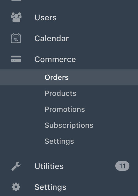
In any event... a pretty common UI paradigm to show parent/child relationships is simply indenting things outline-style:

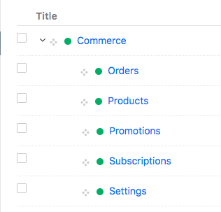
The font size could be kept the same as it was before, but the sub-nav would be even more clearly children of the parent nav... the same way you show that relationship for Structure items:

@brandonkelly I totally agree, it makes hierarchy more obvious and it looks nice by itself.
In the greater context of a typical Craft 3 CP page it feels a bit lost, e.g. next to the fonts of an Element Index page, its sources list and table column headers.
@khalwat I first played with the indentation, but didn’t/don’t care for it.
Most helpful comment
It does seem a little small... but maybe I'm getting old. Time for spectacles? I noticed the change, and immediately didn't like it... but I know that reaction to any change is typically negative, so I let it sit. I think it still feels a little worse, after some reflection.
In any event... a pretty common UI paradigm to show parent/child relationships is simply indenting things outline-style:
The font size could be kept the same as it was before, but the sub-nav would be even more clearly children of the parent nav... the same way you show that relationship for Structure items: