Cms: FR: Positioning of the user account in the global sidebar
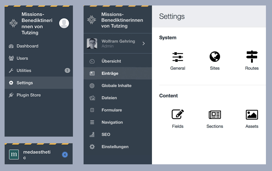
In Craft 3, with the current (RC2) positioning of the user account, things get squished more than in Craft 2. Below is an edge case, but still a real one.
So my suggestion would be: Keep the own row for the user account somewhere in the sidebar. Maybe all img/icons could be centered and the text left aligned which would make it calmer. (Don´t know if the lines are needed or the user could be toned down, different background – this is rough and still bold type, the new regular is nicer.)
Thanks a lot for consideration!
All 10 comments
While I agree with @marflow about the squishiness of the RC1/2 placement, personally I find the RC3 implementation a bit awkward too. These account details are suddenly the most prominent item in the navigation, when I'm not sure that's where they sit in the hierarchy.
I've thrown together a few alternate options which are available here: https://www.figma.com/file/Msia1XwWB660rihvWakZAc9I/Craft-CMS
(Press 0 for 100% zoom, hold space and drag to pan around.)
Version 1.0 (RC1) and 2.0 (RC2/3) are in there for reference.
- Version 3.0 simply moves the account section below the main menu items.
- Version 4.0 brings back the Craft 2 account menu positioning, but confines the debug toolbar to the #main-container section so it doesn't overlay (not sure if possible). The edition is added to the account menu.
- Version 5.0 brings back the Craft 2 account menu positioning, but raises it slightly by adding the edition underneath. This would work best if the debug toolbar could be shorter (not sure if possible).
- Version 6.0 moves everything up into a dropdown menu to the right of the site name, similar to what Slack does on its workspaces. Quite a few people have mentioned they like having the profile photo and/or name there so they can easily reference which account they're in/what kind it is, so perhaps this would need a visual indication of account _type_ at least.
- Version 7.0 moves the account menu out into the #main-container section. As with version 6.0, perhaps there would be a need for a visual indicator to show the logged in user is an admin account.
Anyway, just some thoughts! @brandonkelly also mentioned there will be a slight visual change if you have a Craft ID connected to your account, so not sure how that would change the examples.
@bensomething Thanks for the suggestions. Liked the idea of combining the account & site options into a single menu (v6). Ran with that a bit…
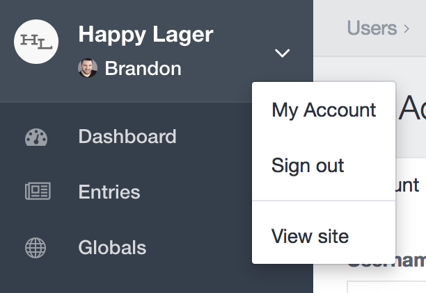
Looks great @brandonkelly! If I may offer one suggestion... I think it would make sense for "View site" to be the first item on that menu.
90% of the time, we'd be clicking on that link to view the front-end in a new tab. (At least speaking for myself. 😄 )
Also, the priority is getting reversed. The button displays like this...
Site Name
User Name
... but the menu displays the opposite...
User Options
Site Options
Other than that, I like it! 👍
I like it too, and agree with @lindseydiloreto that having View Site be first would make it even nicer.
There's one other thing, which may have been discussed. I was pretty surprised that the link for View Site overwrote the CP, instead of opening a fresh tab (or page if your browser's set up that way). This does feel pretty awkward, so would appreciate that the normal behavior got restored...
Hoping not to be off the side of some consensus??
C.
@narration-sd It has target="_blank", but was added a bit after the initial commit (but before RC4 was released). You’re probably just not up-to-date.
Ouch! me, not up-to-date :)
Actually, I held off mentioning this because I thought something like that -- and still got caught...
I will post-haste composer update my dev-develop. Probably paused over those PRs, which will need it anyway...
This is great @brandonkelly, I think this is working much nicer now! I realise I'm going to be _that_ guy once more, but I have a couple of other questions.
- Does there need to be a default site icon at all times? I think it still works nicely without them.
- If this section is now working similarly to how Slack manages it, would it be worth investigating how the dropdown arrow works when attached to the site name? Using @marflow's original example with the RC4 version, it still seems like there's an opportunity for alignment issues.
- Does the site icon need to shift down and to the right ever so slightly to be centred better? Okay, now I'm just being pedantic.
Anyway, just my 2¢.. again.
@bensomething I´d like to add my 2 cents as well, so I guess that makes us _those_ guys again (and you can feel better ;)
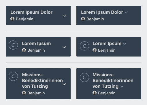
I like the direction you are taking this @brandonkelly, too. Only, the user pic is very (for me = too) small now and adds no real value any more. But I can see myself not uploading the pic at all, since the pic (whatever the size) at this position makes the top look busy again. (And in fact I have only one client where I added an image, and I don´t need my face there at all.)
So my wish would be: If no user img is added, make the space available for the user name (instead of default user icon).
Regarding the position of the arrow, I think it would be best far right like left col of Ben´s mockups. That´s all from me.
So: Wishing everybody a happy new year and hope you can still find the time for other things than the user info ...
@bensomething
Does there need to be a default site icon at all times? I think it still works nicely without them.
The alignment between the system info area and the system navigation was really bugging me. And I kindof like having the subtle Craft branding when a site icon isn’t supplied, especially since Craft 3 no longer has a global footer with “Craft CMS X.Y.Z”.
If this section is now working similarly to how Slack manages it, would it be worth investigating how the dropdown arrow works when attached to the site name? Using @marflow's original example with the RC4 version, it still seems like there's an opportunity for alignment issues.
Ah good point, I do like how it looks with the arrowhead inline with the system name.
Does the site icon need to shift down and to the right ever so slightly to be centred better?
Originally I had it vertically centered, but that looked awkward with multi-line system names. This isn’t the first time someone has brought this up, though, so I just pushed it down 6 pixels (but keeping it top-aligned). So now it will look centered if the system name only takes up one line of text, without going further down if there are multiple lines.
@marflow
So my wish would be: If no user img is added, make the space available for the user name (instead of default user icon).
That’s already the case :)
Sorry to comment on a closed issue, but having just tested Craft 3, this section still feels a little off to me.
- The extra click now to open the site front end is mildly annoying, but I'll probably get used to it.
- Having the site name, user name, and icons crammed in that little space feels, well, cramped.
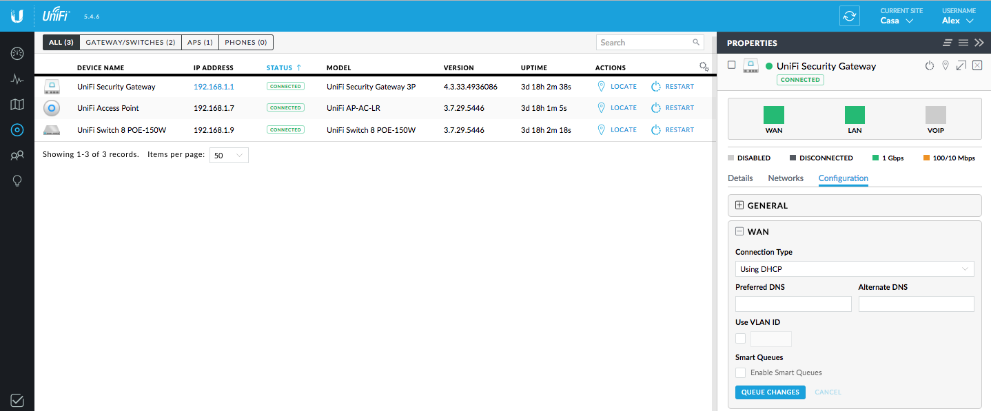
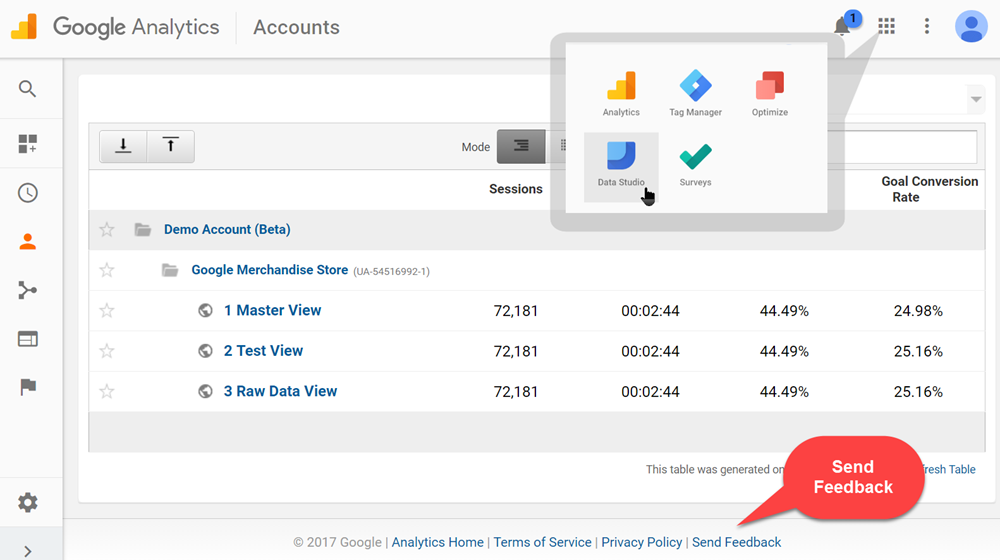
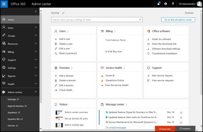
Have you considered a top-bar approach? I think this would solve most issues that arise.
Most helpful comment
While I agree with @marflow about the squishiness of the RC1/2 placement, personally I find the RC3 implementation a bit awkward too. These account details are suddenly the most prominent item in the navigation, when I'm not sure that's where they sit in the hierarchy.
I've thrown together a few alternate options which are available here: https://www.figma.com/file/Msia1XwWB660rihvWakZAc9I/Craft-CMS
(Press
0for 100% zoom, hold space and drag to pan around.)Version 1.0 (RC1) and 2.0 (RC2/3) are in there for reference.
Anyway, just some thoughts! @brandonkelly also mentioned there will be a slight visual change if you have a Craft ID connected to your account, so not sure how that would change the examples.