Cms: Feature Request: Required field message for "Couldn't save entry"
Description
An agency I'm working with has been adding content to a site and was getting the error message "Couldn't save entry". Turns out it was because they had missed a required field. I know the field gets highlighted in red, but is there any way you could make that error message tell them why it couldn't save the entry? I've fallen foul of this myself several times too.
Steps to reproduce
- Set a required field in an Entry
- Save the entry without filling in the field
Additional info
- Craft version: 2.6.2961
- PHP version: 7
 darylknight
All 12 comments
I actually like how the notifications are short and precise.
When saving an entry, it’s 98% because of field validation errors. They are highlighted with red outline and a list of errors inline, which is a standard way to display form errors.
Maybe the Debug Toolbar that comes with Craft 3 is something for you, it lets you further dig into the roots of an error.
 carlcs
on 15 Feb 2017
carlcs
on 15 Feb 2017
Hey Carl - sorry I'm not sure how a debug toolbar will help a user realise they haven't filled in a field?
darylknight
on 15 Feb 2017
Anytime an error can be spelled out more effectively for a non tech-savvy user sounds like a good idea to me. Fields highlighted red don't do any good if you have to scroll down the page, past the initial viewport to see them.
 chasegiunta
on 15 Feb 2017
chasegiunta
on 15 Feb 2017
What if there is a validation error in > 10 fields? How would the notification look like with a lot of error text, I think it would require a whole new design and makeover.
No need to scroll @ChaseGiunta, as each tab with errors is highlighted so you see where the fields are that need to be corrected.

Sorry, but I don‘t see how a list of field names and error messages, which overlay the page and stop me from correcting my mistakes does any good or why it would be needed. 🤔
carlcs
on 15 Feb 2017
@carlcs I don't think Daryl's FR mentioned _listing out the fields_. If anything, it just needs to mention something about field validation errors / missing info so the user knows to scroll down and look for said error(s). You make a good point with the tabs offering context, but not all entries have multiple tabs to make that 'Red / Error' tab vs. 'Black / Good' designation, and Users specifically don't allow tabs.
Only reason I'm commenting on the issue is because I've been victim to this oversight too. When in the history of computing has "Error" ever been adequate information to troubleshooting a problem?
chasegiunta
on 15 Feb 2017
Ok sorry, I’d interpreted more into the request as @darylknight actually wrote. I wouldn’t mind the notification to be a bit more precise, something like "Couldn’t save entry, there were errors validating the fields".
carlcs
on 15 Feb 2017
Yep - doesn't need to list the fields. But at the moment, the user is
assuming Craft failed to save the entry because there's something wrong
with Craft, rather than because they've missed a field.
darylknight
on 15 Feb 2017
Hi guys :) thanks for your great work. I just arrived here trying to find a solution to that error. I was even looking at the production logs. Then I realized that I was missing a field.
This is how it looks:
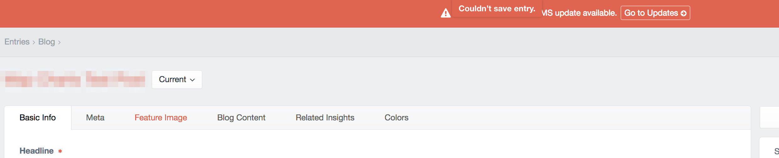
If the problem is in a field in other tab it's hard to see it. Bonus: the error bar disappears after a while, so if you switch tabs right after saving the content (to preview it for example) you'll miss it.
I would suggest at least a clearer message, just like "There are some errors that prevented this entry from being saved", "Please review the errors below".
 nosolopau
on 13 Jun 2017
nosolopau
on 13 Jun 2017
Adding my 2 cents in here. We have launched numerous Craft sites for clients and this issue confuses our clients almost 100% of the time. The error handling experience is simply not clear enough for non-technical audience. I agree some small iterations to this experience - even just clearer error language - could go a long way.
 cosmiceric
on 8 Mar 2018
cosmiceric
on 8 Mar 2018
I've also experienced this myself and with clients. I like the wording @nosolopau proposed - you don't have to list all the errors, but saying that there ARE missing required fields/field validation errors would be very helpful.
 KatieMFritz
on 21 May 2018
KatieMFritz
on 21 May 2018
It might be worth having the red highlighted tab flashing/pulsating to make it more obvious. I'm read/green colour blind and it doesn't stand out too much. Also, it would be great if a list of errors could be shown at the top of the page.
 andrewhawkes
on 31 Aug 2018
andrewhawkes
on 31 Aug 2018
As of Craft 3.0.27, Control Panel tabs that have errors now have alert icons, and as of 3.0.37 we’ve done the same for Matrix block titles. Those combined should make it much more obvious where the errors are.
 brandonkelly
on 11 Jan 2019
brandonkelly
on 11 Jan 2019
Related issues
 angrybrad
·
3Comments
angrybrad
·
3Comments
 leigeber
·
3Comments
leigeber
·
3Comments
 timkelty
·
3Comments
darylknight
·
3Comments
timkelty
·
3Comments
darylknight
·
3Comments
 bitboxfw
·
3Comments
bitboxfw
·
3Comments