Client: Toolbar: Flatten the three activity tabs into the main tabs
What's your opinion on this? I'm annoyed by the 3 sub-tabs in "Activity" and this could be a solution.
Maybe we'd need another tab for "Notifications" to split it away from the server activity view.
The new "About" tab is to fix https://github.com/owncloud/client/issues/6075 however is not strictly needed since we could also put that into a new section in the tray menu.
(I'm aware of the downsides when having a lot of accounts and a non-wide screen. But who has that?)
 guruz
guruz
All 11 comments
I have no strong opinion, but I'm open for it. Let's try…
To give users a better overview. Add indicators for every account?
 michaelstingl
on 17 Apr 2018
michaelstingl
on 17 Apr 2018
Maybe a few tabs like General, Network and Account can go behind a drop down, like in Firefox?
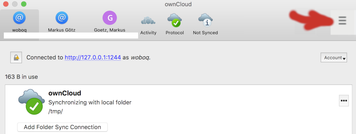
(see artistic red arrow, I love gimp :-/ )
 dragotin
on 25 Jan 2019
dragotin
on 25 Jan 2019
@hurradieweltgehtunter @TheOneRing FYI, what's your opinion?
guruz
on 5 Dec 2019
@wuenschedesign ^
michaelstingl
on 5 Dec 2019
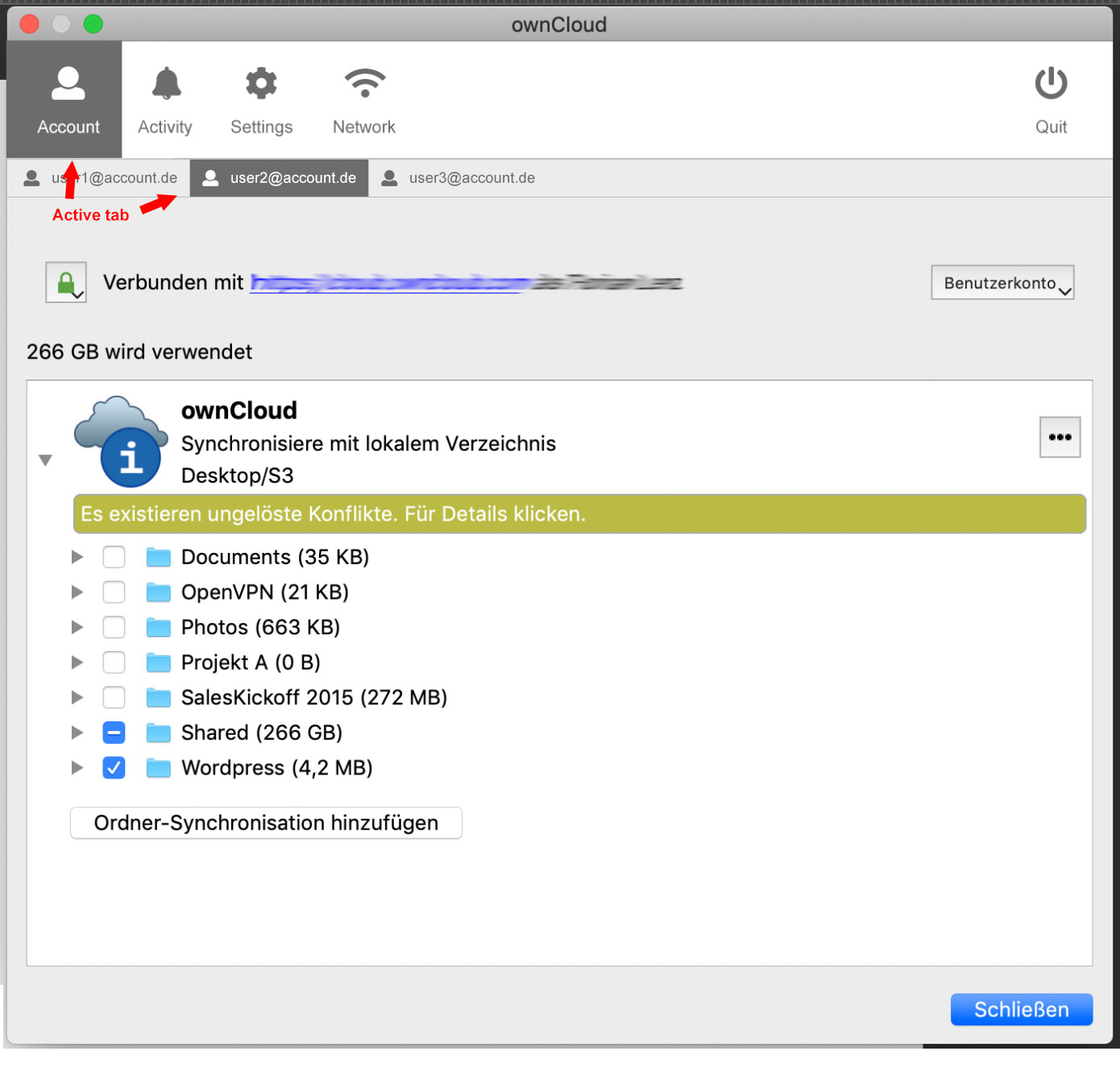
Don't show multiple accounts in the main menu and don't mix menu contexts.
I'd say let's use the main menu for main tabs.
Show multiple accounts as sub tabs in the main "Account" tab.
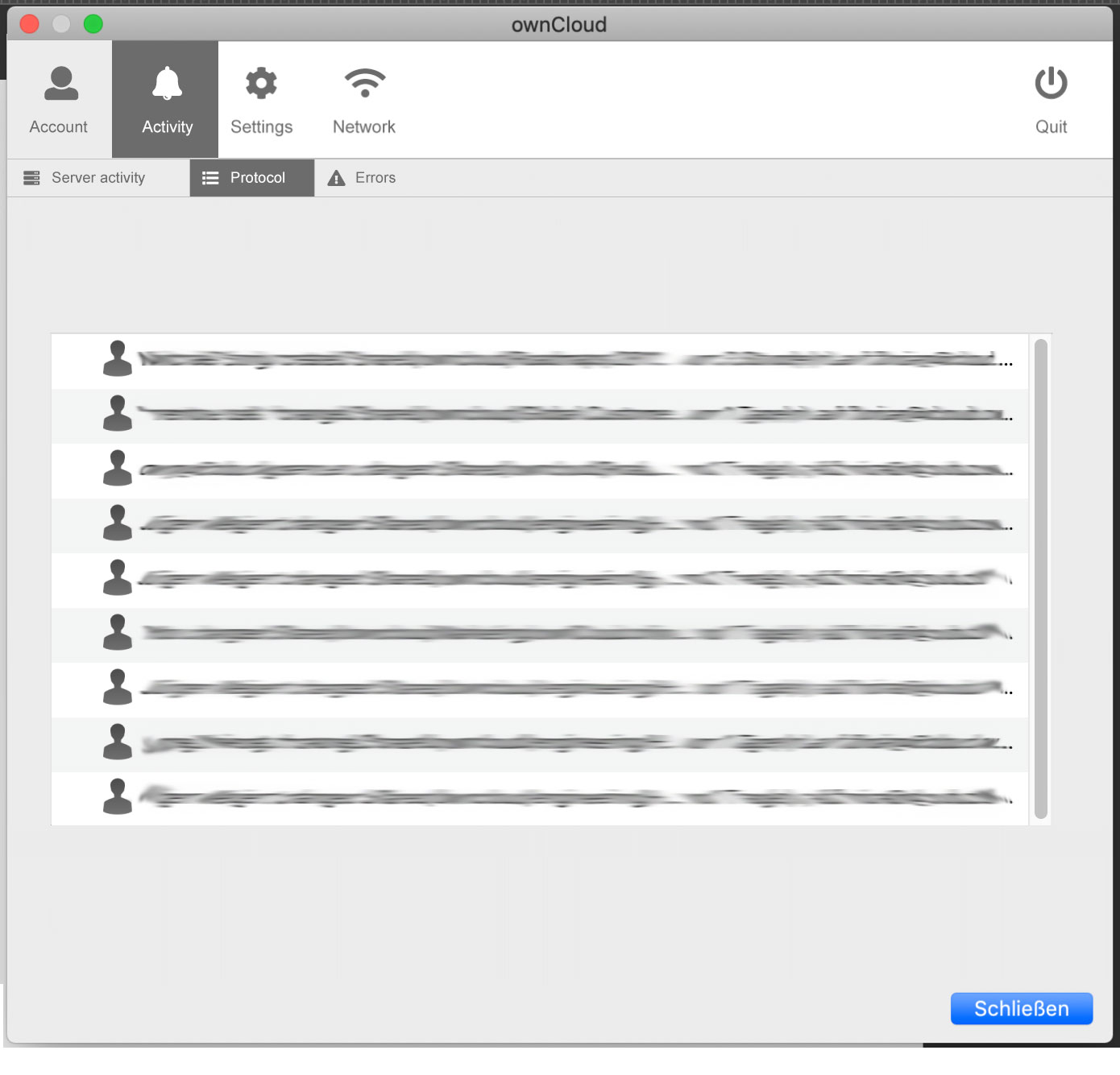
Same goes for logs. Main tab is "Activity"(or "Log") and in a secondary tab level split it into "not synced", "protocol", ...
Also this way we don't need burger menus to hide menu entries.
 hurradieweltgehtunter
on 5 Dec 2019
hurradieweltgehtunter
on 5 Dec 2019
quick mockups for better understanding
hurradieweltgehtunter
on 5 Dec 2019
That's an option too, although I don't know if this huge empty space in the toolbar makes sense...
(I also like how firefox/chrome merge the title bar with the tab bar, but that's probably overkill for us)
guruz
on 5 Dec 2019
Why have 3 separate accounts, but mix activity from all accounts in one view?
michaelstingl
on 5 Dec 2019
@hurradieweltgehtunter Thought some more about it, i don't like the big white space in the toolbar. Now I'm thinking it should be a mix of both of what we said:
Have "Account"(or call it "Sync") as first tab with account sub-tabs
Have "Activity" as second tab with account sub-tabs
Have "protocol" as third tab with account sub-tabs
etc
guruz
on 5 Dec 2019
What about keeping the multiple Account tabs as it is now and add subtabs below with Server Activity, Sync Protocol, Not Synced, maybe even settings for each account (currently Advanced settings from General tab and also VFS would make more sense in there)? Then the General tab would be reduced and could be merged with Network into one single General Settings tab
 HanaGemela
on 5 Dec 2019
HanaGemela
on 5 Dec 2019
Sorry, I can not hold myself back from pushing for the awesome solution for this challenge:
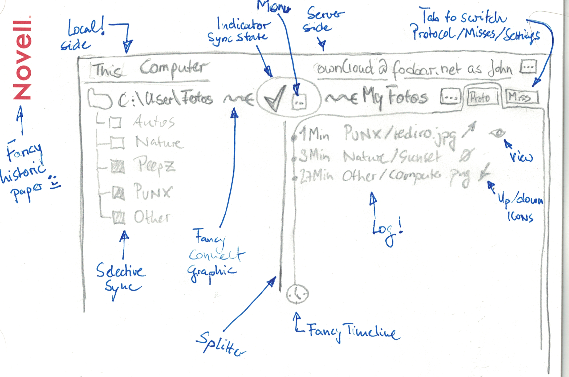
One idea here is to have the local file repo on the left, and the server side on the right. Both are connected by a fancy graphical sync indicator, that actively shows the state similar to now (but more fancy of course), together with a ... button that opens the connection related menu (sync now, sync pause etc).
The sync protocol and the misses could be (either combined in one view or separate) be accessed through tabs as shown in the scribble on the right side, because that space is now completely empty.
The biggest benefit would be that it finally becomes clear what is on local and on server side, which is confusing me with the current design until today.
Note that the whole block can and should be repeated for each sync connection that the user might have configured, although you always told me that this is a rare case.
It is very related to what @HanaGemela suggests, and I believe that if somebody with design skills makes it nice, it will be a good solution.
What I really dislike and ask you to not do is the idea of having "sub tabs" directly underneath the Account tabs. I don't think that is good GUI design. Thx.
dragotin
on 5 Dec 2019
Related issues
 mcastroSG
·
5Comments
mcastroSG
·
5Comments
 dartcafe
·
4Comments
dartcafe
·
4Comments
 codesmaker
·
4Comments
michaelstingl
·
4Comments
codesmaker
·
4Comments
michaelstingl
·
4Comments
 JKawohl
·
5Comments
JKawohl
·
5Comments
Most helpful comment
Sorry, I can not hold myself back from pushing for the awesome solution for this challenge:

One idea here is to have the local file repo on the left, and the server side on the right. Both are connected by a fancy graphical sync indicator, that actively shows the state similar to now (but more fancy of course), together with a
...button that opens the connection related menu (sync now,sync pauseetc).The sync protocol and the misses could be (either combined in one view or separate) be accessed through tabs as shown in the scribble on the right side, because that space is now completely empty.
The biggest benefit would be that it finally becomes clear what is on local and on server side, which is confusing me with the current design until today.
Note that the whole block can and should be repeated for each sync connection that the user might have configured, although you always told me that this is a rare case.
It is very related to what @HanaGemela suggests, and I believe that if somebody with design skills makes it nice, it will be a good solution.
What I really dislike and ask you to not do is the idea of having "sub tabs" directly underneath the Account tabs. I don't think that is good GUI design. Thx.