Clay: What kind of information is contained on component pages?
As we've been updating ClayUI documentation, specifically component documentations, we encountered a point of discussion that others should chime in as well.
The idea came up in #3226 and the point of it is to make it clear what kind of information is contained on component pages like Badge.
Here are some of the questions that I propose to show you the direction I've been thinking in and to inspire some of your questions or thoughts.
- Do we add any advice on how to best use the component?
- Do we only have technical information on components (props, api)?
- Do we have any of the content from Lexicon duplicated on Clay, or do we expect users to consult both before using the component?
This is the page layout that @bryceosterhaus recommended in the related issue. That still doesn't tackle the questions above but can kick start some discussion and ideas.
- Overview/Introduction to component. Why/when/where do we use it
- Variants (going from most used to least used)
- Limitations/Pitfalls/
- API Tables
/cc @bryceosterhaus @pat270 @jbalsas @wincent
 kresimir-coko
All 9 comments
Hey @kresimir-coko, @bryceosterhaus proposal looks good to me 👍
As I commented in the What is Clay in relation to DXP, this might be the time to add a JSP tab with JSP usage as well.
Keeping these docs up to date will be harder, but for as long as I've been thinking about it I don't see a better approach.
 jbalsas
on 18 May 2020
jbalsas
on 18 May 2020
I agree with adding a JSP tab.
Allocating some time on a weekly or bi-weekly basis to go through the docs and noting down any discrepancies shouldn't be a problem once we get all of these issues regarding docs sorted.
kresimir-coko
on 18 May 2020
- Do we have any of the content from Lexicon duplicated on Clay, or do we expect users to consult both before using the component?
I don't think we want duplicated content but we do want bi-directional linkage where possible to make it easy for people to consult both. And in the abstract, ideally components are designed in such a way that doing The Right Thing™ isn't a great feat of skill, but rather, the default outcome.
- Do we add any advice on how to best use the component?
- Do we only have technical information on components (props, api)?
For me the most important and desirable property for the docs is that the description of the props/API is accurate and complete. After that, an example demonstrating usage(s) is handy. I don't know what the "advice" would look like, but it could be useful — although I will point out the obvious that the more explaining we need to do, the farther away we get from The Right Thing™ being the default outcome.
 wincent
on 18 May 2020
wincent
on 18 May 2020
Looking at various component libraries I noted the following.
Component sections/categories
Adding sections or categories to navigation under Components might clarify some of the component relations. See screenshot for example. Something like placing all Form related components under a Form category.
Style choices
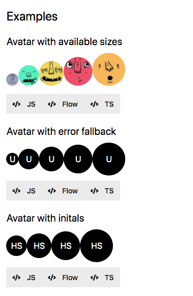
We're doing a good job at documenting different visual implementations of a component, like Button displayType.
Content
We should have at the very least one, but at least a couple sentences per example, main offender of this is something like Pagination Bar. What this content should be is yet to be decided, maybe one of the ideas below (_Common use cases_ or _When to use_).
Common use cases
This is something I noticed in a couple libraries. They mention which other components leverage the component currently being viewed. It might be beneficial to highlight/mention usages of the current component across Clay, for example when you're looking at Select Box we can include a link to Dual List Box explaining in one sentence how it's used within Dual List Box. This doesn't have to be a complete list of usages, but most common ones perhaps, or some not-that-obvious ones.
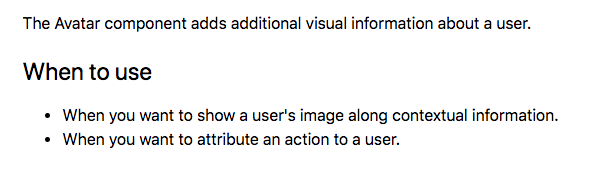
When to use
This might be on the topic of _duplicating content from Lexicon_ but perhaps not.
Screenshot of example.
It might be useful to mention, show, explain or just list some recommendations or rules when to use the component. For example: "use Badge component when you want to display notifications", or "use Badge component only with integers", or something like "use Badge component in combination with a Button component to show how many times it's been clicked"
kresimir-coko
on 18 May 2020
Hey just leaving my humble thoughts: I think that if we try to add too many explanations to the pages of the documents it will increase the maintenance on them, we have to remember that the documentation is very high cost and needs constant maintenance.
We tried to write more explanatory documentation at the beginning of v3 but it would take a long time to launch and it is also difficult to think about what to put on the page of each component. To talk about the component, good practices: we didn't have it, good practices were emerging as people would use them.
I like the idea of @bryceosterhaus, I think it is the same idea of what we wanted to do with the documents but we didn't have time in the beginning.
Just in case you want to get inspired, there are some libraries of some companies that I like to visit to know what they are doing.
 matuzalemsteles
on 18 May 2020
matuzalemsteles
on 18 May 2020
I think that if we try to add too many explanations to the pages of the documents it will increase the maintenance on them, we have to remember that the documentation is very high cost and needs constant maintenance.
Totally agree. I think our aim is to communicate effectively while also doing so very simply. This could be as easy as a single example with a header. Often I think _less is more_ when it comes to component docs.
As for the categories I had noted, here is what I would expect in each of them.
1. Overview
This would likely be a brief explanation for the components purpose and bi-directional linkage to Lexicon. I really like this example from ubers docs
2. Variants & Examples (going from most used to least used)
This would be similar to what we are doing already, but I think we need to go through and clear up out examples. I like how ubers docs are straight to the point showing you "this is what it does". I also like that their snippets are collapsed by default. This lets you see more docs and helps you not get lost in long examples
3. Limitations/Pitfalls/etc
This would sort of be our all encompassing "gotchas" information. Ideally we would identify any odd parts of the API here.
4. API Tables
These may need to be more of a forefront since I think most of the time, this is what users are coming for.
So overall, I think these 4 categories give us a good structure for laying out content. I would try to avoid "over explaining" our examples and try to let the headers and interactions of the examples speak for themselves. Plus, these sort of docs are the last to get updated and hardest to keep in sync.
One last thought... this is a complete curveball, but would there be worth in unifying lexicon and clay docs? For example, this page is really great at explaining on _why_ you use an alert in your design, and then our clay docs are essentially _how_ you implement it via react. Realistically this would be a lot of work, but maybe there is a better way for us to lean on the lexicon docs more since they are already pretty great at explaining the _why_.
 bryceosterhaus
on 19 May 2020
bryceosterhaus
on 19 May 2020
Thinking of taglibs here...
I can see value and consistency for it to be a part of clay. If we add it to the docs, I could imagine us doing something like this in the future for our docs examples and each code snippet tab would be "React", "HTML", "JSP"
I think this would help give a more unified feel across clay rather than 3 segmented offerings.
bryceosterhaus
on 19 May 2020
I agree with the categories you laid out @bryceosterhaus , and especially the part about having code collapsed by default, many of the libraries had either collapsed code or code that was under 10 lines long.
So the takeaway is to not force content where not required, good, I thought that we wanted content always, regardless of how descriptive the title
kresimir-coko
on 19 May 2020
I believe we've reached a conclusion here, roughly:
- Don't introduce descriptions where they aren't needed because it makes maintenance hard
- Use descriptive headings (_Range and Step_) instead of (_Customization_)
- Not all components require their own Markup/CSS or even React Component pages
- Don't duplicate content from Lexicon, it's expected from users to see both Clay and Lexicon
- Things to have in future:
- Code snippets collapsed by default
- JPS code snippets
kresimir-coko
on 21 May 2020
Related issues
kresimir-coko
·
3Comments
 bicienzu
·
3Comments
bryceosterhaus
·
5Comments
bryceosterhaus
·
5Comments
bryceosterhaus
·
4Comments
bicienzu
·
3Comments
bryceosterhaus
·
5Comments
bryceosterhaus
·
5Comments
bryceosterhaus
·
4Comments