Clarity: Incorrect foreground color for status badge-warning
Describe the bug
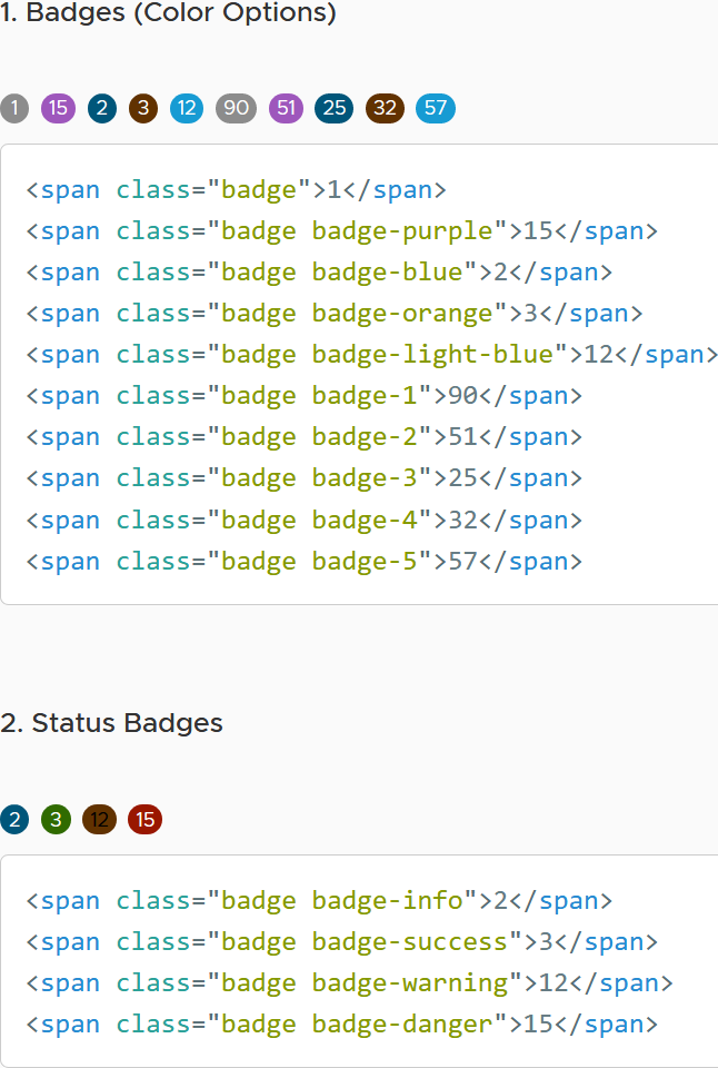
The foreground color of status badge warning does not have enough contrast with background.
How to reproduce
Steps to reproduce the behavior:
- Visit: https://clarity.design/documentation/badges and observe the Status badges

Versions
Clarity: v4.0.5
 karan-kang
All 11 comments
@karan-kang thank you for reporting this. We gonna try to add this issue in our next A11y bug fixes round.
 bdryanovski
on 4 Nov 2020
bdryanovski
on 4 Nov 2020
I've noticed some more changes on the badge coloring from v3 to v4.
The release changelog does not list any badge-related changes, so I'm wondering if the new colors are intended or if this is a side effect from another change?
| V3 https://v3.clarity.design/badges | V4 https://clarity.design/documentation/badges |
|
.badge-orange: #efc006; .badge-light-blue: #79c6e6; .badge-4: #efc006; .badge-5: #79c6e6; .badge-info: #0072a3; .badge-success: #3c8500; .badge-warning: #fee272; .badge-danger: #c21d00; |
.badge-orange: #613200; .badge-light-blue: #179bd3; .badge-4: #613200; .badge-5: #179bd3; .badge-info: #00567a; .badge-success: #306b00; .badge-warning: #613200; .badge-danger: #991700; |

|
|
Also notice that .badge-orange and .badge-light-blue now have white text instead of black.
 erabl-identos
on 9 Nov 2020
erabl-identos
on 9 Nov 2020
@erabl-identos
These changes were intentional. They are to improve the accessibility (color contrast) of the badges.
 mathisscott
on 9 Nov 2020
mathisscott
on 9 Nov 2020
Thanks for the clarification.
erabl-identos
on 9 Nov 2020
@colinreedmiller can you please review the shown badge colors (warning especially) and give us the expected background/font color definitions.
Thank you.
 Jinnie
on 24 Nov 2020
Jinnie
on 24 Nov 2020
These changes were intentional. They are to improve the accessibility (color contrast) of the badges.
Warning badge is almost unreadable, how does it improve something? And brown color for warning is also strange.
 mme-private
on 25 Nov 2020
mme-private
on 25 Nov 2020
These changes were intentional. They are to improve the accessibility (color contrast) of the badges.
Warning badge is almost unreadable, how does it improve something? And brown color for warning is also strange.
Scott's comment was about the other minor differences, mentioned in the other comments above. The warning badge is obviously wrong. We're waiting for feedback from UX with the correct colors.
Jinnie
on 26 Nov 2020
Any news from the UX team? Orange is not orange anymore, more like brown.
 jerone
on 6 Jan 2021
jerone
on 6 Jan 2021
Feedback after my last talks with UX:
Due to accessibility color contrast requirements, this is the background color accepted as warning in Clarity Core:
See here: https://clarity.design/storybook/core/?path=/story/components-badge-stories--status
Synchronizing with them lead to this issue, as we still need to update our font color. We shouldn't mix light over dark with dark over light in the same component, as we initially did.
Jinnie
on 6 Jan 2021
The fix here is to make the text white. The color contrast of text on orange is pretty hard to work out for accessibility requirements, hence the brownish color. This is only Clarity UI.
 gnomeontherun
on 6 Jan 2021
gnomeontherun
on 6 Jan 2021
Hi there 👋, this is an automated message. To help Clarity keep track of discussions, we automatically lock closed issues after 14 days. Please look for another open issue or open a new issue with updated details and reference this one as necessary.
![github-actions[bot] picture](https://avatars.githubusercontent.com/in/15368?v=4&s=40) github-actions[bot]
on 4 Feb 2021
github-actions[bot]
on 4 Feb 2021
Related issues
 clane
·
3Comments
clane
·
3Comments
 beaker1977
·
3Comments
beaker1977
·
3Comments
 yandong01
·
3Comments
yandong01
·
3Comments
 vzayko
·
3Comments
vzayko
·
3Comments
 elesueur
·
3Comments
elesueur
·
3Comments