Clarity: Missing skip link on https://clarity.design
Description
Missing skip link on https://clarity.design
Location
All pages
Priority
High
Recommended fix
https://clarity.design should have a skip link at the beginning of the DOM to allow sighted keyboard-only users as well assistive technology users the ability to skip past the main navigation to the main content of the page. The skip link should be visually hidden but still available to assistive technologies when it does not have focus. It should become visible when it gains focus and visibly hidden on blur. See an example at https://www.starbucks.com. Another example can be found at http://www.chrislane.info/examples/skipLink.html.
LOE
Medium
 chlane
All 17 comments
@coryrylan we have it on the ks-app, I guess we can unify the experience.
 Jinnie
on 6 Mar 2019
Jinnie
on 6 Mar 2019
I have an implementation working. The skip link shows when you first tab on the page and then disappears when you tab away as described in the examples above. When selected it will focus to the content of the page. I made it an application wide alert but happy to change it to whatever design recommends. Any thoughts @colinreedmiller ?
 coryrylan
on 7 Mar 2019
coryrylan
on 7 Mar 2019
I think the app level alert is the appropriate component. Thoughts @chlane ?
 colinreedmiller
on 8 Mar 2019
colinreedmiller
on 8 Mar 2019
What about when we want to use an app level alert? We have this on the homepage currently.
I think it needs to be a different experience.
 gnomeontherun
on 8 Mar 2019
gnomeontherun
on 8 Mar 2019
Most of the time a skiplink is its own thing. I agree with @gnomeontherun
See https://webaim.org/ for a good example.
An app alert may be an expedient choice but I don't think it's the right choice.
 mathisscott
on 8 Mar 2019
mathisscott
on 8 Mar 2019
Hi Colin,
If we are talking about using role=”alert” to notify screen reader users that new content has appeared as a result of routing I don’t think it is the right fit. Simply moving focus to a heading that precedes the newly loaded content is the best way.
Crhis
From: Colin Miller notifications@github.com
Sent: Friday, March 8, 2019 8:47 AM
To: vmware/clarity clarity@noreply.github.com
Cc: Chris Lane chlane@vmware.com; Mention mention@noreply.github.com
Subject: Re: [vmware/clarity] Missing skip link on https://clarity.design (#3153)
I think the app level alert is the appropriate component. Thoughts @chlanehttps://nam04.safelinks.protection.outlook.com/?url=https%3A%2F%2Fgithub.com%2Fchlane&data=02%7C01%7Cchlane%40vmware.com%7C0686c396d48742596b6e08d6a3e5a837%7Cb39138ca3cee4b4aa4d6cd83d9dd62f0%7C0%7C0%7C636876604106602976&sdata=UIHtCpeoiqQlCKprX%2BPrynxUykDVERrBOcUJ30k282w%3D&reserved=0 ?
—
You are receiving this because you were mentioned.
Reply to this email directly, view it on GitHubhttps://nam04.safelinks.protection.outlook.com/?url=https%3A%2F%2Fgithub.com%2Fvmware%2Fclarity%2Fissues%2F3153%23issuecomment-470995509&data=02%7C01%7Cchlane%40vmware.com%7C0686c396d48742596b6e08d6a3e5a837%7Cb39138ca3cee4b4aa4d6cd83d9dd62f0%7C0%7C0%7C636876604106612981&sdata=V7cOhfdXPe9B8tHKGyHVEnQch8OB5oG9Hletxp7dDY8%3D&reserved=0, or mute the threadhttps://nam04.safelinks.protection.outlook.com/?url=https%3A%2F%2Fgithub.com%2Fnotifications%2Funsubscribe-auth%2FAt4IpkpzUOaWKynP1IvDH1FYG8sM3NuKks5vUpP3gaJpZM4bZ7sY&data=02%7C01%7Cchlane%40vmware.com%7C0686c396d48742596b6e08d6a3e5a837%7Cb39138ca3cee4b4aa4d6cd83d9dd62f0%7C0%7C0%7C636876604106612981&sdata=08qf9Q49oXGz%2BKuV35aeACLe47J%2Feq4RrQ6zVT6k9UU%3D&reserved=0.
chlane
on 8 Mar 2019
Hey Jeremy,
If there is a good reason to aggressively interrupt a screen reader user’s reading experience, something like a session timeout warning, then role=”alert” can be used. When role=”alert” is used, it is not necessary to include aria-live=”assertive”.
Chris
From: Jeremy Wilken notifications@github.com
Reply-To: vmware/clarity reply@reply.github.com
Date: Friday, March 8, 2019 at 8:54 AM
To: vmware/clarity clarity@noreply.github.com
Cc: Chris Lane chlane@vmware.com, Mention mention@noreply.github.com
Subject: Re: [vmware/clarity] Missing skip link on https://clarity.design (#3153)
What about when we want to use an app level alert? We have this on the homepage currently.
I think it needs to be a different experience.
—
You are receiving this because you were mentioned.
Reply to this email directly, view it on GitHubhttps://nam04.safelinks.protection.outlook.com/?url=https%3A%2F%2Fgithub.com%2Fvmware%2Fclarity%2Fissues%2F3153%23issuecomment-470998352&data=02%7C01%7Cchlane%40vmware.com%7C9b632c2b48b04676f8de08d6a3e6c7e8%7Cb39138ca3cee4b4aa4d6cd83d9dd62f0%7C0%7C0%7C636876608928823668&sdata=paGWLD363OfhvL4zi0G2MWiRA%2FKERzwj8V3DXQk7tF0%3D&reserved=0, or mute the threadhttps://nam04.safelinks.protection.outlook.com/?url=https%3A%2F%2Fgithub.com%2Fnotifications%2Funsubscribe-auth%2FAt4IpvAYino90cZQcvEqWhjKLMuEV8zCks5vUpXagaJpZM4bZ7sY&data=02%7C01%7Cchlane%40vmware.com%7C9b632c2b48b04676f8de08d6a3e6c7e8%7Cb39138ca3cee4b4aa4d6cd83d9dd62f0%7C0%7C1%7C636876608928833673&sdata=0e%2BlG7m%2FT%2FiFx9XyIBb8eAD2aOA1wfbmDLVM913EX1k%3D&reserved=0.
chlane
on 8 Mar 2019
Agree looking at other examples making skip link its own thing and not an alert. I like @mathisscott suggestion with https://webaim.org/ The skip link on https://www.starbucks.com is kind of funny just a floating button.
@colinreedmiller Maybe take a look at those examples for ideas? We wont use the app level alert component since it conflicts with any existing alerts on the page (see clarity home page for example).
coryrylan
on 8 Mar 2019
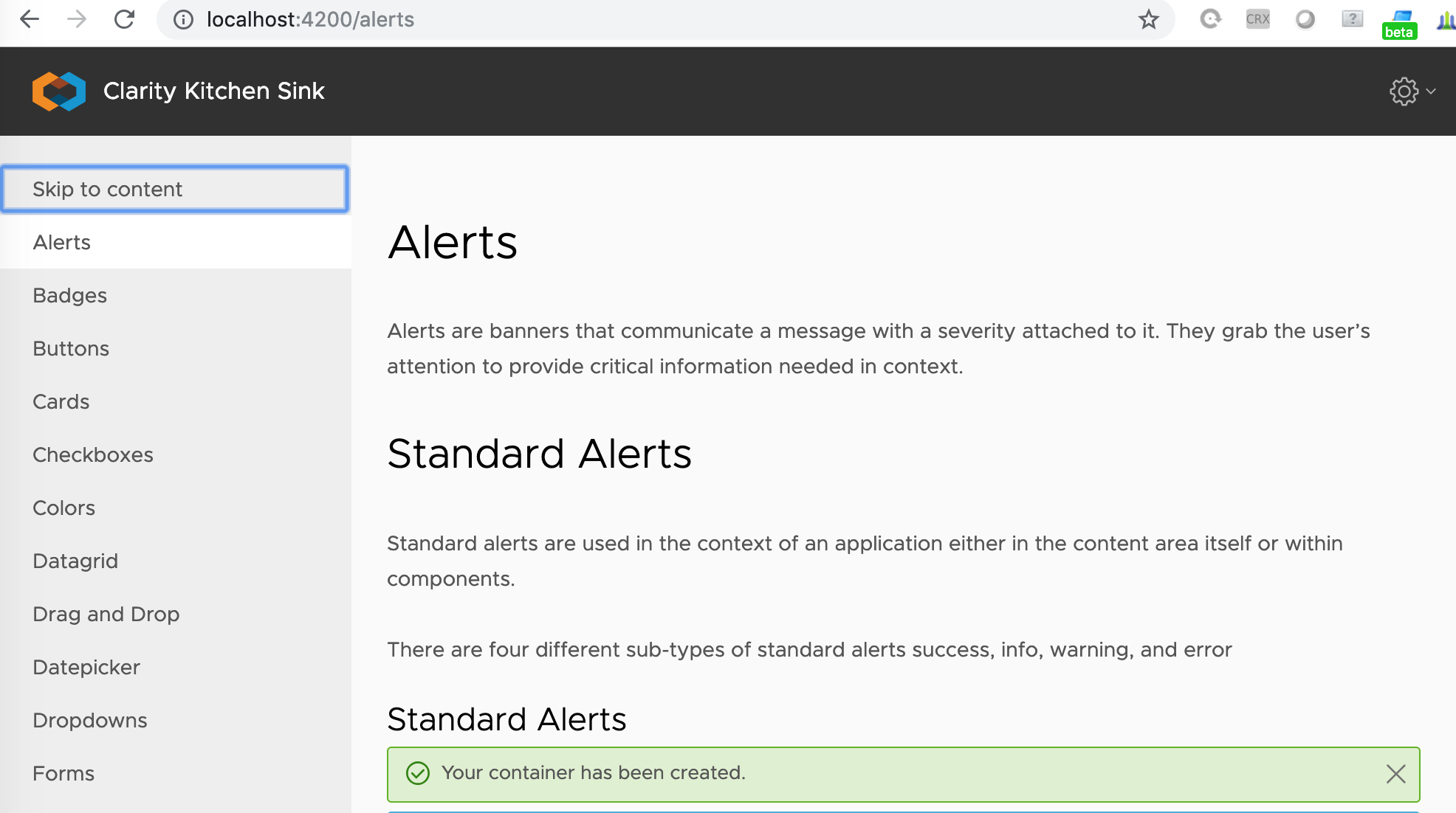
I already mentioned the kitchensink app. There we added the skip link as "invisible" 1st item on the menu that only gets visible when tabbed to. What's wrong in reusing this approach?
Jinnie
on 11 Mar 2019
Sry, I hit wrong "comment" button. Reopening.
Jinnie
on 11 Mar 2019
I didn't follow the KS app example for placement mainly because I was hoping to find a solution to the skip link that is independent of the navigation and content of the application. For example, some pages on the clarity site do not have the side nav immediately available. If we can find a generic solution, then we can point users to the docs for an example that they can use in their applications.
coryrylan
on 11 Mar 2019
Still, you need to have something to skip :)
If you don't have a menu, what is it that you are skipping? IMO, the idea behind "skip to content" is exactly to skip a possibly lengthy vertical nav. Horizontal ones are not so big, though yes, they can be a candidate for skipping, too. Open for other points of view, of course!
Jinnie
on 11 Mar 2019
Yes there should be something to skip. The idea is to provide a mechanism to skip past repetitive navigation structures. There is no hard and fast rule regarding how many controls are not worth using a skip link. It’s good to simply provide skip links for navigation menus both vertical and horizontal.
Also, the skip link violation is frequently flagged by automated accessibility checkers so it’s good idea just to pass the checks as well.
From: Ivan Donchev notifications@github.com
Sent: Monday, March 11, 2019 9:45 AM
To: vmware/clarity clarity@noreply.github.com
Cc: Chris Lane chlane@vmware.com; Mention mention@noreply.github.com
Subject: Re: [vmware/clarity] Missing skip link on https://clarity.design (#3153)
Still, you need to have something to skip :)
If you don't have a menu, what is it that you are skipping? IMO, the idea behind "skip to content" is exactly to skip a possibly lengthy vertical nav. Horizontal ones are not so big, though yes, they can be a candidate for skipping, too. Open for other points of view, of course!
—
You are receiving this because you were mentioned.
Reply to this email directly, view it on GitHubhttps://nam04.safelinks.protection.outlook.com/?url=https%3A%2F%2Fgithub.com%2Fvmware%2Fclarity%2Fissues%2F3153%23issuecomment-471621661&data=02%7C01%7Cchlane%40vmware.com%7C2febe588aa9b42acf64408d6a640da26%7Cb39138ca3cee4b4aa4d6cd83d9dd62f0%7C0%7C0%7C636879194804225869&sdata=3uW16ND5Di%2BB7k5pn%2F%2F6Ylat2R6r5bb5fcrxCSSyaCs%3D&reserved=0, or mute the threadhttps://nam04.safelinks.protection.outlook.com/?url=https%3A%2F%2Fgithub.com%2Fnotifications%2Funsubscribe-auth%2FAt4IpkXI5S3EZFWvnCmchkjFnCwhL3Zjks5vVof0gaJpZM4bZ7sY&data=02%7C01%7Cchlane%40vmware.com%7C2febe588aa9b42acf64408d6a640da26%7Cb39138ca3cee4b4aa4d6cd83d9dd62f0%7C0%7C0%7C636879194804235869&sdata=HVrI4ExdaqH4yGpxbrpI8NAZ7qhAmT0fcqTjGz29sPI%3D&reserved=0.
chlane
on 11 Mar 2019
So, Cory's initial approach seems better. We'll always have at least the top navigation on the site to skip.
Jinnie
on 11 Mar 2019
The initial approach was critiqued on the basis of the use case when an app level alert is already present or needed simultaneously to the skiplink. I spoke at length with @chlane about this and have drafted a solution quite similar to what we see in Webaim. I need to check with Sheri re: placement in the visual hierarchy because the layout of https://clarity.design/documentation leaves no obvious location without either changing, occlusion, or placement where it appears lower in the hierarchy than expected.
colinreedmiller
on 11 Mar 2019
Design spec.

Considerations:
Highly visible is essential - keyboard users often move quickly and are more likely to miss an item that is invisible - then visible - then invisible again, thus over afforded (color) is good, especially in a tight layout that should not dynamically change with the appearance of the skiplink.
also: Using this opportunity to align the header tabs with the side nav (see spec).
Below - appearance on other Clarity tabs with and without side nav:


 colinreedmiller
on 3 May 2019
colinreedmiller
on 3 May 2019
Hi there 👋, this is an automated message. To help Clarity keep track of discussions, we automatically lock closed issues after 14 days. Please look for another open issue or open a new issue with updated details and reference this one as necessary.
![github-actions[bot] picture](https://avatars.githubusercontent.com/in/15368?v=4&s=40) github-actions[bot]
on 9 Sep 2020
github-actions[bot]
on 9 Sep 2020
Related issues
 JohannesRudolph
·
4Comments
JohannesRudolph
·
4Comments
 gperdomor
·
3Comments
gperdomor
·
3Comments
 reddolan
·
3Comments
reddolan
·
3Comments
 aaronfrost
·
3Comments
aaronfrost
·
3Comments
 Thatkookooguy
·
3Comments
Thatkookooguy
·
3Comments