Clarity: Using a button for toggling in the header doesn't use correct CSS
Select one ... (check one with "x")
[x] bug
[ ] feature request
[ ] enhancement
Expected behavior
When a button is put into the header along with the .nav-icon class, it should have a transparent background, no border and cursor should be pointer so that it looks the same as a dropdown button or an <a> link button with the .nav-link class.
Actual behavior
Currently using a button in the header displays a generic button
Reproduction of behavior
- Include a link to the reproduction scenario you created by forking one of the Clarity Plunker Templates:
How it looks now: https://stackblitz.com/edit/clarity-theme-switch-toggle-2
How it should look: https://stackblitz.com/edit/clarity-theme-switch-toggle-1
Note: I have hacked around the target look by using an <a> tag. Since my target is to use the button to toggle between themes, I don't feel <a> is semantically correct. I have found that the required CSS is being added by the .dropdown class in case of a dropdown header.
Environment details
Angular version: 5.x.x
Clarity version: 0.11.7
OS and version: Win10
Browser: [all]
 SayakMukhopadhyay
All 13 comments
@SayakMukhopadhyay - You are missing a couple of things from your app. I updated your StackBlitz here.
I added in the <clr-dropdown> component which has the clrDropDownTrigger and clrDropdownItem directives in the right places. You can read more about Dropdowns in our docs: https://vmware.github.io/clarity/documentation/v0.11/dropdowns
Closing this based on above. If you have more questions about Dropdowns, please ask on StackOverflow and tag your question with vmware-clarity and we will be notified.
 hippee-lee
on 3 Mar 2018
hippee-lee
on 3 Mar 2018
@hippee-lee My issue is that I am not looking for a dropdown. My action button will be in the header itself and not via a menu. As mentioned in my issue, I know that the dropdown is adding a class to the icon which shows the intended behaviour. I also know that using an <a> tag is working fine. Its <button> which is not.
SayakMukhopadhyay
on 3 Mar 2018
Ok. Sorry about that. I'll take another look.
hippee-lee
on 3 Mar 2018
Re-reading our docs we only discuss using navigation elements in the header. Pinging @reddolan or @lil-kim for UX guidance on using a button in the header for something like a theme switcher.
hippee-lee
on 3 Mar 2018
I am also interested in something similar, but after trying different placements I decided to go with a toggle-switch inside a dropdown menu. I just thought that having a button or toggle-switch in the header itself was a bit too conspicuous…
Of course, I had to add some css hacks to get the toggle-switch to display correctly, so it would be good if at some point we could have a native way for doing this.
Some pics:
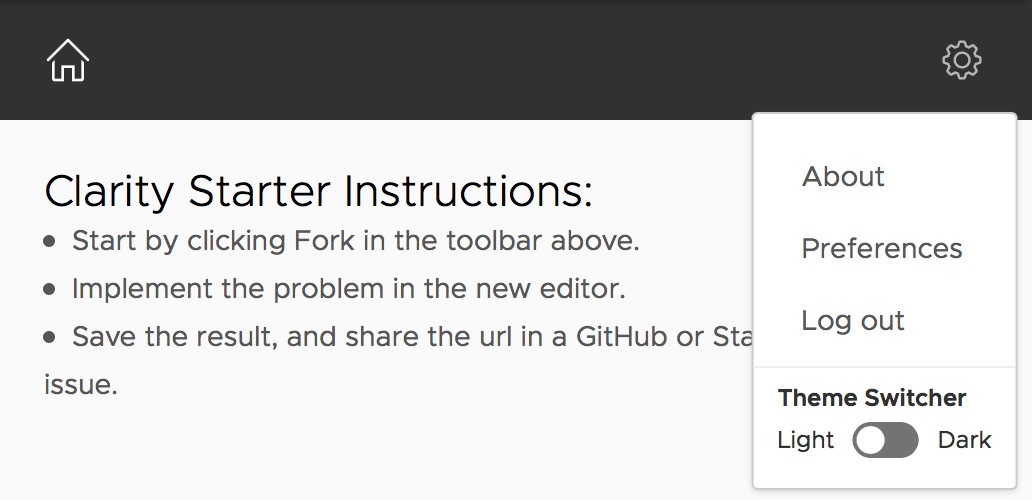
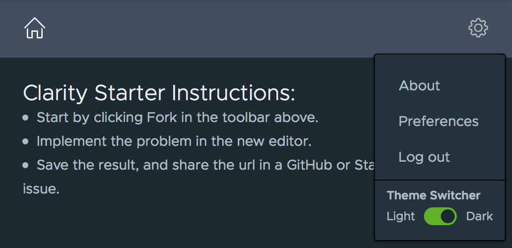
Modified StackBlitz https://stackblitz.com/edit/clarity-theme-switch-toggle-2-e2tyjb.
 gomesjj
on 6 Mar 2018
gomesjj
on 6 Mar 2018
@reddolan @lil-kim: Do we want to support buttons in the header by default?
 adityarb88
on 2 Jul 2018
adityarb88
on 2 Jul 2018
@adityarb88 are we intentionally not supporting them?
 reddolan
on 2 Jul 2018
reddolan
on 2 Jul 2018
A lot of apps already have too many options in the main header. IMO switching themes isn't an option that warrants visibility at all times. I prefer it in a dropdown menu.
 lil-kim
on 2 Jul 2018
lil-kim
on 2 Jul 2018
I would second @lil-kim's comment. I would be surprised if a user needed the quick access to changing theme. In the setting menu or even on a user preferences page, seems to make more sense to me for this case.
reddolan
on 2 Jul 2018
Though the issue is more around buttons in the header. While having a number of buttons in the header wouldn't be desirable, restricting someone from putting a button in the header isn't something we really want to do.
reddolan
on 3 Jul 2018
@reddolan: We aren't restricting anyone from putting a button in the header. You can put a button in the header but the alignment might be off. While the header was being designed and implemented, we didn't have a good use case of using a button in the header. We could give the search button as an example of a valid use case but if I remember correctly, we had thought about the search experience to be more like the select experience where the user starts typing and a dropdown menu appears with the search results.
So in summary, you could still use buttons in header but the alignment would have to be done on the app side. If we think that we should be supporting the alignment part out of the box, then we can definitely remove the margins and the paddings on our side and the buttons should align correctly.
Also, since header is divided into 4 parts, so we would have to know exactly where the buttons can be placed as each part might need different adjustments.
adityarb88
on 3 Jul 2018
The use of buttons in a the header is not a very common case.
The example of theme switching is better solved where the toggle appears in a dropdown.
Unless a common use case can be shown that justifies the effort required to remove the margins / padding to support alignment OOTB, which includes addressing the 4 potential locations, it is better to leave the alignment on the app side.
@mathisscott
 colinreedmiller
on 21 Feb 2019
colinreedmiller
on 21 Feb 2019
Hi there 👋, this is an automated message. To help Clarity keep track of discussions, we automatically lock closed issues after 14 days. Please look for another open issue or open a new issue with updated details and reference this one as necessary.
![github-actions[bot] picture](https://avatars.githubusercontent.com/in/15368?v=4&s=40) github-actions[bot]
on 11 Sep 2020
github-actions[bot]
on 11 Sep 2020
Related issues
 Thatkookooguy
·
3Comments
Thatkookooguy
·
3Comments
 vzayko
·
3Comments
vzayko
·
3Comments
 srikanthps
·
3Comments
srikanthps
·
3Comments
 Vad1mo
·
3Comments
Vad1mo
·
3Comments
 JohannesRudolph
·
4Comments
JohannesRudolph
·
4Comments
Most helpful comment
Re-reading our docs we only discuss using navigation elements in the header. Pinging @reddolan or @lil-kim for UX guidance on using a button in the header for something like a theme switcher.